


Delicious Parks
~ And the spirit was hovering over the surface ~


Revealing a new spectacular collaboration after two log rolls.
📖 Reserve your copy of Info We Trust, my “love letter to data storytelling” coming this fall, directly from Visionary Press:
Comics maker and theorist Scott McCloud recently blurbed, “INFO WE TRUST is a supremely readable book tackling many of the most important challenges facing today's information landscape.”
📺 I recently appeared on Bill Shander’s DataViz show discussing the importance of lost (and found!) information design. Watch it on LinkedIn.

OK, on with today’s feature!—
A Delicious View of U.S. National Parks
In May 2023, this newsletter highlighted a rendered hike around Mt. Blanc, beautifully visualized by Shanghai designer Wendy Shijia. Within a few weeks, I was lucky to be chatting with her about a vision:
What if each U.S. National Park had a cookie-cutter section removed and placed on a giant chessboard for easy comparison?
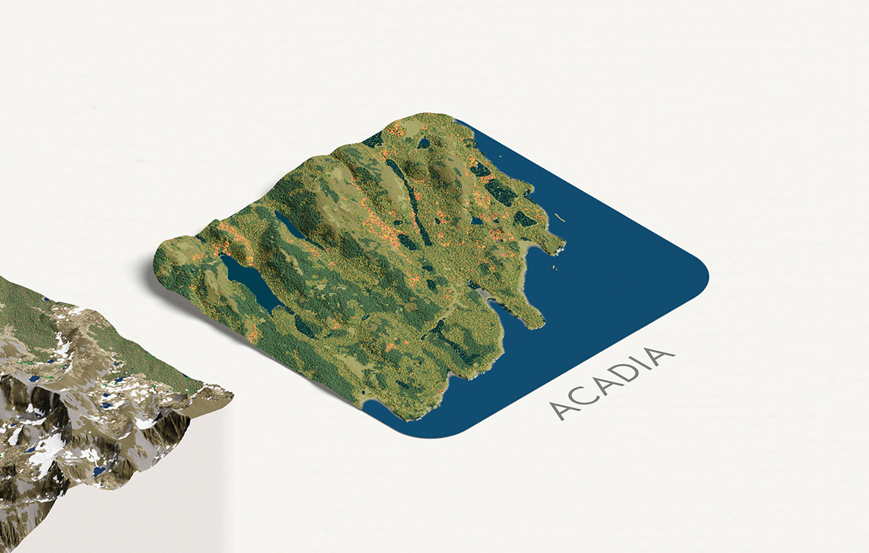
Here’s a concept sketch showing a section removed from Acadia National Park, as if a god walking over the face of the Earth had grabbed it for their personal Wunderkammer:
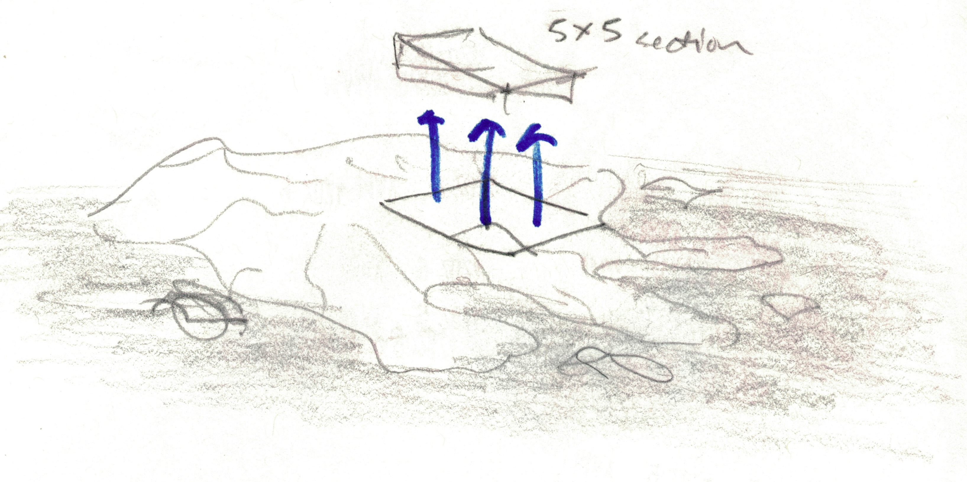
Wendy and I soon began modeling parks, discussing our sections as if they were fine pieces of chocolate, arranged and annotated deliciously for the eyes to feast.
Today, after a year of collaboration, we are thrilled to announce that our project was accepted to the Atlas of Design, a biennial volume from NACIS “dedicated to showing off some of the world’s most beautiful and intriguing cartographic design.” With this prestigious commendation, it is time to reveal our progress.
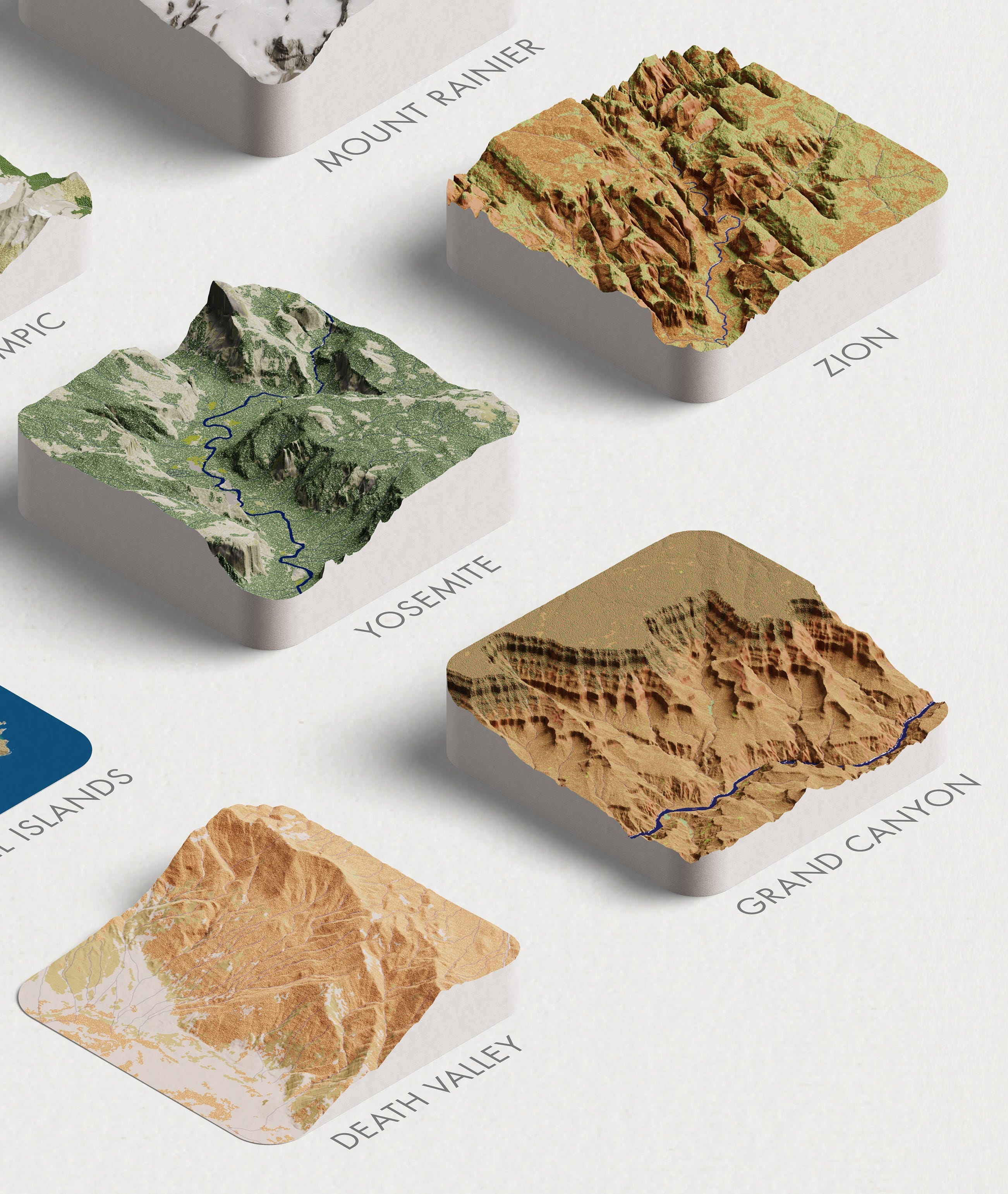
Here are our first twenty parks as they will be presented in the NACIS volume, arranged geographically from the west to east coast of the United States.
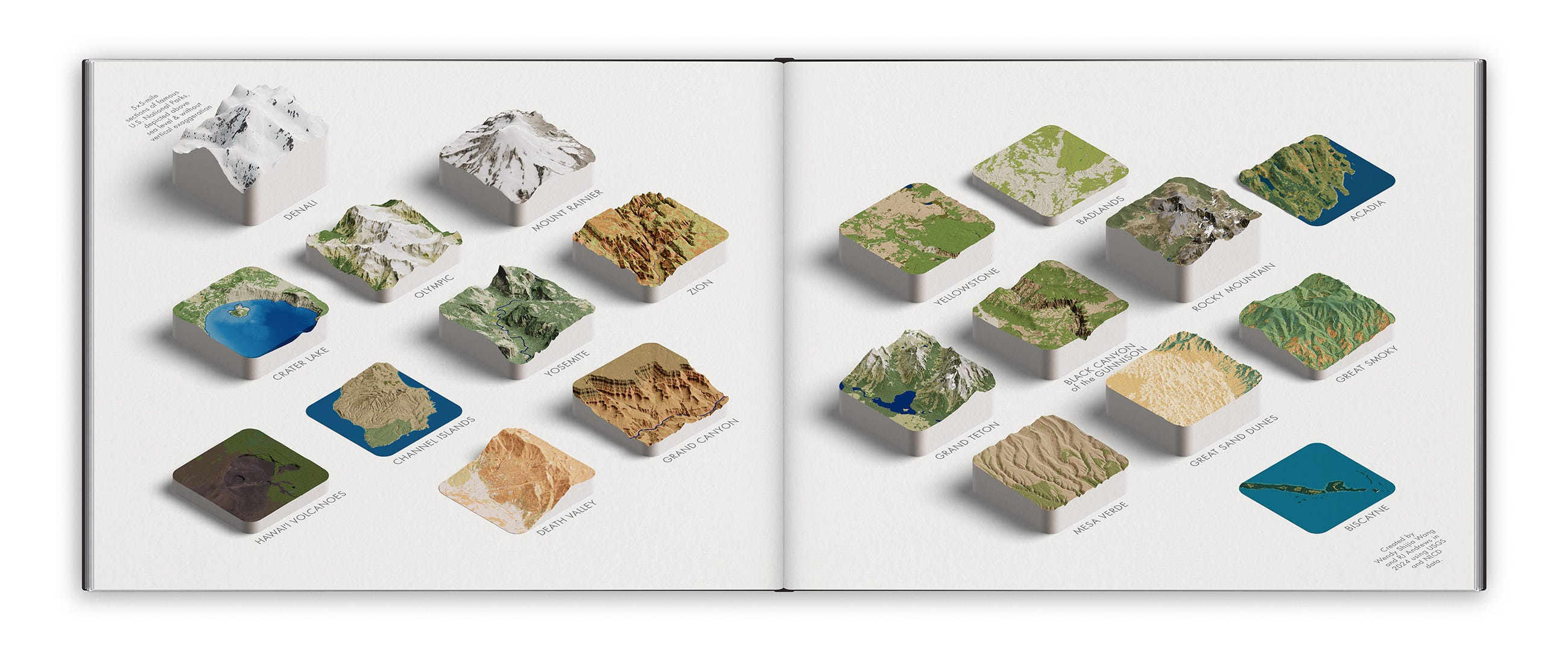
Each park is a 5×5-mile section, raised above sea level without vertical exaggeration. As we described in our NACIS design essay:
In 1972, Charles Eames described design as “an expression of purpose.” The purpose of this composition is to enable natural comparisons between U.S. National Parks. . . . Seeing any park in the context of the others further distinguishes what makes each one special. The Grand Canyon is somehow even more grand.
Of the many behind-the-scenes artistic and technical details, the element that took the longest to develop was their style.
Our goal was to recreate the emotional appeal of each park—its vibe. We wanted something closer to how a mid century poster would portray the park, and less how it photographs from an airplane. Indeed, we found that aerial imagery wasn’t colorful enough (and removing its shadows was too troublesome). Instead, we relied on National Land Cover Database areas augmented with custom 3-D textures (e.g. tiny bumps for forests) and park-specific colors.
For example, the same “barren” data layer appears differently depending on the park: medium gray in Yosemite and orangey-tan in Grand Canyon.
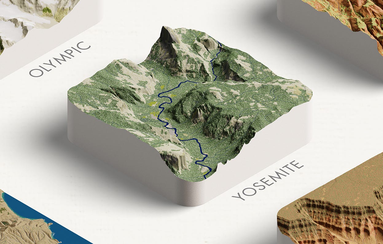
We rotated and positioned each park to exhibit its special features. Yosemite, for example, is oriented looking up-valley to reflect visitors’ mental models of the park. El Capitan and Half Dome are carefully framed, with the latter’s iconic shape silhouetted against the blank canvas.
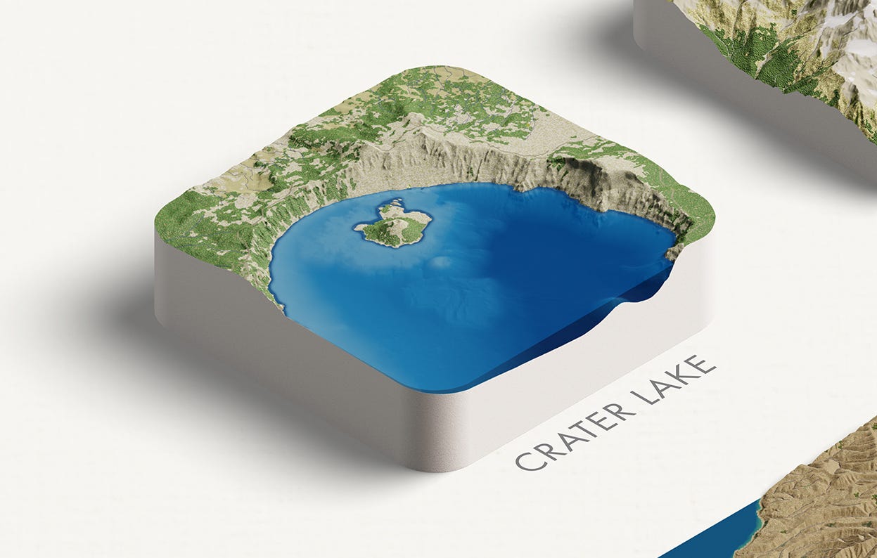
We made special efforts to bring certain parks to life. For example, Crater Lake bathymetry data glimmers beneath its blue water.
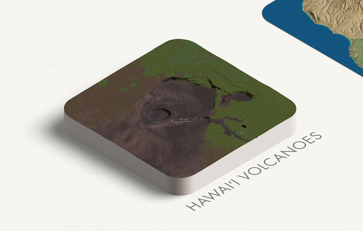
In another unique case, we found aerial imagery necessary to give Hawai’i Volcanoes’ dark soil interesting texture. Many of these small refinements resulted from critiques by cartographers-extraordinaire: Ken Field, Rosemary Wardley, Tom Patterson, and Rob Simmon.
This is not the first time I’ve explored comparisons of parks. In 2016, I released Profiling the Parks, a short film comparing 2-D profile cuts inspired by my curiosity about the similarities and differences between Yosemite Valley and Zion Canyon.
Today, I am overjoyed to make more lively comparisons in an added dimension.
We selected the first twenty parks based on their popular familiarity and topographic diversity. Admiring them has inspired new visions in us. In many ways, “Delicious Parks” has just begun.
We aim to complete models of all 63 U.S. National Parks. (We also think our process could be expanded to international locations.)
Can you connect us with a mainstream outlet or institution to help us develop and publish the next iteration of our project?
Beyond the digital realm, we are interested in making 2-D prints and sculpting real-life 3-D models.
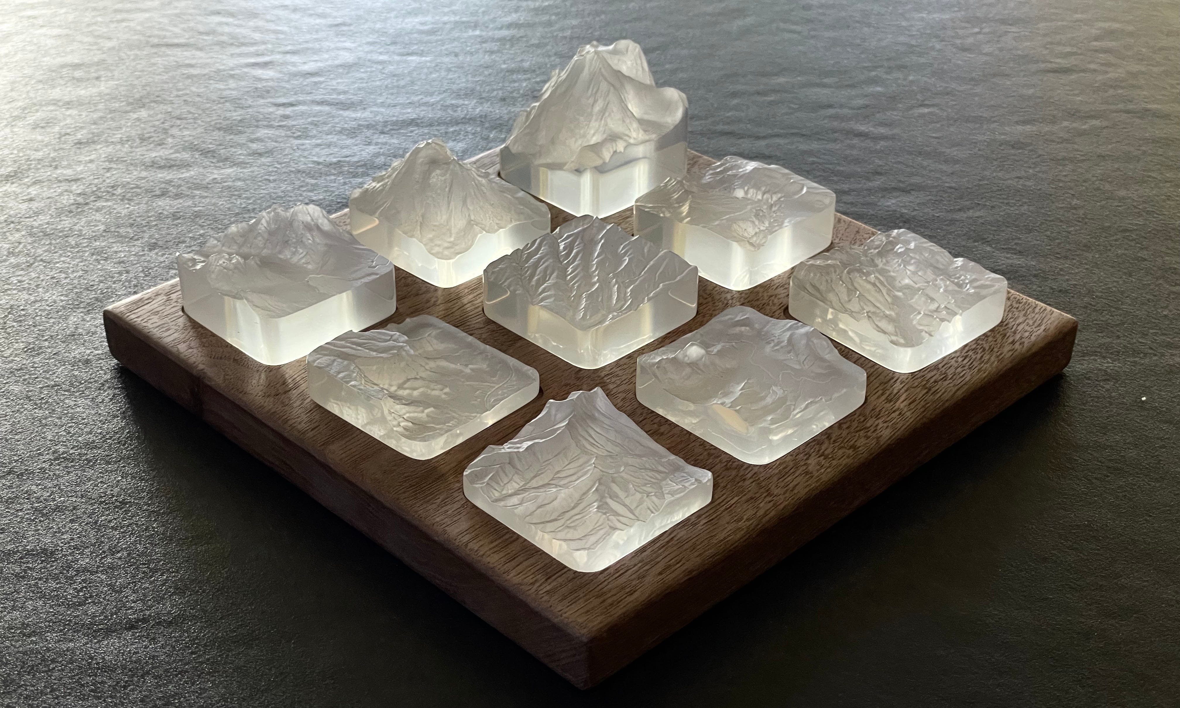
Wendy has already begun experimenting with materials and methods for bringing our models into the real world, which she recently revealed to me. After a year of virtual collaboration, Wendy and I met in person.
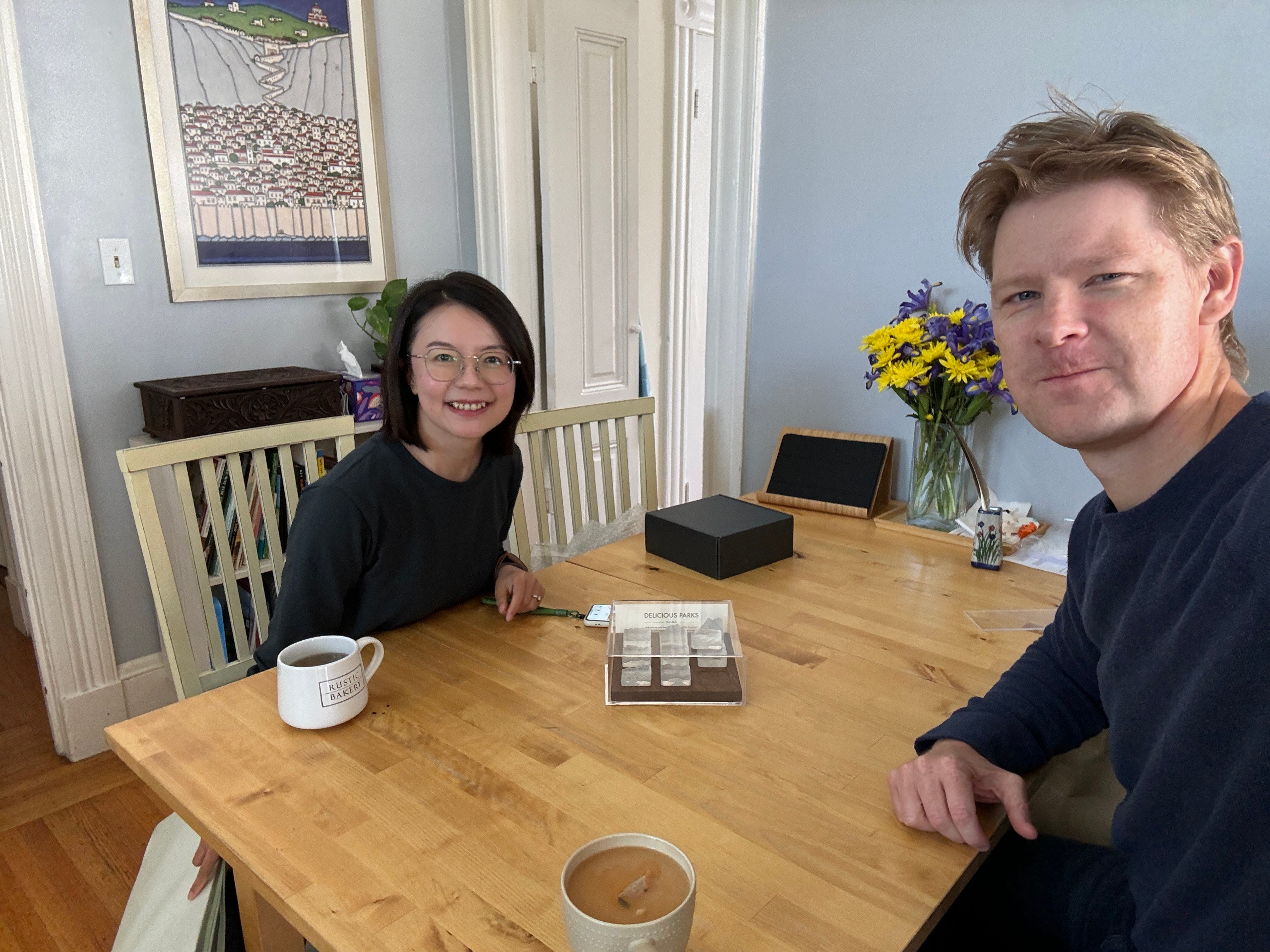
She arrived to San Francisco with a special gift: a first-edition set of nine resin parks. See more details about her sculptures on Twitter.
Working through on this project—6,000 miles apart—has made us very happy.
Our original intent and vision was only partial motivation over the many months of creation. Our maps were permission to learn from and relish in another’s passionate design-thinking, shared inspiration, and technical know-how. This project afforded us an opportunity to delight in joyful cartography as we spurred each other’s enthusiasm for seeing the world in delicious ways.
We hope our project inspires similar excitement in you.
Onward!—RJ & Wendy
About
Wendy Shijia Wang is a data visualization and 3D designer from Shanghai. See her portfolio of all dataviz work and follow her on Twitter. Her Mt. Blanc hike was previously featured in this newsletter.
RJ Andrews helps organizations solve high-stakes problems by using visual metaphors and information graphics: charts, diagrams, and maps. His passion is studying the history of information graphics to discover design insights. See more at infoWeTrust.com.
RJ’s recently published Information Graphic Visionaries is a book series celebrating three spectacular data visualization creators. With new writing, complete visual catalogs, and discoveries never seen by the public. His next book, Info We Trust, will be published in 2024 and is currently available for pre-order.
 | A guest post by
|