Inspiration from Info We Trust #032
The most beautiful data dashboard and Stanford exhibition opening!
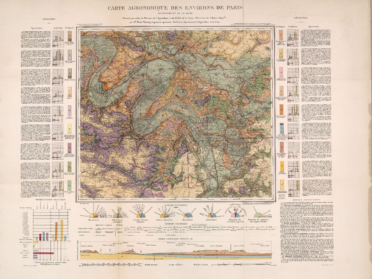
This week's inspiration: Agriculture of the Surroundings of Paris
This 1897 analytic tableau was designed to present the findings of the latest decennial agriculture survey. It may be my favorite dashboard ever.

Creator Paul Vincey, of The Ministry of Agriculture, was inspired by the graphic statistics albums of the Ministry of Public Works and directly reference its geodata.

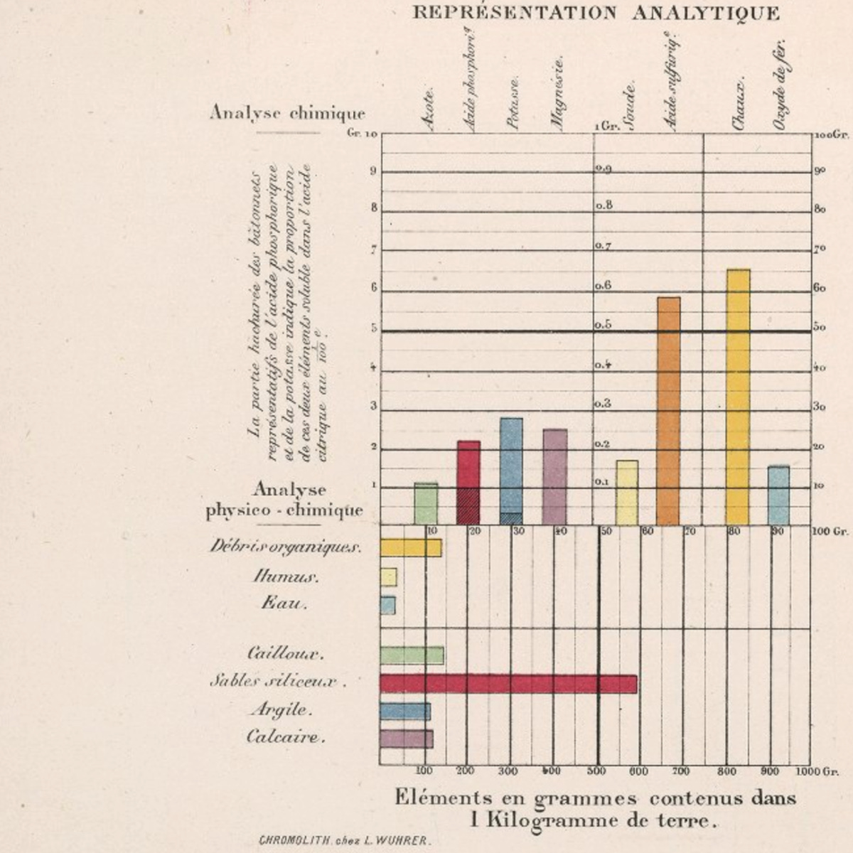
The center map is flanked by a detailed color legend that describes and shows the chemical composition of each topsoil strata. Below the map the composition bars are explained.
Semicircle pie charts show summary statistics related to land use.


An elevation view of the ridge lines around Paris anchors the composition.
Read my translation of the map's explanatory introduction and explore it and many other thematic maps from the Album de Statistique Agricole in super high resolution thanks to David Rumsey.

The virtual opening event for my exhibition at Stanford University is taking place on September 25. We are very excited to present to you a colorful program on the history and magic of information graphics. Please register using this link:
The first attendees to sign-up will receive a complimentary keepsake I helped design and am excitedly waiting to receive too! I look forward to seeing you all real soon.
Onward! -RJ
Like inspiration? See more at Info We Trust:

