A Double-Shot of Inspiration
Super Sundry Vol. 6: splendidly-matched data graphics (and a little more).
In this edition of Chartography: two upcoming Dogpatch events, a new course announcement with Cooper Union, and THEN a pairwise tour of inspiring sundries from the world of information graphics. Let’s go!
🗓️ My neighborhood of Dogpatch, San Francisco is booming. We recently welcomed tech-champs OpenAI and YCombinator to our little patch of sunshine on the Bay. Even better, SF is in the midst of opening a string of beautiful new parks that includes a sandy beach, Crane Cove.
Dogpatch is ready for a dedicated hangout to show and tell data graphics. Join me for the first ever Dogpatch data-graphic office hours hangout, this Thursday afternoon at Wooly Pig.
Please reply directly to this email so I know to look forward to seeing you and see details in this Google calendar event:
🗓️ I am appearing LIVE! in conversation with Rob Saunders at the Letterform Archive to discuss “glorious data graphics.” It will be an evening of insights and delights from the world of information graphics. The event is both in-person and virtual (and free!)—let’s pack the room:
📓 I will teach Principles of Data Graphics via Cooper Union’s public workshops, which are available to anyone wishing to build their skills and knowledge base. It’s an original six-session virtual class of my own design.
We will dissect the elements that make charts and maps spectacular. Each session will focus on a specific aspect of information design, ranging from choosing effective visual metaphors to visualizing uncertainty to the subtle art of color-encoding. Throughout our critiquing and making, the emphasis will be on the hard human decisions necessary to create effective data graphics.
Tue, February 20 – Tue, March 26, 2024, 5:00–8:00 PM ET (2:00–5:00 PT)
The workshop will fill fast. Register now to get one of our limited seats:
Inspiration Double-Shots
We can see more when we look across and between designs. In that spirit, aesthetic companions inspire in this super-sundry edition.
(And also, twinning images like this let me squeeze in more. Go ahead and zoom-in, or see all of these on a big screen.)
Left: Full day photographing Wells Cathedral by Andy Marshall. He also has a 6-square version, and a 1,024-square version!
Right: “Cost of buying a home, relative to renting” from December 2023 Fortune Magazine.
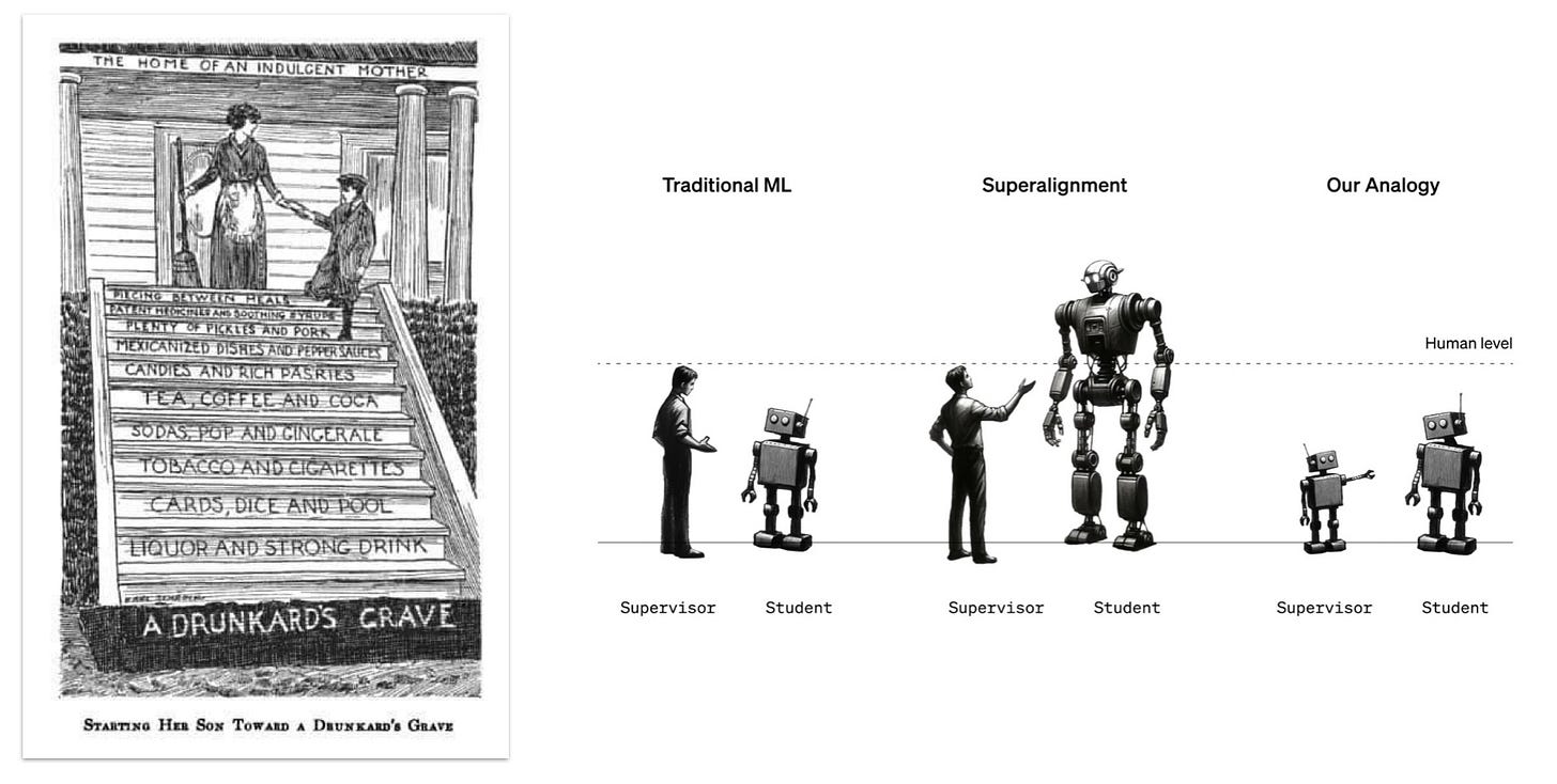
Left: “Starting her son toward a drunkard’s grave” from The Temperance Program (1915).
Right: “A simple analogy for superalignment” by OpenAI (2023). I like how so many factors are conveyed in this friendly diagram: robot-human, above/below human level, relationships and disposition.
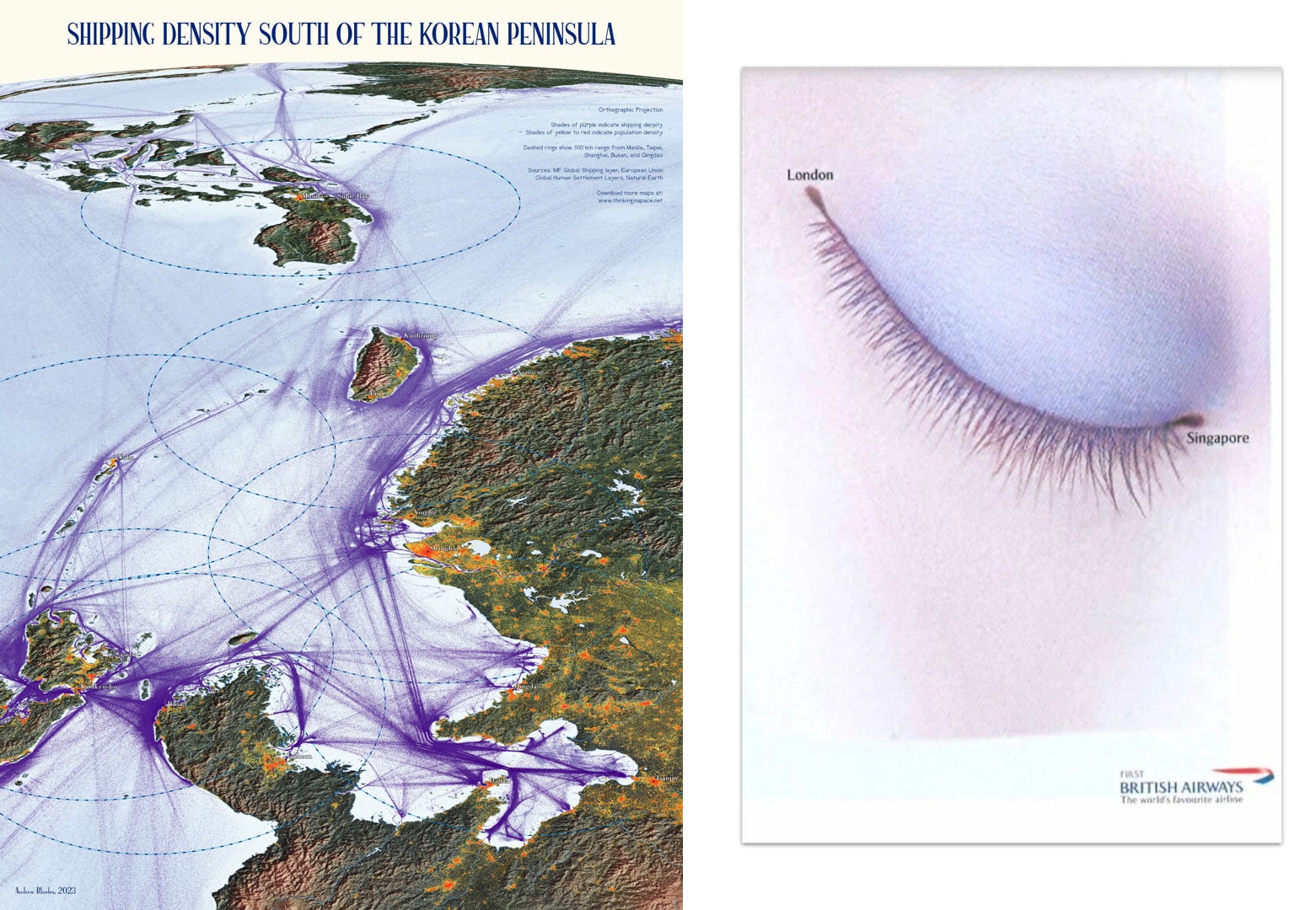
Left: Shipping density by Andrew Rhodes (2023).
Right: British Airways 'London-Singapore, Valentine's day' ad campaign (2005).
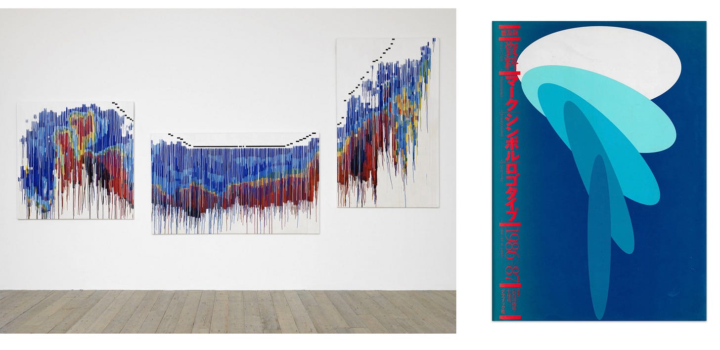
Left: Views over the Po Valley (Milan) by KP Brehmer (1978).
Right: Trademarks, Symbolmarks & Logotypes In Japan, 1986-87 (資料・マーク,シンボル,ロゴタイプ) via Logo Archive.
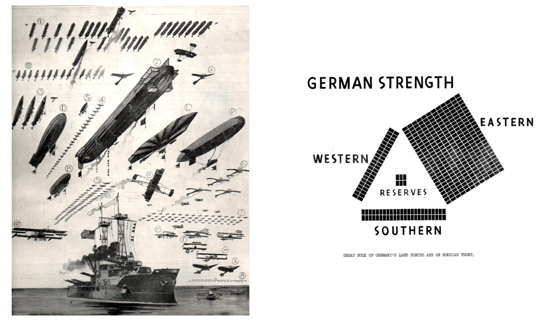
Left: “One ‘Dreadnought’ Buys 52 Dirigibles and 235 Aeroplanes” from The Illustrated London News (1911). Dreadnought literally means fears nothing. From etymonline:
Dreadnought is mentioned as the name of a ship in the Royal Navy as early as c. 1596, but the modern generic sense is from the name of the first of a new class of British battleships, based on the "all big-gun" principle (armed with 10 big guns rather than 4 large guns and a battery of smaller ones), launched Feb. 18, 1906.
Right: “Great bulk of Germany’s land forces are on Russian front” from a rare report to U.S. Congress on the strength of the axis powers (1943).
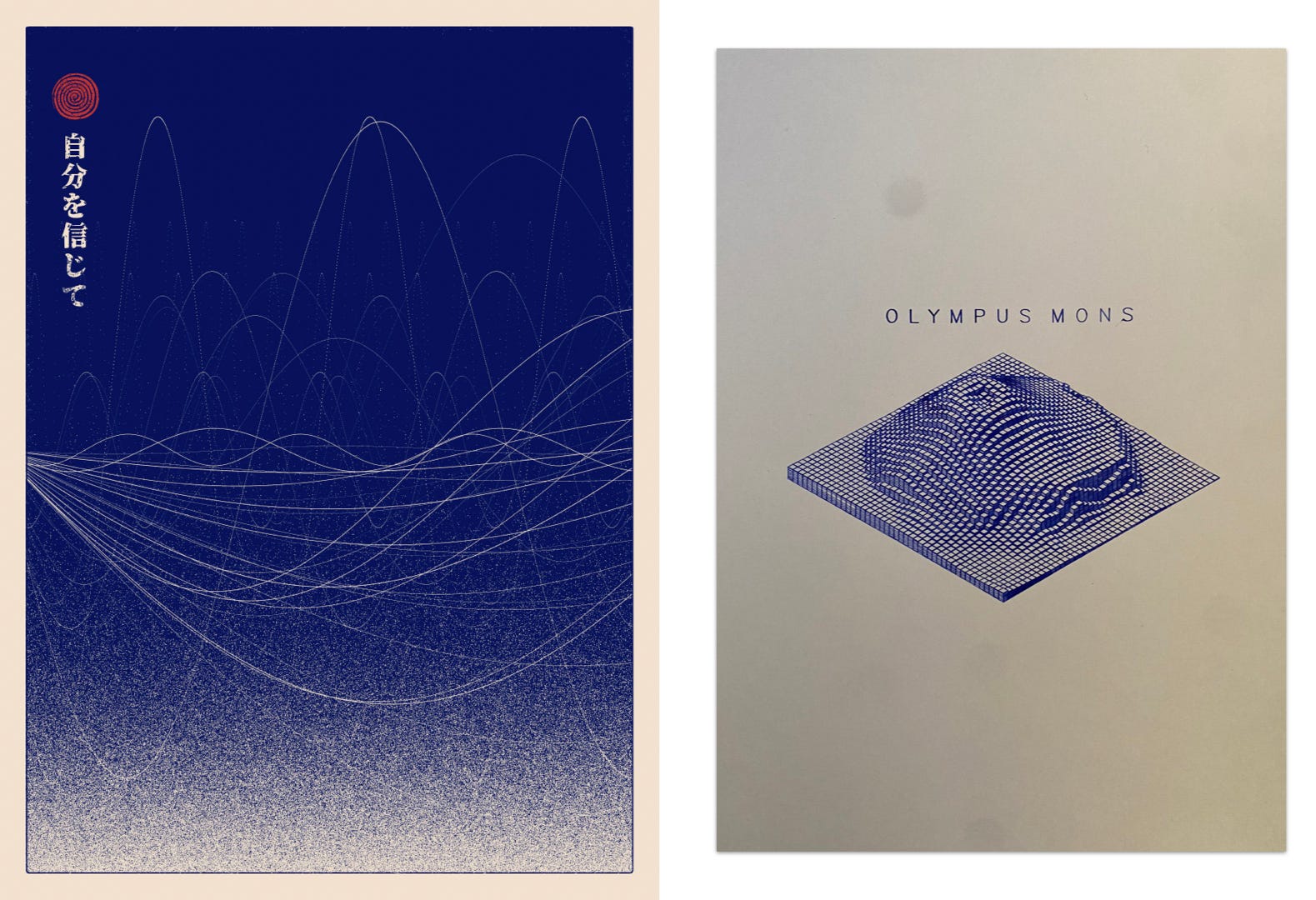
Left: Wave Study #3 by Hamonshu.
Right: Isometric Axidraw plot of Olympus Mons, Mars by Chris Holmes.
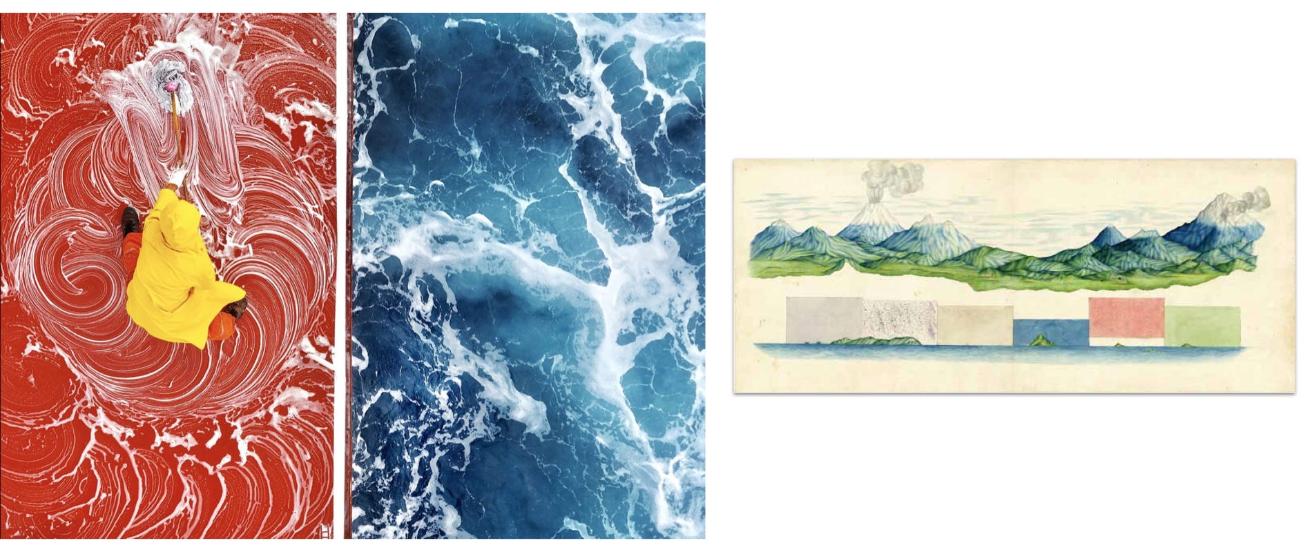
Left: photograph of a ship deck being swabbed by Zay Yar Lin.
Right: Profile of the Andes by Francisco José de Caldas c. 1802. (Who can tell me more about his work?)
Left: Don't miss the ticks on the outside of this 1941 Japanese pie chart, from a pamphlet encouraging Korean soldier enlistments. See many more charts from this publication at the David Rumsey Map Collection.
Right: “By circulating dollar bills stamped with fact-based infographics, Occupy George informs the public of America's daunting economic disparity one bill at a time.”
That’s nearly all the inspiration that can be crammed into a single email. Paid subscribers, please keep scrolling for your bonus graphics.
Chartography has a big year planned, I’m so happy you are all here for the ride.
Onward!—RJ
About
Data storyteller RJ Andrews helps organizations solve high-stakes problems by using visual metaphors and information graphics: charts, diagrams, and maps. His passion is studying the history of information graphics to discover design insights. See more at infoWeTrust.com.
RJ’s recently published series, Information Graphic Visionaries, a new book series celebrating three spectacular data visualization creators. With new writing, complete visual catalogs, and discoveries never seen by the public. His first book is Info We Trust, How to Inspire the World with Data., is currently being remastered for a new edition.


