Welcome to Chartography: insights and delights from the world of data storytelling.
Exploring Benjamin Benus’s new book about The World Geo-Graphic Atlas in our last edition led me to discover the TIME magazine vault. This digital archive is aglow with inventive charts. I had to see them all. I began with TIME’s inaugural issue from March 1923, and turned every page.
(Fun fact: TIME’s working title was FACTS.)
I made it through the first decade of the “weekly news-magazine”—spotting over one hundred information graphics. Here are my favorite finds from 1923 to 1934. Let’s go!
The charts are in advertisements, not articles.
Remarkably, statistical charts found their home almost exclusively in advertisements during TIME’s formative decade.
Each example below is from an advertisement, including TIME advertising subscriptions or other publications inside its own pages.This tells me that these images are being used more as graphic sirens, and less as tools of discovery or insight.
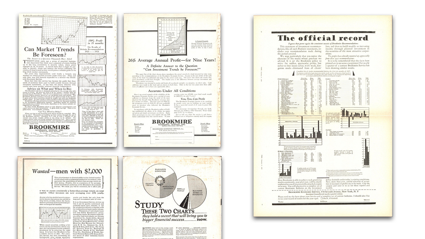
Below are some of the earliest examples, four single pages and one double-page spread, all from the same advertiser: Brookmire Economic Service, Inc.
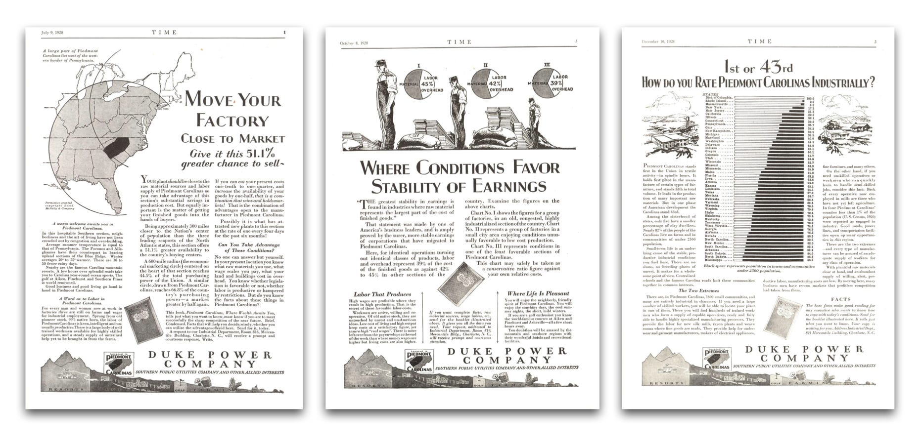
Brookmire’s reappearance was typical for this decade. It was common for the same advertiser to include charts across a series of ads. Below are three ads for Duke Power Company from 1928.
Unlike today though, the creative was usually fresh for each new ad. It was rare to see the same ad twice, perhaps because they are each a little info-mercial served to a population who actually read.
At its outset, TIME’s ads were targeted to the business man, usually on some theme related to nationalization and corporatization of American industry. Persuasive maps helping cities clamor for attention as national distribution hubs was a recurring motif. As the 1930s dawned, TIME's advertisers had either pivoted or refined their focus—now featuring a plethora of consumer goods like automobiles and cigarettes.
Heroes and charts.
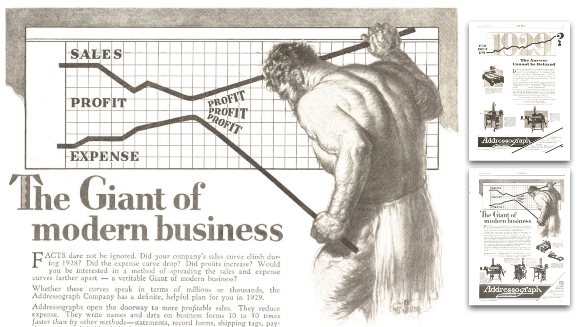
What captivated me most were the advertisements featuring a solitary subject in dynamic interaction with a chart. Below is the most fantastic, a bearded giant bending the distance between sales and expense curves to increase profit, one of two chart-ads for the Addressograph labeling machine.
Below, a driver cooly scans a data table exploding out of a car part advertising which car models are “Timken Bearing Equipped.”
And here, an arc welder solders a promising upward sales curve.
Happy curves go up.
Happy upward curves, like the arc welder’s above, appear throughout the decade. The recurrent use of this imagery underscores that the charts serve less as statistical tools and more as potent conveyors of optimism, opportunity, and the anxiety of missed chances.
This is most evident in a 1934 series that repeats the same upward curve depicting TIME’s own growth in circulation, against a variety of potential advertising contexts: home gadgets, home-improvement wares, automobiles, refrigerators, and pre-packaged foods.
No software defaults.
It’s clear that each of these advertisements was painstakingly handcrafted. They are at their best when illustrations convey some simple numeral, such as the below fraction advertising Los Angeles County.
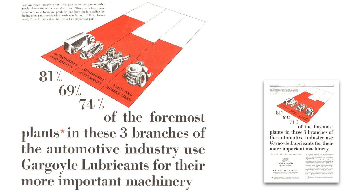
The advertisement for machine lube, below, conveys its association with cost reduction (albeit with some asterisk caveats). The chart’s perspective skews the bars—a technique frowned upon by chart professionals even years before this advertisement's creation. To me, the bars catch my attention. And that means they did their job.
But it wasn’t all graphic hokum. Some ads, like the cartogram below, presented graphics that would still be considered sophisticated.
This wasn’t the only data-sized cartogram I found. Another sized states by their farm market, emphasizing the Upper Mississippi Valley. Cartograms were all the rage in the 1920s, championed by patent-holder Karl G. Karsten, who wrote:
We do not sell our goods to the mountains, bill them to the rivers, or credit the forests with payment. Probably from at least a subconscious appreciation of this circumstance, many national distributors, advertisers, and sales-managers have discarded maps on which the rivers, forests or mountains are shown when they are studying the geographic distribution of their sales. . . . Your sales manager does not sell to square miles, acres, or other units of land-area measurement. He sells to human beings. Why should he use maps which show, not human beings, but square miles, that is, maps in which the areas indicate not the population but the land surface? Why indeed!
Charts and Graphs (1925), p. 623.
The fancy charts are fun, but there were plenty of simple and tiny charts too.
A few had happy upward curves. Some had heroes. Lots had B.A.N.s.
There are so many more—I pulled over a hundred information graphics! (Unfortunately we didn’t get to all of the maps, the best maps are ads for FORTUNE magazine and General Motors.) Many of these information graphics would pass today, indistinguishable from what modern organizations publish, nearly one hundred years later.
What’s next
If you know all about these charts, and especially who designed them and how they were created, I’d love to learn more.
Going forward, I'm contemplating a deeper foray into TIME’s treasure chest. The next decade of exploration would encompass World War II, and promises even more chart riches. I welcome your thoughts on where my archival excavations should take me next.
While assembling these newsletters brings me immense joy, each edition demands substantial effort—often consuming several days. Please consider becoming a paid subscriber so the fun can keep rolling.
Onward!—RJ
About
Data storyteller RJ Andrews helps organizations solve high-stakes problems by using visual metaphors and information graphics: charts, diagrams, and maps. His passion is studying the history of information graphics to discover design insights. See more at infoWeTrust.com.
RJ’s recently published series, Information Graphic Visionaries, a new book series celebrating three spectacular data visualization creators. With new writing, complete visual catalogs, and discoveries never seen by the public. His first book Info We Trust, How to Inspire the World with Data—will be published in a remastered edition in 2024.


If you would like a hand in collecting charts from the archives let me know. I love doing that!
I think there is a reason to call upward curves visual propaganda. Even the word "growth" (in economic sense) is a linguistic construction of capitalism (White 2003), which was later adapted by communism as well. Upward curves and increasing graphs not only in their visual forms but in their metaphoric sense weren't fun in Soviet-communist propaganda, they were more of a threat, rebuke, expectation, spectacle, and even a symbol to be worshipped in the most stupid form.
"And all these data can be seen on beautifully increasing graphs, by anyone at the entrance to Kistext (a factory - A. B.), in the wonderful new wooden building painted in national colours, which displays the news and statistics of the labour competition and is located in an old, small cupboard which is no longer adequate for the purpose." - "The happy wandering flag is flying on spinning and weaving machines in Kistext factory." In Szabad Nép, 1948/120: 9
"At the turn of the stairs, the Credit Bank's workmen's labour-competition table is displayed. From the ground floor we can see the giant upward curve of productivity. And turning down the stairs, we can turn back and admire it a little more" - In Népszava 1948/159: 2
There are hundreds of upward curves and growing graphs from the post-war communist Hungary between 1948 and 1956, the contemporary daily press wrote these words dozens of time every day, and the entire country was mesmerised with them.