
Bellissimi Data Graphics
Luigi Perozzo's 3-D illusion, reimagined with SVG.

Welcome to Chartography—insights and delights from the world of data storytelling.
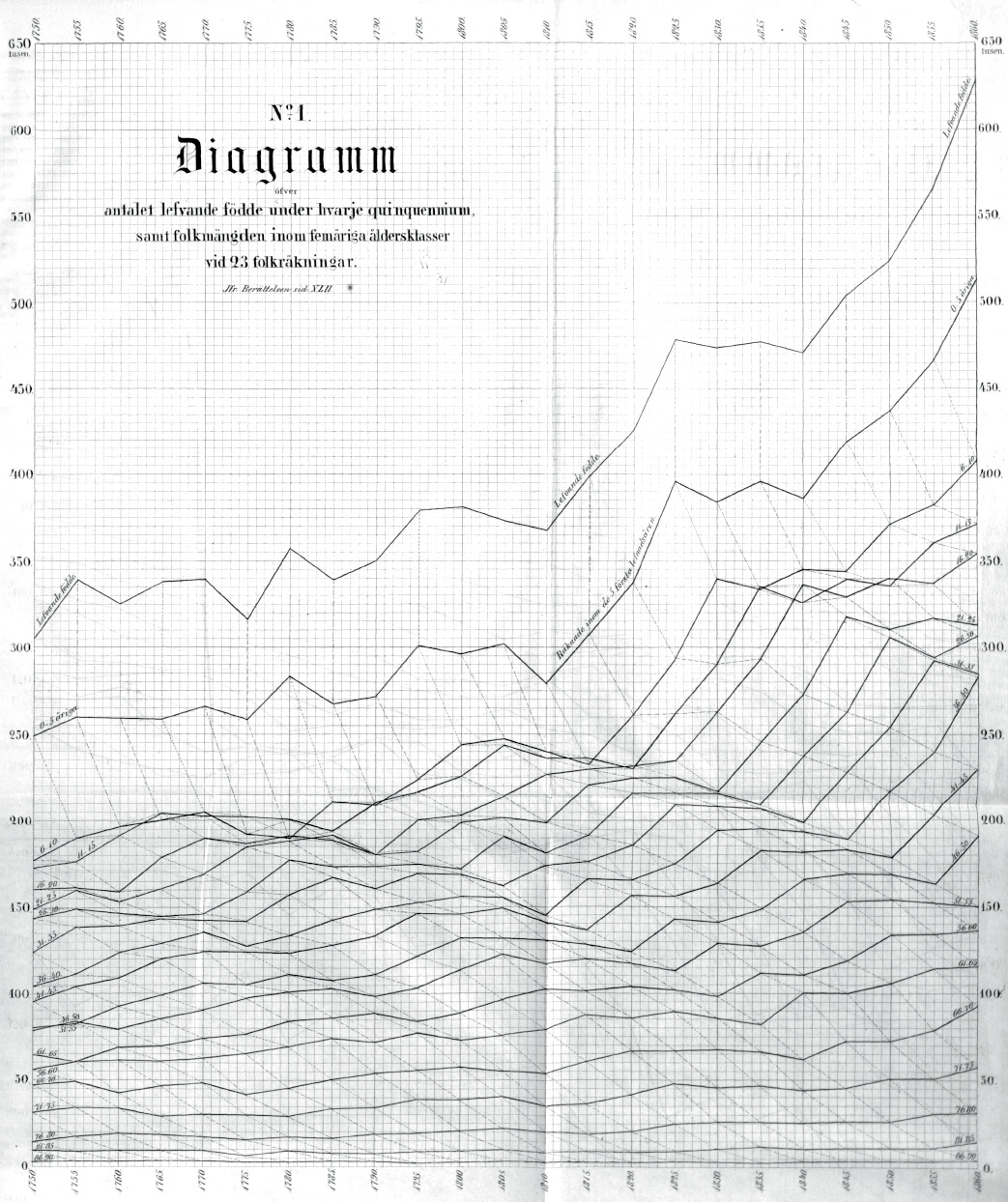
There’s a data graphic that has long-captured imaginations.
Its first version looks like this:

I’ve long marveled at this graphic, without really understanding how it works or why it came to be. Aesthetic appeal held my admiration—it’s like something from a steampunk future that never was.
They called this chart type a stereogram, named from the Greek stereos, solid, for its voluminous heft. They also considered calling it a triagram, recognizing that diagram references two dimensions, but rejected this as an impractical neologism. Today, you might know “stereogram” from Magic Eye optical illusions, a slightly different usage.
Over the past months, I’ve chased down (and acquired some of) its variants, read several contemporary papers about its development, and reconstructed the stereogram as an interactive digital version. I’ll show you the interactive in a moment.
Perozzo’s dream
The stereogram shows Sweden’s male live births and survivors by age class over time.
It was published by Luigi Perozzo, a twenty-four-year-old Italian engineer and statistician, in an 1880 volume of Annali di Statistica.
Perozzo chose Sweden because it boasted impressive national population statistics: centralized, continuous, frequent, and age-specific censuses since 1749 collected by the Church of Sweden. It was the very best data set from which to build a time-sequenced 3-D surface.
Why does seeing a population matter? If you manage a state, insurance company, or pension, then it is critical to understand demographic statistics. Perozzo created the diagram chasing two goals, which are often in graphic tension:
Represent statistics as clearly and precisely as possible.
Elevate analytic insights such as summaries, variation, and uncertainty.
Perozzo was convinced his stereogram could accomplish both goals simultaneously.
Graphically, Perozzo was inspired by contour and relief representations at the 1878 Congrès international de démographie in Paris. In particular, he singled out an 1860s chart by Fredrik Berg, the first head of Sweden’s Statistiska central-byråns.
Mathematically, the stereogram-approach built on the work of a group of German visionaries including Georg Knapp, Karl Becker, Wilhelm Lexis, and especially Gustav Zeuner. To get his particular 3-D projection, Perozzo blended Zeuner’s three-axis approach with a 60° tilt inspired by Hungarian Jakab Lewin.
As part of Perozzo’s skeuomorphic perspective development, he also seemed to explore the data by fabricating physical models—but the extant evidence of this is thin.
Perozzo’s design research and development helped him recognize that a 3-D object brings clarity to particular features of a population and makes its overall character more memorable. He wanted to make population feel more real and the stereogram was how to do it.
How it works
To detail Perozzo’s stereogram, I’m going to use my digital rendition, which allows us to establish it in layers. Then we’ll see what it has to say.
Start with a 2-D grid, below.
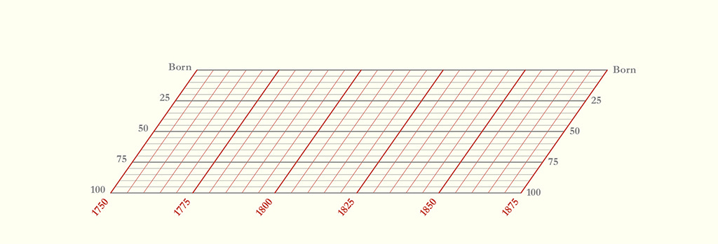
🟥 The red horizontal dimension is years, from 1750 to 1875. Every 25 years gets a thick line. Every five years gets a thin line.
⬜️ The gray dimension is age, also marked in 25- and 5-year increments, from birth to 100-years-old in the foreground. (This project taught me that quinquennial is the term for every five years.)
These are the x- and y-axes. This grid is the base of the stereogram.
Next, raise every intersection in the grid to a height representing the population size at that point. For example, the gold ring below marks how many men were in the 25-year-old age bucket in the year 1775. (That bucket includes all men ages 21-25).
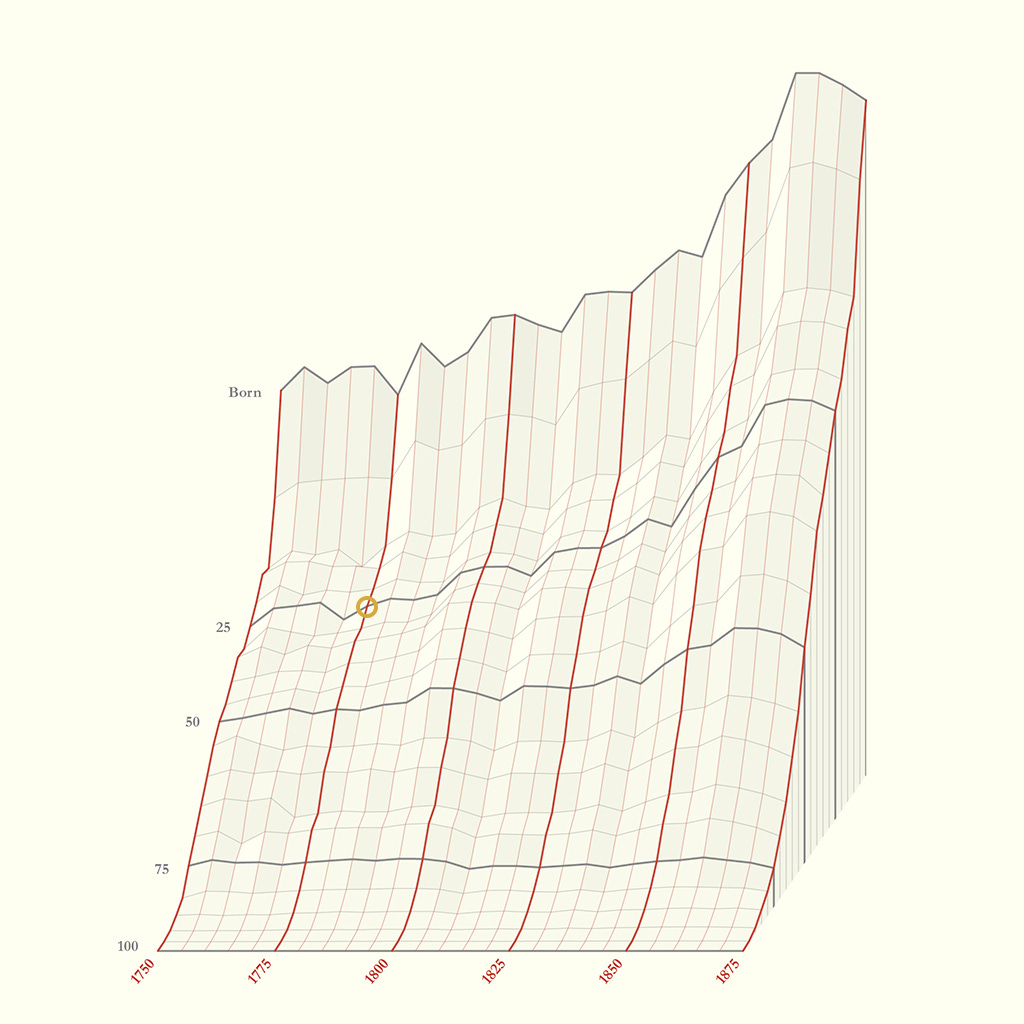
With points meshed into a 3-D surface, add shading to reinforce the stereogram’s dimensionality.
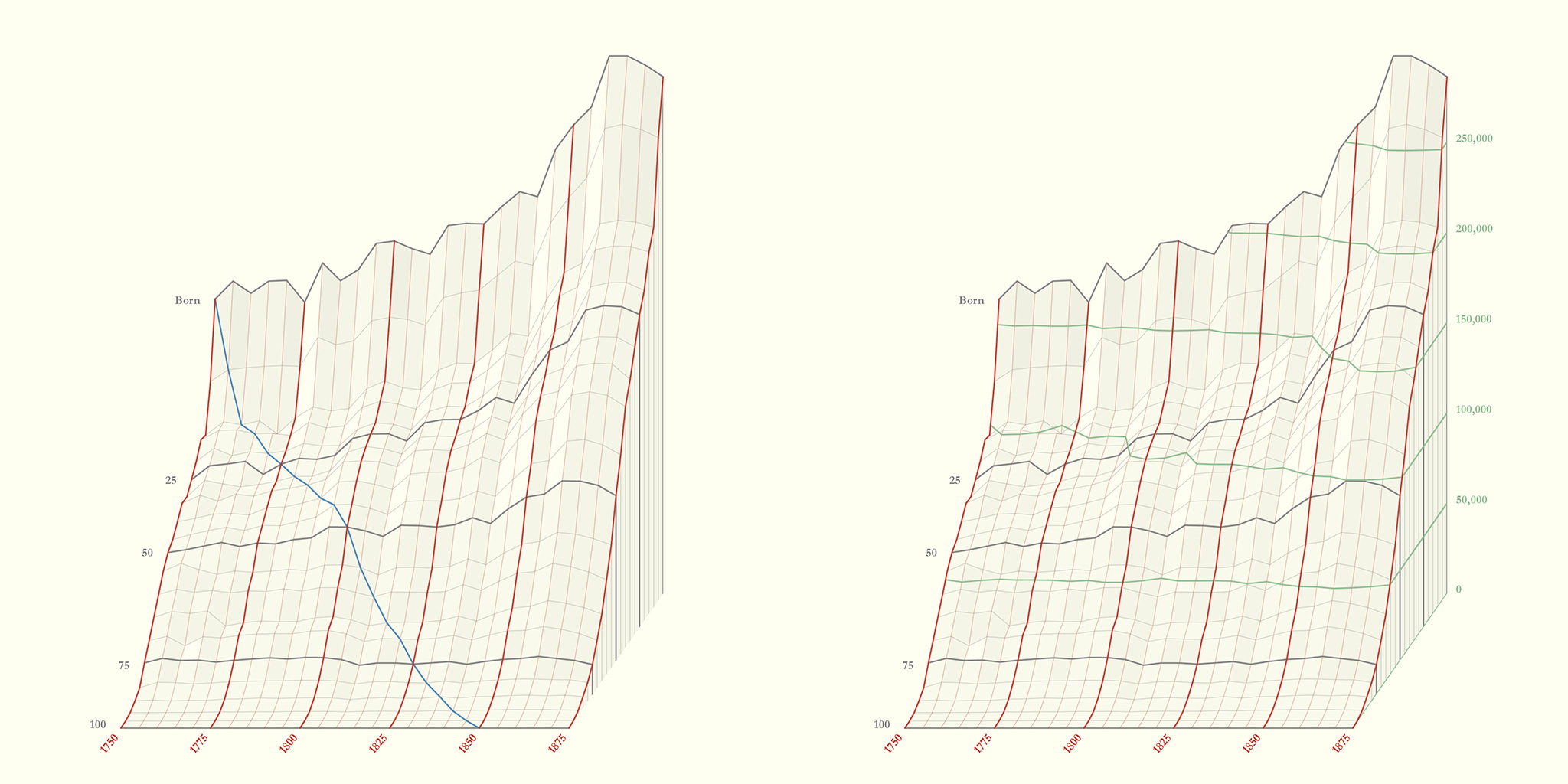
On top of the 3-D surface, Perozzo layered two analytic colors.
🟦 Blue (below left) traces cohort survivorship. See, for example, how many people were born in 1750 and then follow the line downward until the few survivors of that cohort are 100-years-old in 1850.
🟩 Green (below right) are isolines marking constant values. They help us read how many people exist at each point. For example, you can read the increase in 25-year-olds: 100,000 in 1795 and 150,000 in 1850.
Put all the quinquennial red-gray-blue-green lines together and you get a rather stunning object. Here is Perozzo’s 1880 original again:
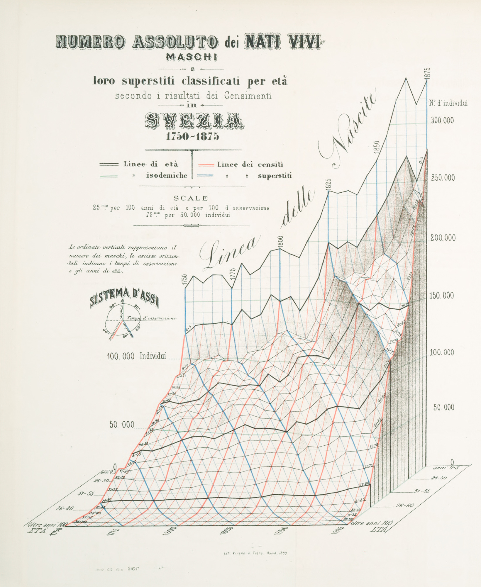
At a glance, what can we see?
A progressive, albeit noisy, increase in number of births. The final 50 years is a population boom. This is emphasized by the large swoopy Linea delle Nascite.
A harrowing child mortality rate. Each blue line begins with a horrible fall down a steep cliff, from birth to age 10.
By age 100, nearly everyone is dead.
Then, look a little deeper, sprinkle in a little history, and you will see more.
The stereogram reveals that shocks to birth—war or disease—don’t just show up once. They propagate diagonally as the cohort ages. See how any initial dip in births triggers a diagonal valley that continues through the ages.
These valleys have echoes too. As a smaller cohort reaches adulthood, they produce relatively fewer children, resulting in a new valley. See how births take a dip around 1810, likely because of the Napoleonic wars. Births take another dip 30 years later when the war-thinned cohort reaches family-forming age. Since they are fewer in number, they have fewer children. And then, 30 years later, there is another dip around 1870!
I masked the original stereogram to emphasize these valleys:
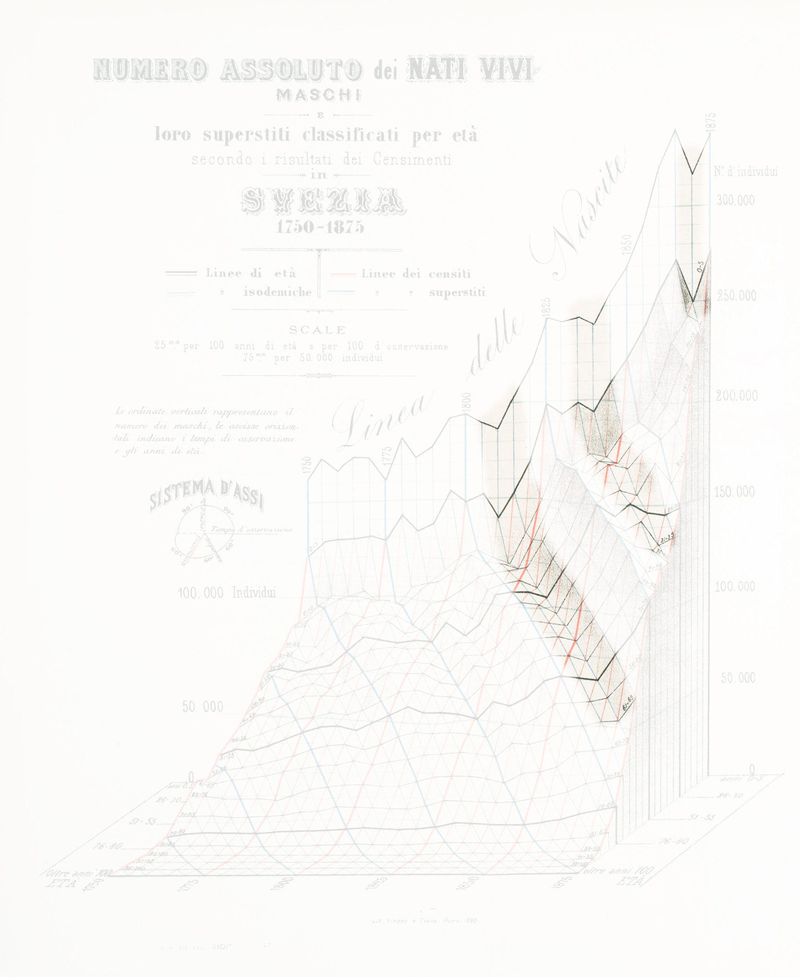
The same war echoes for generations. These demographic waves illustrate long-lag consequences, something that Perozzo emphasized would be difficult to appreciate without the stereogram.
Luigi rides again
I transcribed one of Perozzo’s data tables and recreated the stereogram in SVG. It’s now a digital interactive, with a simple tooltip that teaches you how to read the colors:
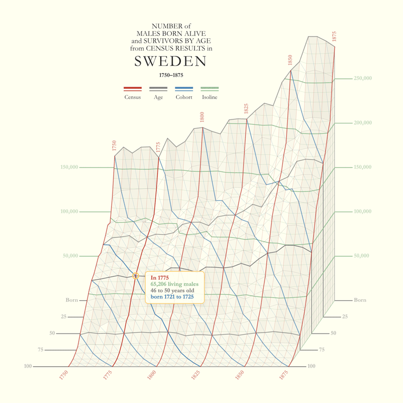
Digitizing the stereogram taught me how difficult it is to simulate a solid object in a convincing way—a way that balances all design elements. It also exposed how small changes in perspective, color, and shading can totally change the emphasis of the construction.
This project benefited from encouragement by Tony Chu and Santiago Ortiz. You can play with the interactive here:
Admiring masterpieces like Perozzo’s stereogram, I have often wondered why we can’t achieve similar lavish levels of design digitally.
The reason is that it is really really hard. The whole thing is an illusion: a pile of 2-D lines and shapes and text, all data-driven, that come together in a convincing way to fool us into thinking it is 3-D. Creating a simulated 3-D object from real demographic tables is hard. Rendering a surface, architectural elements, and labels in the same 3-D coordinate system is hard.
The boon is that I now have a reusable engine, and can do it again, quicker. I can now turn other data sets into 3-D illusions.
A success?
Perhaps you are still not sold on the stereogram. You would be in good company.
Wilhelm Lexis, pioneer of the analysis of demographic time series, translated Perozzo’s paper into German the same year. He followed the translation with his own observation, acknowledging that while three-axis representation is scientifically rigorous, it still may hinder usability.
Because demographic quantities can be related in so many ways, a stereometric (3-D) construction, having one more dimension, can in itself achieve a greater completeness of immediate representation than a planimetric (2-D) one; but these 3-D constructions are more complicated, harder to survey at a glance, and therefore more inconvenient for practical use than the 2-D ones; … so in practice the planimetric constructions will always keep the upper hand.
In response to Lexis, and determined to prove that the stereogram could be useful to practical analysis, Perozzo refined and elaborated his design. The resulting graphic, version two, was published the following year of 1881. It has been lauded by generations of information designers since.
We’ll study Perozzo’s refined vision, and expand his methods to modern visual problems, in a future edition of Chartography.
Onward!—RJ
Update: the second part is here:
The Stereogram Strikes Back

Welcome to Chartography—insights and delights from the world of data storytelling.
Two timely notices for your radar this week:
Nightingale talk + discount
On January 29th I am delivering a talk at the Florence Nightingale museum, “God’s Revenge Upon Murder” about Nightingale’s mortality diagrams.
Watch on Zoom or attend the London watch party at the Nightingale museum. Free, but registration is required.
Plus, I’ve discounted my Nightingale book in honor of this talk. Order one from Visionary Press.
Freshy-fresh website
A nasty performance bug sucked me into a complete re-design of my online presence: avatars, images, copy, pages—you name it and I improved it.
This includes a new logo and color kit for Chartography (did you notice?) and a totally refreshed portfolio website. Check it out:

About
Chartography is the newsletter of Visionary Press and Info We Trust, by RJ Andrews.
RJ Andrews is obsessed with data graphics. He helps organizations solve high-stakes problems by using visual metaphors and information graphics: charts, diagrams, and maps. His passion is studying the history of information graphics to discover design insights. See more at infoWeTrust.com.
RJ’s book, Info We Trust, is out now! He also published Information Graphic Visionaries, a book series celebrating three spectacular creators in 2022 with new writing, complete visual catalogs, and discoveries never seen by the public.
As difficult as it can be to read, Luigi's chart is one of the most ahead of its time pieces of data graphics I have ever come across. It's just stunning. So glad to see other people digging into it.
The new website looks great, RJ!👏