
Charts Follow Chaos
How information design rescued the railway from fiery catastrophe.
Welcome to Chartography.net — insights and delights from the world of data storytelling.
On a Sunday in May 1842, the world’s faith in progress went up in flames outside Paris.
A special excursion train was returning from the King’s annual fête at Versailles. The train—two engines followed by seventeen wooden carriages—was packed with nearly 800 partiers.
Near Bellevue, a locomotive axle snapped on the descent to the city. The iron horse pitched over the rails, the boilers ruptured, and the front passenger cars jackknifed.
In moments the wreck became a furnace.
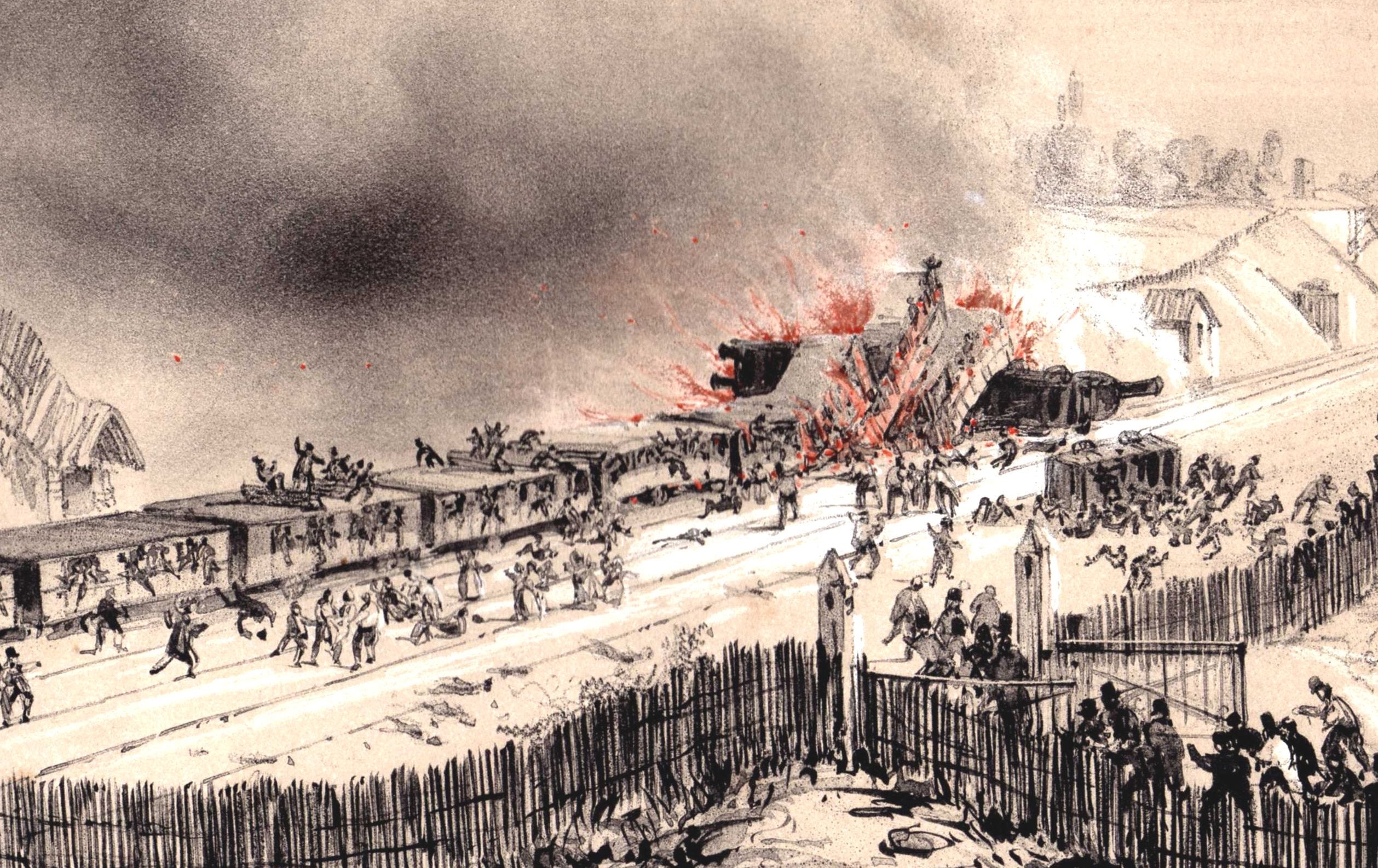
It gets worse. The car doors had been sealed—perhaps to prevent fare-dodgers hitching a free ride, perhaps to prevent passengers from injuring themselves while the train was in motion. After the crash, some passengers escaped through the windows. Others, injured or pinned in the wreckage, were unable to move. Trapped inside, they burned alive. Their screams haunt several eyewitness accounts.
More than fifty people died, including Antarctic explorer Jules Dumont d’Urville and his family. The Versailles-railway catastrophe was not just a mechanical failure, and not just the deadliest railway accident ever. It was an early reckoning with the speed and scale of industrial life. The accident revealed how thin the line was between harnessing energy and being consumed by it.
Could the speed of progress be tamed?
In the months that followed, engineers picked through the twisted metal to analyze what had gone wrong. One of those engineers was Jules Petiet.
Petiet’s Diagram
Next spring, Jules Petiet’s technical analysis of the accident appeared in Journal des chemins de fer (5 June 1843).
Petiet was an impressive fellow. He would soon be Chief Engineer of the Chemins de fer du Nord [Northern Railway Company]. He then designed locomotives before leading the prestigious engineering school École Centrale Paris. Petiet’s name is one of 72 inscribed on the Eiffel Tower.
Around the same time as his analysis came out, Petiet also published a new type of diagram that promised to help avert future rail disasters. Tracé géométrique de la marche et de la composition des trains (“Geometric layout of train movement and composition”).
Petiet charted movement over time, showing train paths snaking down stations across the course of the day. His diagram may be lost to history, but a contemporary description detailed that it also encoded the importance of each train, as measured by number of carriages, in the train’s line thickness.
Descendants of Petiet’s time-distance map are still created today. See a modern Caltrain example below.
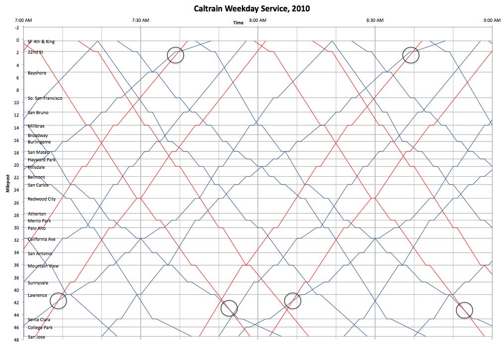
Each red or blue string represents a train, some move up the train-line and some move opposite, down. Circles highlight where red express trains overtake blue local trains. The diagram helps identify pathing conflicts (string intersections), train speeds (string slopes), and station dwell times (horizontal strings).
To our passenger’s eye, the Caltrain diagram is a fascinating novelty. Curious, but not as helpful to catch a train as a simple timetable. Petiet’s diagram, however, was not invented for passengers.
Ibry’s Diagram
Petiet’s original graphic method was immediately put into use by Jacques Alphonse Busche on northern railway lines. It was also picked up by Charles Ibry, deputy chief operating officer of the railway from Paris to Rouen. (On some documents, Ibry is spelled Ybry.)
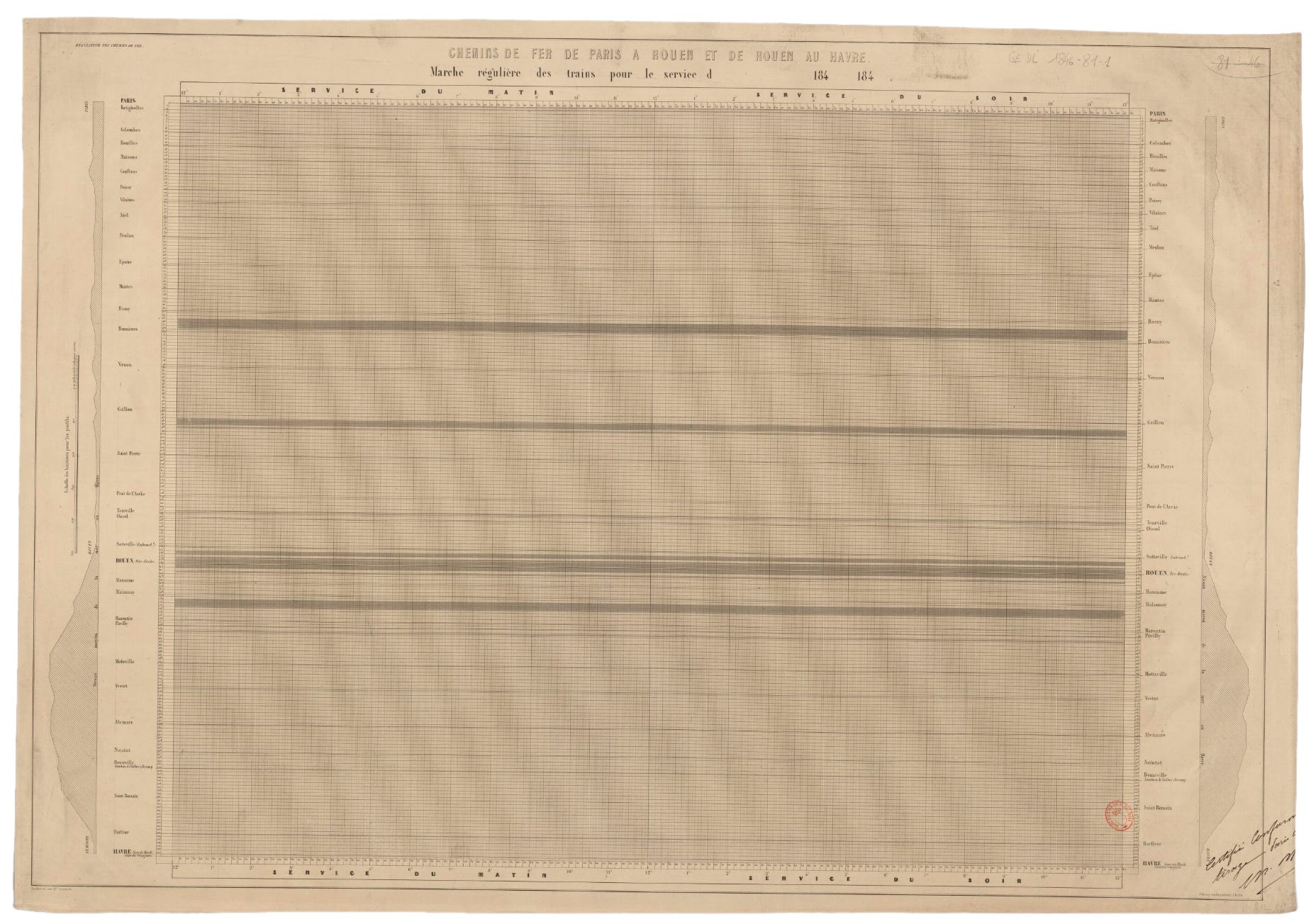
In 1847, as part of a promotion blitz to deploy the design cross-country, Ibry presented the design system to the Minister of Public Works. Its summary report included the following plate showing the Paris-Rouen line.
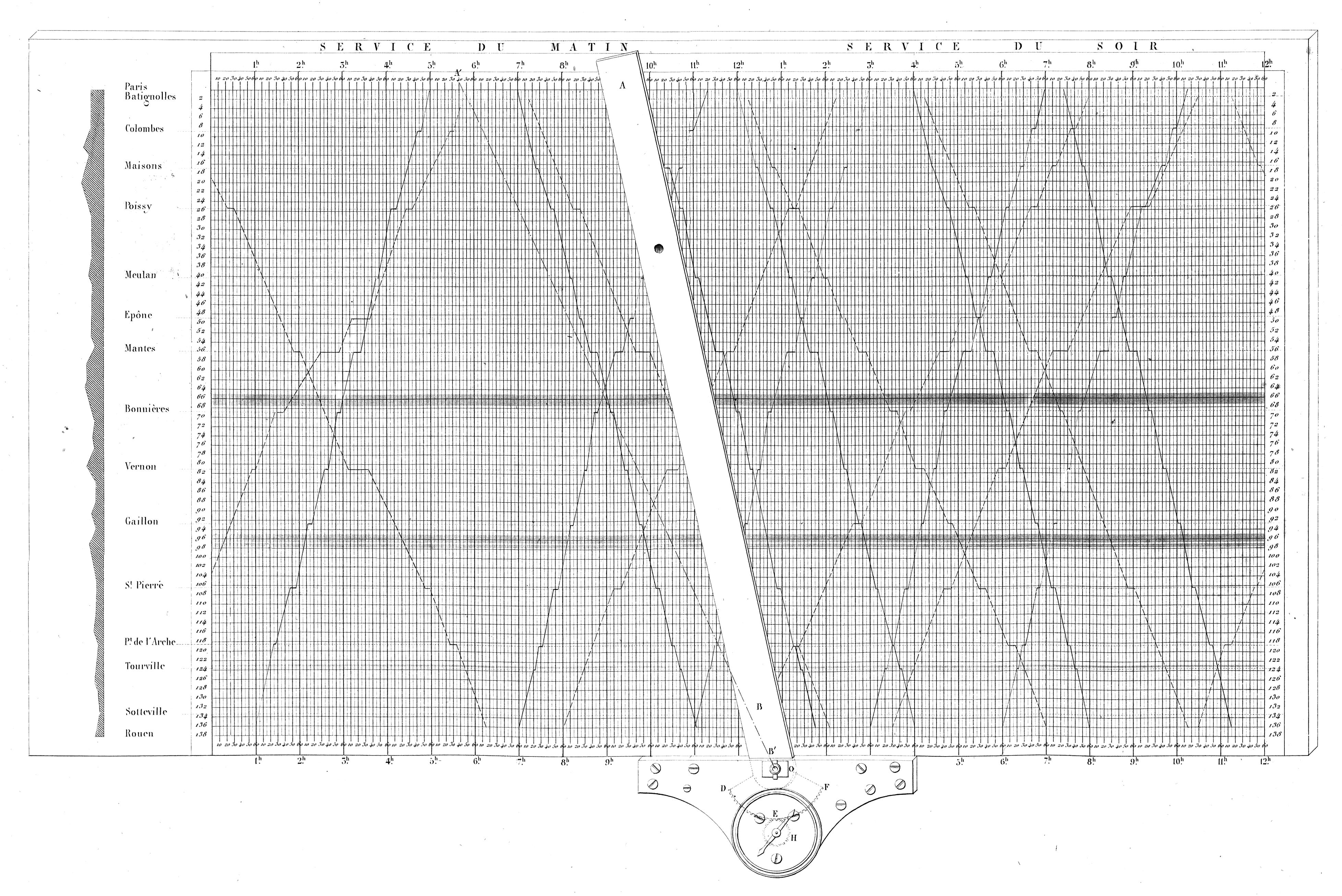
Like the Caltrain diagram, stations go down the page and time goes across it. Notice the criss-crossing trains, land elevation to the left of the station names, and dark horizontal bands.
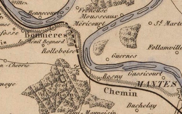
The dark horizontal bands represent tunnels. For example, the top band occurs just above Bonnières. It’s the 2,600m (1.6 miles) Tunnel de Rolleboise, which opened in 1843. You can see it on this period map of the Paris-Rouen line as a dashed line.
The other feature of this plate is its skeuomorphic angled ruler. It is an astonishingly instructive detail. In 2019, design historian Sandra Rendgen gushed for Ibry’s machine (emphasis hers):
what is MOST EXCITING is that the article features a graphic showing a hardware instrument for plotting the schedules– this piece does not simply show a diagram, it shows a board with a flexible ruler screwed onto a little plate which can glide along the bottom of the diagram. By adapting the angle of the ruler, the engineers were able to schedule an individual speed for each train. This chart is absolutely unique – it makes us understand that these charts were not just meant to display a pre-conceived schedule—no! The charts and the instrument were actually used to set up the schedule in the first place.
The speed-indicating needle (H) at the bottom of the sliding ruler (B’) is geared (DEF) to turn with the ruler’s angle. This enabled an engineer to fix the ruler’s slope to a particular speed and then plot the train’s path.
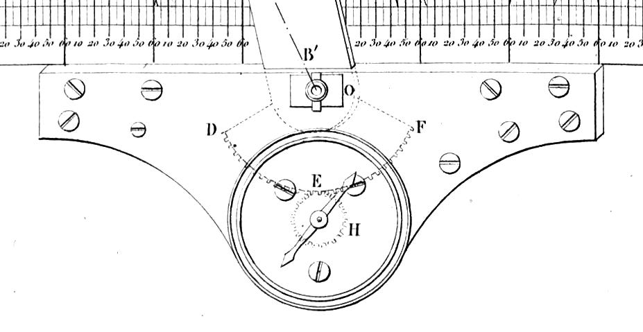
Look at the slope from the elevation plan, and schedule the train’s speed accordingly. This graphic method does not just visualize schedules. It made the schedules.
Ibry’s 1847 campaign was a success. Railway diagrams swept the contintent, and were then expanded to other modes of transportation such as omnibus.
The Bibliothèque nationale de France holds two early blank diagrams, one with Ibry’s name on the bottom. They are labeled with the diagram’s name: RÉGULATEUR DES CHEMINS DE FER. Railway regulator. These extant templates are still waiting to be inserted into the machine and have their trains plotted.
Decades later, Léon Lalanne reflected that there wasn’t a single railway timetable that is not the numerical translation of graphical constructions “previously designed to ensure, for a fixed number of trains determined a priori, the most economical, safest, and most advantageous operation for both passenger and freight service.”
Marey’s Diagram
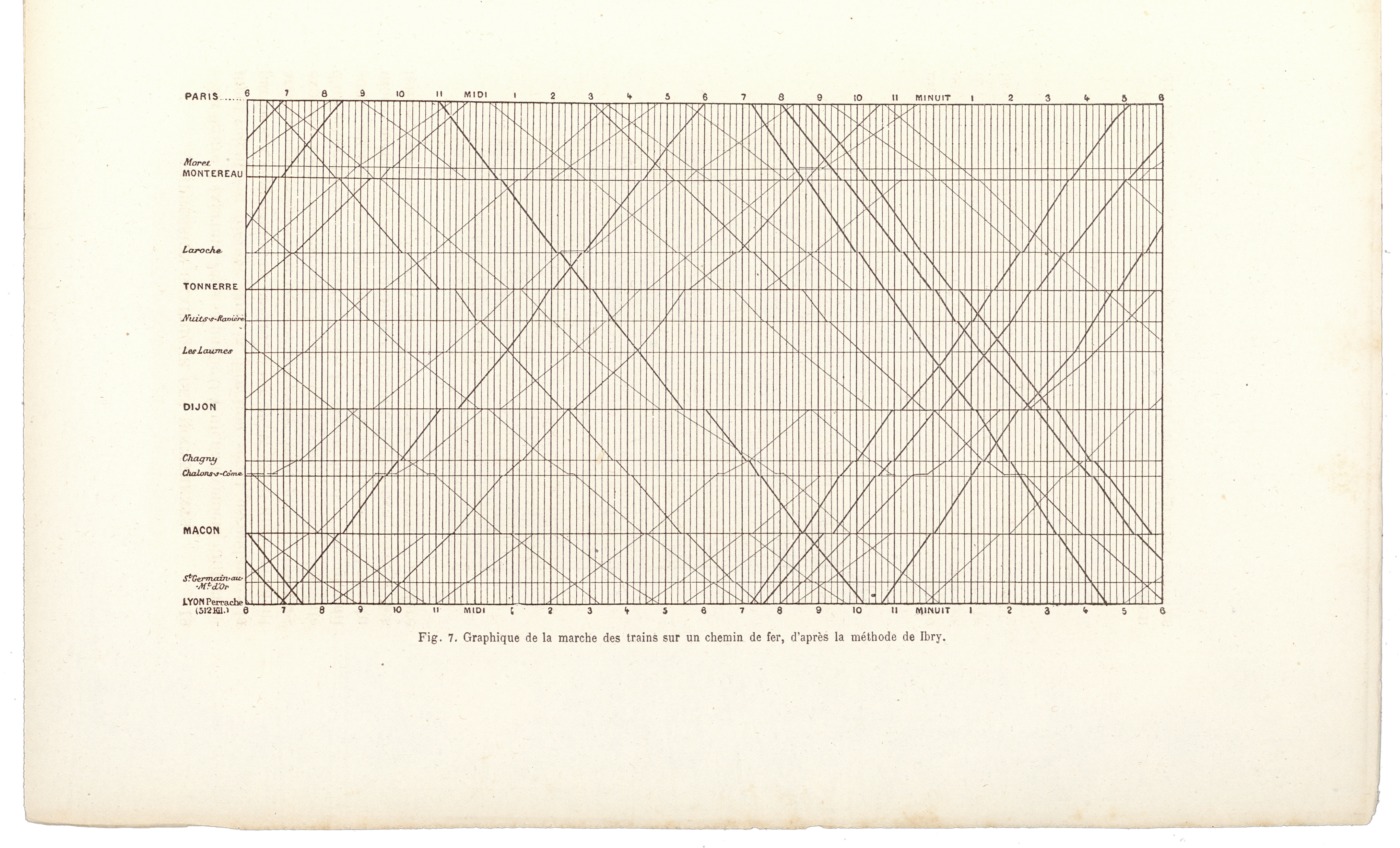
Étienne-Jules Marey honored Ibry’s diagram by including it in his La Méthode Graphique (1878, 1885), which I recently translated with Georges Hattab (Visionary Press).
Marey’s cartoon rendition kept station names and time of day but left off the elevation plan. (He also [mis]attributes the invention to Ibry.) Marey admired that “the line corresponding to each train expresses: departure and arrival times, relative and absolute train speeds, time of passage at each station, and duration of stops.”
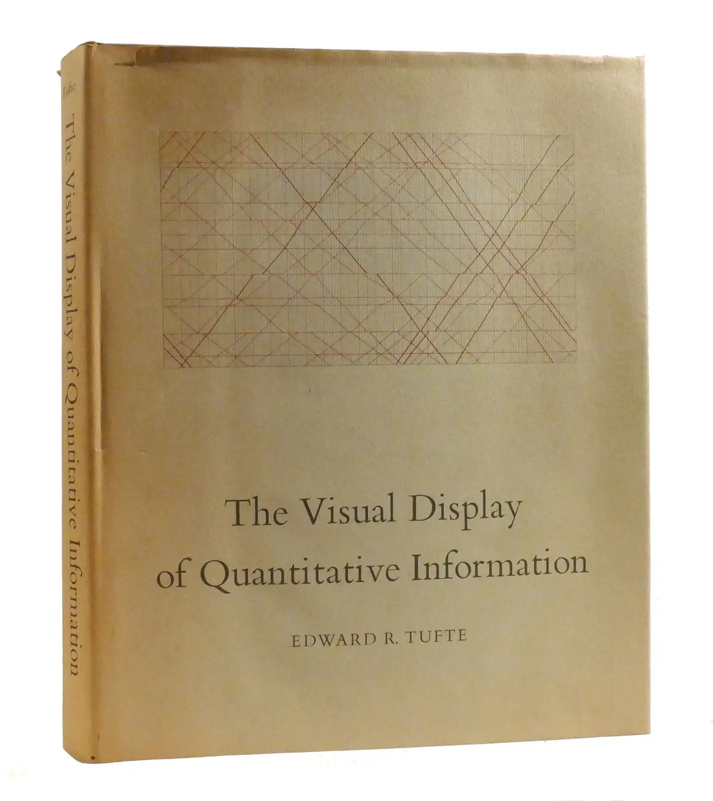
By the time Edward Tufte used Marey’s graphic for the cover of The Visual Display of Quantitative Information (1983), it was completely detached from historic context. On Tufte’s cover, station names and times are absent. Inside, Tufte credits only Marey. The Versailles wreck, Petiet’s origin, Ibry’s promotion, and everything else was forgotten. The chart had become pretty furniture—a billboard for the book that introduced a generation to data graphics.
To recount:
1843 — Petiet charts it.
1847 — Ibry mechanizes it.
1878 — Marey abstracts it.
1983 — Tufte immortalizes it.
Howard G. Funkhouser included Ibry’s campaign in “Historical development of the graphical representation of statistical data” (1937), referencing the 1847 report. That’s how I knew it existed, and how I found and purchased the volume containing that remarkable plate showing Ibry’s machine in action.
Research, guided by a sense that an extraordinary thing might be out there, is a pillar of rare works collecting. It’s one of its joys. In a way, this essay is a tidy version of what went through my mind as I hunted for that early graphic. (Not included: my many dead ends.) I am interested in sharing more about collecting and understanding old charts.
I am also interested in how data graphics come to be. They are born mostly from necessity—too often from horrific necessity. Time and again, charts have helped us claw our way out of disaster. From tragedy, a data graphic of modern transport was born. How many lives did it save? We thankfully will never know.
Onward!—RJ
About
RJ Andrews is obsessed with data graphics. He helps organizations solve high-stakes problems by using visual metaphors and information graphics: charts, diagrams, and maps. His passion is studying the history of information graphics to discover design insights. See more at infoWeTrust.com.
RJ’s book, Info We Trust, is out now! He also published Information Graphic Visionaries, a book series celebrating three spectacular data visualization creators in 2022 with new writing, complete visual catalogs, and discoveries never seen by the public.
This piece realy made me think. The 1842 accident as an 'early reckoning' with industrial speed is such a profound observation. It's wild how those core challenges of harnessing energy without being consumed by it still apply to our modern systems. Makes you wonder, doesn't it?
Fifteen years ago I wanted to write my art history thesis about catastrophes in art. Even I started a Tumblr blog 'Delightful Horror" as my thesis' title was 'A sort of delightful horror: catastrophism in art in the age of revolutions', documenting my journey. The blog does still exist! https://catastrophisminart.tumblr.com/ The the third image is the Versailles rail accident.