
Color Engineering
The tool that snaps mercurial design into mechanical focus.

Welcome to Chartography.net — insights and delights from the world of data storytelling.
I’m struggling to make a new color palette for a project.
So I built a small tool based on how I think about color design: Color can be engineered in a repeatable way that clarifies messy choices.
Color is hard
A simple way to understand meaning is as a game of difference. We don’t care as much about absolute values as we do relative contrasts. Young and old, rich and poor, kind and cruel. Things often matter because we compare them to something else.
Knowledge deserving more emphasis in your brain gets more graphic emphasis on my canvas, often by marrying semantic contrast with graphic contrast. Left and right, big and small, light and dark.
Color is a magical phenomenon. Its properties beautifully match our need to differentiate information. From the color chapter in Info We Trust Remastered (Visionary Press, $39):
Distinct colors draw our attention because we perceive color according to difference. From a survival perspective, colors are most relevant in relation to their environment. Over the course of a day, the quality of light is changing as the sun moves through the sky—both in brightness and in color—but we seldom perceive this. Our pupils physically adapt to the changes in lighting by contracting in bright conditions and dilating when it is dim. Meanwhile, other parts of our visual system compensate for the shift from yellow-white light when the sun is high above to the orange and red light when the sun is low on the horizon. . . .
Imagine you are hunting for ripe red apples among a green expanse of leaves. To contrast the red color of desire against other environmental cues, our eyes and brains adjust to changing conditions. This adaptation lets us hunt for fruit at noon and dusk, on an open plain or in a forest. We change to make effective comparisons across various lighting conditions.
Color’s interdependent nature also makes it hard to nail the right color palette. Sometimes I find the right mix intuitively, almost artistically. Other times I turn to a more mechanical method that anchors on the idea of using color’s ability to differentiate, contrast, and emphasize.
Two things to know
There are lots of ways to model color. A popular method comes stock with digital design tools, HSB: Hue accounts for named colors around the color wheel. Saturation is color intensity or strength—how far away something is from gray. Brightness is related to how dark or light a color looks. (This luminance dimension is sometimes presented as lightness or value.)
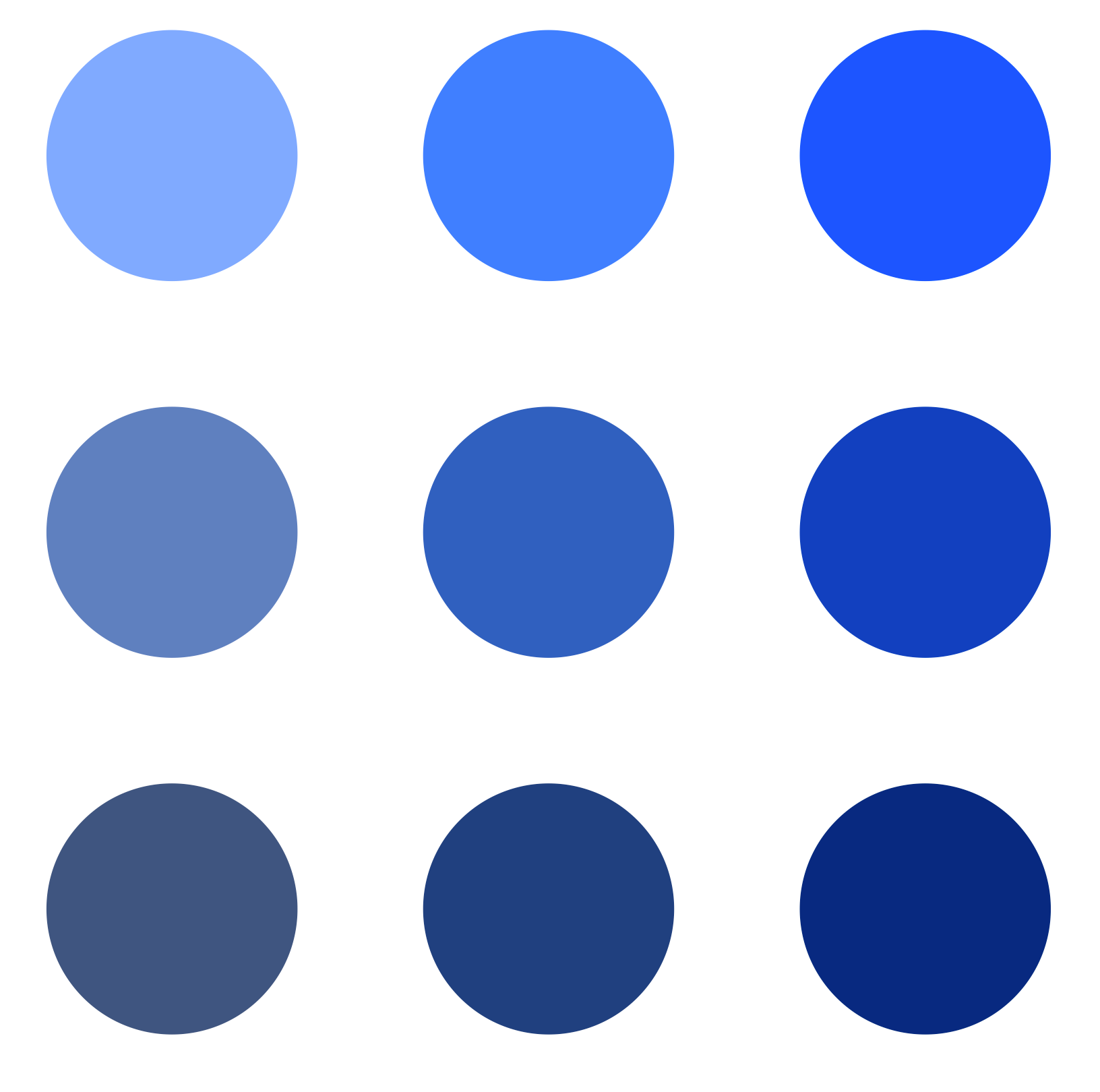
For example, for a fixed blue hue, see how color changes as brightness increases upwards and saturation increases rightward. Try starting with the center dot, and move your eyes up (brighter) or down (darker) or left (more gray) or right (more vivid). Then, look at the corners to see combinations (e.g. upper right corner is brighter and more saturated).
If colors are to help us differentiate information, they must be well-differentiated.
What’s curious about color is that brightness is generally a stronger differentiator than hue or saturation. This has physiological roots in our visual system: we are wired to notice light–dark edges first. Equal-brightness hues tend to fuse at small sizes or in the periphery. Even a modest step in brightness separates marks cleanly.
Designing with brightness first is also more resilient to color deficiencies, which may cause confusion between two colors distinguished only by hue.
Color is a lifetime study; but for information design, two points can do the lion’s share of the work: (1) Color can be broken into three dimensions. (2) Color’s brightness dimension is the most useful to differentiate.
Brightness → hue → saturation
This sequence reflects how color can help differentiate and emphasize information:
First, set brightness levels. The color that deserves the most emphasis gets the highest contrast compared to the background color. Colors that should be well-differentiated should have different levels of brightness. Aim for at least 10 points in your tool’s brightness/value scale between neighbors; thin lines or small labels may need more.
Next, choose your hues. Beware semantic opportunities (water is blue) and traps (red may not be best for positive connotation).
Finally, adjust saturation. This step achieves aesthetic coherence—it helps everything hang together.
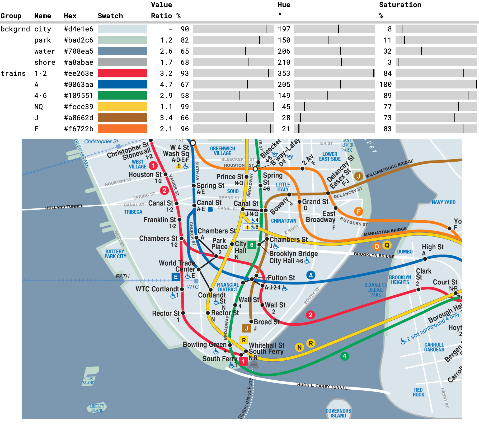
Let’s explore this method by analyzing some of the colors in the below map detail of Takamatsu’s public transit by Jug Cerovic.
I used my eye dropper tool and found the numerical value of brightness, saturation, and hue. Then I plotted them together:
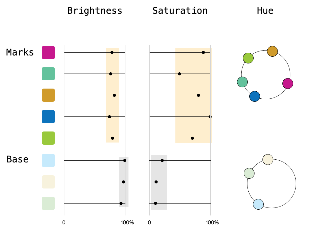
There are two groups of colors: transit-line marks and basemap. The groups are differentiated from each other by both brightness and saturation dimensions: see how each group exists in their own vertical bands of brightness and saturation, which I’ve highlighted with yellow and gray background fills.
Brightness and saturation distinguish each group. Then, inside either group, colors are differentiated by hue. See how each color owns a unique part of its hue circle.
The first time I made this color-deconstruction plot, a lot of the mercurial aspects of color snapped into mechanical focus. It also helps me explain color design to others. (This approach originated once upon a time when a client begged for a technical explanation of how a proposed palette worked.)
Extracting color dimensions, plotting their values, and iterating design is a pretty clunky workflow. Since my first plot, I’ve only reached for it to teach color design and when I’m in a real pickle. Until now.
Color tooling in practice
I made a simple color tool that plots swatches, their component dimensions, states their contrast ratio compared to the background color, and lets me adjust component values. Here it is analyzing the new NYC subway map. You can see a saturation distinction between background and transit groups. (Note that I’m using Value here instead of Brightness.)
The tool gives me a perspective on how color works. It’s also useful beyond analysis, for actual iterative creation. This method gives me hints on where to nudge colors toward more effective palettes. For example, here’s a horizontal bar chart that needs a strong hierarchy: a “hero” color (dark blue) that I want to distinguish from secondary and tertiary categories:
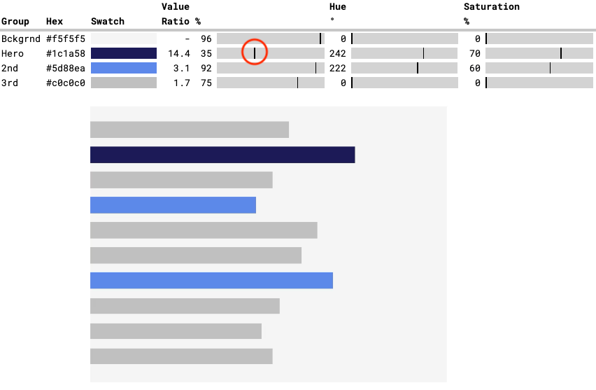
Analyzing the palette, I like that the hero color’s value (brightness) is far separate from the others (red circle). But the overall effect still has unwanted clash.
Diagnosis: Some color attributes may be too close. Background and 2nd blue have similar brightness value. Hero and 2nd blue share similar hue and saturation. Both are opportunities for further distinction.
Remedy: Chang the 2nd blue, dramatically altering its hue and saturation. Modify the 3rd color (gray) to put the brightness values and contrast ratios of the Hero-2nd-3rd sequence in the proper order. Here’s the palette remade addressing those unwanted neighbors:
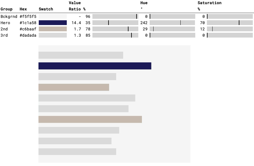
To my eye, these colors have a stronger visual hierarchy. The overall effect is also better because the colors don’t compete as much for attention. It is more calm in a useful way.
You’re invited to play
Made in Google Sheets, this tool is super flexible. It can drag-and-drop rows, sort by brightness to spot near-neighbors, or add a new column that gives me the specific gap between neighboring brightness levels. (Under the hood it’s just a few HEX2DEC and DEC2HEX tricks.)
This tool is still a work in progress. Maybe someday it will evolve to something with a polished UI.
There is a link at the very bottom of the email for paying subscribers to play with the tool. Make a copy and have fun. Tell me where it soars and where it fails. (And if a paid subscription is too much of a burden for you right now, message me and I will get you access.)
Rolling your own tooling is fun. But you gotta build something with it! I still need that new color palette for my project.
Onward!—RJ
p.s. This is a companion to A Dangling Blue, my rant against cold inhuman design tools.
About
RJ Andrews helps organizations solve high-stakes problems by using visual metaphors and information graphics: charts, diagrams, and maps. His passion is studying the history of information graphics to discover design insights. See more at infoWeTrust.com.
RJ’s book, Info We Trust, is out now! He also published Information Graphic Visionaries, a book series celebrating three spectacular data visualization creators in 2022 with new writing, complete visual catalogs, and discoveries never seen by the public.
