
Curiosity, Craft, and Clarity
My top 5 essays of 2025 (plus a few studio notes).

Welcome to Chartography — insights and delights from the world of data storytelling.
The past year of Chartography spanned the philosophy of design, practical know-how, and a lot of inspiration from the history of data graphics. We also launched my new book Info We Trust Remastered and the Maps for Kids poster series.
By the numbers, Chartography was read more than 150,000 times in 2025. That includes the attention of over 1,000 new subscribers. Everyone will benefit from a fresh look at one or more of the top five essays from the past year. Here they are, ordered according to my own capricious whim.
One of 2025’s first essays was a real heater. You ate it up. I still don’t say “data visualization” (except when it gets me paid) and have noticed that “data graphics” is catching on.
Don't say "data visualizations"

Data visualization is awkward to write, awkward to say, and inconsistently spelled. Its plural and its lilliputian dataviz are both absurd. It reeks of the kind of language used to make the speaker feel better about themself, not the kind of language that helps convey a message to
I enjoy information philosophy and adore historic charts, but practice is the heart of it all. For any of my theory or research to be valid, it must connect to how I make new charts that have to be really useful. Sometimes it’s a challenge to abstract lessons from my client practice. Not so with “Color Engineering”—it’s an approach that begged to be codified and shared.
Color Engineering

The first time I made this color-deconstruction plot, a lot of the mercurial aspects of color snapped into mechanical focus. It also helps me explain color design to
It took me a summer of reading and research to come to grips with clarity—a quality often extolled as the ideal of information design. It never sat right with me. Digging into its true meaning revealed why.
Clarity Unbound

Clarity has two faces: lucid makes meaning clear, luminous makes it sing. Information excels when it has both—but lately luminous clarity has slipped out of frame.
A near-acquisition led me to discover the most violent story behind a new chart form. It’s a perfect example of how charts help us claw our way out of disaster. (That acquisition? It happened. But the volume arrived missing its key fold-out chart. The hunt continues.)
Charts Follow Chaos

The Versailles-railway catastrophe was not just a mechanical failure, and not just the deadliest railway accident ever. It was an early reckoning with the speed and scale of industrial life. The accident revealed how thin the line was between harnessing energy and being consumed by it.
I had a theory a few years ago that Nazis, with their mechanical mania and insidious indoctrination, probably made some interesting charts. Since then we’ve surfaced many striking examples worth study. Attila Bátorfy and I examined one collection:
When Fascists Chart

The Nazis were not playing with a full deck, but information warfare was surely too powerful of a weapon for them to abandon. Like other great powers, they must have churned out visually-rich statistical propaganda. Right?
As I review these essays, I’m proud of the variety of stories told. I’m also grateful for the quality of their writing. Writing helps me interrogate the world, make sense of it, and crystallize understanding. I couldn’t sink effort into these if I didn’t know you’d be reading. Thank you for your patronage—your attention, your paid subscriptions, your reply emails, your in-person compliments. They mean a lot.
Writing from the United States, 2025 was a year of upheaval. For those dedicated to craft and advancing our understanding of reality, it wasn’t the most harmonious trip around the sun.
One of the songs I’ve returned to this year is Stevie Wonder’s “As”—for its sermon of a bridge:
We all know sometimes life’s hates and troubles
Can make you wish you were born in another time and space
But you can bet your life times that and twice its double
That God knew exactly where he wanted you to be placed
So make sure when you say you’re in it, but not of it
You’re not helping to make this earth a place sometimes called Hell
Change your words into truth and then change that truth into love
And maybe our children’s grandchildren
And their great-grandchildren will tell
I’ll be loving you
I choose to be cheerful, productive, and strive to engage in as many in-person connections as possible. Looking back, it surprises me how much that attitude helped me be productive, and hopefully bring some good into the world:
Hosted monthly lunches at my new library/studio in Dogpatch. The amount of design talent we have in one room frequently feels dangerous. Reach out if you are in San Francisco and want to come to the next one.
Published Info We Trust, Remastered—my love letter to data storytelling, with a book-launch party at Letterform Archive.
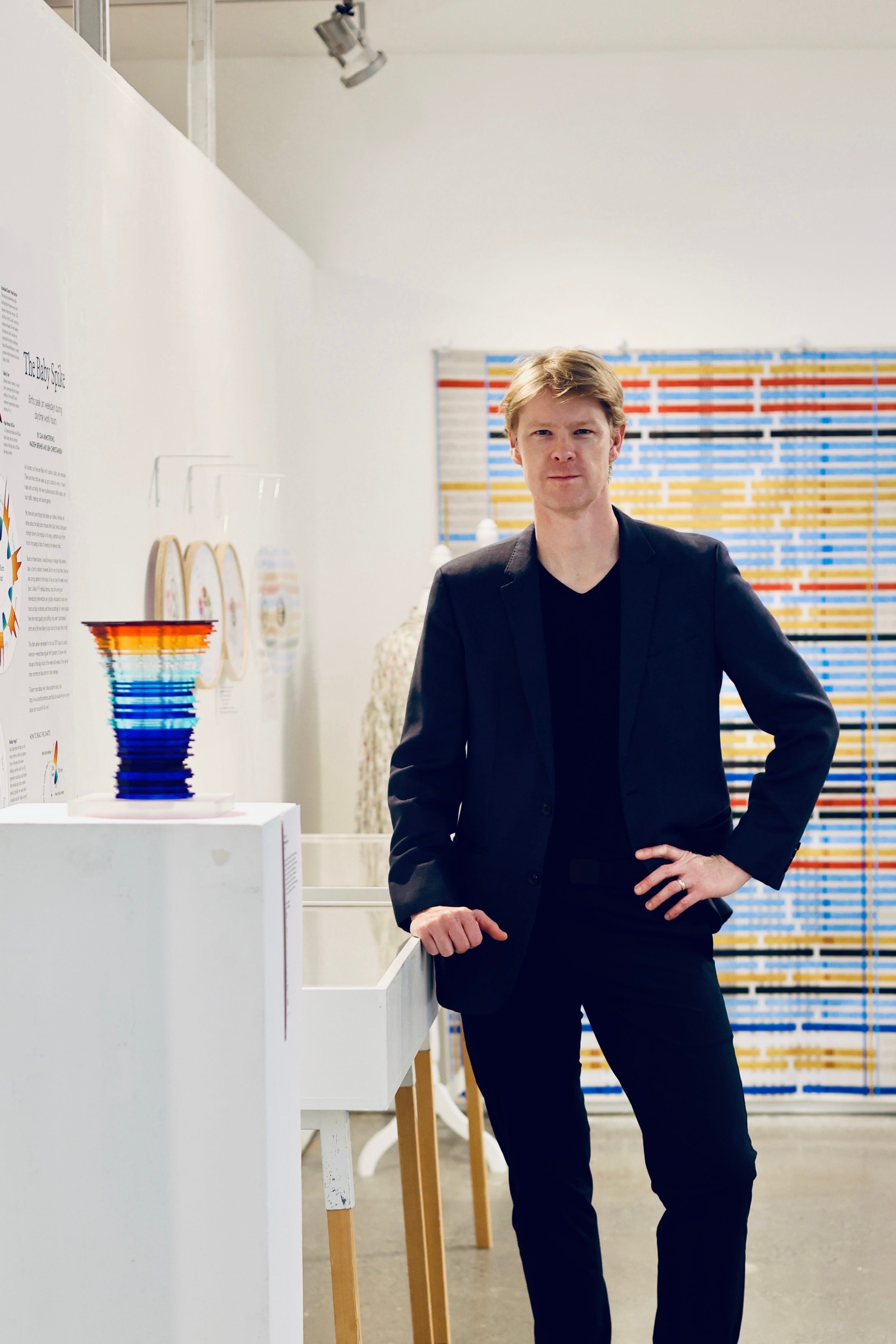
Curated and mounted The Craft of Data Graphics exhibition in New York, elevating the work of living and historic information designers.
Edited the Clarity summer series, republishing classic essays about information design.
Two-dozen historic publications collected for my design library. (Come visit it in SF!)
Launched the new Maps for Kids poster series and sent posters to kids all over. Discounts and free shipping are still available for a short while!
Chartography will return in 2026.
Onward!—RJ
About
Chartography is the newsletter of Visionary Press and Info We Trust, by RJ Andrews.
RJ Andrews is obsessed with data graphics. He helps organizations solve high-stakes problems by using visual metaphors and information graphics: charts, diagrams, and maps. His passion is studying the history of information graphics to discover design insights. See more at infoWeTrust.com.
RJ’s book, Info We Trust, is out now! He also published Information Graphic Visionaries, a book series celebrating three spectacular creators in 2022 with new writing, complete visual catalogs, and discoveries never seen by the public.
Love the retrospective and how you've woven philosophy with actual craft. The distinction between lucid and luminous clarity is particulary sharp—it reframes why so many dashboards feel soulless despite being technically clear. I've noticed that the best charts I've worked with tend to have some tension betewen the two, not perfect balance. The studio lunch series sounds like something special; that kind of in-person design talk seems increasingly rare these days.