
Data Graphics Need a Memory
How Michael Friendly gave charts a history.

Welcome to Chartography—insights and delights from the world of data storytelling.
Data graphics are powerful. Data graphics are also homeless. It’s a weird quirk of our trade.
Charts influence almost everything—medicine, journalism, business, science, public policy—yet our field has rarely enjoyed a single institutional home. It’s not owned by statistics. It’s not owned by design. It’s not owned by cartography, computer science, or journalism either. In different decades, different parts of society carried its torch. It advances everywhere, which is part of why it’s so useful, and why it’s so beautiful.
But that scattering has a cost: the people who make charts for a living are often floating, untethered to much tradition. We solve the immediate problem. We move on.
That’s where Michael Friendly’s contribution is unusually important.
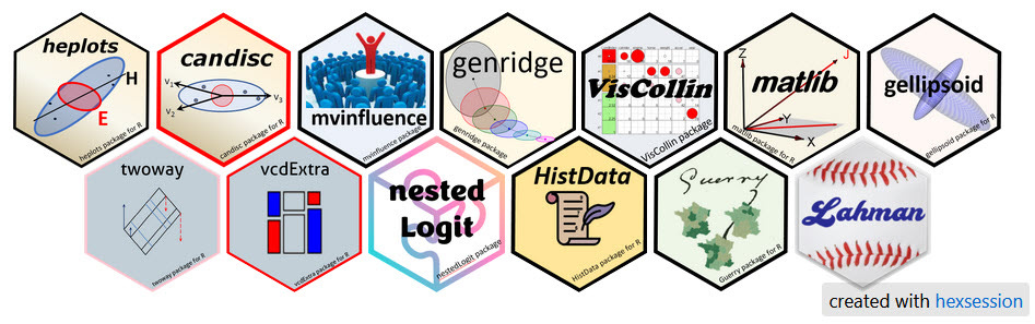
Michael Friendly is a quantitative psychologist and Professor at York University in Toronto. You might know his Milestones Project—or his R packages for statistical graphics, especially for categorical data and multivariate models. He’s enthusiastic about both on Bluesky.
Friendly is also co-author of History of Data Visualization and Graphic Communication, with Howard Wainer. Like Wainer, Friendly studied at RPI and then Princeton, where he arrived just after John Tukey founded Princeton’s statistical department.
Like many, I first encountered Friendly through his Milestones Project—one of the best “map rooms” we have for the history of data visualization. Since then, his research has enlightened and inspired my own career. His work on moral-statistics visionary André-Michel Guerry, for example, taught me about the birth of modern public data and the resulting emergence of social science. Friendly’s passion for Guerry also directly inspired my investigation of Florence Nightingale’s statistical graphics.
Friendly and I have shared our joy for historic charts and collaborated a bit, particularly on a radiant-diagrams paper tracing the history of Nightingale’s polar-area charts. I am also a member of Les Chevaliers des Albums de Statistique Graphique, which he founded. After years of digital friendship, we met in person at the Barry Ruderman Conference at Stanford’s David Rumsey Map Center.
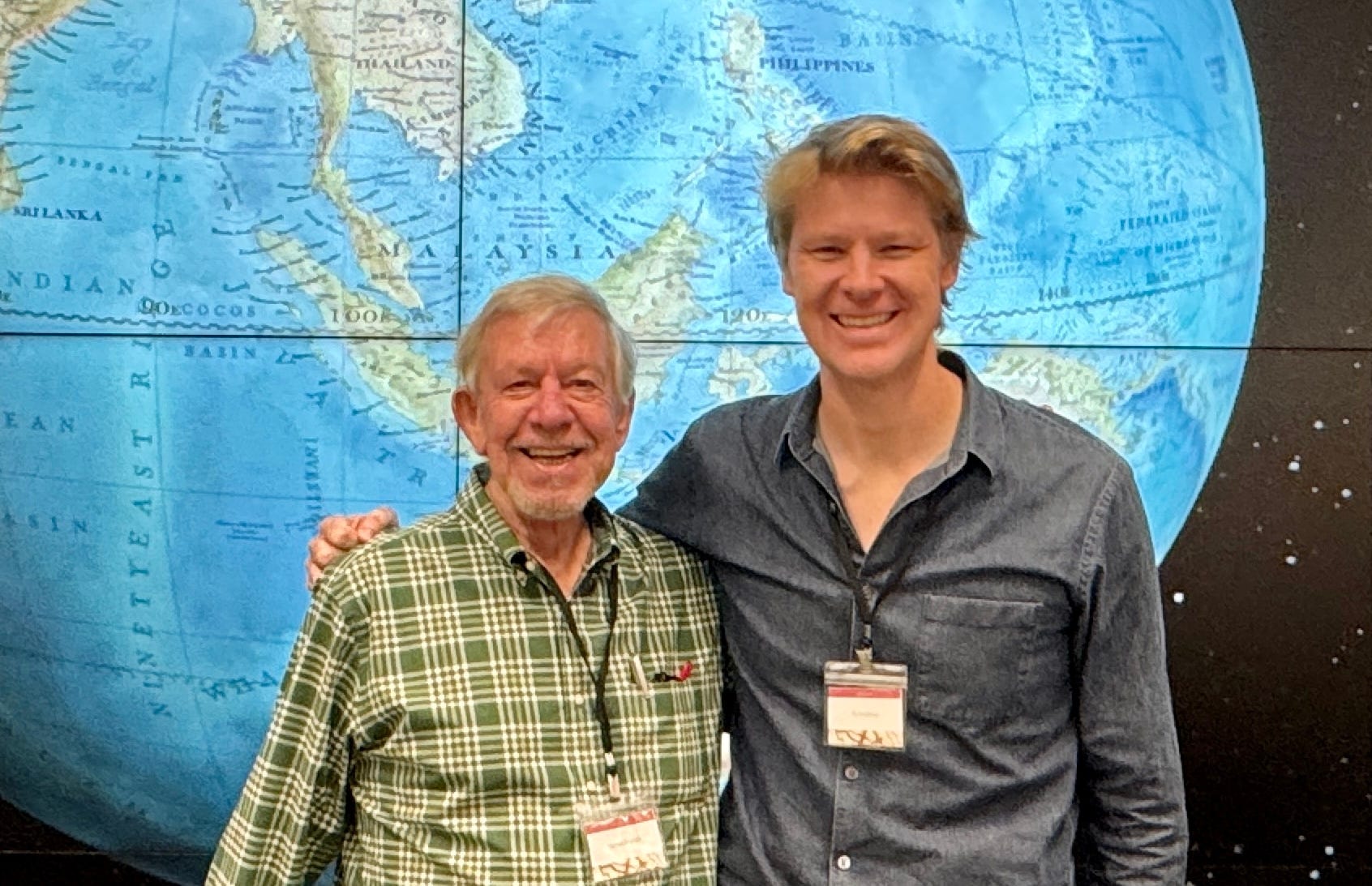
I recently wrote a formal recommendation letter for Michael. With his permission, I’m reshaping the core of it into this edition of Chartography.
Every field needs someone who keeps it from forgetting itself.
Michael Friendly has been that person for data graphics. Friendly has spent decades doing something that sounds soft until you’ve tried to do it: giving data graphics a memory.
Not nostalgia. Not “look at this quaint antique.” Actual working memory: standards, techniques, lineages, prototypes, dead ends, and rediscoveries.
When you have that kind of memory, a field behaves differently. You stop mistaking novelty for progress. You become harder to impress (in a healthy way). You gain range. You start to see the present as one moment in a long, collective project: How do we make reality more visible? How do we share those visions?
This is why I think of his work as service—not to a single institution, but to the whole messy, multidisciplinary culture of data graphics.
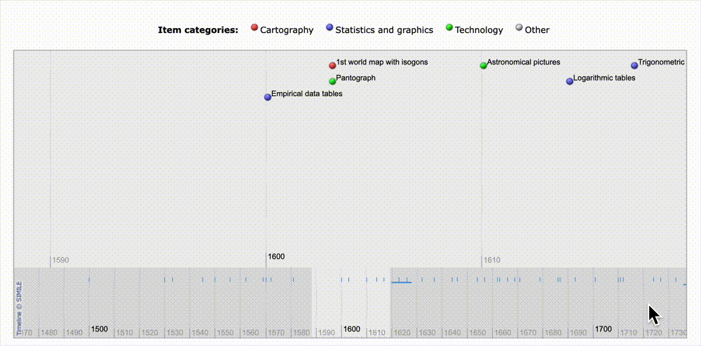
The Milestones Project is not a scrapbook—it’s infrastructure
If you only know one Friendly contribution, make it his Milestones Project.
It’s a curated, scholarly backbone for the history of data visualization. It pairs “what happened” with “why it mattered.” Old work is treated as technical and intellectual material—not just decoration.
.
And Friendly doesn’t just point at milestones; he explains them.
In his writing on Minard, Guerry, the scatterplot, van Langren, and the heat map, he’s doing the kind of recovery work that makes history usable. He reconstructs the problem the original designer was solving—the constraints, the questions, the tools, the intent.
An example that I love inserting into my talks is Friendly’s telling of Minard’s famous map of Napoleon’s retreat from Moscow. Friendly looks past it as mere “brilliant encoding” and sees it as antiwar protest by a 90-year-old engineer who had seen war up close:
In fact, there is a more personal and more emotive meaning to this graphic—as an antiwar statement by an engineer who had witnessed the horrors of war in his youth and who, in his final year, was forced to flee his home as the Prussian army approached Paris in September 1870. [Minard’s obituary] says, “Finally, .. . as if he could sense the terrible disaster that was about to disrupt the country, he illustrated the loss of lives that had been caused by ... Hannibal and Napoleon. ... The graphical representation is gripping;. .. it inspires bitter reflections on the human cost of the thirst for military glory.”
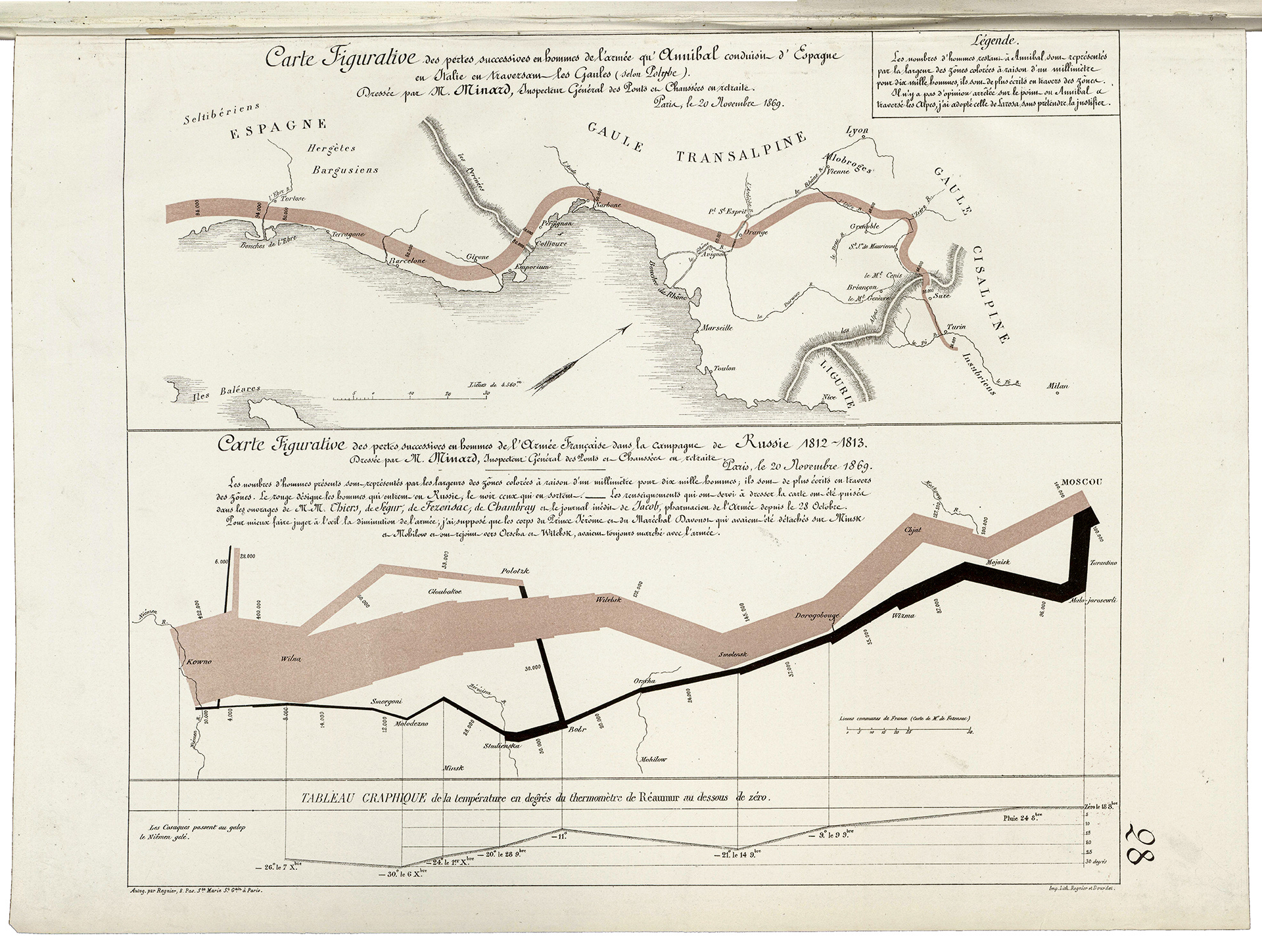
That’s classic Friendly—he sees the graphic and human experience as one.
He’s not only a historian of charts. He’s a builder of them.
This is the part that often gets missed by people who only know Friendly through the history work.
He’s not standing outside the field with a clipboard. He’s been inside it for decades, building modern statistical graphics: mosaic displays, HE plots, and a wide set of R tools and methods.
That matters because it changes the texture of his histories. He knows where the difficulty actually is. He knows what a “small” invention costs in practice. He knows what survives contact with real data and real audiences.
So when he says a historical graphic is ingenious, you can trust that it’s not just aesthetic admiration. It’s a practitioner’s respect.
Friendly the ambassador
The other thing Friendly gives the field is tone. He’s a joyful person to be around, a walking advertisement for nominative determinism.
He’s rigorous without being gatekeepy—and still clearly delighted by the work. I’ve seen him do this live. At the David Rumsey Map Center’s Ruderman Conference, his “Celebration” keynote (on Les Chevaliers) combined reverence and restlessness. Admire prior art, but don’t be trapped by it.
His web presence and public talks keep pulling historical material back into the present—where it can actually do work for people. That’s the right posture for a field like ours.
A short lineage
If you want to place Friendly in a lineage, it’s a small one.
In the 19th century, Étienne‑Jules Marey helped articulate the graphic method with scientific seriousness. In the early 20th, Howard Funkhouser surveyed statistical graphics with a historian’s sweep. Friendly carries that baton into the digital era, with an extra twist: he combines the historian’s archive with the builder’s workshop, and he’s unusually approachable while doing it.
Plenty of people can make charts.
Fewer can invent new graphical tools.
Fewer still can explain where our tools came from—and why the old work still matters.
Michael Friendly has done all of that, steadily, for decades. And the effect is simple: he made it harder for the rest of us to be careless with history.
Which is a gift.
Onward!—RJ
About
Chartography is the newsletter of Visionary Press and Info We Trust, by RJ Andrews.
RJ Andrews is obsessed with data graphics. He helps organizations solve high-stakes problems by using visual metaphors and information graphics: charts, diagrams, and maps. His passion is studying the history of information graphics to discover design insights. See more at infoWeTrust.com.
RJ’s book, Info We Trust, is out now! He also published Information Graphic Visionaries, a book series celebrating three spectacular creators in 2022 with new writing, complete visual catalogs, and discoveries never seen by the public.
What an extraordinary story, RJ. Thank you again for your pursuit of the things that matter most in this world of data graphics that we all love.
Meeting Mr Friendly through you this morning made my day.
And thank you AGAIN for adding human context to the Minard masterpiece. That one work never ceases to amaze.
I think this is just lovely!