Designing Delight
Behind-the-scenes looks at how better page-design helps my INFO WE TRUST "directors cut" soar
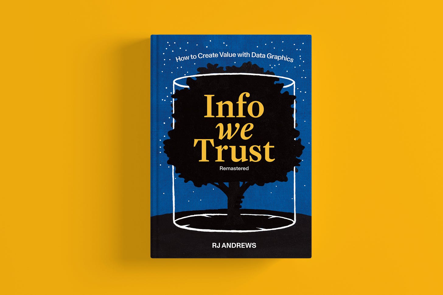
To hype my INFO WE TRUST Kickstarter I’m stepping up this newsletter’s cadence. This week, we will continue our tour what makes this new edition so splendid.
We just hit 200 backers for my remastered Info We Trust and are VERY close to achieving our campaign goal.
I appreciate your enthusiasm for this splendid edition.
Remastering Design
As I introduced last week, Info We Trust Remastered is my director’s cut. I’ve improved all aspects of the book: its content (text, marginalia, illustrations), design (layout, color system, typography, etc.), and production (materials and construction).
It is a privilege to be able to correct and improve the book’s original design. Following is a shortlist of design improvements that, together, help this book soar to new heights .
Size
A book’s format is a reflection—perhaps an extension—of the human body. A book should be sized for comfortable reading. Info We Trust Remastered will have a slightly smaller trim size than the first edition. It will also be two signatures shorter. Despite having fewer pages, the new edition will actually have more text and illustrations. These adjustments will make the book a more friendly (and more portable) experience.
Committing to size adjustments necessitated that I completely re-flow and re-layout all of the book’s content. This freed me to discover new ways for my refreshed content—text, marginalia, and illustrations—to interact across the page.
Typography
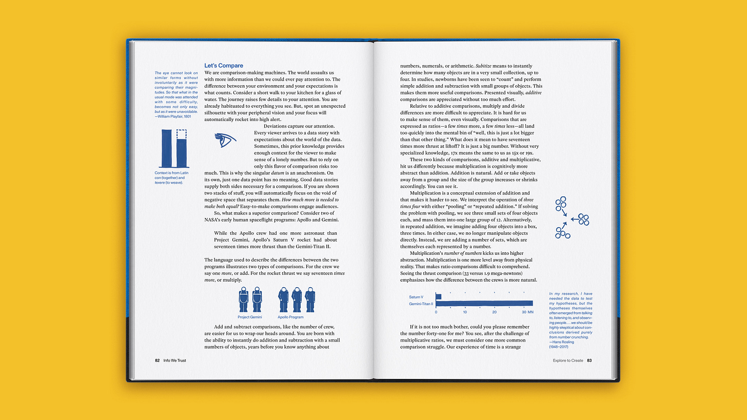
All blue marginalia is now justified, aligning the text along both left and right margins, to create a more substantial look for the side columns.
The main body text is now ragged right, aligned along the left margin with an uneven right edge and without uneven spacing, which is the standard for more easily readable longform text. (These assignments reverse the typographic alignment of the previous design.)
Previously-generic typefaces have been updated to the Visionary Press house style: Monument Grotesk (sans, in blue) and Rosart (serif, in black). These are the same beautiful typefaces we used in our Information Graphic Visionary book series. I love working with them.
We are also employing more sophisticated (and sometimes custom) typographic flourishes, such as old-style numerals, slab-serif 1s, and improved formula and table formatting where appropriate.
Color
My rules about deploying the book’s indigo blue have become more strict. Blue no longer highlights indented passages because they do not need the extra emphasis.
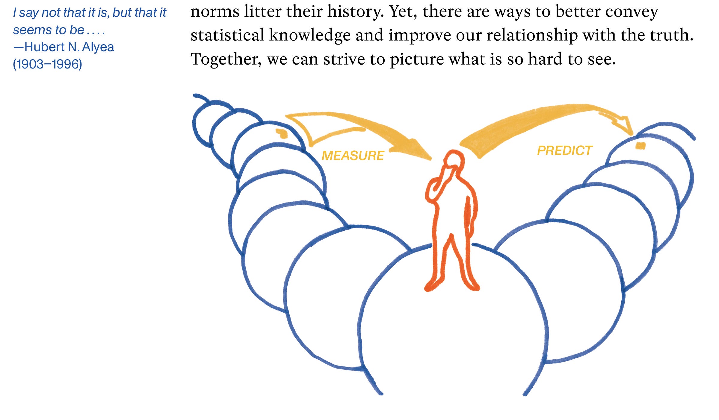
In some cases, I also added more colors to illustrations that were previously all-blue. I found it better to actually redraw most of these illustrations, rather than just edit them in Photoshop.
In an upcoming newsletter, I will describe enhancements to the book’s production materials. Spoiler: color is the major upgrade you will see when you hold it.
You may not notice each of these upgrades individually, and that might be a good thing. Together, however, I am sure they will elevate your experience of the book.
I could not have achieved these flourishes without the lessons and active involvement of my mentor and friend Lorenzo Fanton, a champion graphic designer who shares my enthusiasm for beautiful books.
Thank you for reserving your copy of Info We Trust.
Onward!
—RJ


