Welcome to Chartography: insights and delights from the world of data storytelling.
My strong preference is to get the remaining copies of our Visionaries books out of their cold warehouse and into the loving hands of you and yours. With our big holiday discounts (up to 50%-off), shopping for gifts has never been easier:
Now, on with the show.
Diagrams are an under-theorized art form
Perhaps it is because making diagrams is rooted in drawing pictures, which seems relatively in decline compared to today’s dominant methods of clicking buttons and typing coding. My personal taxonomy places pictorial diagrams as the third art form of information graphics, at the same level of statistical charts and geographic maps.
We recently toured outrageous charts and maps in pre-war TIME magazine ads. Today we will complete the triad by training our gaze at ads with diagrams—most with a numerical flair.
Diagrams are sometime a little charty, expressing numerals and time with pictures, like the ads above for the Metropolitan Life Insurance Company that illustrate a dying cohort over a human lifespan.
Diagrams can also be a little mappy, like the ads below encouraging businesses to move to the tax-haven paradise of Nebraska. Nebraska since introduced a sales tax (1967) and income tax (1968).
In my book Info We Trust I enthused that
Diagrams eclipse other communication media when they use the freedom of drawing to transcend space and transport reality through time.
Spatial constraints have no control over diagrams. By thwarting the rules that govern where physical matter exists, we can gain new views about all sorts of phenomena. Layers can be cut-away from a single scene to show what is inside. Buildings on opposite sides of the world can be placed side-by-side for entertaining comparison. Spatial scales can be adjusted to give new appreciation for the miniature or gargantuan. Disparate items of the same group can be collected and rearranged in a tidy grid. Some of these scenes are conceivable in real life—medical students actually do dissect cadavers to better understand how the body works. In these cases, diagrams help bring exclusive vantages to the masses.
Time can similarly be manipulated. Processes that occur over moments or millennia may be sliced into frames and juxtaposed, letting us understand the horse in motion, how a dinosaur fossilizes, or how a structure rises.
Diagrams transport, transform, and rearrange physical reality. They pile on layers of context and invisible concepts. What results is a tighter correspondence between how we see the world, and how we understand the world.
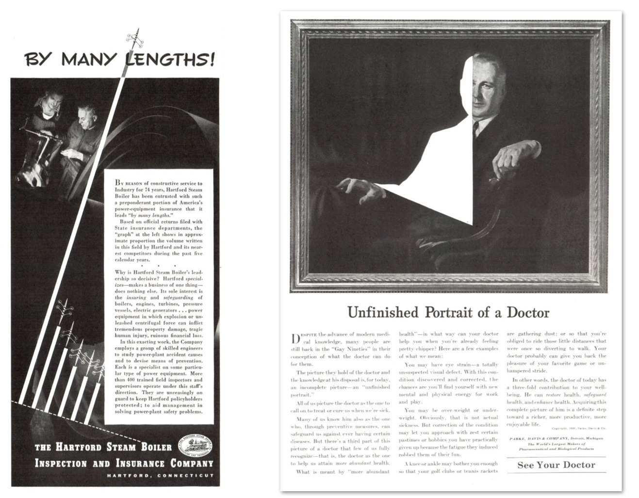
The diagrams below call upon bar-chart and pie-chart forms. But they do not really convey any data or statistical information. Each encourages a fear of missing out in its audience: a fear of not engaging the best steam boiler, and a fear of not taking advantage of all that a doctor has to offer.
Below, two ads encourage readers to engage with their services to make more money. The Multilith (left) is represented as an accounting stick that moves cash from expense to profit columns. Target customers (right) are selected from files because they have been identified as part of a diamond-shaped set of consumers who are heavy buyers of “branded merchandise." The inset pyramid details that
Extending from top to bottom of the national income triangle, [the red diamond] is wide in the middle where sales are greatest; tapers at the top where there are fewer people; tapers at the bottom where selectivity is all-important because there is a decreasing market for most nationally advertised products.
That is, don’t bother marketing to the poor.
Numerical and quasi-numerical artifacts persist, but they aren’t the main show in diagrams. Below, photos are collaged with illustrations. Don’t miss the typist pulling the actual water glass out of the illustrated ring.
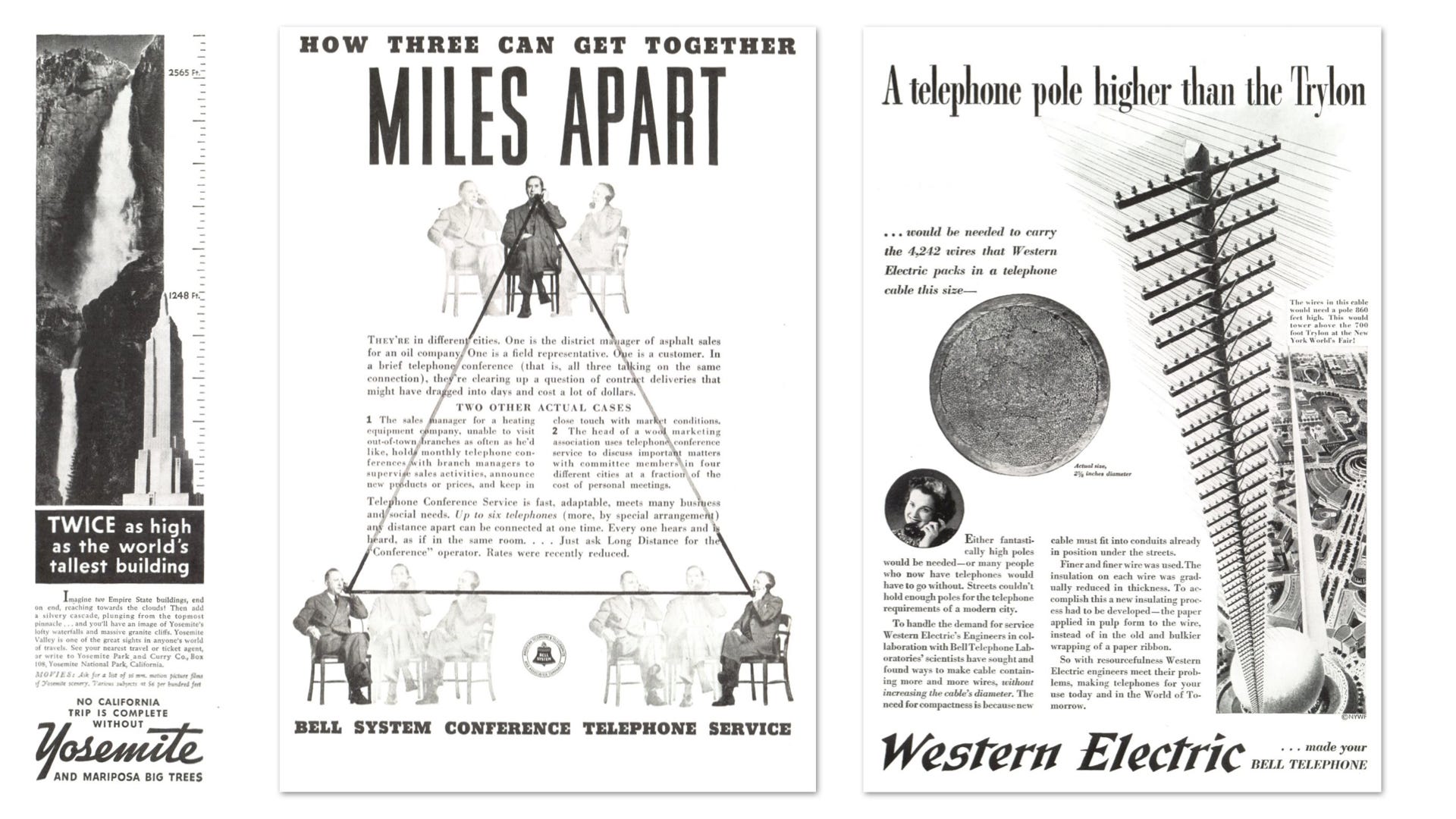
Diagrams are at their best when they illustrate things that are impossible to see in real life: skyscrapers in national parks, people in multiple places at once, and super-tall telephone poles (with an inset ACTUAL SIZE cross-section of a real telephone cable).
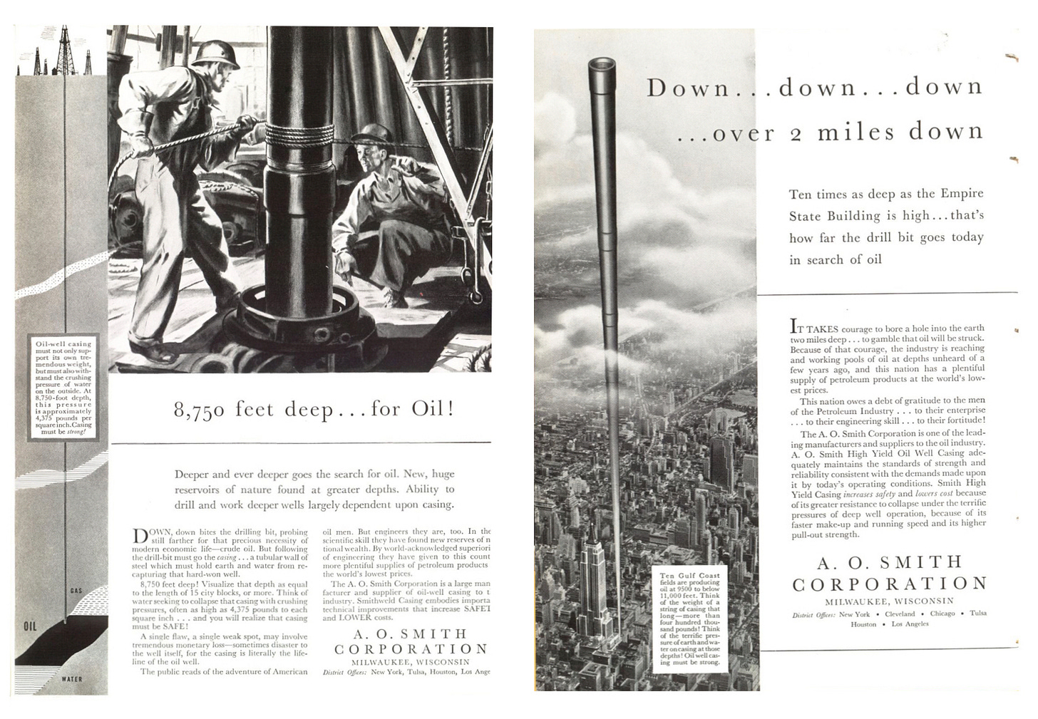
A. O. Smith Corporation similarly used diagrams to convey a sense of the impossible-to-see depths of its oil wells.
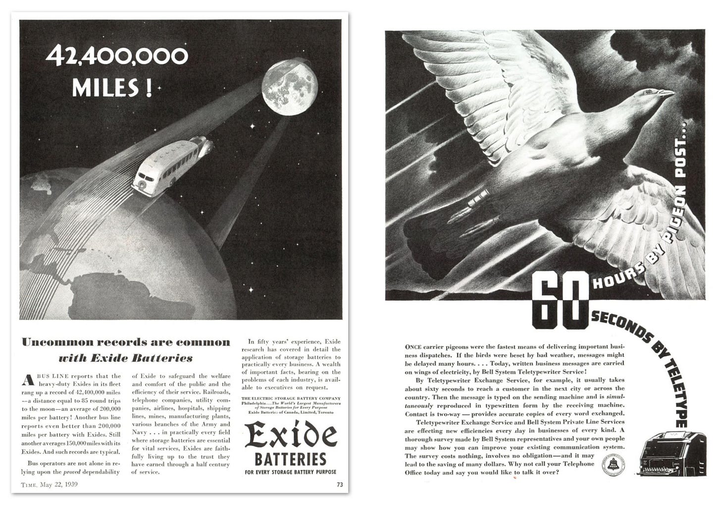
And Exide showed how far a busline’s fleet (not a single bus, as illustrated) traveled on its batteries, while Bell sneaks in an abstract line-graph to punctuate the time-saving benefits of teletype.
The Monroe adding calculator promised to relieve a timeless anxiety: the relentless march of data. I like how the commanding officers are number ones (left) and how the fog of abstract numerals block the pedestrian from seeing the city (right).
Material subscribers, keep scrolling for your bonus graphic (it’s wickedly good).
Thank you everyone for a fun year writing about information graphics. I’m eager to hear how your gifting of Visionaries went over the holidays.
Chartography will return in the new year.
Onward!—RJ
About
Data storyteller RJ Andrews helps organizations solve high-stakes problems by using visual metaphors and information graphics: charts, diagrams, and maps. His passion is studying the history of information graphics to discover design insights. See more at infoWeTrust.com.
RJ’s recently published series, Information Graphic Visionaries, a new book series celebrating three spectacular data visualization creators. With new writing, complete visual catalogs, and discoveries never seen by the public. His first book Info We Trust, How to Inspire the World with Data—will be published in a remastered edition in 2024.
Guest contributor Byron Raco is an avid bibliophile and curious mind. He journeyed through investment banking, strategy and CFO roles before settling into a life of investing and exploring the world while enjoying the printed page.
Keep reading with a 7-day free trial
Subscribe to Chartography to keep reading this post and get 7 days of free access to the full post archives.


