
Don't say "data visualizations"
Imprecise and knotty language is bad for charts.

Welcome to Chartography.net — insights and delights from the world of data storytelling.
🍎 My next Cooper Union data graphics class starts this week. We’ll begin with visual metaphors. If you don’t get in please make sure to join the waitlist as we will privilege that next time.
🥳 Letterform Archive is hosting a party for my book launch March 20th in San Francisco.
Sometimes I ask my students to create a visual ontology of words related to our field. You can try it too. Start with words like chart, map, diagram, plot, data story, infographic, data visualization, etc.
Here’s an internally-inconsistent attempt, by me:

Students have produced Venn diagrams, spectrums, mindmaps, and all kinds of other contraptions illustrating which words they use in their own daily practice, and how they relate to one another.
No one illustrates all the available words and no two schematics are the same. That’s part of the point. Our field is omnipresent—and inconsistent. We use different words to mean the same thing (e.g. to chart, to plot, to graph). And the same word to mean different things (e.g. map, infographic).
Mary Eleanor Spear touched on this in 1969:
Each field has its own concept of graphic methods and standards of presentation and its own identifying codes, nomenclatures, or symbols.
We have no style guide. And in that sense, we have no style. You might have a style. And I might have a style. But our style is scattered in broken little pieces.
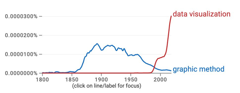
We are not only broken today, but also broken across time. Data visualization is a relatively recent term. Look at its digital-computing rise compared to “graphic method”—a previous way scientists and engineers referred to using pictures to grapple with complex phenomena.
Data visualization is awkward to write, awkward to say, and inconsistently spelled. Its plural and its lilliputian dataviz are both absurd. It reeks of the kind of language used to make the speaker feel better about themself, not the kind of language that helps convey a message to an audience.
To me, visualization is an almost mystical word that should be reserved for something that happens inside your head—perhaps in response to seeing a chart. Don’t burn it on the artifact, save it for the verb.
Cartographers don’t say geo-visualization or geo-graphic. They say map. I don’t know why we bother with data visualization when we can just say chart.
Labels for people who make charts are also a mess. Once upon a time, we could call ourselves chartists or chartographers (heh) but neither saw wide adoption. Data storyteller has dulled as the “storytelling” fad has faded. Information designer seems the most generic durable title.
The ambiguity in our words is a potent reflection of the real uncertainty in our craft. From one perspective, everything is data. From another perspective, everything is a map. Our media, charts, resist strict classification. Any chart is a half-step away from another.

But one of our jobs as information designers is to create clarity where we can. Having a wishy-washy billboard for our field does not benefit chart-makers or chart-readers. It muddles the conversation at a time where everyone is seeking simple easy-button solutions.
So, what are we to do? No one should (nor can) dictate language. But we would all benefit if we each considered more careful use of terminology.
I’ve paid attention to my own usage. Here’s what has stuck:
Instead of data visualization I say charts or, sometime, data graphics, because I find that it is still useful to have the word “data” involved. You can see this reflected in Info We Trust Remastered’s subtitle and text.
I make sure to distinguish horizontal and vertical bar charts, often calling the latter column charts. Graphically, these charts are nearly the same, but the metaphors they convey are far different. Separating them as distinct forms helps.
I use line graphs, not line charts. To me, graph conveys some sort of connection—just like a network graph. Line graphs are connected, bar charts are not. Graphs are a special kind of chart. (I never use bar graph.)
I do not use plot as a noun. Today, it seems dedicated to the act of chart-generation (pen-plotter). If I could wave a magic wand then I would resurrect it as a term for area charts, connecting plot back to its early meaning of a plot of land.
I don’t say infographic, associating that with tall and ugly web graphics. I use information graphics frequently to refer to the entire field of charts, maps, and diagrams.
I use diagram to refer to pictorial, relational, and other non-statistical designs.
For several years I’ve introduced myself without any fancy language. I just say: “I make charts.” People seem to appreciate the brevity. Data storyteller is still printed in some of my bios, but I say it less than I used to.
It seems that committing to more confident language fosters more confidence in my audience. I’m curious to learn from your experience talking charts.
Onward!—RJ
About
RJ Andrews helps organizations solve high-stakes problems by using visual metaphors and information graphics: charts, diagrams, and maps. His passion is studying the history of information graphics to discover design insights. See more at infoWeTrust.com.
RJ’s next book, Info We Trust, is currently available for pre-order. He published Information Graphic Visionaries, a book series celebrating three spectacular data visualization creators in 2022 with new writing, complete visual catalogs, and discoveries never seen by the public.
In Hungarian, the word "diagram" first appeared in its original meaning: a schematic representation of relationships, processes, ideas, or engineering drawing, or geometric proof. The "graphic method" was used for a long time to any sort of data graphics, including pictorial, then "graph" took over this general role, graph was the line chart, the bar chart, the Isotype or the Sankey. Later the meaning of diagram was extended to the field of specific statistical charts: what is pie chart in English is a torta (pie) diagram in Hungarian. Chart and plot have not become widespread in Hungarian, and are only used when there is no good translation of the original in English, for instance slope chart, or beeswarm plot. Meanwhile scatterplot is translated as korrelációs pont diagram (correlational point diagram). We do not use the word map or carta for cartographic representations, we use the word térkép (meaning "spatial image"). I really do like the old Hungarian word földabrosz, meaning Earth-tablecloth for maps. Data visualization is again not widely used, only by designers, scientists and journalists. In everyday usage, infographic, diagram, graph mean much the same thing for the public.
Love this reflection. I've been trying out "data interfaces" for the kind of work I do, which encompasses dashboards and charts but also feels like it allows for new representations to emerge