
Explore Like a Designer
Search Isotype charts by type, features, and color.

Welcome to Chartography—insights and delights from the world of data storytelling.
I’ve been cooking—building an original archive explorer from my collection of Isotype Institute charts and maps, so I can find fresh insights and inspiration in seconds.
Now I can search charts the way my designer brain wants: by chart type, features, and color. I’ve also loaded it with publication metadata and OCR text.
You can play with Isotype Explorer too. Right here:
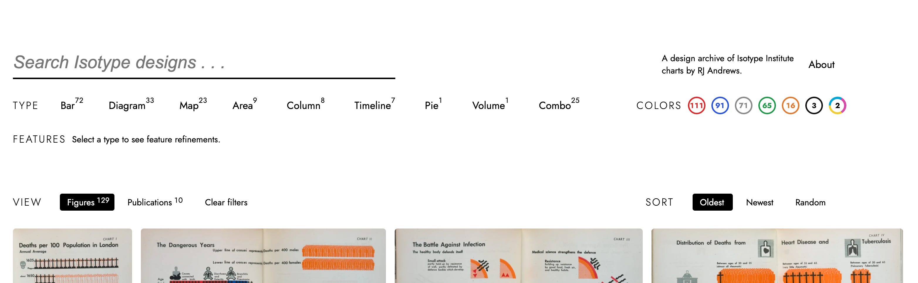
So far, it includes 129 figures from 10 different publications. Here’s what the user interface looks like:
Isotype is a favorite source of inspiration for me and many information designers. For the uninitiated:
Isotype shows data with pictorial symbols. It consists of standardized methods and abstracted pictograms to represent social-scientific data.
Isotype is associated with Otto Neurath and his collaborators. It was first known as the Vienna Method of Pictorial Statistics, originating in the 1920s at the Gesellschafts und Wirtschaftsmuseum in Wien (Social and Economic Museum of Vienna). The term Isotype was applied to the method in the 1930s, after its key practitioners were forced to leave Vienna amid the rise of Austrian fascism.
This effort is inspired by:
David Rumsey—digitization and open access
Letterform Archive—gorgeous archival UI
Jason Forrest—shared Isotype enthusiasm
E-commerce—filtering & sorting that respects intent
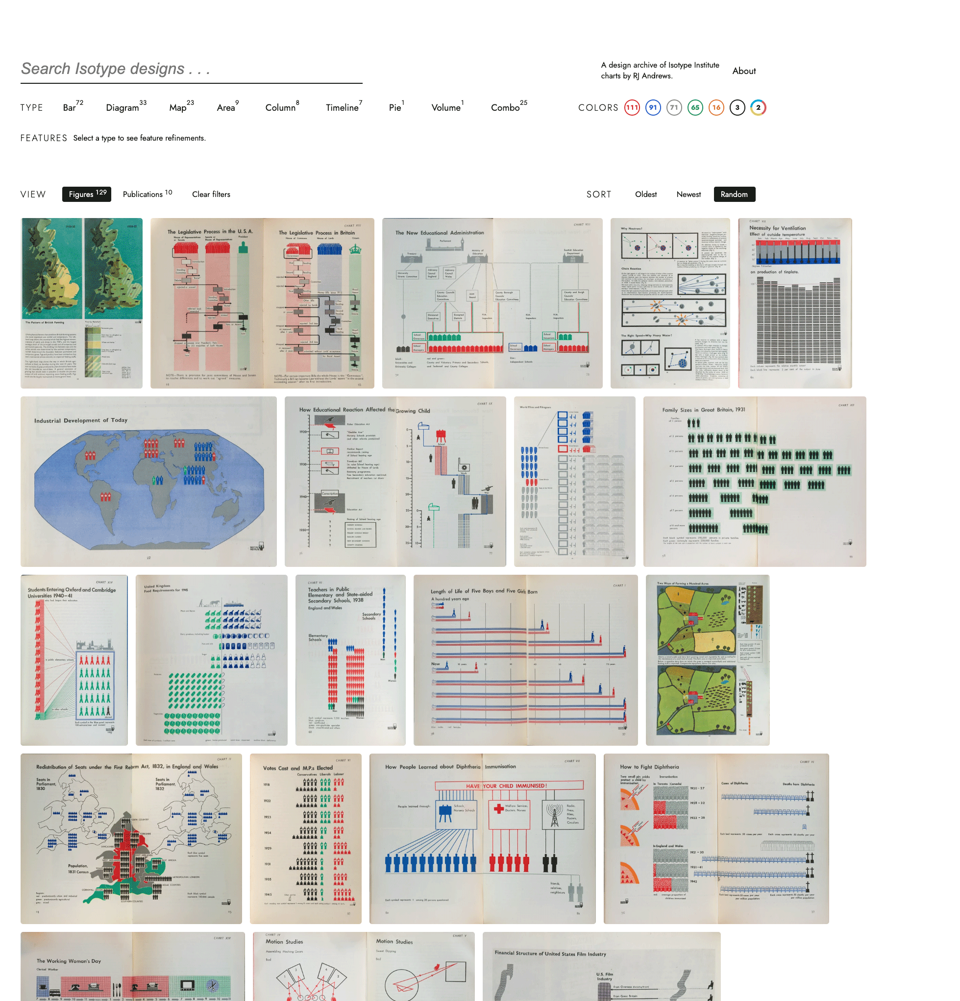
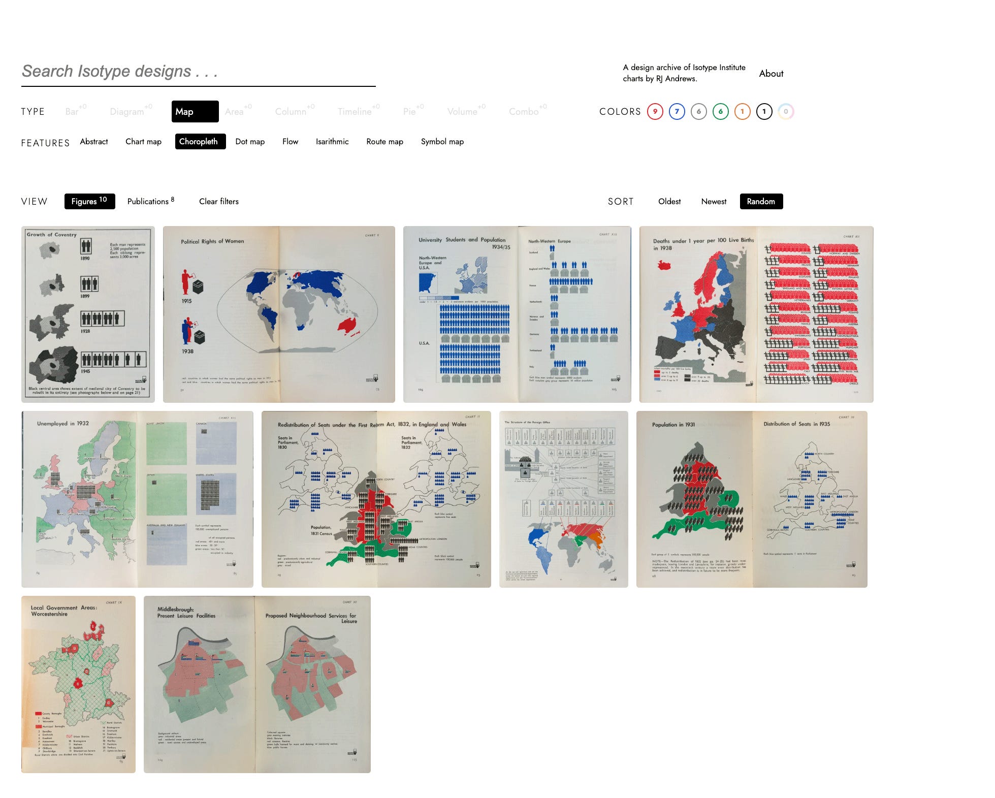
Isotype Explorer has a few neat views. The grid view is great for discovery. Here it is with random sort, which creates unexpected juxtapositions.
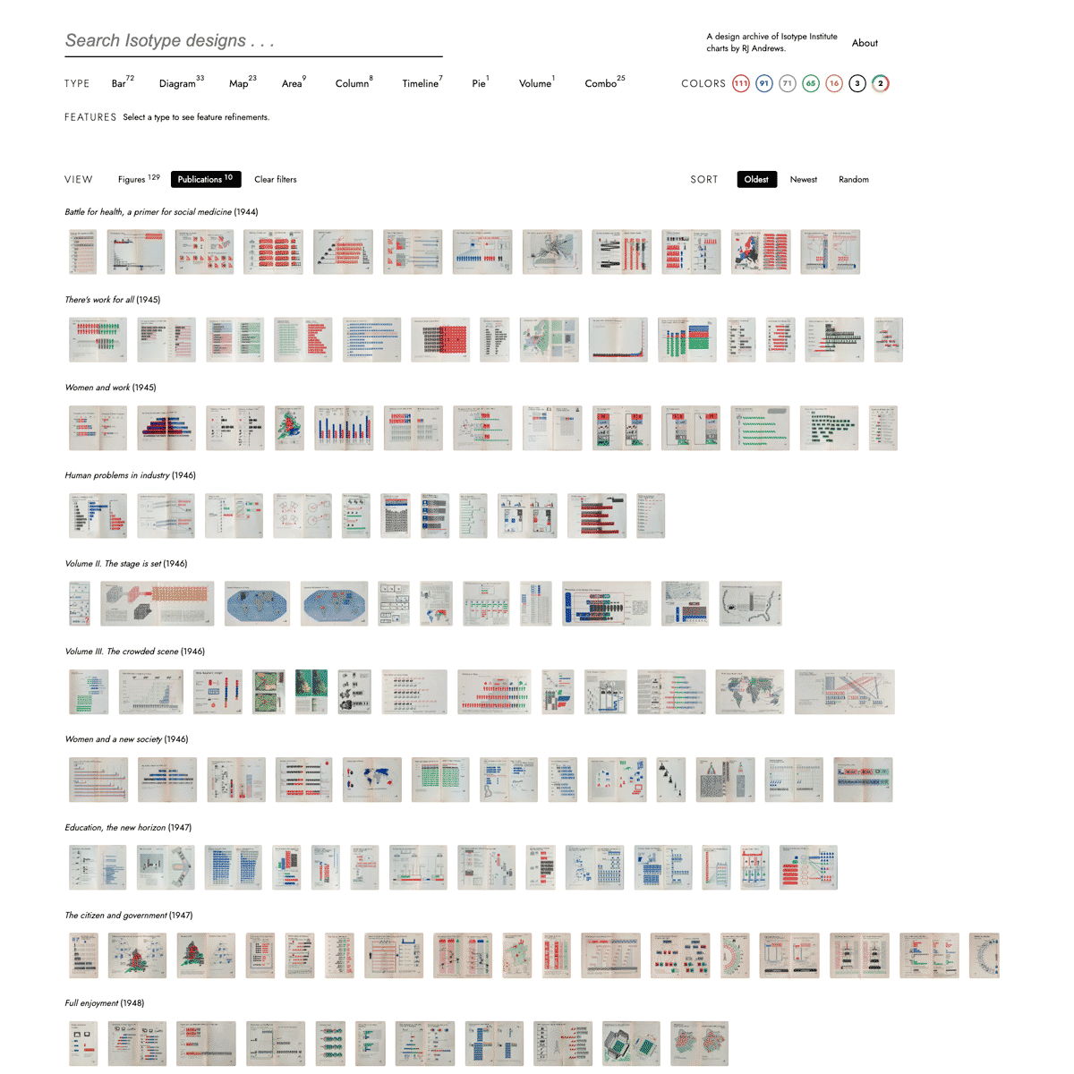
The publication view helps you understand the total catalog. It’s shown below demonstrating chart and color filters.
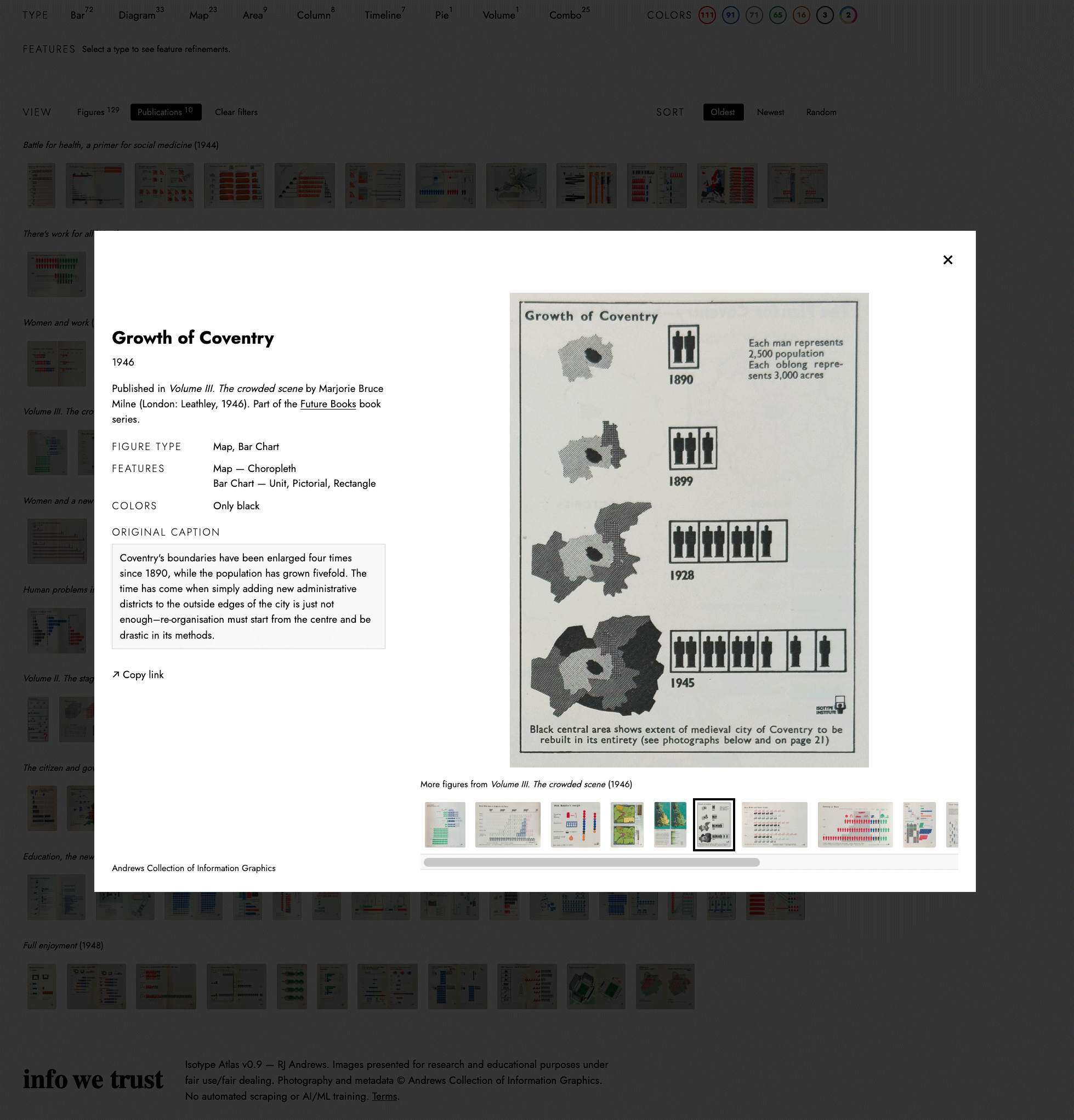
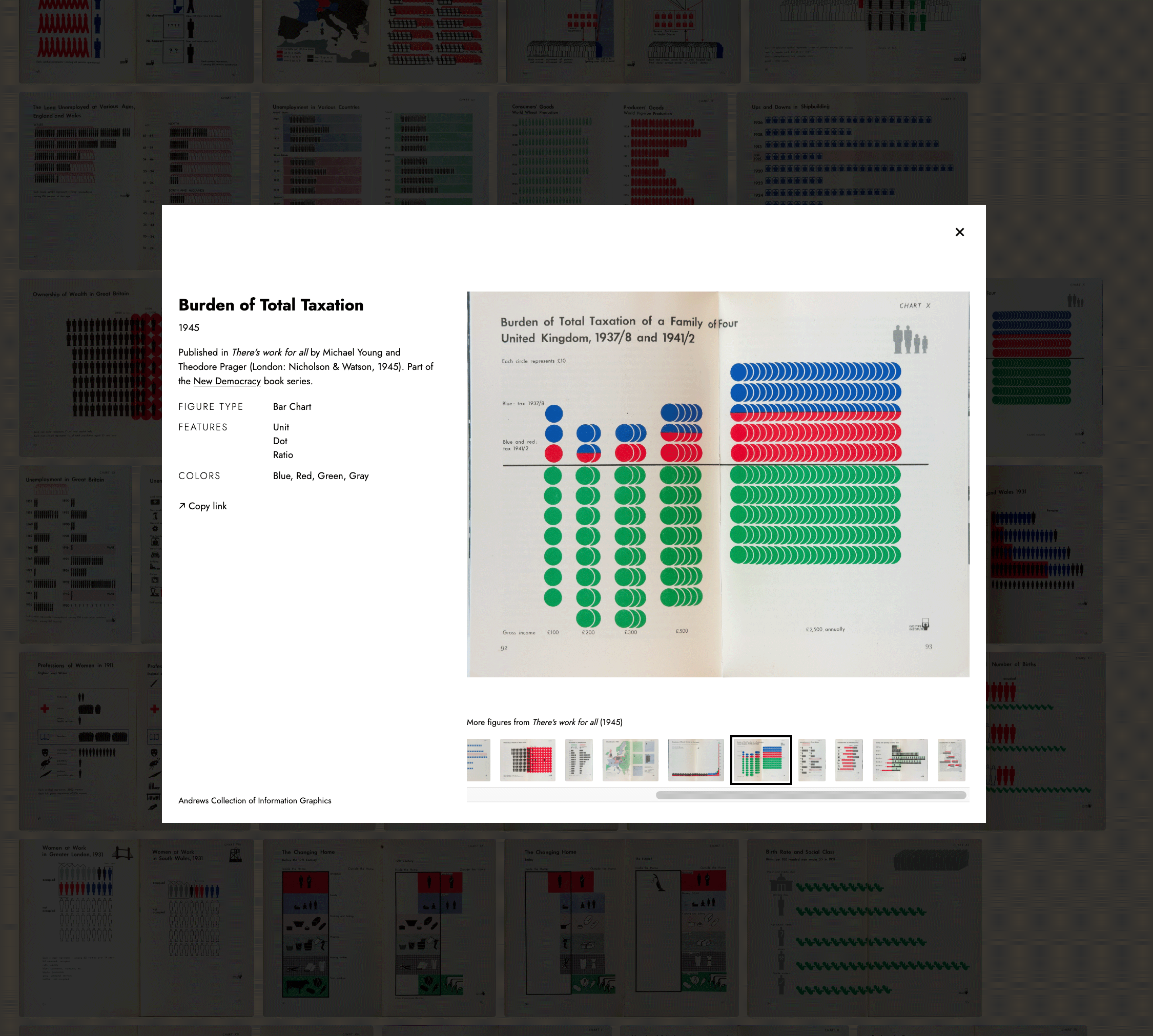
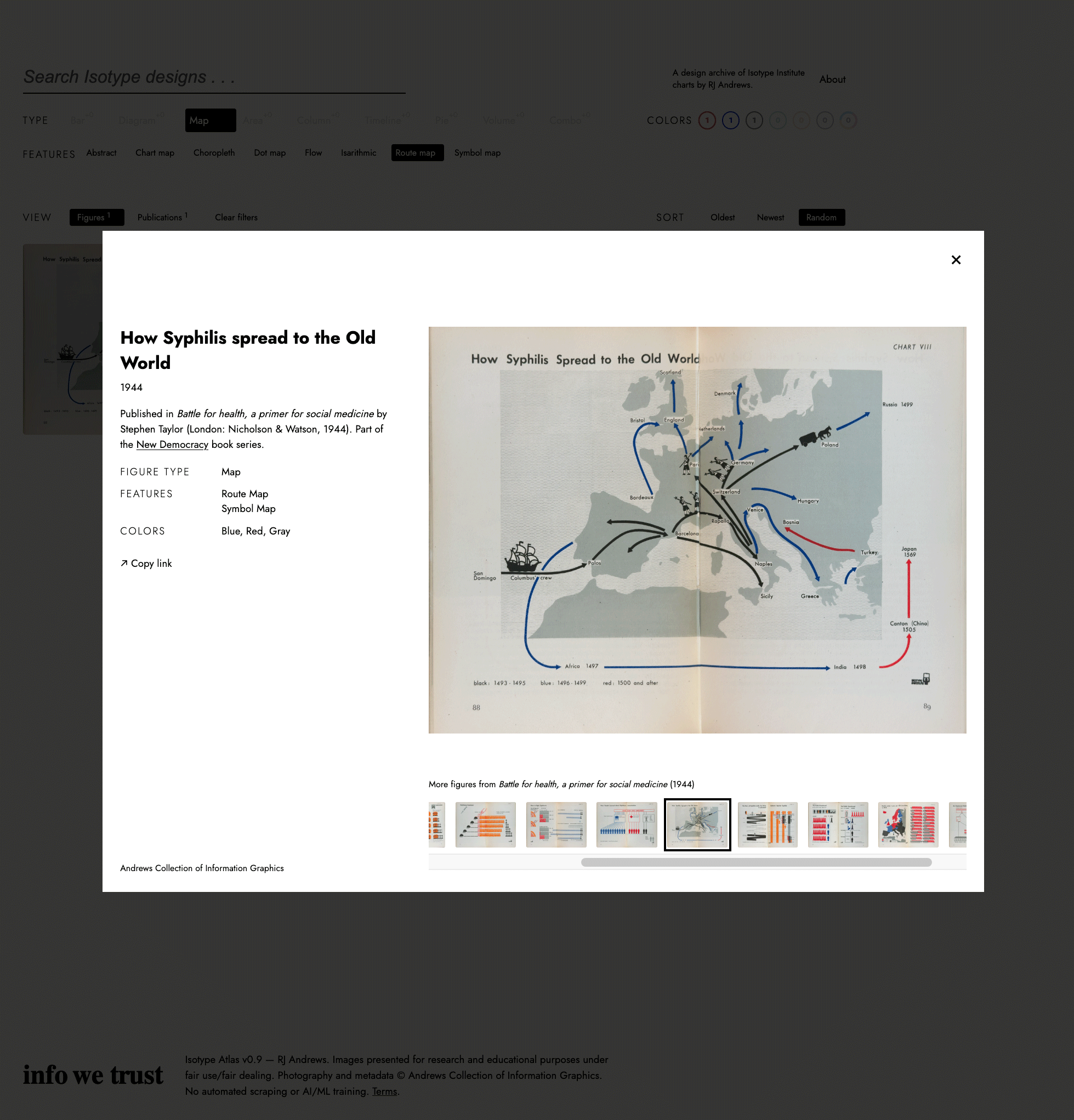
The figure lightbox (below) details a single figure. Open it to read publication context, plus original caption text when relevant.
I find searching by a specific chart type to be really useful. Try: filter Type → Map → Choropleth (or just search “choropleth”).
The search bar queries publication and figure metadata, plus OCR text. You can also search by token keys. It currently supports: type, work (= publication), year, feature, and series. I’ve also added a British-to-American dictionary because these are mostly British publications. The tool understands theater and theatre, color and colour.
Despite these books being within arm’s reach for years, I never noticed some of their brilliant figures. For example, here is "Burden of Total Taxation.” I love how it compresses stacks of dots horizontally while maintaining the same diverging deciles.
Here is another surprise to me, “How Syphilis spread to the Old World.” It’s a perfect balance and density of arrows and symbols.
The whole site tracks state in the URL, so it’s easy to share any chart or filtered view. For example:
https://isotype.infowetrust.com/#/?sort=oldest&view=publications&id=w0002-p0088-f99
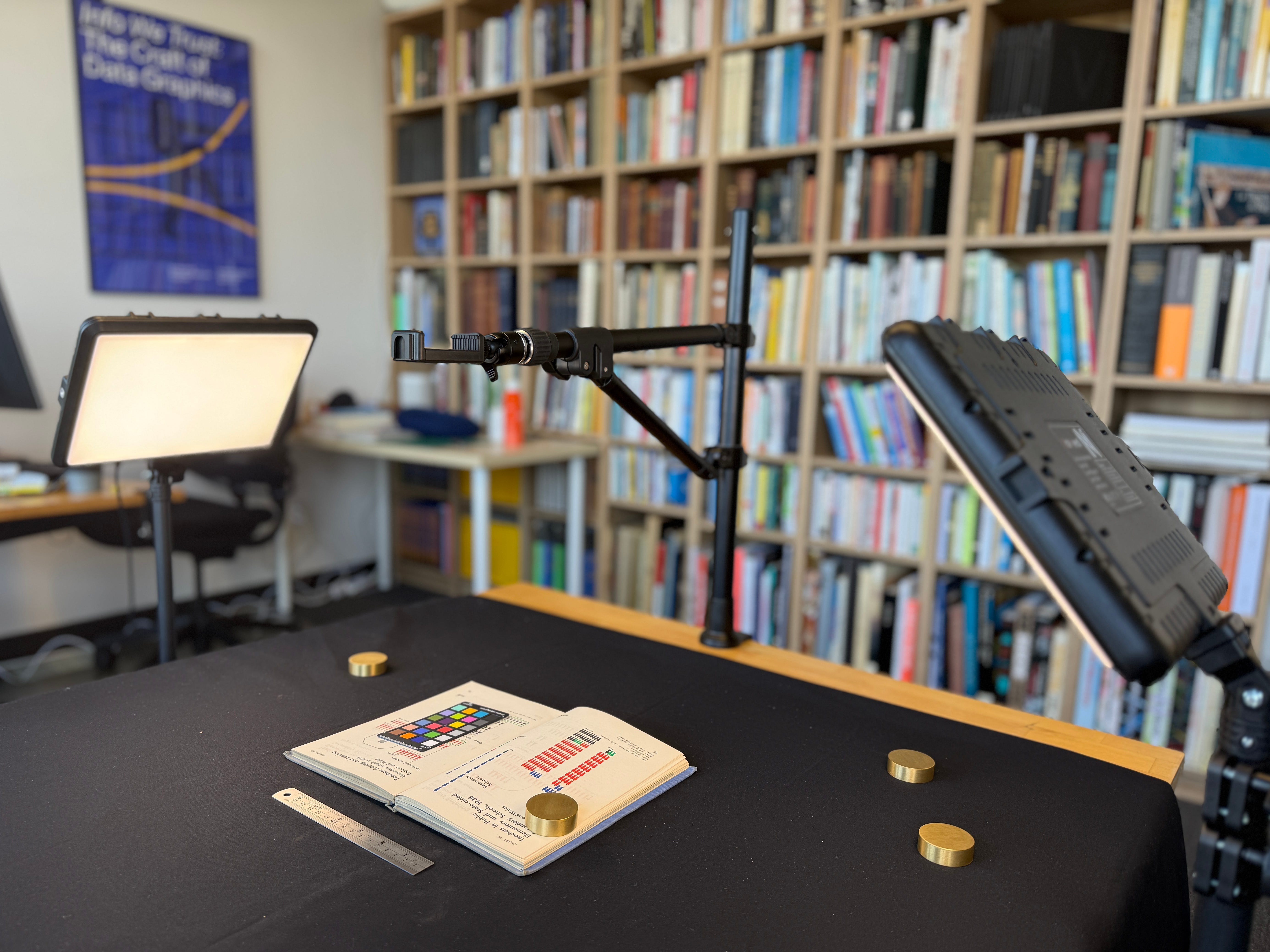
And it’s all original, including new photography, color correction, metadata, and website design by me.
I have many more publications, and hundreds of figures, to add.
You can help by playing around at isotype.infowetrust.com and let me know what you think.
Reply with the coolest chart you find.
Tell me what filter you wish existed.
Flag any bugs you run into.
I gave some attention to mobile design, but it’s really best on your biggest screen. Enjoy.
Onward!—RJ
About
Chartography is the newsletter of Visionary Press and Info We Trust, by RJ Andrews.
RJ Andrews is obsessed with data graphics. He helps organizations solve high-stakes problems by using visual metaphors and information graphics: charts, diagrams, and maps. His passion is studying the history of information graphics to discover design insights. See more at infoWeTrust.com.
RJ’s book, Info We Trust, is out now! He also published Information Graphic Visionaries, a book series celebrating three spectacular creators in 2022 with new writing, complete visual catalogs, and discoveries never seen by the public.
This looks great! Just found this, really excited about it, I’m also obsessed with diagrams and data graphics. Will take a look deeply at the tool and let you know my thoughts
Very nice!
Would you consider adding the german language charts that Neurath and his team created when working at the "Gesellschafts- und Wirtschaftsmuseum" in 1920s Vienna, like the "bildstatistisches Elementarwerk"?
It can be found here: https://www.digital.wienbibliothek.at/wbrobv/content/titleinfo/2295773
BTW, there currently is an exhibition about Isotype at the "Wien Museum" (City Museum of Vienna) titled "Knowledge for All. ISOTYPE – the Picture Language from Vienna". It runs through April 5th, 2026.
IMO, it is well worth a visit. I am there at least once a week as they offer public workshops about various aspects related to creating Isotype charts.
Information can be found here: https://www.wienmuseum.at/knowledge_for_all