
"Factual Phenomena"
Georg von Mayr's 1877 statistical lines, rectangles, circles, and triangles.

Welcome to Chartography.net — insights and delights from the world of data storytelling.
This summer, we are showcasing a series of historic writing about information design. It is the SUMMER OF CLARITY! These essay inspired the blue marginalia in my new book Info We Trust ($39 from Visionary Press).
Housekeeping: This is the final edition from our series republishing historic texts. But it is not the end to the Summer of Clarity. Here’s what I have been working on:
A print keepsake inspired by this series for paying subscribers to Chartography, published by Visionary Press. Please consider a paid subscription today.
A new essay by me reflecting on the concept of clarity, inspired by texts that predate modern statistical graphics. The digital discourse about clarity is all wrong, and I look forward to setting things right.
I look forward to presenting these in the coming weeks. Until then…
Today, please enjoy Georg von Mayr on data graphics, excerpted from his 1877 Die Gesetzmäßigkeit im Gesellschaftsleben [The laws of social life]. This is a case where the figures (seen in new photography) may be more innovative than the text (newly translated). Enjoy!

Ways of Representing Statistics
… In addition to numerals and words, however, the graphic representation of statistical results has become more and more popular in recent times. This serves primarily to popularize statistics and therefore deserves special consideration at this point.
For the time being, however, let us briefly consider the number and the word as a means of representing statistics. The number is the most original manifestation of statistics; it must be there before everything else, for without numbers there are no statistics in the modern sense of the word. The numbers themselves, however, do not appear in a colorful jumble, but in the well-ordered form of a table. The table presents the quantitative results of mass observation in a neat and clear grouping according to internal and external classifications. The tabular form is more than justifiably hated by the reading public. This is probably due to the fact that the table requires concentrated thinking, whereas the public prefers watered-down thinking.
It is obvious that the science of statistics cannot do without the word. If the word explanation is mentioned here at all as a “means of representation” of statistics, this is only due to the fact that in the past, many people, especially in the circles of official statisticians, were of the opinion that statistics should and should only produce [numeric] figures and nothing more. Today there is hardly anyone who seriously shares this limited view.
When official statistical tables were just beginning to be published, it was still possible to indulge in the delusion that private science would soon throw itself with particular enthusiasm on the [numeric] figures provided and utilize them in the most diverse ways. Time soon cured the official statisticians of this delusion, for it turned out that statistics, which only produced [numeric] figures, was a dead child. The statistician who conducted the survey and compiled the tables is first of all obliged to use his [numeric] figures scientifically and to criticize them himself. This is, of course, not possible without an explanation. If the statistician himself does not venture into the sea of [numeric] figures that he publishes, he should not be surprised if the layman, unfamiliar with the cliffs and shallows of this sea, shies away from it from the outset and pays no further attention to the series of figures presented to him.
Graphical representation requires more explanation than numbers and words.
The graphical method includes both the simple geometric illustrations of statistical figures—the diagrams—and the representation of statistical relationships on the map - the cartograms. These two types of graphical representation are essentially different from each other; it is therefore advisable to discuss them separately here.
I. Diagrams. The following can be considered for the geometric visualization of statistical figures: the point, the line, the area, the solid.
1. The point. The point as such has hardly any significance for pure diagrams. Since the point lacks any relationship of size, it cannot be used to represent anything other than the unit of the statistical numbers. Therefore, if a diagram were to be made absolutely in points, as many points would have to be made as the statistical numbers in question contain units. This would not provide a clear illustration even for small numbers, especially since the dot diagram would not require a specific grouping of the dots in a regular distribution on lines or areas. Rather, such an arrangement would indirectly produce a line or area diagram, and essentially only the technique of dotting would remain. However, this must not be confused with the dot diagram. The point is not used for quantitative visualization, but only as a means of distinguishing areas. Dotting here simply competes with hatching and color.
Incidentally, the uselessness of the point for statistical graphics only applies to “pure” diagrams. If the topographical representation is added to the diagram, in other words if the diagram and the cartogram are combined, then the point also gains significance for statistical graphics, as will be shown in more detail below.
2. The line. The line is used in diagrams in two ways, first as a straight line of different lengths (Fig. 1a), and secondly as a line connecting the end points of such straight lines (Fig. 1b).
The fact that in the first case only straight lines are chosen is recommended for clarity of representation. For the same reason, parallel straight lines constructed at right angles to a base line are chosen.
The following Figure 1 contains samples of such line diagrams.
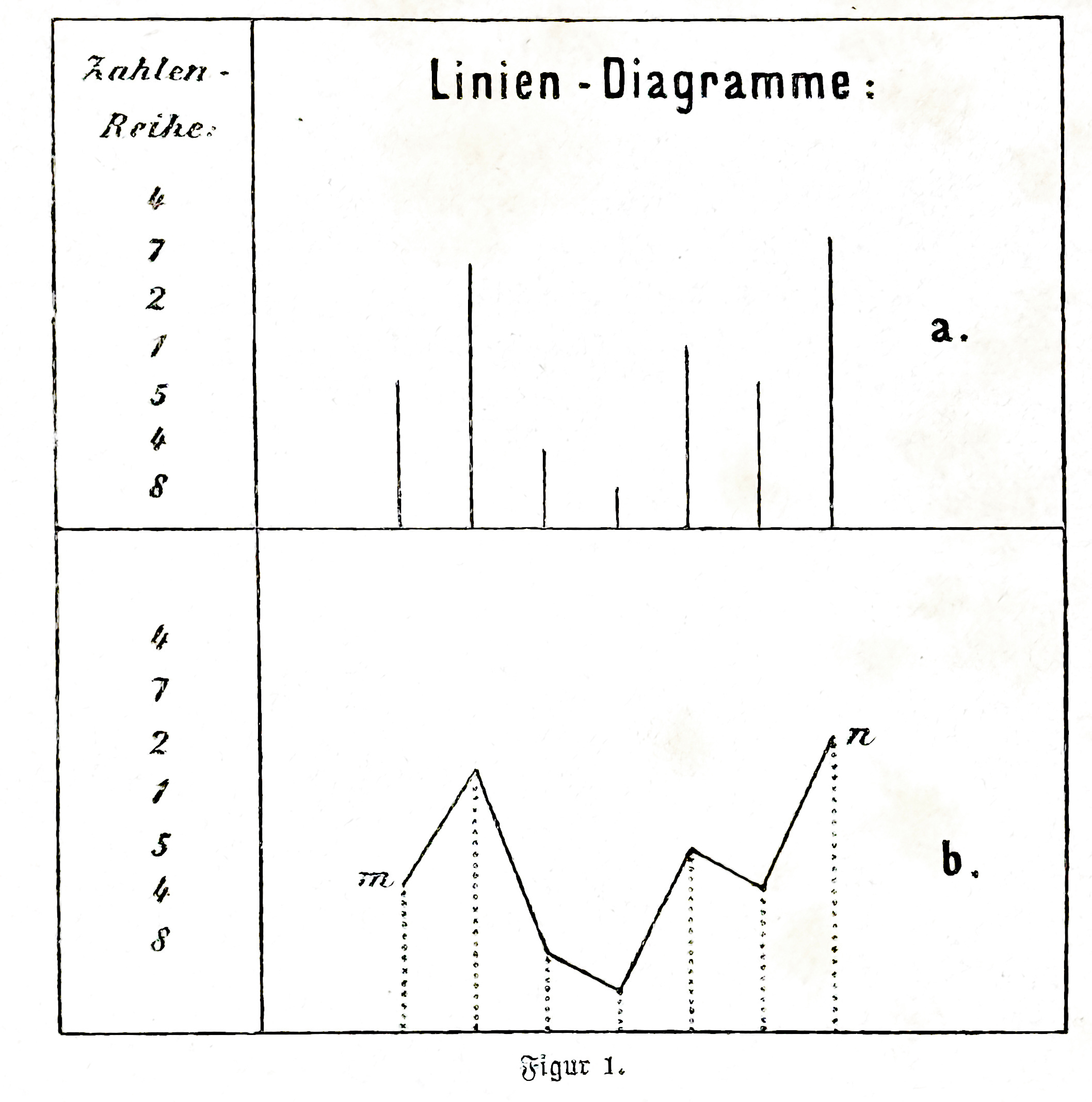
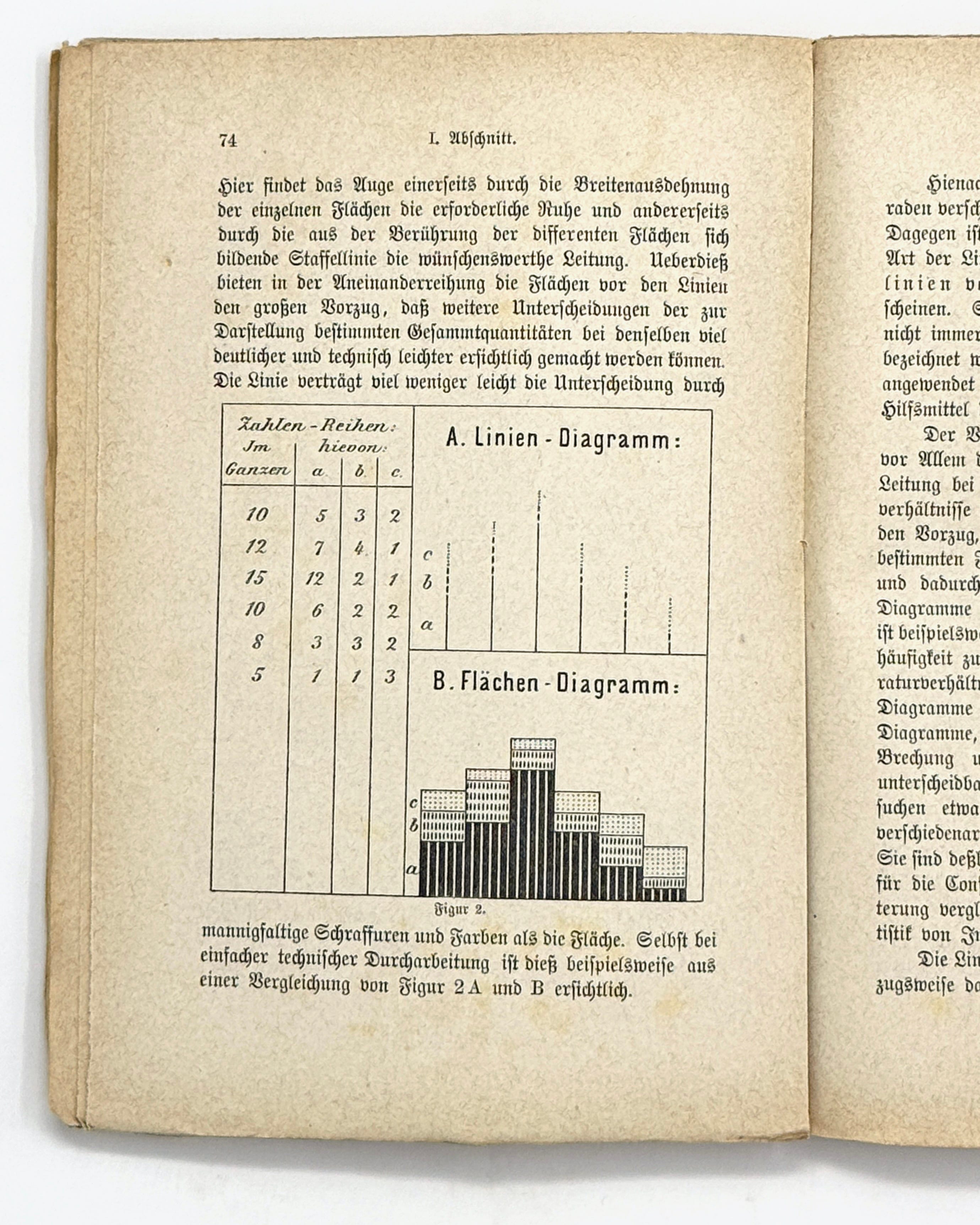
Moreover, it cannot be denied that the method of representation, according to which straight lines of different sizes are placed next to each other without a connecting line, lacks clarity and has a downright disturbing effect on the eye. The eye wanders inactively between the end points of the straight lines, which are at different heights, and it is very difficult to miss the guiding connecting line between these end points. The situation is different if, instead of lines, surfaces that touch each other are lined up.
Here the eye finds, on the one hand, the necessary resting place through the width extension of the individual surfaces and, on the other hand, the desirable guidance through the graduated line formed by the contact of the different surfaces. In addition, the juxtaposition of the surfaces in front of the lines offers the great advantage that further distinctions between the overall quantities intended for representation can be made much more clearly and technically more easily. The line is much less easily distinguished by multiple hatchings and colors than the surface. Even with simple technical elaboration, this is evident, for example, from a comparison of Figure 2A and B.
According to this, the mere juxtaposition of straight lines of different lengths does not appear suitable as a line diagram. However, this is the case with the other type of line diagrams, which appear as the connecting lines of end points of different straight lines. Such line graphs, which are often, if not always with mathematical justification, called “curves”, have been used many times and in an appropriate way and will always remain an important tool of statistical graphics.
The advantage of this type of linear diagram lies above all in the fact that it offers the eye a simple and reliable guide in tracing the ascending and descending numerical relationships. In addition, they have the further significant advantage that they only take up a minimum of the area intended for the graphical representation and thus allow the addition of one or more comparison diagrams in the same linear representation. This is the case, for example, when mortality and birth rates are shown together with grain prices and temperature conditions in a diagram containing four comparative lines. Such comparative line diagrams, which can be made very easily distinguishable by coloring, dotting, breaking and other patterning of the lines, greatly facilitate the detection of any parallelism or antagonism between different factual phenomena. They are therefore of interest not only as illustrations of statistical figures for the consumers of statistics, but also to facilitate comparative research for the producers of statistics.
The line diagrams of the type just mentioned are preferably used where it is a question of illustrating simple members of statistical series of figures which contain no internally varying structure and move in regular sections, e.g. to show the price history of certain commodities, the annual movement in the number of deaths, crimes, etc.
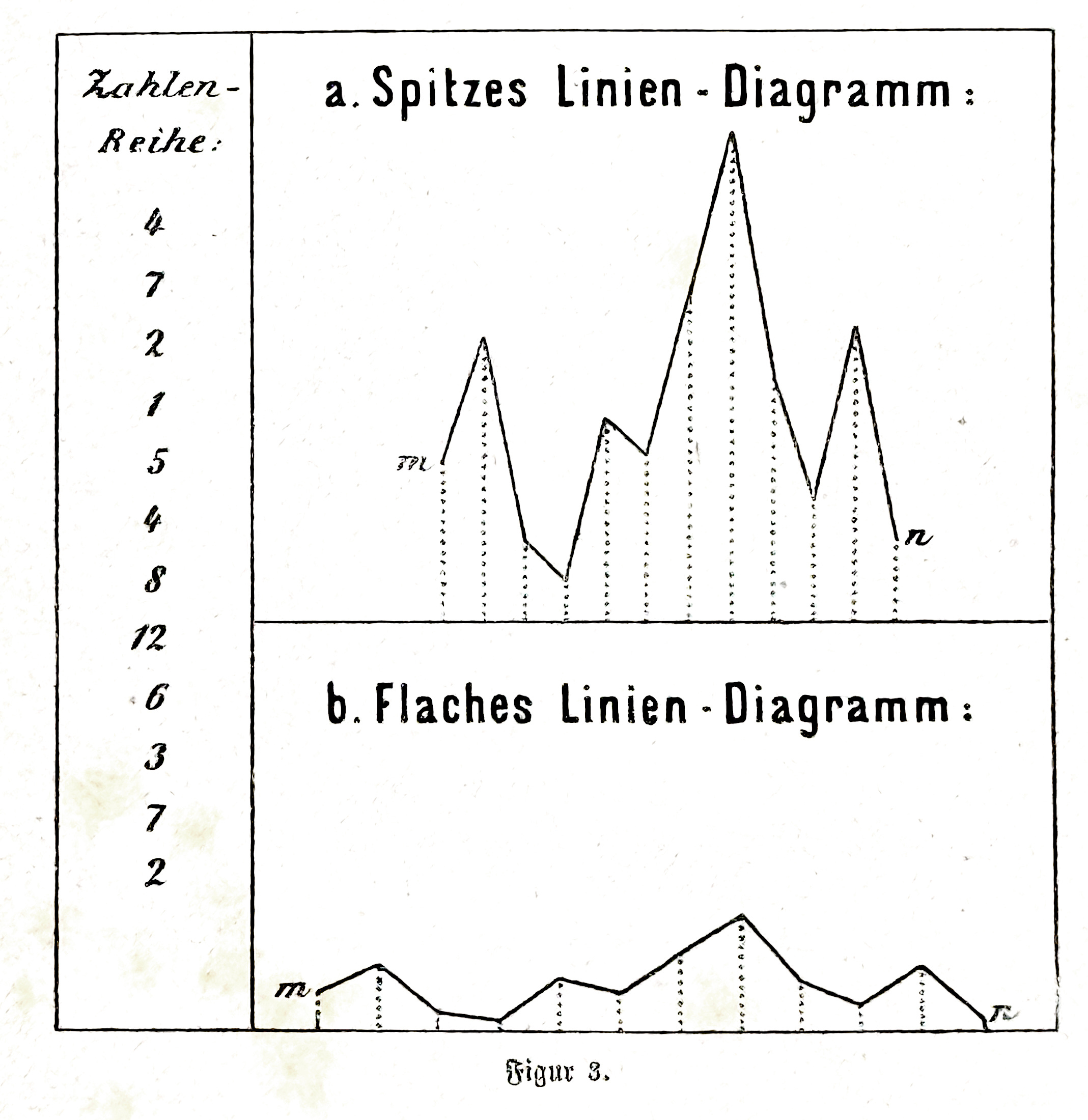
A drawback of line diagrams is that there is no fixed internal relationship between the width and height of the overall representation. It is completely arbitrary how far the distance of the straight lines, which are chosen for representation by themselves or by connecting their end points, is taken.
The effective height of this straight line is just as arbitrary. In the first case, only the equality of the initially arbitrarily determined distance is required, and in the second case the proportionality of the initially likewise arbitrarily determined height. From this it follows that the same statistical series can be represented in a number of externally more or less dissimilar diagrams. If we pay particular attention to the diagrams shown in connecting lines, we can see how a “spiky” or a “flat” line diagram can be chosen with completely the same mathematical justification. Figure 3 gives an example of this.
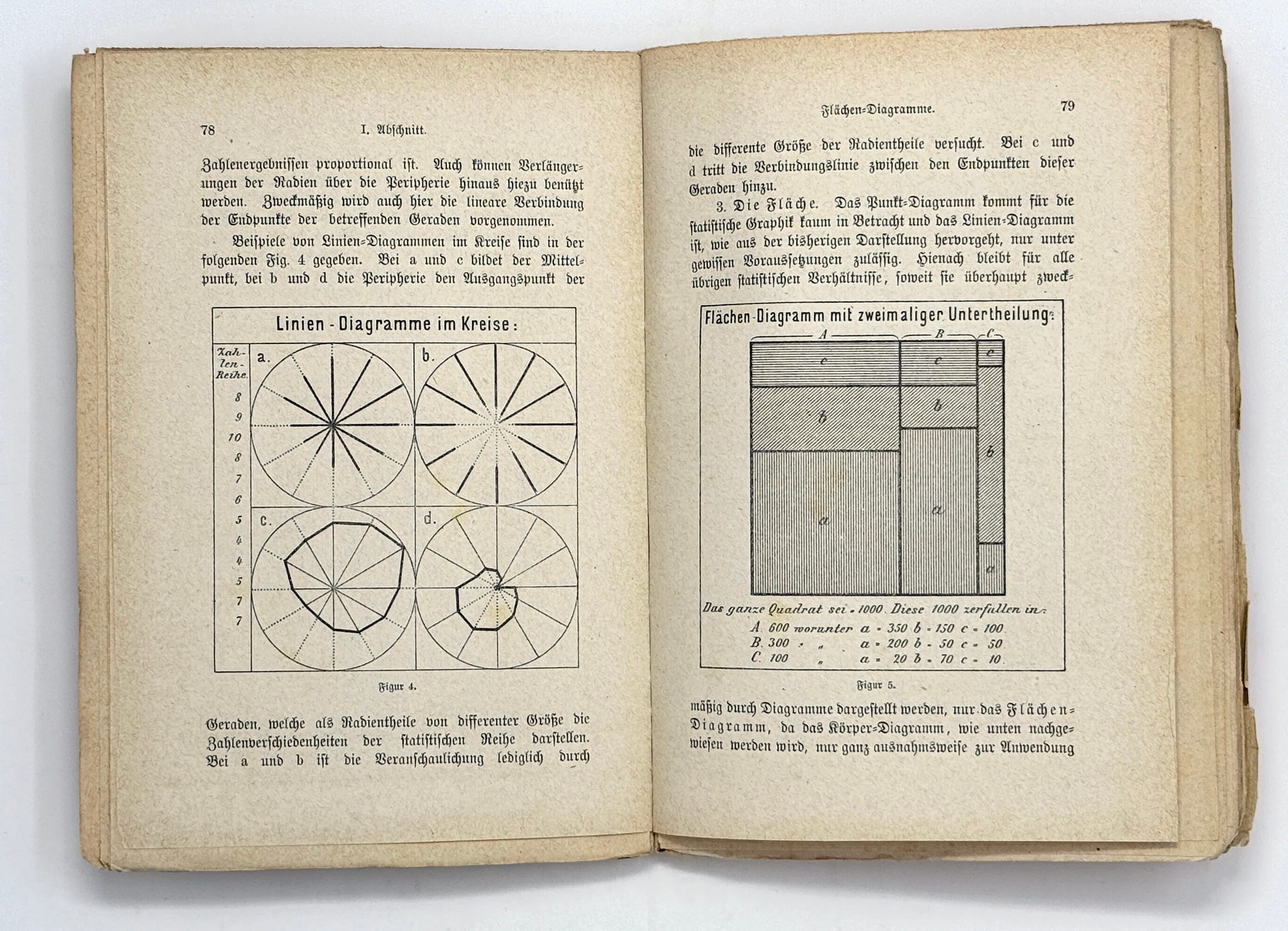
In the previous discussion of line diagrams it has been assumed that a straight line forms the basis on which the lines proportional to the numbers are constructed perpendicularly. However, this is not necessary in itself; rather, any curve could be chosen as the base. Of course, the clarity of the representation would then suffer greatly, so that in practice the straight line will always retain the upper hand. Only another type of line, namely the circular line, can make some claim to consideration under special circumstances. The line diagram drawn in a circle can be used with some justification to depict relationships that actually represent a cycle. This is the case, for example, when mortality by month is not to be shown for a single calendar year, but according to the average of an annual series. In this case, January is in fact as close to December as it is to February, which can only be achieved by plotting in a circle, but not on the basis of a straight line. Fractions of the radians, measured from the center or from the periphery, represent the straight lines whose size is proportional to the numerical results. Extensions of the needles beyond the periphery can also be used for this purpose. The linear connection of the end points of the relevant straight lines is also useful here.
Examples of line diagrams in a circle are shown in Fig. 4 below. For a and c the center, for b and d the periphery forms the starting point of the straight lines, which represent the numerical differences of the statistical series as radius parts of different sizes. In the case of a and b, the illustration is only attempted by the different sizes of the radius parts. For e and d, the connecting line between the end points of these straight lines is added.
3. The area. The dot diagram can hardly be considered for statistical graphics and the line diagram, as can be seen from the previous presentation, is only permissible under certain assumptions. Accordingly, for all other statistical relationships, insofar as they can be usefully represented by diagrams at all, only the area diagram remains, since the solid diagram, as will be shown below, can only be used in only exceptional cases and is of no special significance for the statistical literature.
An essential advantage of the area diagram, as already indicated in the criticism of the line diagram, is that it permits the exact representation of the inner structure of the statistical relationships. However, the detail to be distinguished in the representation must not be too manifold, otherwise the same defect occurs here as with line diagrams, in which too many lines of comparison cross each other.
The conditions under which area diagrams appear appropriate are as follows.
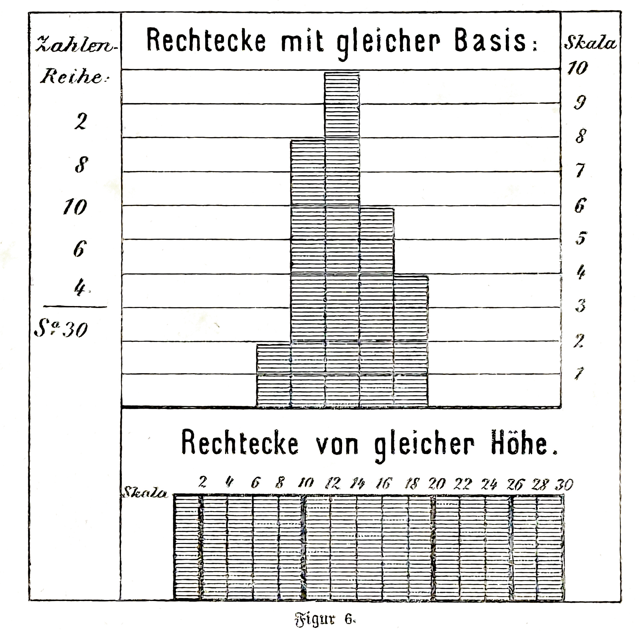
Only simple figures may be chosen. For individual overall facts whose subdivisions are to be shown, it is advisable to use squares, which are divided into rectangles according to the subdivisions. Fig. 5 [above] shows a sample area diagram with two subdivisions.
If several statistical facts are to be compared graphically by means of surface representation, the use of rectangles appears to be the most suitable. For this purpose, rectangles with the same base and different heights or rectangles with different bases and the same heights can be chosen. The first of these methods of representation is the more descriptive, as can be seen from a glance at Fig. 6 [below]. It is closely related to the line diagram and can be seen everywhere, with particular advantage when it is necessary to visualize statistical subdivisions. This type of area diagram is therefore widely used in practice. It is desirable, and greatly facilitates the detailed study of these diagrams, if one square of the net, in which the upright rectangles are drawn, corresponds to the unit or a multiple of the statistical ratios shown, falling within the decimal system.
Figures other than rectangles can only be used in area diagrams in exceptional cases.
As far as the triangles are concerned, they could be used in series instead of the rectangles with the same base that follow one another, since they behave like these rectangles in terms of their area. However, a test (Fig. 7) shows that the rectangles are clearer and that the correct estimation of the height of the triangles is made somewhat more difficult by the size of the lines and the unequal angles.
However, the greatest reservations arise against the series of triangles when the representation of the inner structure of the statistical facts comes into consideration. While this is extremely simple and easy to understand in the case of rectangles, it requires extensive geometric calculations in the case of triangles and therefore makes the estimation of areas extremely difficult.
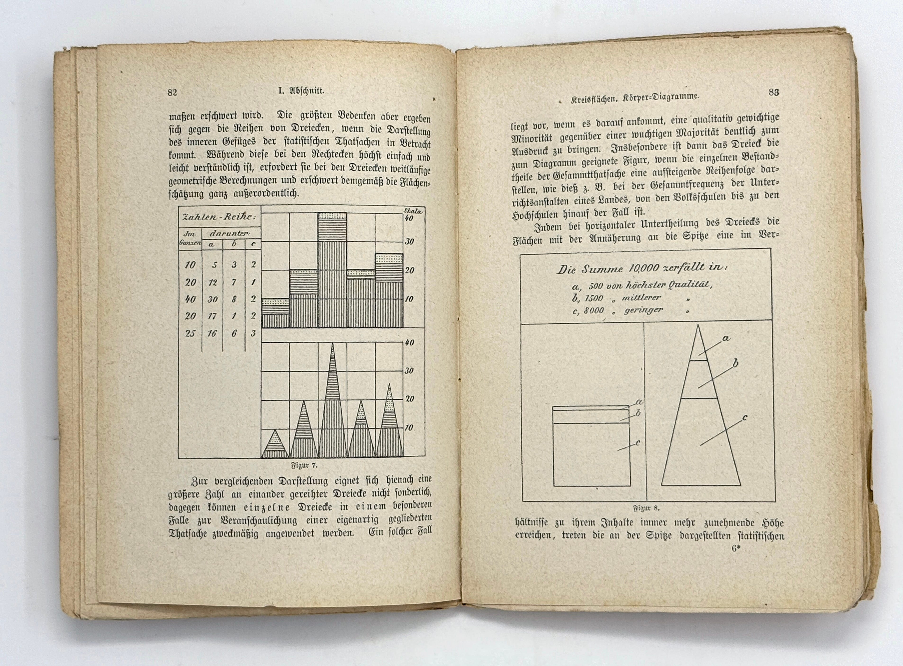
A large number of triangles in a row is not particularly suitable for comparative representation, but individual triangles can be used in a particular case to illustrate a peculiarly structured fact.
Such a case exists when it is important to clearly express a qualitatively important minority in relation to a massive majority. In particular, the triangle is the most suitable figure for the diagram when the individual components of the overall fact represent an ascending order, as is the case, for example, with the total number of educational establishments in a country, from elementary school up to universities.
By subdividing the triangle horizontally, the surfaces reach an ever-increasing height in relation to their content as they approach the spike, the statistical relationships shown at the apex become particularly clear without the proportionality of the surfaces being affected. If one were to represent the same thing in a square, the qualitatively significant but quantitatively small minority would almost completely disappear. By choosing the triangle, statistical graphics succeed in such special cases in achieving something more than merely converting numbers into areas. Fig. 8 [above], which shows the same composition of a complete fact in a triangle and in a square, serves as a model for comparison.
If rows of rectangles or triangles are chosen as diagrams, they are constructed on a straight line, usually a horizontal line. The polygon can only be used as a basis for concentric or outward-facing triangles in exceptional cases. This form of representation is internally justified in the same cases in which the line diagram can be selected in a circle. Examples of this are shown in Fig. 9.
It is not practical to use circular areas for the comparative representation of statistical relationships because the circle, despite its regularity, includes an area that is difficult to estimate. It seems more appropriate to subdivide the circle into circular sections to show the statistical division of a whole.
From a technical point of view, it should be noted that area diagrams allow the most extensive use of color and hatching to distinguish individual diagrams and their sub-areas. In particular, a careful combination of color and hatching makes it possible to express multiple relationships in one diagram. Care must be taken, however, that the diagram does not become artificial and incomprehensible.
4. The solid. If it is important to visualize statistical relationships in a rather rough way, the choice of the solid as a diagram can be useful, e.g. for exhibitions. For literature, however, this type of diagram is out of the question, since it is not possible to enclose boxes with the books, which are intended to popularize statistics in wooden cubes.
[Text proceeds from here to discuss maps.]
Georg von Mayr (1841-1925) was a Bavarian economist known for his expertise in administrative and bureaucratic statistics. He is know for a novel bivariate map, mosaic plot, and early polar diagrams including a series of star plots.
Read Mayr’s original German text at https://archive.org/details/diegesetzmssi00mayr/page/70/mode/2up
Thanks to Francis Harvey (Leibniz Institute for Regional Geography) for reviewing my translation. Translation ©2025 RJ Andrews. All rights reserved.
About
RJ Andrews helps organizations solve high-stakes problems by using visual metaphors and information graphics: charts, diagrams, and maps. His passion is studying the history of information graphics to discover design insights. See more at infoWeTrust.com.
RJ’s book, Info We Trust, is currently out now! He also published Information Graphic Visionaries, a book series celebrating three spectacular data visualization creators in 2022 with new writing, complete visual catalogs, and discoveries never seen by the public.