Honest Peacocks
Creating extravagant charts, the kind that require loads of talent and resources, is one of the best ways to convey the importance of a story.
Welcome to Chartography: insights and delights from the world of data storytelling. This week I have some historic-themed sundries and the fourth installment of How to Value Data Graphics. Enjoy!
Sundries
🛠️ After many dormant months, I have returned to my Charts! experiment reviving analog excellence for the digital web. Below, notice the hollow red bars, which indicate a sub-group and are labeled by their relative percentages.
Plus, don’t miss how the text styling emphasizes thousands-numerals to make each value more legible. Here’s what that looks like under the hood:
The combined effect of color, mark, text, and innovative features creates a coherent proclamation unseen in other data graphics. See the recreation of Davis Trietsch’s bar-within-bar wonder at infoWeTrust.
📚 We have new beautiful photography of our Information Graphic Visionaries books. They will appear soon at Visionary Press, from where we continue to ship books all over the world (this week Wichita, Lima, Prague, and Quebec to name a few!).
💷 My exploration of old information-graphic covers of The Economist continues. Here’s a recent favorite:
I am currently touring the 1990s and seeing Economist covers that resonate with today concerning the role of NATO, Russia’s lingering threat, and the danger of global warming. Explore the growing list (nearly 100 covers) on Twitter.
📸 A stack of how-to-chart textbooks published from 1910 (bottom) to 1950 (top). This collection is a sample of many instructional charting books produced in the first half of the 20th century.
The most revered of these are the two Brinton books, particularly his self-published Graphic Presentation (1939), and Karsten’s Charts and Graphs (1925).
How to Value Data Graphics, Part 4
After introducing this essay series about the value of data graphics (Beyond Insight), we examined background charts (All Rhyme No Reason) and attention-attracting charts (Graphic Sirens).
Today, I present my third essay considering how charts create value before being read.
Honest Peacocks
Signaling theory helps us understand how agents credibly convey information.
In sexual selection, signaling explains seemingly maladaptive traits such as a peacock's large tail, which is expensive to grow and limits his ability to dodge predators. The cost is the point: only a peacock of greater biological fitness can maintain an impressive tail. The tail provides a peahen with information that would be otherwise hard to come by.
Charts say things that can be understood without actually reading the chart—information that has nothing to do with their data. These signals are often the dominant reason a chart is used. They can often be better conveyed by charts than other information media.
The presence of a chart is a credible signal of the mere existence of data. How else can you quickly prove that you’ve got the goods? Some charts, such as network graphs, often cannot say anything beyond We have data, a lot of it.
(In my experience, network graphs are mostly instantiations of Roger Hargreaves’s Mr. Messy, big on complexity but small on insight.)
Data graphics can also help convey the culture of the signaler. The addition of a statistical chart is an outward statement about being analytical, data-driven, or scientific. A graph says Look at me, I am STEM. A reader can sense the nature of an article before even reading the headline if they see that the publication includes a chart.
American politician Katie Porter has used tables and charts to great effect during her live presentations to the U.S. Congress. But her lasting impact is not one of conveying any enduring insight. The overall effect is creating a persona of Porter as someone who is rational, sharp, and someone who knows the data. (Unfortunately, that’s a rather distinguished character.)
In organized religion, participants signal their belonging with irrational expressions. Belief cannot be proven, and that gives belief power. If it made sense to believe, then everyone would do it. At the extreme, religious in-group signaling can manifest as costly acts such as water deprivation and snake handling. The cost is the point: A genuine expression of devotion fosters group cohesion.
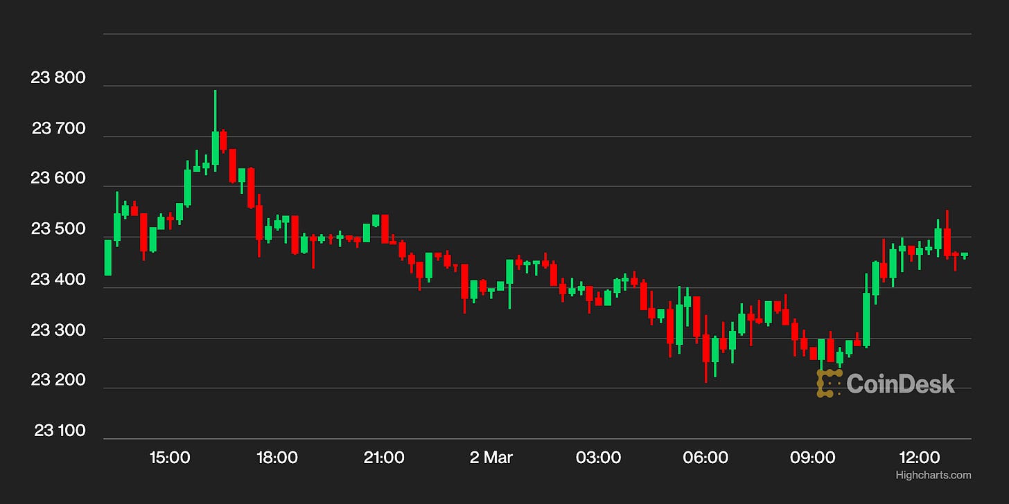
Some weird (i.e. inferior) chart designs persist as part of in-group cultures. We can see this in stock-trading’s candlestick charts, financial statements that go right-to-left, and academic publishing’s color legends (instead of labeling marks directly).
Like modern religious dietary practices, vestigial chart designs were born under different norms and constraints. What was practical then survives to today because of tradition. Outdated formats persist as displays of proper conformity to the in-group analytic culture.
A more precise way of understanding the peacock’s tail is through the handicap principle: Fitness is indicated by wasteful signals that handicap the signaler. The cost is what makes the signal credible. An effective signal should be well-correlated to the signaler’s inherent quality of interest, accessible by target audiences, and impossible for low-quality signalers to fake.
In humans, hunters will target large game that are not calorically efficient compared to an alternative food source such as gathering shellfish. Gathering shellfish gives a confident return on time invested, and that’s the problem: Gathering shellfish is not a good signal of the hunter’s phenotypic qualities. A successful big hunt is a wastefully extravagant signal about a hunter’s eyesight, coordination, strength, knowledge, endurance, or bravery—none of which are particularly required to gather shellfish.
The handicap principle applies directly to data graphics: Creating extravagant charts, the kind that require loads of talent and resources, is one of the best ways to convey the importance of a story. This is why an organization may invest in an interactive contraption. You might be able to convey the same insight with a block of text, but it would not carry the same meaning. Haters who say that the bespoke visual should have been a bar-chart miss the real purpose of the performance: To let the audience know how worthy the story is of their attention.
In general, people are impressed by any visible extra effort that goes into a product.
—Rory Sutherland, British ad executive
The chart’s importance can be appreciated if the audience perceives you have sunk a lot of resources into it. There is a bit of a paradox here: Making an irrational investment in the show is a rational way of conveying value. Every time I pursue a project scope that seems a little irrational, I am bolstered knowing that it may be the crazy effort that helps it succeed. From this vantage, chasing crazy is a worthwhile pursuit.
When it comes to rational storytelling, I believe extravagant data graphics is one of the few tools we have to inform audiences that their attention will not be wasted.
Going Forward
This is the last entry about the value created without reading data graphics. Internally, I organize these three essays with emoji:
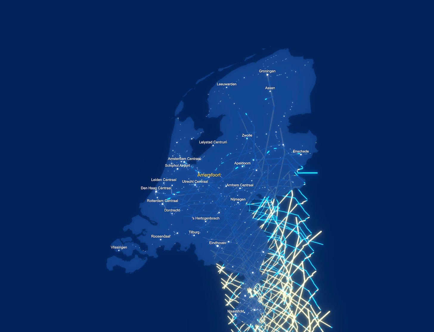
In 2019, Dutch Railways published their annual report. It included an interactive by Jan Willem Tulp that revealed the train schedule of a typical working-day in the Netherlands.
Here’s one frame of the project, which works by showing each slide of time on a map, and then drops those slices below the map to create a 3-D record of the day’s train travel.
The resulting glowey object is quite stunning.
I caught up with Tulp to ask him about my hunch that his project was all about audiences seeing, not reading, his beautiful work:
RJ Andrews—[it] fills a space, attracts attention, is an outward symbols of costly effort—like a peacock’s tail. The statistical informing/insights is not the #1 goal.
Jan Willem Tulp—That's exactly right. As a matter of fact, that was the explicit project brief. The idea was: everybody has to write annual reports, nobody reads them, so we need something cool on that page so that people at least visit that page... that was it!
The next section of this series concerns four values from reading charts. (I might pair them into two total essays.) As a teaser, I am thinking about the value of reading data graphics with these emoji:
Until next time. Onward!—RJ
Notes
You don’t have to collect rare books to enjoy historic how-to-chart tomes! Visit the Internet Archive for Graphic Method for Presenting Facts and Charts and Graphs and Graphic Presentation.
The candlestick chart emerged from Japanese rice trading of yore and came to America in the 1990s. It is a chart type that is not seen outside of finance. Learn more at Wikipedia.
Play with Jan Willem Tulp’s interactive for Dutch Railways by clicking the modal link on this page.
About
Data storyteller RJ Andrews helps organizations solve high-stakes problems by using visual metaphors and information graphics: charts, diagrams, and maps. His passion is studying the history of information graphics to discover design insights. See more at infoWeTrust.com.
RJ’s recently published series, Information Graphic Visionaries, a new book series celebrating three spectacular data visualization creators. With new writing, complete visual catalogs, and discoveries never seen by the public. His first book is Info We Trust, How to Inspire the World with Data.


