
Human-Centered Workflow for Hundreds of Icons
A handmade system for colorful Isotype-style pictographs.

Welcome to Chartography.net — insights and delights from the world of data graphics.
I’m designing a Maps for Kids poster that plots 200 foods by macronutrient composition. Each mark is a tiny picture—so I need hundreds of symbols that read at small sizes, keep stylistic cohesion, and still feel exciting.
Here’s my hand-to-digital system that makes that possible.
Style Inspiration
Isotype is my primary reference for Maps for Kids. Their symbol style, crafted by Gerd Arntz, features hand-cut silhouettes—bold, chunky masses with nicks, wobble, and tiny printing artifacts that give them a tactile feel. Proportions are slightly volumetric, in profile or ¾ view.
Here’s a selection of Isotype and Isotype-inspired food icons from around the 1930s I assembled as reference:
Compared to modern Noun Project-style icons, Isotype is less sterile and less geometric, with varied line weights, irregular edges, and specific, narrative detail that conveys materiality and category at a glance.
Design Constraints
I’m not trying to imitate Isotype pictographs exactly. My needs and goals are a little different:
Show hundreds of different symbols at once (Isotype only used a few in one composition)
Each symbol is printed relatively small
Each symbol can have more than one color to help differentiate them and make the poster more exciting
The Isotype qualities I aspire to are roughness, handmade feel, and occasional ¾-perspective.
Workflow
After attempting a digital-only workflow, I developed a process that originates with pencil sketches, continues with marker fills, and then proceeds to Photoshop to separate and clean color layers before choosing specific colors. The easy trick to get a handmade feel continues to be … make it by hand.
Here’s what the progress looks like for my watermelon symbol:
But a single symbol isn’t enough.
I need to do this for hundreds of foods in a way that maintains style while also differentiating each food. (Yeah, I briefly tried to use AI to do this. It couldn’t. I also considered stock image libraries.)
Here are the first pencil sketches. Each was made while looking at “studio lighting” photography of real food.
Below are the marker fills for the same illustrations.
You can see early attempts with blue and gray markers on the first page. I quickly learned that black-red-yellow markers separate nicely and stuck with them for the rest.
The marker fills are rough and full of wobbly lines. In a word, human. Perfect!
These illustrations are the primary ingredient to my digital workflow. But I’m not publishing a red asparagus—my icons need another ingredient: color.
Color System
Isotype symbols rarely had more than one color. Marie Neurath described in Instructural Science 3 (1974):
Colours are also part of the visual language. Their meaning is often traditional, but often we had to introduce our own traditions. We tried not to use too many colours with too many meanings, as pictures should be read easily and also remembered if possible; too many colours would confuse. … We tried to adhere more and more to the rule that even in black and white a chart could still make sense.
I developed a color palette based on historic Isotype colors. Its swatches are below: Columns are hue families; rows are value from dark (top) to light (bottom). Background swatch approximates the poster’s field.
Why so many greens? I need several options to help detail all the leafy vegetables.
Having a consistent color palette helps me move quickly—I never have to think about which red I should use. It also helps the overall composition hang together because all of the icons are colorfully associated.
Coloring is done with masked color fill layers in Photoshop. This let’s me quickly eyedrop colors from my palette. Notice the layered use of masks.
Photoshop detail: I made fill layers from the scanned marker illustrations by: selecting color range, and then modifying selection with smooth (2px), expand (2px), and adjust levels to get rid of any color ghosts.
Toolchain
The color palette is a living document (Illustrator) that live links to the icons (Photoshop) which live links to the poster composition (InDesign). Here’s what my system looks like:
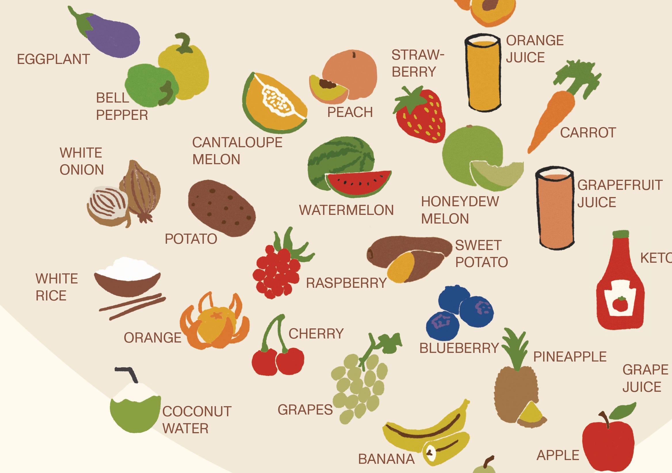
And here are the icons so far. Not quite 200, but we are getting there!
I’m developing these as quickly as I know how, and it still feels slow. Perhaps not artistically slow, but economically slow.
Is this level of effort worth it? Looking forward it hardly ever does. It seems like there’s a waterfall of content out there more quickly produced that will garner much more attention. But looking backward at a dozen years of nifty projects, I’m glad I always put in the work.
Critique
Seen together, I spot a few symbols that may need more love: that spinach leaf needs a second color, I don’t like the heavy lines on the juice box, the onion needs another try.
But overall I’m pleased with the result. It’s not Isotype, it’s its own thing. And that’s good.
The symbols also do not have to do all the lifting: on the composition, the icons will be accompanied by labels too. I’m still playing with label size and color.
I’m also considering distinguishing the labels for any foods that get more than half their energy from a special carbohydrate: sugar. Perhaps by changing their label’s color?
By now, you may have noticed that my symbols lack protein and fat. That’s because they are nearly all carb-heavy foods. Let’s see how they all look laid out on the carbohydrate corner of the ternary diagram.
