Inspector Explorer
Data graphics create value by allowing us humans to interface with machine technology. They allow us to see what’s happening in ways otherwise impossible.
Welcome to Chartography: insights and delights from the world of data storytelling.
This week we begin with a special invitation to a Susan Schulten lecutre + other sundries before the fifth installment of How to Value Data Graphics. Enjoy!
Sundries
🎟️ Susan Schulten, editor of Emma Willard, Maps of History, is presenting to the Chicago Map Society this week, Thursday March 16. I am able to share with you a non-public registration link so that you can enjoy her tour of Emma Willard's spectacular world: Registration Link
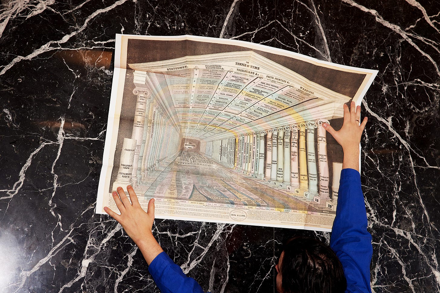
See more of Schulten’s book—which includes a full-scale reproduction of Willard’s Temple of Time, perhaps the most stunning timeline ever produced—at Visionary Press.
🎧 Hear me chat Information Graphic Visionaries with Alberto Cairo and Simon Rogers on the The Data Journalism Podcast. Listen wherever you pod. Spotify link
🥧 Happy Pi Day to all who celebrate. I have re-presented one of my favorite charts of all time, a polar diagram from A Graphic Analysis of the Census of Manufactures (1923) by the National Industrial Conference Board. It boasts rich textures and polar-coordinate text (easy to describe in words, relatively hard to implement). See the full chart at infoWeTrust.
📺 Kirby Ferguson completed his film series Everything is a Remix with a bang. His final installment is a beautiful accounting of what’s happening with A.I.-enabled creativity. It ends with an uplifting message to go make your thing and a reminder that "collective creativity—human genius is not individual, it is shared." Watch it on YouTube.
How to Value Data Graphics, Part 5
After introducing this essay series about the value of data graphics (Beyond Insight), we toured how charts create value before being read. We examined background charts that furnish space (All Rhyme No Reason) and attention-attracting charts (Graphic Sirens).
The most recent essay was about how charts signal value (Honest Peacocks). Since publication, I have updated this essay with examples from Katie Porter and Jan Willem Tulp.
These three essays covered a broad spectrum of values with a “pre-attentive” or “primary attention” lens: Charts can stimulate value without requiring conscious effort from their audience. In my consulting experience, these are the never-mentioned reasons we keep using charts.
The next set of essays relates to our audience’s engaged concentration (sometimes called “secondary attention”). Let’s think about reading charts.
The ABCs of Reading Charts
What do we get by actually reading charts? We get informed, of course.
Information is valuable. But merely becoming informed is not valuable in any immediate way. Memorizing all of the world capitals does not increase your bank account. A transformation of the mind often remains stuck between your ears.
To be valuable, information needs to effect some behavior with the outside world. This includes encouraging us to do nothing, which can be valuable too.
We can measure the value of using (and withholding) information through downstream effects like improved decision-making, product innovation, risk-reduction, and competitive advantage.
But charts, and the information-cultures that charts encourage, are rarely the only source of these downstream effects. Recall: We can know that Florence Nightingale’s sanitary movement saved a billion lives. But we cannot know how many of those lives were saved by any one particular diagram.
We do not have practical ways of measuring the general impact of reading charts because their use is highly-context dependent. We are able, however, to generalize the ways in which charts are read.
I am playing with reading charts as a value-creating act via the following four topics:
The boundaries between these four modes are admittedly blurry and overlapping in many use cases, as today’s examples illuminate.
Inspect Machines
Data graphics create value by allowing us humans to interface with machine technology. They allow us to see what’s happening in ways otherwise impossible. Your car’s speedometer dial tells you information, graphically, that you could not intuitively feel with the same accuracy or precision.
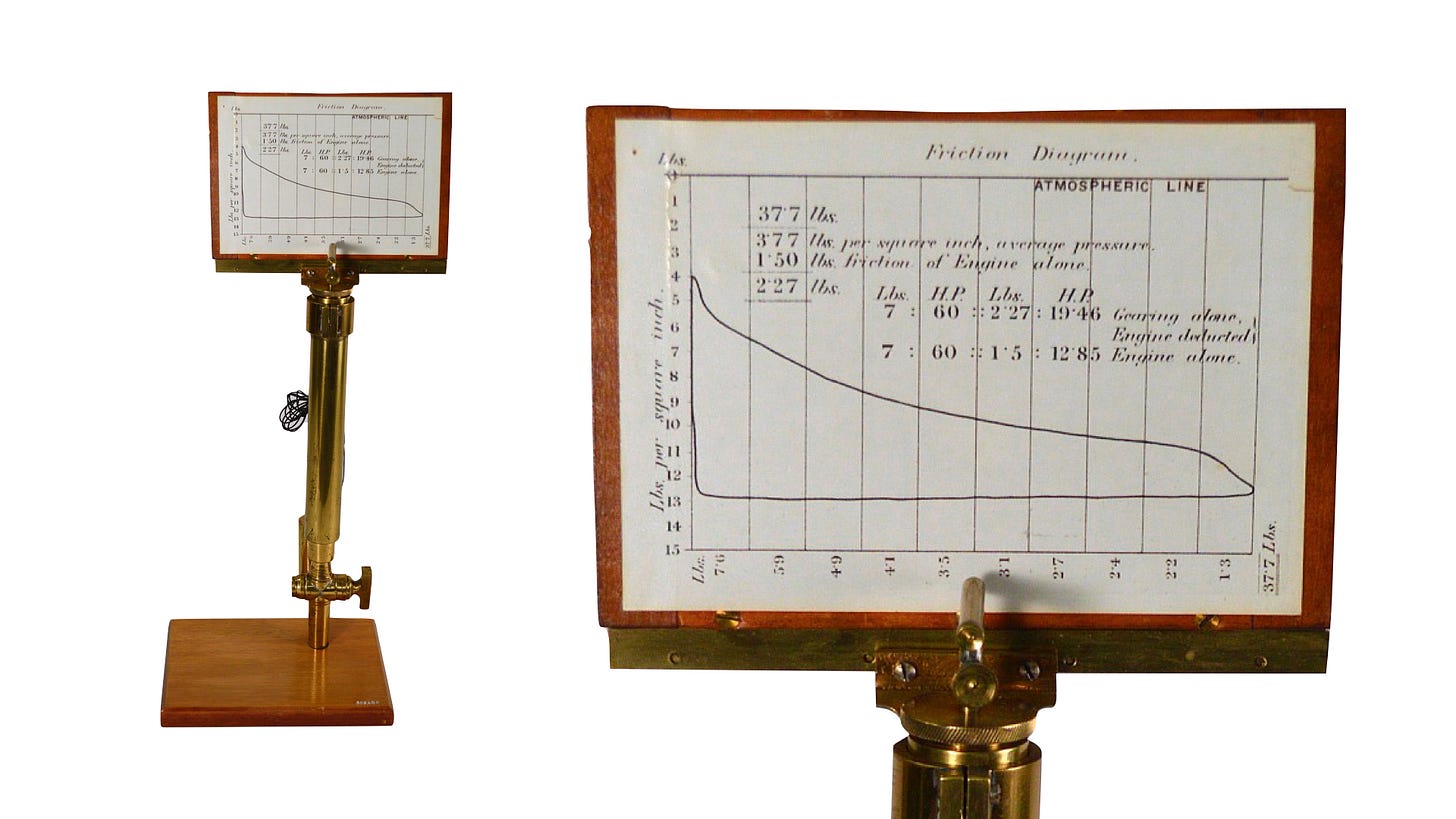
Have you heard of the secret graphic that auto-magically illustrated the steam-engine stroke cycle for James Watt?
Watts’s “indicator” mechanically drew cylinder pressure versus piston displacement by attaching a stylus to the top of the reciprocating piston head. From the Smithsonian:
A weight attached to the tablet via a pulley caused the tablet to move back horizontally as the engine’s piston returned to its original position. The result is a steam pressure-volume diagram which is used to measure the efficiency and other attributes of the steam engine. The introduction of this steam indicator in the late 1790s by James Watt had a great impact on the understanding of how the steam behaved inside the engine's cylinder and thereby enabled much more exacting and sophisticated designs.
The indicator diagram allowed Watts to see—to know—what was happening inside the engine. It was a live window to the machine that enabled downstream insights and improvements to engine efficiency that would have otherwise come very slowly. It showed the way to industrial modernity.
Today, we similarly use charts to inspect and develop our machines, especially our digital contraptions. At the first encounter with fresh data, charts can help assess data quality and guide us through its preparation for analysis.
Most fantastically, charts are being used to inspect the workings of machine learning technology, such as this playable neural-network model by Daniel Smilkov and Shan Carter.
A real example of a chart helping understand a specific machine learning technique is below. Shared with me by Zan Armstrong, it shows with position and color how results improved (blue) or worsened (red) when one factor (data augmentation—AUG) is switched off.
As an engineer, I consider data inspection to be all about using charts in tight iterative loops alongside machine development.
Explore Data
Once the machinery is set, once the data is cleaned, analysis can rise above inspection to focus on what the data has to say. Let’s distinguish this mode as exploring data—an iterative mode that is interested in interacting with the machinery, but not changing it.
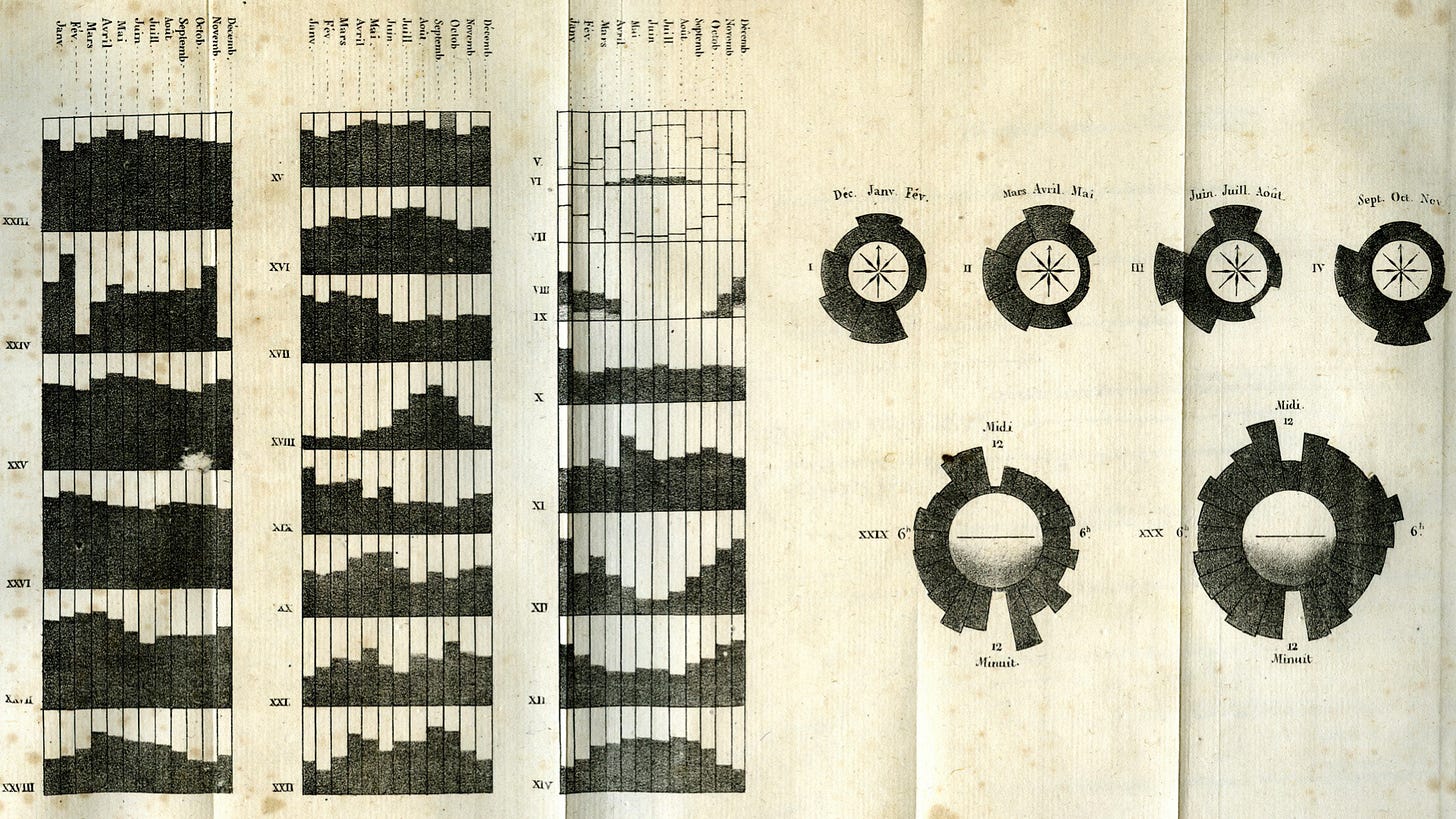
The 1820s saw early waves of large national dataset publications, first in France and then in England. Data explorers scoured these publications for meaningful relationships. For example, Did an increase in a sector’s education correspond to a drop in violent crime? The search for patterns across datasets was conducted without fancy mathematics like regression analysis—which wasn’t popularized until much later.
Without abstract analytics, the data explorers turned to data graphics: often bar charts and shaded choropleth maps. Comparing criminology and public health “moral statistics” to weather data was a popular venture. Below is an 1829 foldout from André-Michel Guerry that features sets of bar charts aligned for easy comparison.
Today, thousands and thousands of data dashboards are created in a similar effort to see what the data has to say. Most of these views are secret windows, just like Watts’s indicator, kept hidden behind company NDAs. They are built with charting software from Salesforce and Microsoft and others.
But it’s not all secret. Some of these views are designed to encourage public exploration of national datasets. Newspapers, NGOs, and governments all publish friendly interactives that guide readers to filtering and detailing data. Aesthetically and functionally, they are a lot like Guerry’s 1829 foldout.
Going forward
We will next bridge from exploring data to discovering data with the help of John Tukey.
Until then. Onward!—RJ
Notes
Concerning information and value creation: There is an argument for becoming broadly-informed as being essential to creating collective value, such as sustaining a functional democracy. But that is beyond our scope today.
The Watts engine indicator shown is a replica from the Smithsonian. Read more about the indicator here.
Play with the TensorFlow neural network by Daniel Smilkov and Shan Carter here.
The ML example is from “Affinity and Diversity: Quantifying Mechanisms of Data Augmentation” link. See more of Zan Armstrong’s machine learning work here.
The earliest form of regression analysis, the method of least squares, was developed by Legendre and Gauss in the early 1800s—but “regression” was not coined and popularized until decades later. Wikipedia
See André-Michel Guerry, “Tableau des variations météorologiques compares aux phénomènes physiologiques,” Annales d’hygiène publique et de médecine légale 1, no. 1 (Paris: Baillière, 1829), 228 –232. To learn more about Guerry, consult Michael Friendly’s papers here.
About
Data storyteller RJ Andrews helps organizations solve high-stakes problems by using visual metaphors and information graphics: charts, diagrams, and maps. His passion is studying the history of information graphics to discover design insights. See more at infoWeTrust.com.
RJ’s recently published series, Information Graphic Visionaries, a new book series celebrating three spectacular data visualization creators. With new writing, complete visual catalogs, and discoveries never seen by the public. His first book is Info We Trust, How to Inspire the World with Data.


