Welcome to Chartography: insights and delights from the world of data storytelling.
I appreciate everyone’s enthusiasm with this series. We are within striking distance of becoming one of Substack’s top-10 design newsletters! It would be quite helpful for you to share Chartography your friends and colleagues who appreciate the importance of information design.
No sundries this week. On with the show!
How to Value Data Graphics, Part 7
Last newsletter discussed using data graphics to discover insights. See that essay (Sketchy Science) to trace back to an overview of the entire How to Value Data Graphics series.
Today, we have arrived at the fourth and final topic related to reading charts.
We may be on the doorstep of a context revolution. This new world would not tolerate simple soundbite models of understanding. Demanding context, we would enjoy nuanced perspectives and rich knowledge. How do we help make that world?
Grasp Context
Understanding context frees us from narrow one-dimensional perspectives.
The single story creates stereotypes, and the problem with stereotypes is not that they are untrue, but that they are incomplete. They make one story become the only story.
—Chimamanda Ngozi Adichie, novelist
From its original meaning of “weaving together” (think textile)—context describes the parts of a discourse that surround and throw light on meaning. If you care about meaning, then you crave context.
Context is the foundation of trustworthy information. As a designer and storyteller, I place context at the base of an information stack:
INSIGHT
COMPARISON
CONTEXT
Insights, like A is a big number, might be able to transmit knowledge. But insights all alone are not particularly engaging, nor are they inherently trustworthy. Lonely insights are effective when an author eloquently articulates something their readers already believe.
Accompanying an insight with a supportive comparison, like A is big compared to B, engages audiences with a relationship that qualifies the insight.
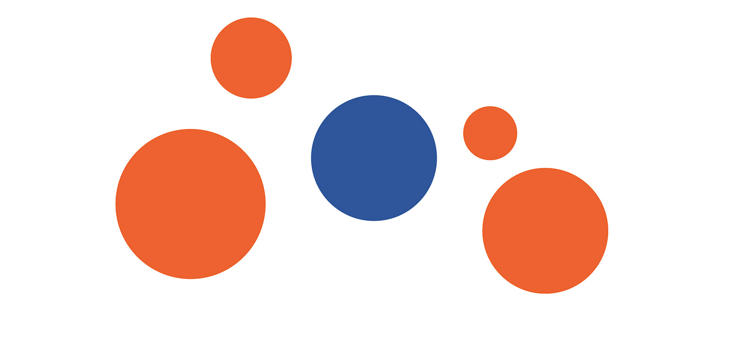
Adding context might present A with a field of its peers. Seeing the entire cohort is not necessary to believe that A is a big number. However, you will appreciate and trust qualities of its bigness that are not possible at the higher levels of insight and comparison.
Now, context will not guarantee absolute truth. But it can help us be more truthful. A field of background marks that supports an insight and seems to be in place assures a reader. It’s easy to give a wrong direction. It’s harder to fake an entire map.
Showing more than the bare-minimum also enhances relevance and reduces misinterpretation. Context situates insights in a web of relationships. The simple blue bar chart has a couple dozen comparison relationships (each pair of bars including A-B and each bar against the overall shape). Maps are not just about determining a route from here to there. Maps let you find your way from here to anywhere.
Giving context gives us more meat to play with. There is more information to design, and more possibilities to create something that might attract and engage an audience. Context envelops insight with meaning.
The three contexts
I have identified three typical contexts that can be incorporated (and combined!) to make information design more effective.
Counterpart context, like the above bar chart, affords comparisons between an object of focus and its peers. You can think of this as “external context” that relates a mark to members of its cohort. Beyond bar charts and bubble diagrams, geographic maps excel at counterpart context, partially because their use of space is predetermined by physical location.
Anatomic context reveals what’s inside. You can think of this as “internal context” that shows the make-up, or guts, of the object of focus. In the case of our big number, it reveals the parts that add up to make it so big. A visible anatomy diagram, which magically shows what’s inside without incision, is the model to keep in mind. Statistically, any part-to-whole diagrams, like packed bubbles and pie charts and tree maps, are common ways of illustrating anatomic context.
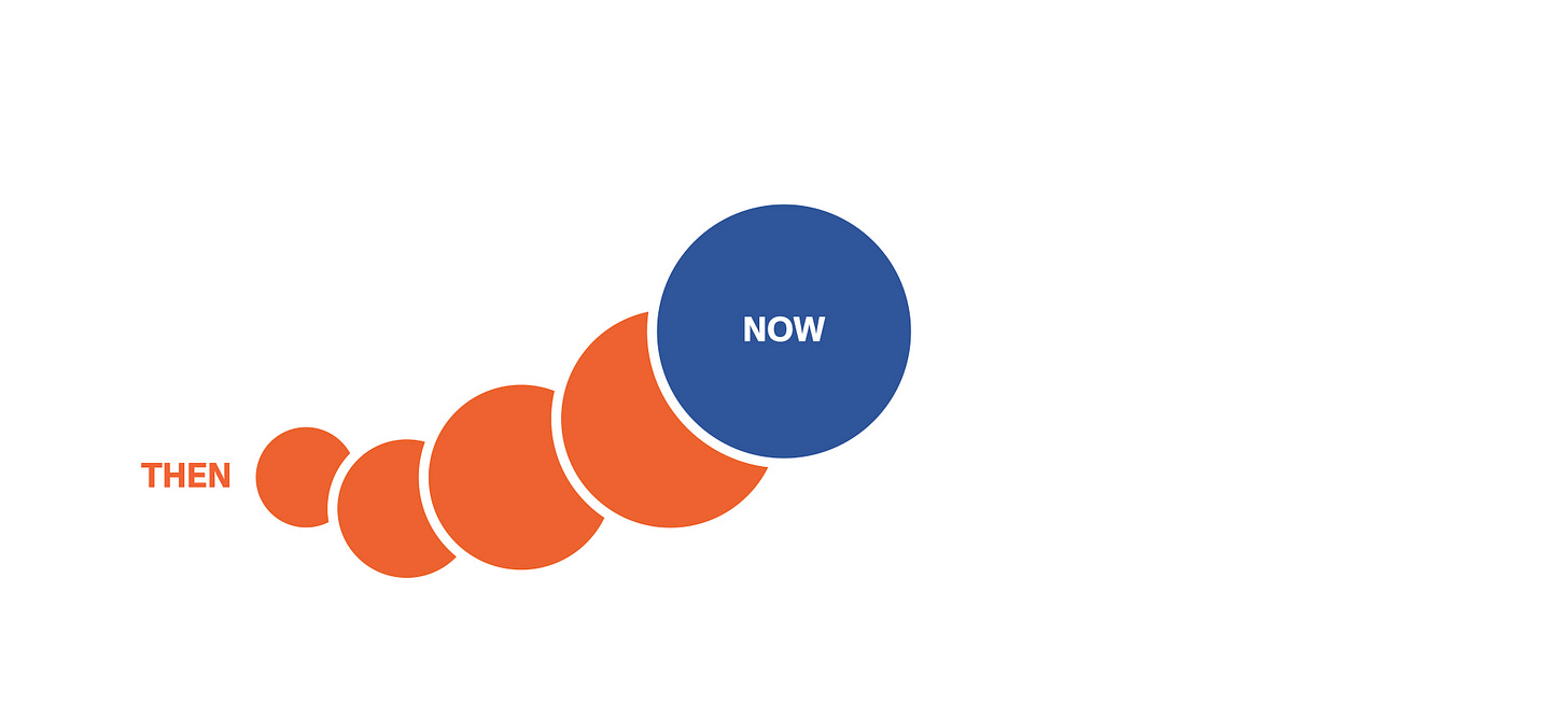
Chronological context answers "how did we get here" by showing the progress over time to now. Data visualization was developed by lifting the lessons of cartography to understand time. A lot of what we do is explain chronological context.
Examples abound for each category.
It’s hard to find a popular data graphic that doesn’t beam with some sort of context. Context is our secret super power, the aspect that data graphics can do better than all other forms of information media. Clever designs combine contexts into one view to afford layers of engagement, and layers of meaning.
Charles-Joseph Minard’s Maritime Ports in France in 1857 compared the relative importance of French sea ports according to total cargo processed. Bubble size and location oozes with counterpart context. Each bubble is a pie chart that distinguishes international (blue) and domestic (black) shipping—anatomic context.
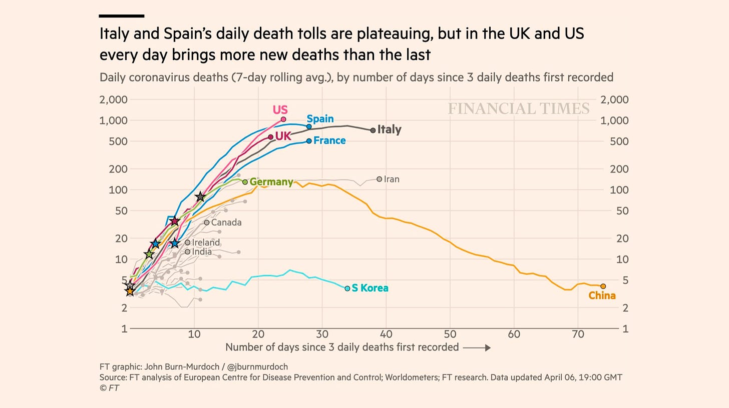
John Burn-Murdoch’s series of Covid-19 charts in early 2020 may be the best modern argument for the value of charts. We hung on each of his daily charts, comparing our own country’s trajectory (chronological context) to those of others (counterpart context) in hopes of glimpsing how bad it was going to get.
Context topology for information design seems to be under-explored territory. If you know about other ways of thinking about this then I want to hear from you.
Going forward
We’ve seen a lot! Four ways reading charts produces value (a rather analytic lens). And before that, three ways that simply seeing charts creates value (a rather aesthetic lens).
I have the third and final section already sketched out. To conclude the series, we will look at some ways data graphics create value using a social lens. It is a communications art after all, let’s not lose sight of that.
Until then. Onward!—RJ
Notes
Join 33 million others who have watched Chimamanda Ngozi Adichie’s TEDGlobal 2009 talk, “The danger of a single story.” link
The Minard graphic is dated 1859. Read Sandra Rendgen’s The Minard System. Amazon
John Burn-Murdoch is chief data reporter at the Financial Times. Read his work. link
About
Data storyteller RJ Andrews helps organizations solve high-stakes problems by using visual metaphors and information graphics: charts, diagrams, and maps. His passion is studying the history of information graphics to discover design insights. See more at infoWeTrust.com.
RJ’s recently published series, Information Graphic Visionaries, a new book series celebrating three spectacular data visualization creators. With new writing, complete visual catalogs, and discoveries never seen by the public. His first book is Info We Trust, How to Inspire the World with Data.


