Welcome to Chartography: insights and delights from the world of data storytelling. Three offerings and then a big follow-up to 2023’s most popular letter.
🍎 This fall I am teaching Persuasive Data Graphics in-person at San Francisco’s fabulous Letterform Archive. From the workshop’s description:
Data graphics are magical. Come learn how to make pictures that can help us discover and discuss otherwise invisible phenomena.
I will teach using original historic data graphics. Learn more and sign-up here.
📖 My opus Info We Trust is out of copy-editing and awaiting the return of our designer and printer from July vacations. Then, we print! Here is a colorful and freshly-illustrated spread that I am particularly proud of.
Order your copy of Info We Trust directly from Visionary Press:
💹 As I roll-off making Info We Trust, I am re-calibrating my balance for this fall between teaching, writing, and design consulting.
My consulting specialty is graphics for high-stakes situations. I am seeking to partner with an organization who wants to make a LOT of very high quality (yet simple) data graphics.
There is huge opportunity to differentiate yourself and create value with a steady march of fantastic graphics. Do you, or someone you know, believe similar? Please reply to me directly and let’s chat about this and other graphic opportunities.
Seeing Centuries, Part 2
“Seeing Centuries” from May 2023 explored visualizing human history by selecting ten pivotal events for each 25-year generation in United States history.
Soon after, a meeting with Casey Cripe of the Long Now Foundation posed an intriguing question: Could human recorded history and the deep history of human migration be visualized together?
Yes, and I’m excited to show you how.
Background: vertical time
A constellation of vertical-time inspiration reignited my interest in deep human history, and I believe they will inspire you too.
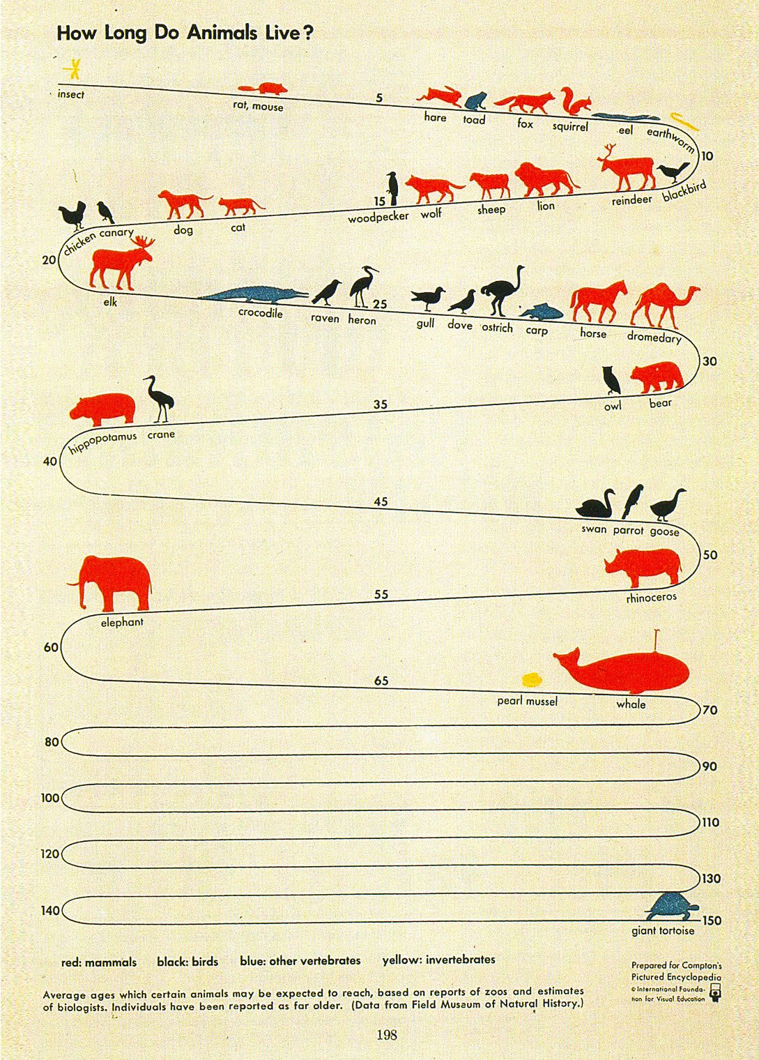
My journey back into this area began while hosting Jason Forrest, editor of Nightingale magazine. Together we admired the Isotype Institute’s chronostatic masterpiece “How Long Do Animals Live?” from Compton’s Pictured Encyclopedia (1943):
Later,we visited Stanford’s Rumsey Map Center and Branner Earth Sciences Library. At Branner, I spotted John Gurche’s “Tower of Time” from Smithsonian Magazine (1981) stuck to a wall.
Anyone who visited the Smithsonian’s Natural History Museum before its refurbishment might remember this tower in the dinosaur hall:
(In this photo, the Tower does not seem as imposing as it did when I saw it as a kid.)
The tower is an extraordinary illustration, rich with metaphorical details, such as the triceratops head poking through the K-T extinction barrier, becoming a fossil.
Forrest and I also discussed Info We Trust Remastered, which includes an entire chapter about seeing time.
Today, time progresses vertically as we scroll down web pages via a moving-window or moving-page metaphor. You advance toward the future as you read down toward the bottom of an article. By contrast, in static vertical graphics where the reader does not move content, such as in a printed newspaper, the most recent events are often at the top. This suggests the murkiness of the past: Sit in a boat today and look down into the water of time, where less light reaches older events. Since recent events are typically most relevant, placing them at the top also prioritizes them for the reader.
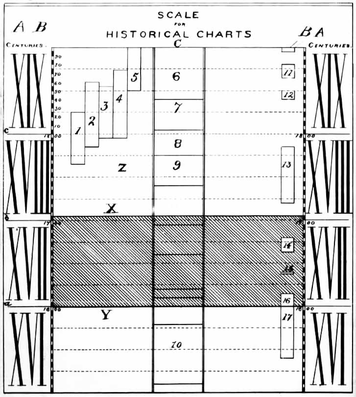
Following Forrest’s suggestion, I dug up Arthur Scaife’s 1895 patent for a vertical timeline. Scaife argued “it is essential that the scale should be vertical” for easy comparison of contemporary events, and included a diagram:
Visual-history enthusiasts might recognize this system from Scaife’s later work, History of the Civil War in the United States (1897).
The final piece of inspiration came from the recently-passed James C. Scott. I’ve been waking up early to read his Against the Grain: A deep history of the earliest states. Coffee brewed, I plop outside on our fog-damp deck and drink in Scott’s history. It’s the perfect start to a day.
Scott’s book disrupts the tight linkage between agriculture and city-states, presenting evidence that sedentism predates domestication of crops and animals by thousands of years, and domestication predates territorial states by similar margins.
I was delighted to find that Scott’s introduction features a vertical timeline of major milestones in deep human history, qualifying many with “strong” or “scattered” evidence.
Seeing millennia
With this inspiration blowing in my sails, I began sketching. My aim was to weave together three views of history:
~post-Renaissance modernity
ancient history’s myths and legends
deep history tracing back to modern human migration out of Africa
Could all three be visualized with a generational tempo?
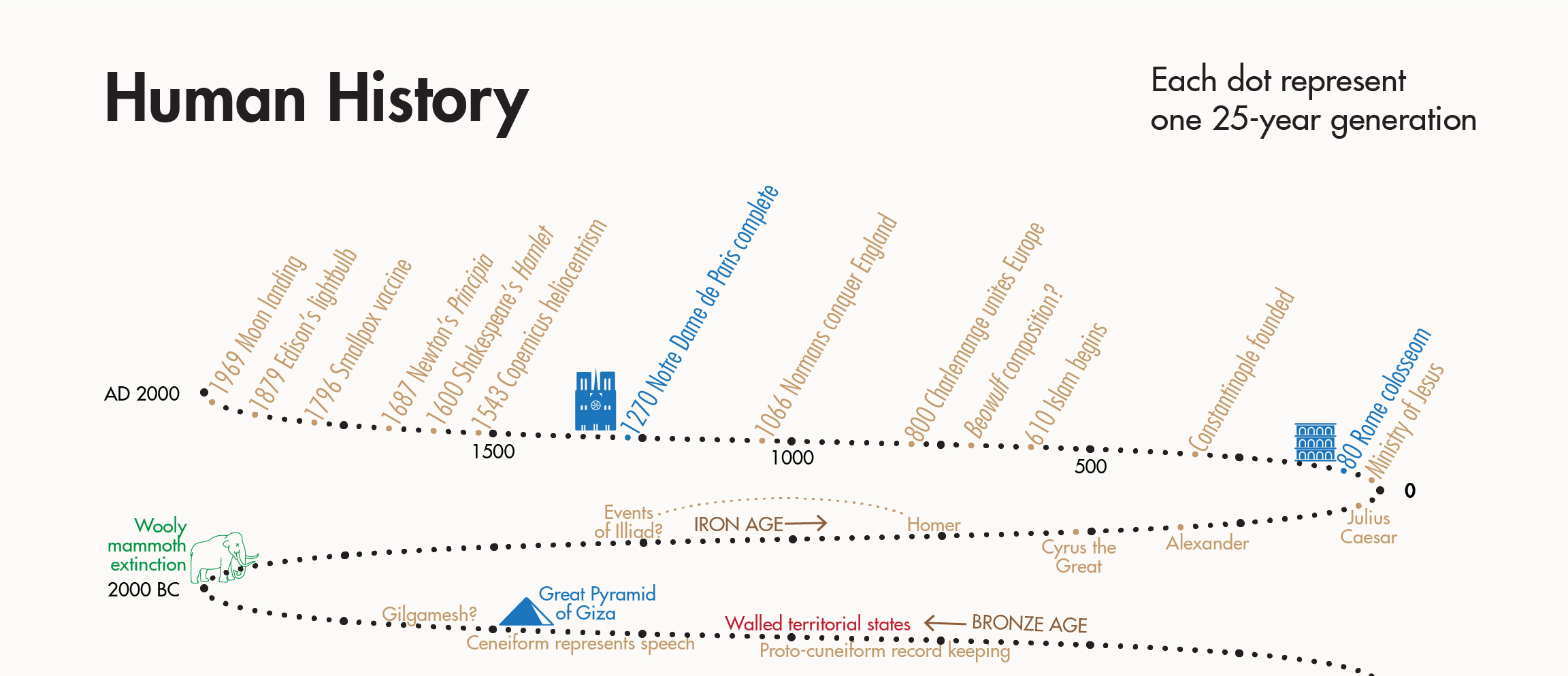
I began with a traditional linear timeline to cover the past 2,000 years—essentially the period I’m familiar with. Each 25-year generation gets a mark, and every ten generations (250 years) a larger mark. For visual flair, I added a couple cartoons.
Your eyes start at today in the top-left and move rightward down through time.
The upper position of the most recent two millennia affords ample empty space above, used to label numerous historic events—selected mostly ad hoc.
After 2,000 years, the timeline turns into a tall stack of zig-zags. Recorded human history fits easily into the first three ramps, allowing for call-outs of kings, myths, and civilization milestones.
Seeing this short stack is surprising. The Great Pyramid of Giza existed for hundreds of years before the woolly mammoth went extinct. Imagining back to Christ’s time, it isn’t much further to the earliest written records. Civilization is relatively new, huh?
The ramps continue, stretching back over 60,000 years to the most recent migration out of Africa. Across this expanse, we see famous works of cave art and sculpture, megafauna extinctions, the last ice age, and the spread of modern humanity across the globe.
Researching this work brought Indonesian and Neanderthal cave paintings to my attention. The saber-tooth cat reminds me of James C. Scott’s masterful opening to Against the Grain:
What fire meant for hominids and ultimately for the rest of the natural world is presaged vividly by a cave excavation in South Africa. At the deepest and therefore oldest strata, there are no carbon deposits and hence no fire. Here one finds full skeletal remains of large cats and fragmentary bone shards—bearing tooth marks—of many fauna, among which is Homo erectus. At a higher, later stratum, one finds carbon deposits signifying fire. Here, there are full skeletal remains of Homo erectus and fragmentary bone shards of various mammals, reptiles, and birds, among which are a few gnawed bones of large cats. The change in cave “ownership” and the reversal in who was apparently eating whom testify eloquently to the power of fire for the species that first learned to use it.
Scott described general interest in “the allures of deep history” as a preference for the “history of long-run processes (la longue durée) in place of a chronicle of public events.” I say: why not both?
This image is a history for me. It is naturally biased to what know. Also, given its topic, it is far from accurate. Exact dates are impossible for most of these events and I have not always couched labels with appropriate uncertainty. Moreover, history is rife with conflict, climate anomalies, extinctions—it’s not for the timid.
This is my timeline—show me yours.
Big Bonus Preview (cont. from last edition)
As I previewed in last edition, there is a newly discovered monumental chronology to get excited about. It’s massive, very colorful, and by an early 19th-century British woman.
So far, I have assembled a biography of its creator from census, property, death, newspapers, and other public records. Today I am waiting on new images from two rare book archives. With those I expect to have a complete picture worthy of your attention and excitement. Next edition?
Until then, I appreciate your support by becoming a paid subscriber to Chartography.
Onward!—RJ
About
RJ Andrews helps organizations solve high-stakes problems by using visual metaphors and information graphics: charts, diagrams, and maps. His passion is studying the history of information graphics to discover design insights. See more at infoWeTrust.com.
RJ’s next book, Info We Trust, will be published fall 2024 and is currently available for pre-order. He published Information Graphic Visionaries, a book series celebrating three spectacular data visualization creators in 2022 with new writing, complete visual catalogs, and discoveries never seen by the public.


Wow! Beautiful examples! 🥰
As always, fascinating and thought provoking.