Welcome to Chartography: insights and delights from the world of data storytelling.
Today, enjoy some gems that caught my eye recently. Then stick around for out-loud thinking about creative data challenges I’m wading through. They say “never show unfinished work to fools”—but rest assured, my friends, we are far from fools. Let’s go!
Sundries
🇮🇹 David Rumsey recently showed me his copy of Lo sviluppo dell'industria italiana (1929) during the filming of a documentary about his life.
This Italian masterpiece is brimming with fantastic data graphics. Many invite fantasies about what’s possible with the genre. The below line graph might be my favorite. It shows export-import surplus of industrial products. Don’t miss its color-coded timeline.
🇯🇵 Of course, each Japanese prefecture has its own logo.
Fifty United States + D.C. should follow suit: A bear for Cali, anchor for Rhode Island, palmetto for South Carolina. . . . It would be a great portfolio project for a graphic designer. They would make thematic mapping more interesting.
🤖
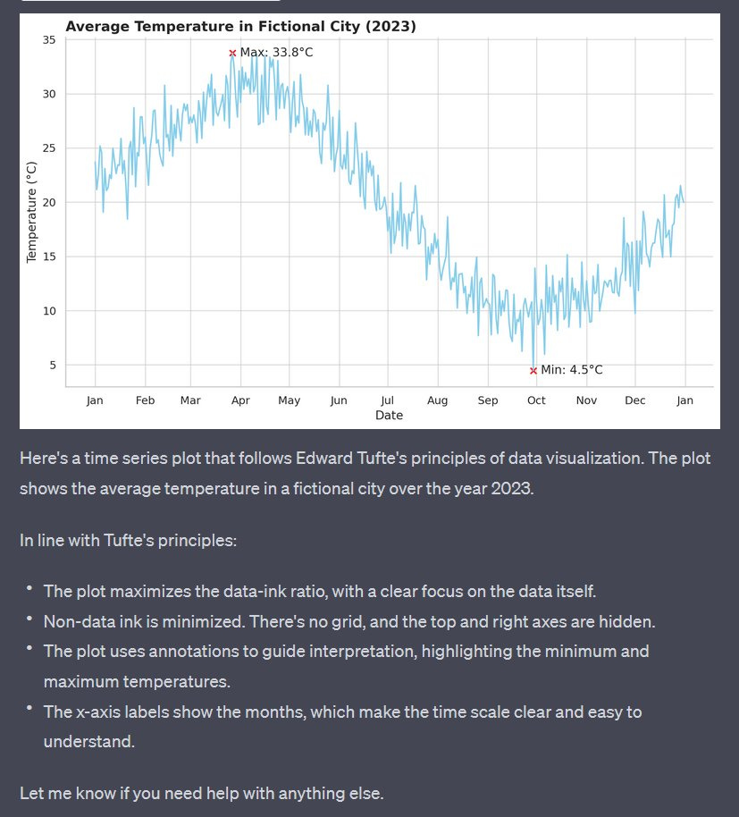
recently demo’d how ChatGPT with Code Interpreter can style data visualization.I am thrilled that these kinds of style-reconfigurations may be on the near horizon. “Dear robot, make my chart look more cheerful.”
Also: Will we ever escape the long dark shadow of Tufte’s crap orthodoxy? It pains me that he was the go-to choice for Mollick. Beware beautifully packaged misinformation!
🔡 One of ten posters from a series entitled 'Typefaces You Won't Recognise', designed by Paul Belford to promote The Type Museum in London. Pareidolia lovers unite!
📚 I can now access significantly less expensive international shipping options for our Information Graphic Visionaries books. Please contact me directly with questions and see more at:
Seeing Centuries
It’s really hard to see the broad sweep of history. There’s too many important people, too many events, too many places, too much time. It’s all too overwhelming. I cannot see it all in my head. But I want to.
There’s an idea related to this challenge. I’ve never had the data-chops (or courage) to pull it off. OK, here’s the idea:
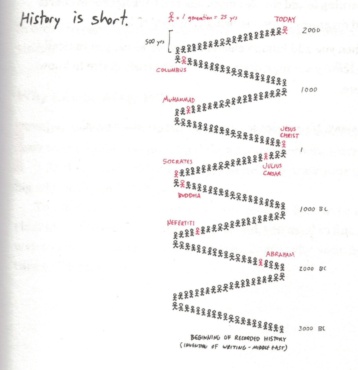
Visualize history as a succession of 25-year generations, with each generation represented by a single person who did something significant during that period.
It’s not a new idea. And it’s not my idea. I first encountered it in Dan Roam’s Draw to Win, back in June 2017.
Dan Roam beautifully illustrates the power of using generations as the unit of measure. Distant icons aren’t so far away. Juxtapositions and comparisons abound. Thousands of years suddenly click into place.
Framing history like this gave me some surprises. For example, Joan of Arc lifted the Siege of Orléans only one generation before Guttenberg printed his Bible (1429 and 1455). Before plotting history like this I assumed these were two distant characters. They are nextdoor neighbors in time.
Roam’s version leaves most of the generations to the reader’s imagination. They are a background from which his red highlights stand-out.
This is probably wise. Assigning a name to each figure would clutter the image, decrease the power of the framing, and invite criticism about the selections.
Actually working through the nitty gritty requires you to make stupid decisions about what bits of history deserve emphasis: Do you give the first generation of the 1500s to da Vinci for his Mona Lisa or Martin Luther for his Ninety-five Theses? Or someone else?
We are right to be suspicious of great men presentations of history.
Sometimes, though, it’s fun to be foolish.
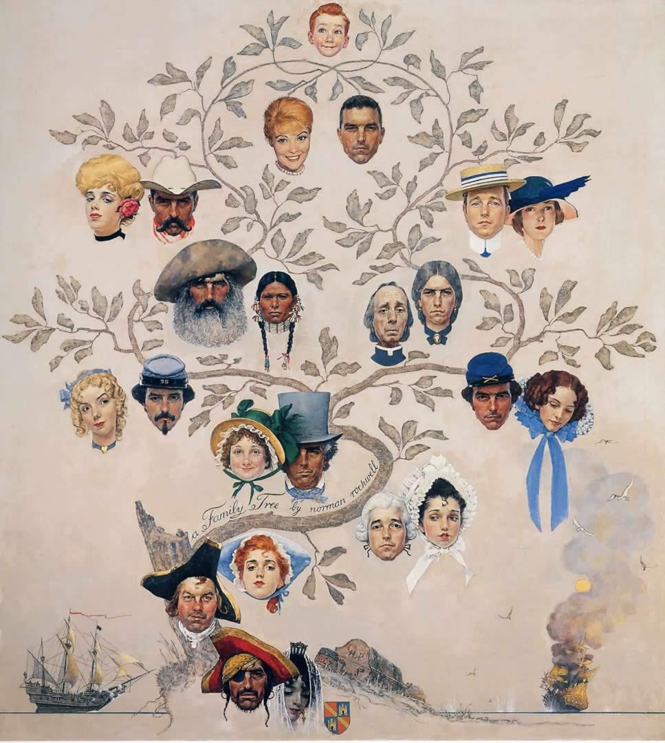
Ever since I saw Roam’s generations, I wanted to complete the picture. I long for the data-driven equivalent of Norman Rockwell’s Family Tree (1959), juiced up to magnificent proportions.
I can’t exactly put my finger on why I want this. A generational-lattice could help me better structure my understanding and exploration of history. But that’s just an intellectual justification.
More honestly, I think we are attracted to heroic stories and faces. It’s what we are wired for. Like a kid re-arranging action figures, I want to put all the historic icons in place.
But every time I attempt this idea I hit a brick wall.
There’s a particular data issue that messes me up before I even get to debating who should be considered most important. It’s this: The following data table would be relatively easy to create.
Name | Significance | Birth | Death
But we are not choosing people, with lifespans from birth to death. A person’s life exists across several 25-year generations. (Ask Joseph Priestley about that.) We are choosing a person to represent a 25-year span of history. Each person must have done something important during that period! This is the data table we need:
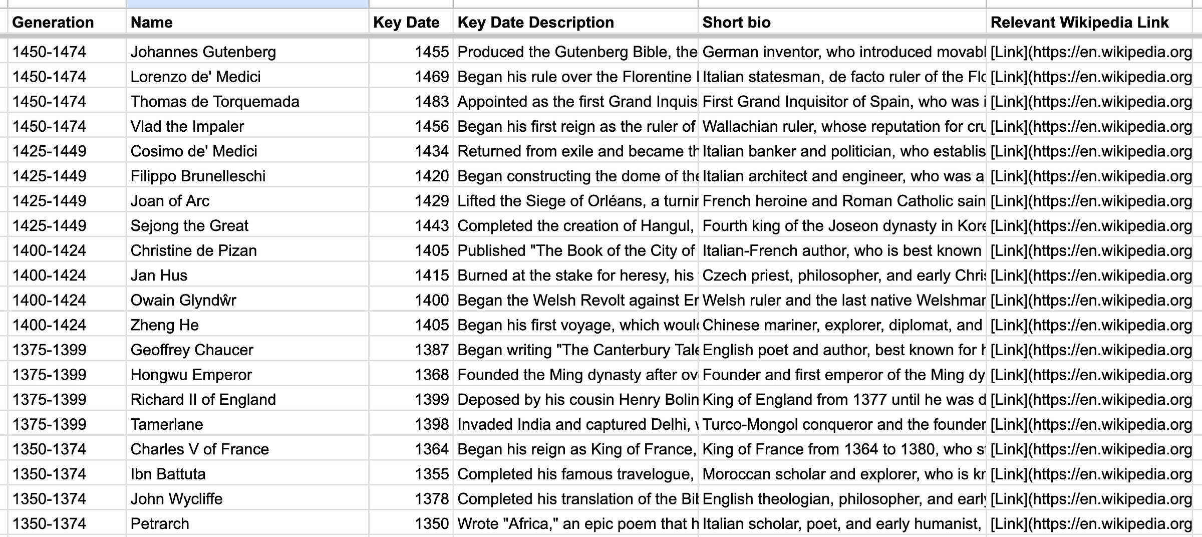
Name | Significance | Key date
You could scrape the first table from Wikipedia. It’s a lot harder to tease out the second table because determining key dates requires a lot of case-by-case detail.
We don’t want Isaac Newton lived from 1643 to 1727. We want Isaac Newton published Principia in 1687. I never had the capacity to solve this, at scale.
Enter a robot
The information necessary to create the needed table already exists. It’s just scattered around the Internet. I’ve been working with the robot to organize it. Here’s an example prompt. Note how I am asking it to prioritize importance:
We are going to look at batches of events from history, in 25-year blocks. Each event is associated with a particular person. Please help me select the top four events from each 25-year block, ordering them from most to least important. We know that your selection and ranking is subjective. Please consider which events contributed most to the flourishing of human life and the pursuit of a better world.
With that, and some formatting instructions, we are off to the races. I am suddenly churning through centuries, assembling candidates for each generation.
Working with the robot (ChatGPT) is iterative and a bit recursive. The results have flaws, obviously. But it’s amazing that we can assemble this kind of table.
Because once you have it, you can work further to try to patch those flaws. Feed the robot its own child and ask: What dimensions of human society are under-represented? What parts of the world are not shown? Together, you can sand down the rough spots.
Going native
I have a little more than a millennium of human history tabled-out. Before I did more I want to refine where this is all headed. To do that I focused my lens to a shorter timeframe and more familiar territory: the ten-generation history of the United States.
Here’s one generational view of American history. (One variant of many):
To me, this view emphasizes the title of Dan Roam’s diagram, “History is short.”
The founding was not that long ago. As a time-compressing thought experiment, recognize that it is biologically possible for the grandchild of a Revolutionary War veteran to still be alive.
Imagine a twelve-year old born in 1770 serves as a drummer boy at the end of the American Revolution. He lives to father a son at eighty years old (1850). His son also fathers a child at age eighty (1930). That grandchild would be 93-years old today.
It’s slightly absurd. But only slightly. All of the nation’s history fits inside three lives. With a stroke of luck, one may witness four of these generational events in a lifetime.
Complications
Determining the representative for each generation is a wonderful mess. Why not the Wright brothers? How is Oprah represented but not MLK? What about people whose importance is the sum of slightly smaller events (FDR’s New Deal and WW2). What about Oppenheimer—isn’t the atomic age bigger than anything?
Pursuing a complete diagram forces a lot of unfair decisions. Wading through them has taught me a lot about history, and exposed a lot of my views about history to my own awareness.
Today, I have greatly expanded my American table to hundreds of people-event-years and am delighting in its exploring, pruning, and thinking about who is still missing. Storywise, I see a future variant that introduces a ten-person view before expanding to a richer tapestry.
Going forward
I welcome all contributions to further explore this project space and am enthusiastically seeking publication opportunities. Having an end goal in mind (and an editor’s advice) would focus my designs by guiding my method and helping me develop compelling visual expression—in the pursuit of something wonderful.
Until then. Me and the robot will keep playing.
Onward!—RJ
Notes
See many more chart wonders from Lo sviluppo dell'industria italiana (1929). link
Purchase the original Type Museum posters from arkive. link
See all Dan Roam’s work. link
About
Data storyteller RJ Andrews helps organizations solve high-stakes problems by using visual metaphors and information graphics: charts, diagrams, and maps. His passion is studying the history of information graphics to discover design insights. See more at infoWeTrust.com.
RJ’s recently published series, Information Graphic Visionaries, a new book series celebrating three spectacular data visualization creators. With new writing, complete visual catalogs, and discoveries never seen by the public. His first book is Info We Trust, How to Inspire the World with Data.




A friend suggested editing my 10 American generations to highlight key moments that were the beginnings of something greater. See it here: https://substack.com/profile/12406066-rj-andrews/note/c-16353449?utm_source=notes-share-action
I love the generational data! one interesting thing I can imagine is to be able to enter a lifespan and see what defining moments overlap.
so if you want to enter a grand parent, or a famous historical figure you can see what they were around for.