Talent for Synthesis
Humanizing data has always required us to live at the edge of the future.
Welcome to Chartography: insights and delights from the world of data storytelling.
Today: Lots of goodies including a return to the Value of Data Graphics series. We are pushing the upper limit of what can be sent in a single email. Let’s go!
Sundries
💌 In 1979, Austria celebrated the 150th anniversary of its central statistics office by issuing a stamp.
This stamp featured an 'age structure of the resident population' pyramid, with men on the left and women on the right. See the missing people from World War II around age 60, and a shadow of the war years in the next generation. Please comment below if you know what the colors mean.
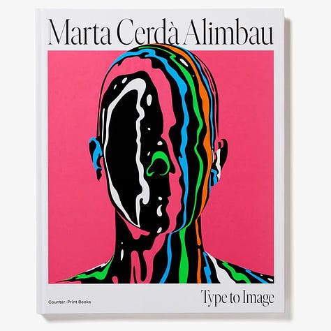
🎨 Designer Marta Cerdà Alimbau blends typography and illustration. My favorite pieces explode with color.


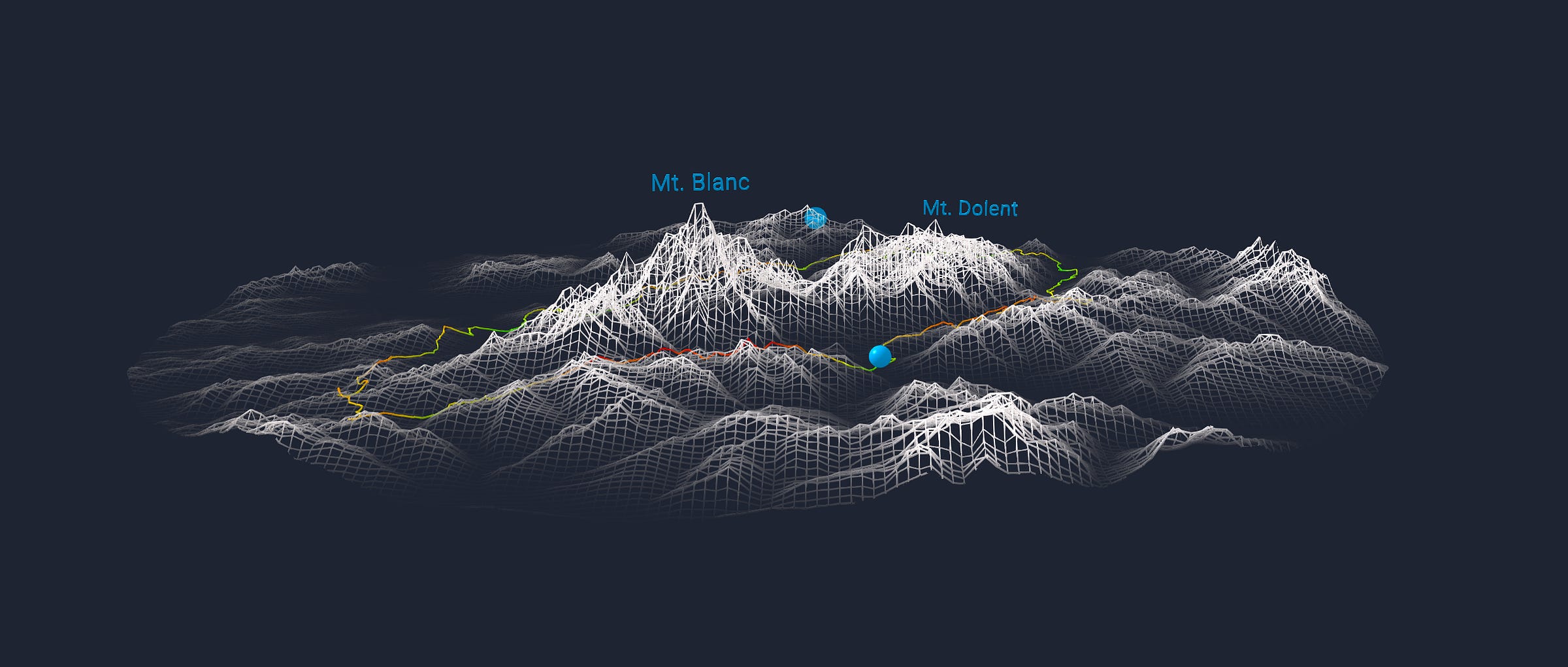
🏔️ Wendy Shijia’s model of a 2017 hike around Mt. Blanc, complete with a big rolling ball, is a most aesthetic data visualization.
🏙️ The recent passing of American artist Yvonne Jacquette put her cityscapes on my radar. They are muted and sparkling at the same time.
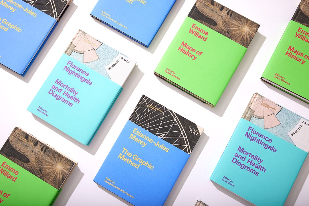
📚 Most of the discussions I've had about the Information Graphic Visionaries books revolve around the anticipation of the next volume. Will there be another? Who will it feature? When can we expect it?
I’m excitedly beginning pre-production research for the next volume of the series. I say excited because it is more optimistic than anxious. But anxious fits too.
As many of you know, these books were fabulously extravagant, i.e. expensive, to create. Today, I don’t have enough feedback (i.e. sales) from the first books to begin production on the next one, but I look forward to hitting that milestone. I appreciate everyone’s enthusiasm for these spectacular books.
We are now able to offer cheaper international shipping via DHL that is not listed on the website. Please contact me directly with questions about shipping and see more at:
If the next book comes true, it will take the series to a new continent, a new century, and a new information-graphic artform that is more colorful than anything ever seen before.
How to Value Data Graphics, Part 8
Until now, this series has concentrated on the various ways data graphics generate value. We have explored how these modes are often hard to untangle and quantify. (See the Chartography archive for parts 1–7.) Today, let’s consider data graphics with a marketplace metaphor.
From a demand-side perspective, data graphics create value in the mind of their readers. The person viewing the chart matters. A national-news hurricane tracker hits differently if you are a student at the University of Miami (in Florida) or Miami University (in Ohio). Different readers derive different value from the same image, much like a size 12 shoe or an umbrella is more valuable to some individuals than to others.
Supply-side charting
What are the costs of creating these values? From the supply-side, data graphics can be appreciated as the synthesis of two inputs: data and design, or as I called them in Info We Trust: content and form.
Think of data as the content and the number lines we use to plot data as the form. The content-form pair is analogous to water and the vessel that holds it. The same content looks different in different containers.
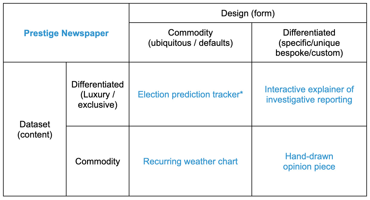
Both inputs can be assessed on an economic spectrum that stretches from commodities to luxury goods. For example: Daily stock market financial data and default charting templates are commodities. Exclusive leaked documents and custom creative-encoding are luxury goods.
Intersecting our inputs, we can see how different combinations of content and form coexist within the same organization. Here’s what it looks like at a prestige digital newspaper:
*There was a bunch of pre-2022 innovation in election journalism design, but things seemed to have settled down to a consistent batch of forms, for now.
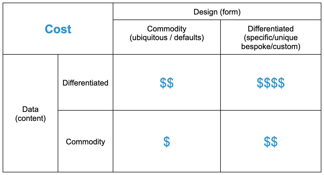
And here’s how the same dimensions intersect for a global corporation:
Of course, the specifics will vary a bunch between organizations, so you might have better examples.
The data-design 2×2 is an OK indicator of the cost of producing different data graphics. Top-right luxury graphics are more expensive to create than bottom-left commodity graphics because their inputs are more scarce and their synthesis requires more talent.
But is the data-design cost correlated to value-creation? As we’ve already explored, that’s a lot murkier ground.
Now, with robots
Artificial Intelligence (AI) is already reducing the costs associated with both data and design. It seems as though we witness a new breakthrough every week. It is truly exciting.
Public commodity datasets are easier to find and easier to access. Already, ChatGPT can recommend a list of datasets to answer your question that is much more helpful than Google search results. Private code-interpreters simplify exploration of exclusive data.
AI is also making it easier to create commodity charts (see ChatGPT’s Wofram plugin) and making formerly-bespoke designs feel as easy as commodities (see ChatGPT’s Noteable plugin). Code-interpreter has already helped me create bespoke web projects.
As far as predictions go, I’m with data journalist Chad Skelton, who observed that Copilot inside Microsoft’s PowerBI , plus ChatGPT, could to be a game changer. But, as
and coauthors stress in Power and Prediction, will they be clever enough to assemble the whole system?Going forward
Rick Rubin, American record executive and music producer, was recently interviewed by Anderson Cooper. The following exchange highlights our possible near future.
ANDERSON COOPER: Do you play instruments?
RICK RUBIN: Barely.
Do you know how to work a soundboard?
No. I have no technical ability. And I know nothing about music.
(laughs) You must know something.
Well, I know what I like and what I don’t like. And I’m, I’m decisive about what I like and what I don’t like.
So what are you being paid for?
The confidence that I have in my taste and my ability to express what I feel has proven helpful for artists.
The synthesis of data and design requires talent. That talent now requires you to surf the big waves of AI.
Part of being human is making and wielding new technologies. Humanizing data has always required us to live at the edge of the future. This year, the future seems to be arriving a bit quicker than we're accustomed to.
Considering my past decade of work: I have published upper-right quadrant luxury-luxury projects at infoWeTrust.com. These are bespoke curiosities that are built to attract public attention.
My client projects, however, involve the whole spectrum of data, from everyday to exclusive. Work often starts with common designs that sometimes evolve to some sort of luxury-design deliverable. But, frankly, I deliver the most value when I stay at the sketching and ideating level. Others, including robots, are often more than capable of executing the vision.
I see a future that enables us to be a little more like Rick Rubin: Have an opinion. Be decisive. Commit to doing the thing.
Onward!—RJ
Notes
Play with Wendy Shijia’s interactive hike around Mt. Blanc here and follow her on Twitter.
See more of Marta Cerdà Alimbau’s colorful designs and her new monograph from Counter-Print books. Portfolio
Thanks to James Cham Twitter, Jason Forrest Twitter, and Amanda Makulec Twitter for comments on the first draft of this essay.
Follow Elijah Meeks to keep up with Noteable’s AI integrations. Twitter
Follow Chad Skelton to track emerging AI + dataviz developments. Twitter
Watch Rick Rubin’s clip with Anderson Cooper. YouTube
In the past few years, my attention has shifted to executing simple charts really well. I believe that we can squeeze much more value from bar charts and line graphs than we do today. But that’s a story for another day.
About
Data storyteller RJ Andrews helps organizations solve high-stakes problems by using visual metaphors and information graphics: charts, diagrams, and maps. His passion is studying the history of information graphics to discover design insights. See more at infoWeTrust.com.
RJ’s recently published series, Information Graphic Visionaries, a new book series celebrating three spectacular data visualization creators. With new writing, complete visual catalogs, and discoveries never seen by the public. His first book is Info We Trust, How to Inspire the World with Data.



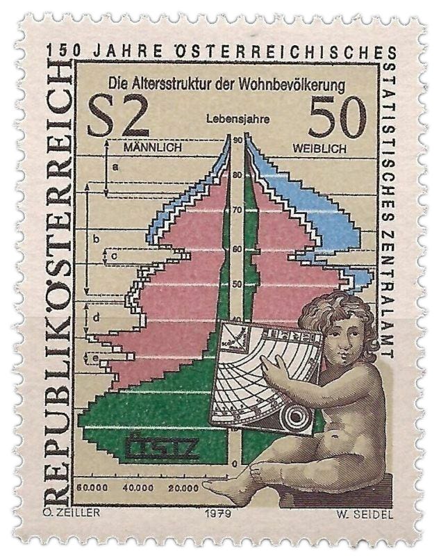



Just guesswork, but the colours on the Austrian stamp: are they marital status? Green = single, pink = married, blue = widowed? Particularly, the pattern of the blue segment for women seems to be what you'd expect from (a) life expectancy, (b) war.
In retrospect, this is in the years 1914 – 1919, the deaths are then the result of the First World War. If I look at the stamp, I see the same notch again. It is now among the 60-year-olds. Under the letter "c" on the stamp I would put the consequences of the First World War. The population pyramid on the stamp seems to me to be from (approximately) 1979. And under the letter "d" I would put the population decline due to World War II. Under the letter "e" I place the hesitant "baby boom" after WW II. Between the letters "b" and "d" the "boom" of the Ansluss with Germany in 1938 (11 and 12 March 1938). I can't place the colors (yet).