
The Geometry of Inequality
From mapping poverty to charting the 1%.

Welcome to Chartography—insights and delights from the world of data storytelling.
Imagine you are watching a strange parade of people march by. Each person is sized by the money they make. A person of average height has an average income. Someone a little shorter than average makes a little less. Someone a little taller than average makes a little more. The first people in the parade are invisible, they are all in debt. Then, tiny folks no bigger than matchsticks flutter by. The parade continues, each marcher slightly taller than the last. Each marcher slightly richer than the last. The last person is a man of inconceivable height, several miles tall.
This parade vision is how Dutch economist Jan Pen gave readers a visceral introduction to economic inequality data in his 1971 book Income Distribution. Pen’s parade is modern and playful. But the impulse behind it, to make inequality visible, is much older. Over the past two centuries, we’ve developed a suite of ways to measure and visualize inequality.
Data graphics are machines for comparison. They let us see two groups side by side and ask: why are they different? The visual inquiry of inequality is a magical tool that has led to understanding and progress of many sorts.
Today, Wednesday February 25th, I’m talking live with Jeremy Ney, who writes the popular American Inequality newsletter. His work looks beyond income and wealth inequalities to chart other ways America is unevenly distributed. Join us for our discussion here:
https://open.substack.com/live-stream/116379
To prepare for my chat with Jeremy, I reviewed the history of visualizing inequality.
This year we celebrate the bicentennial anniversary of Charles Dupin’s education map calling for the expansion of schools. What follows is a whirlwind tour of my favorite graphic gestures at understanding and conveying inequality since Dupin’s choropleth map, 200 years ago.
Moral statistics in space
Charles Dupin’s map (below left) is shaded by student density, expressed as a productivity measure: how much population is needed to “supply” a male pupil. Lighter districts have a higher proportion of students. He used the map and its accompanying tables to argue that education is the foundation of scientific and industrial power, education produces wealth, and education is correlated with a positive financial return. With Dupin’s map, administrative space became a statistical surface.
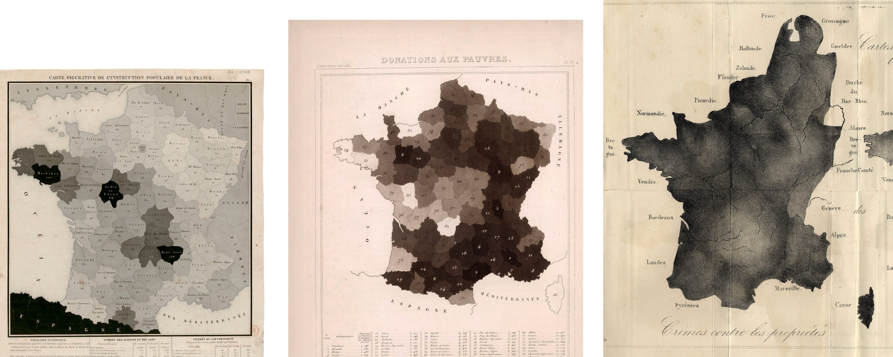
Early inequality visualizations were similar to Dupin’s map: French districts shaded in grays to show a variety of newly published state data. They were part of a movement called moral statistics sparked by André-Michel Guerry and championed by Adolphe Quetelet (1830s examples from both above). They advanced the radical idea that social phenomena obey laws, that society could be studied with the same scientific rigor as physics.
Moral statistics was particularly concerned with correlations between poverty and health outcomes—an association which still fascinates us.
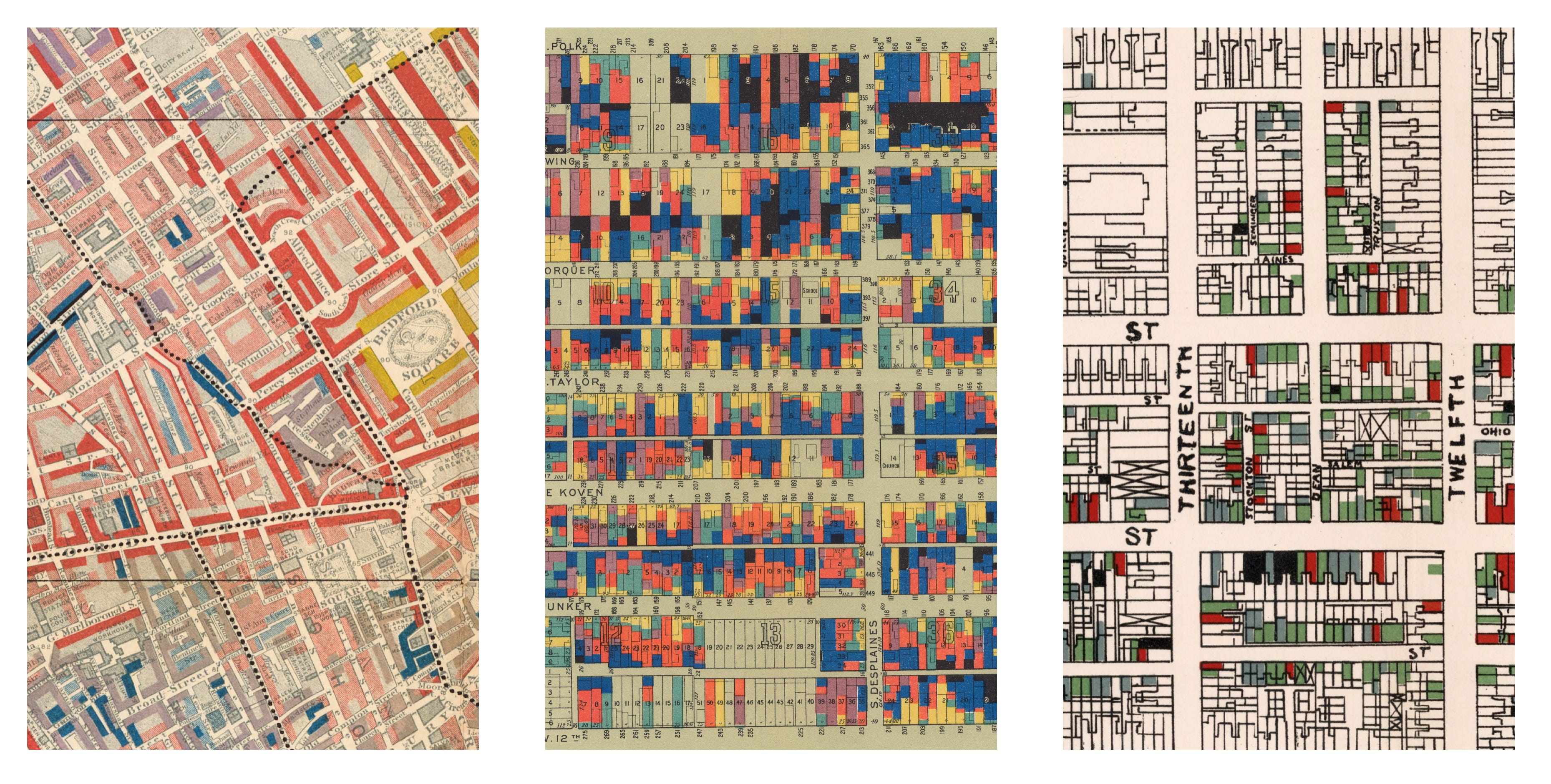
By 1900, choropleth maps had traveled beyond France. They became colorful and more precise, with a late-century burst of vibrant examples tracking economic data at the building level: London poverty by Charles Booth (1889), Chicago wages by Hull-House (1895), and Philadelphia social-classes by W.E.B. Du Bois (1899)—all detailed below.
Economist curves
Maps are pretty. They are also powerful declarations of the breadth of available data. But it’s hard to claim precise assessments of inequality across hundreds of marks on a map.
For these kinds of behavior insights, inequality data must be compressed—abstracted—into summary values. Graphically, we also followed suit. Instead of making marks where people lived we piled them into buckets, stacked them in columns, and plotted abstract markers of populations as line-graph curves.
Maps show where inequality lives. Curves show how inequality behaves, across a population and across time.
Many of these statistical inventions survive in the modern analytic imagination, including: Pareto’s power-law distribution of income distribution (1896, below left) and Max Lorenz’s curves expressing the inequality of income and wealth distributions by comparing them to the 45° angle of equality (1905, below right).
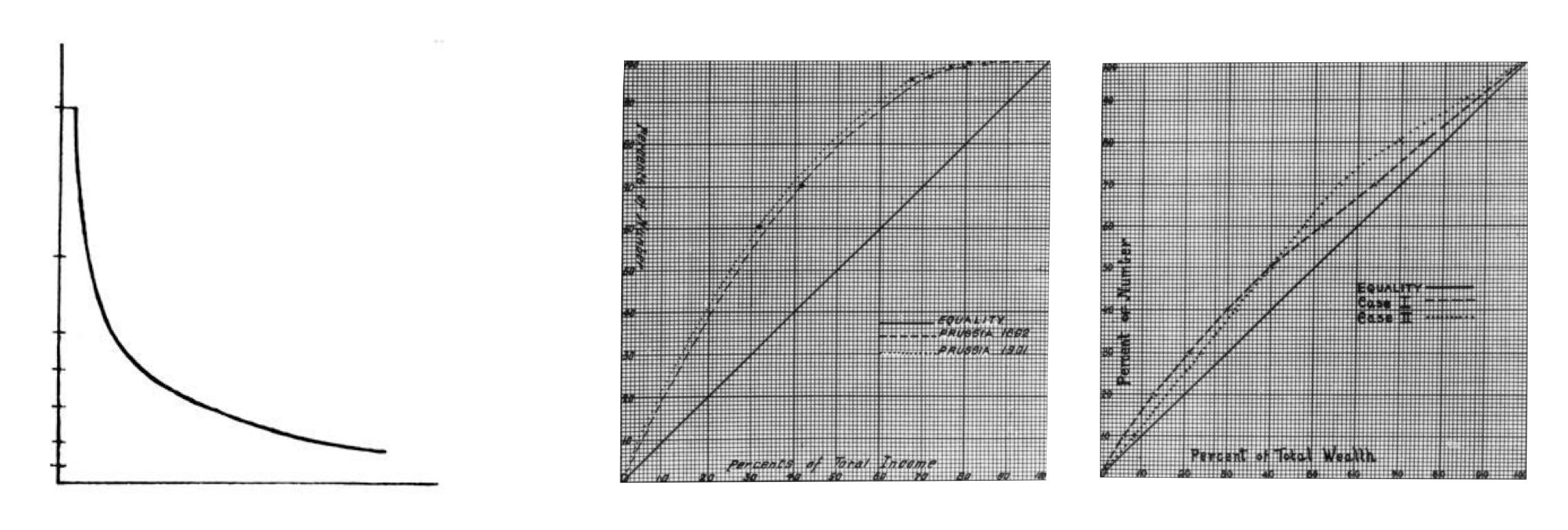
Later, Corrado Gini reduced the gap between Lorenz’s curve and equality to a single number (1914), further compressing and abstracting inequality measures.
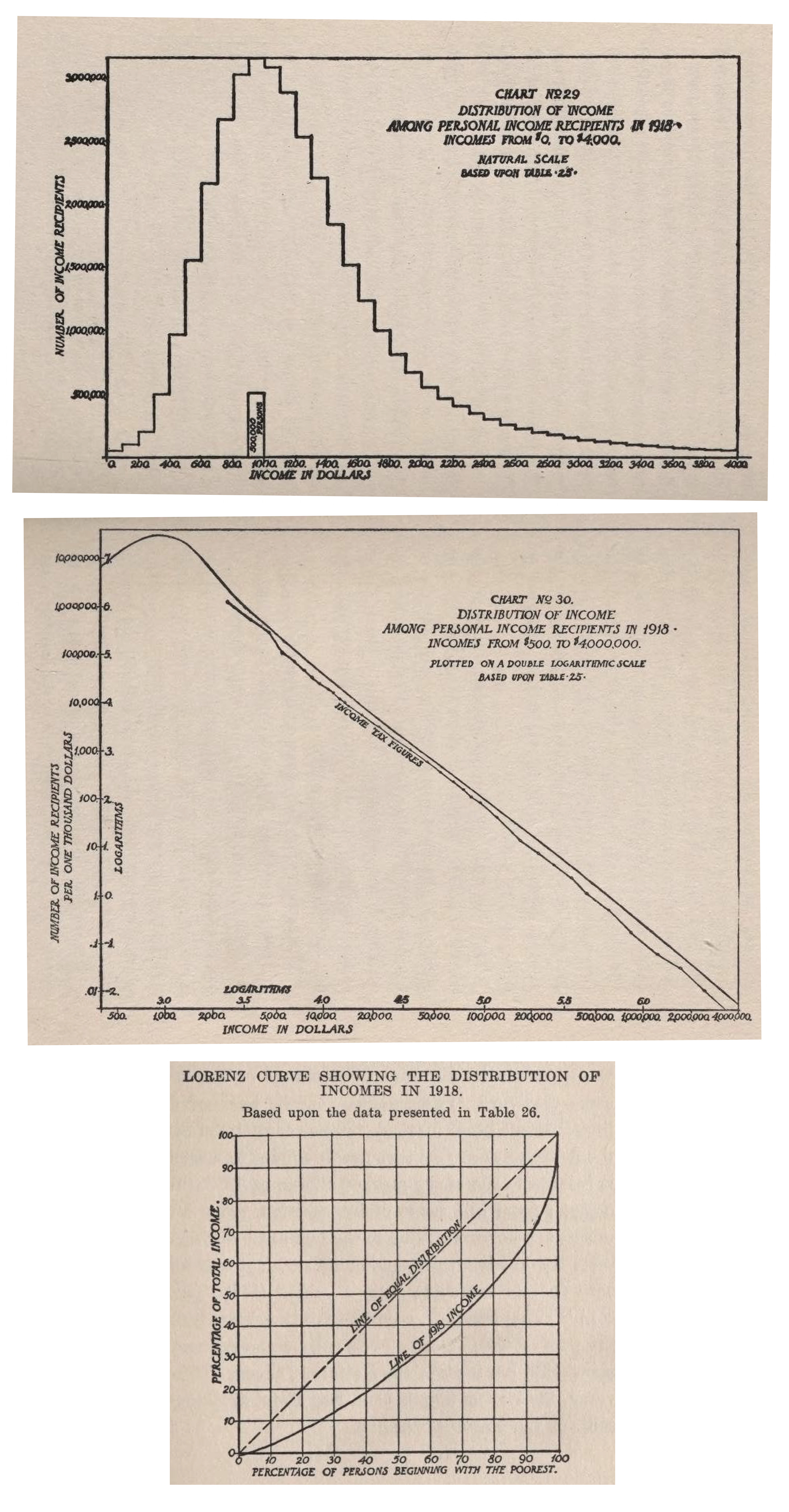
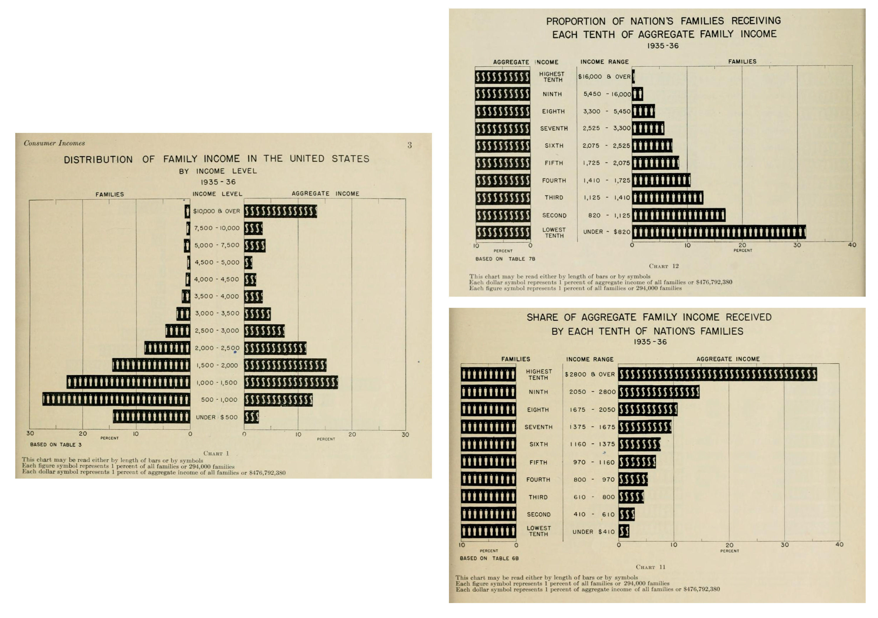
As tax systems and household surveys expanded, so did the data available to compress into curves. With new data and new statistical tools, nations and NGOs produced serious charts across the twentieth century of all sorts of inequalities. You can see these new ways of showing economic inequality in action in Wesley Mitchell’s Income in the United States (1921, below).
Another example of this genre is a 1938 package of charts by the U.S. National Resource Committee. I like how, together, they show that anchoring your buckets to different dimensions changes the analytic lens. Below, see the same data presented by income level, aggregate income, and families:
Selling inequality to the public
Post-WW1 corporate and government policy charts were often austerely-styled. But all color was not lost.
The 1930s and 1940s also saw a boom in persuasive (and propaganda) graphics in magazines and trade books for the masses. They used data graphics to attract attention and advocate for a cause. The finest examples of this genre were designed by Otto Neurath’s Isotype Institute. For example, see the below inequality charts from There’s Work for All (1945).
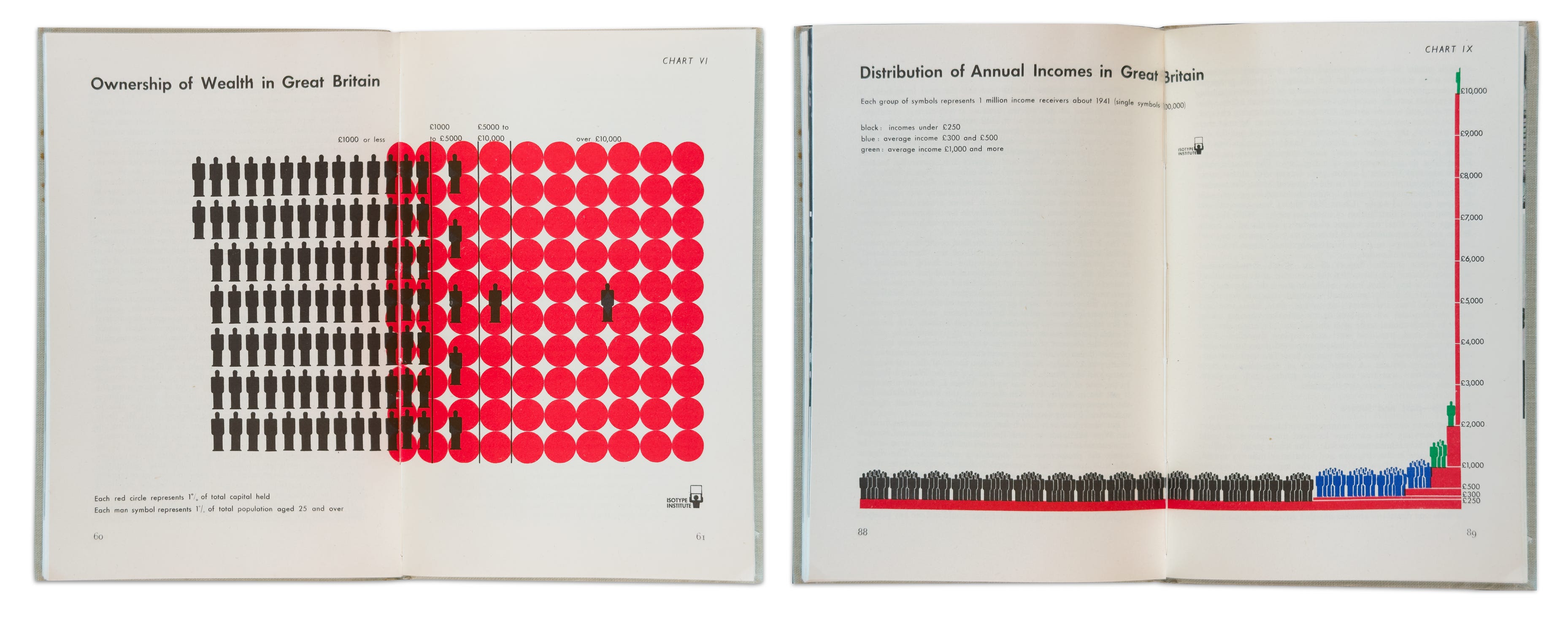
I particularly love chart VI (left), which gives 1% marks to both wealth and people, especially contrasted against the more conventional income towers of chart IX (right), which remind me of Pen’s Parade. See hundreds (and growing!) Isotype examples in my new explorer: https://isotype.infowetrust.com
Inequality goes digital
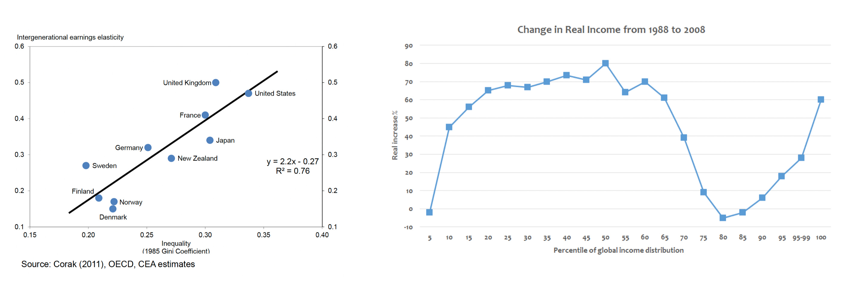
The Internet amplified all of these approaches to visualizing inequality. In my lifetime, there’s been an explosion of books and policy documents littered with global and national inequality charts. Some earned cute nicknames: Alan Krueger’s “Gatsby curve” shows higher income inequality associated with lower intergenerational mobility (2012, left). The Lakner-Milanovic “elephant curve” shows the unequal distribution of income growth for individuals belonging to different income groups (2013, right).
YouTube has given us a new medium for data storytelling: the mass-consumed short video.
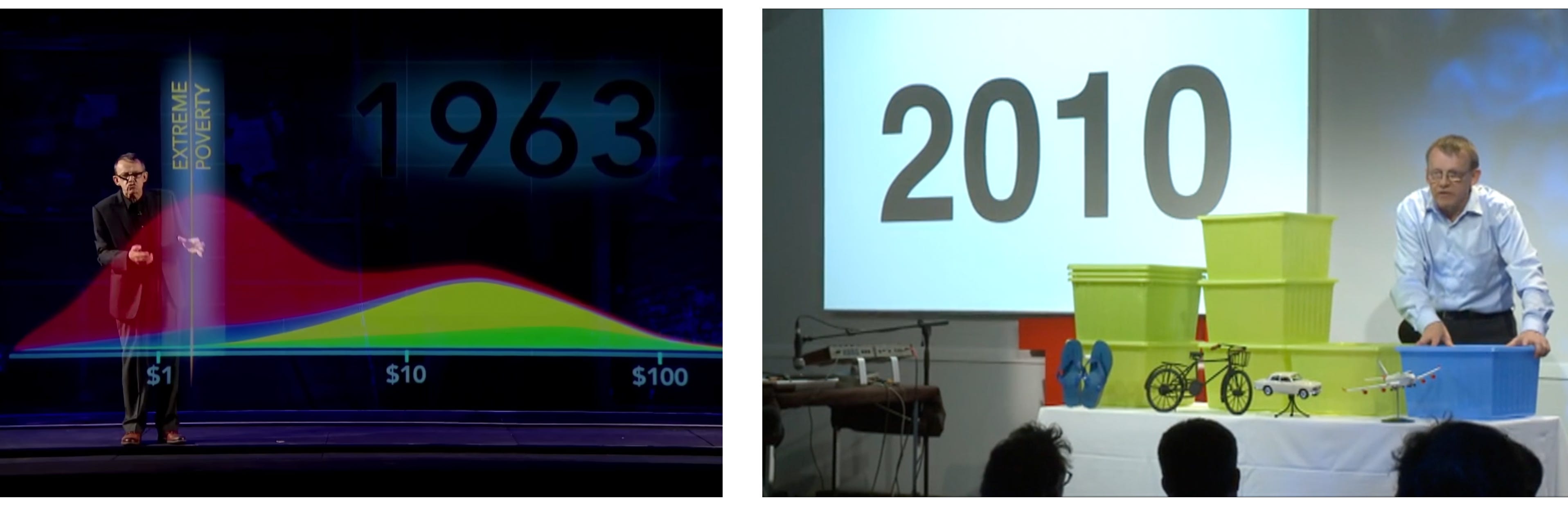
In living memory, Hans Rosling used this new tool to best effect, painting dramatic stories of economic and health progress using digital morphing magic (left) and channeling Isotype with simple props that represent large aggregate values (right: each box represents 1 billion people across an income spectrum).
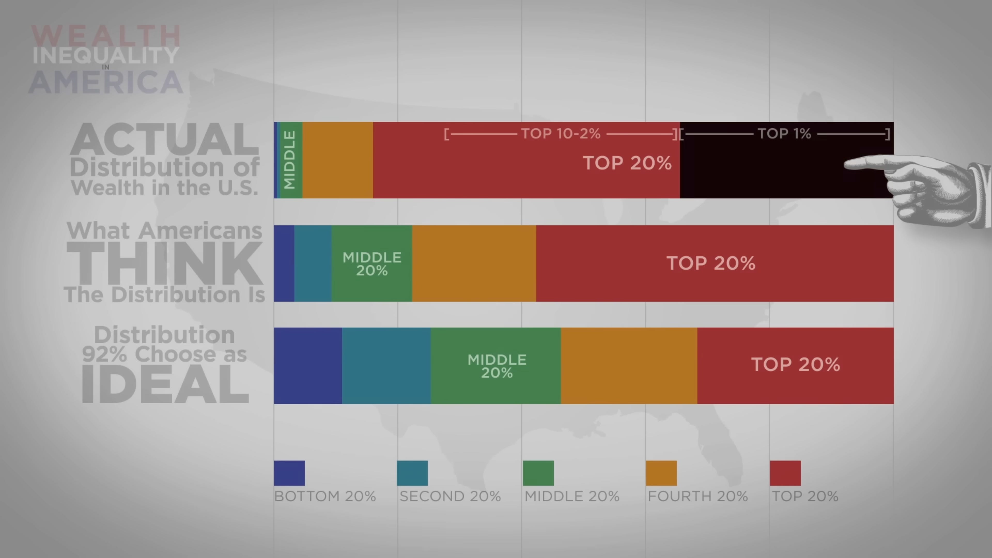
In 2012, Politizane published a viral video that dramatized the extreme differences between how we think about inequality compared to actual inequality:
More extravagant charts were developed too. Below is a stereogram set by Jack Blundell showing income deciles between 1980 (top) and 2014 (bottom). Each set is colored by the country’s 1980 position, which highlights extreme jumps in rank (see China). The richest decile for each country is in the back.

Early inequality graphics obsessed over poverty. Today, we obsess over billionaires.
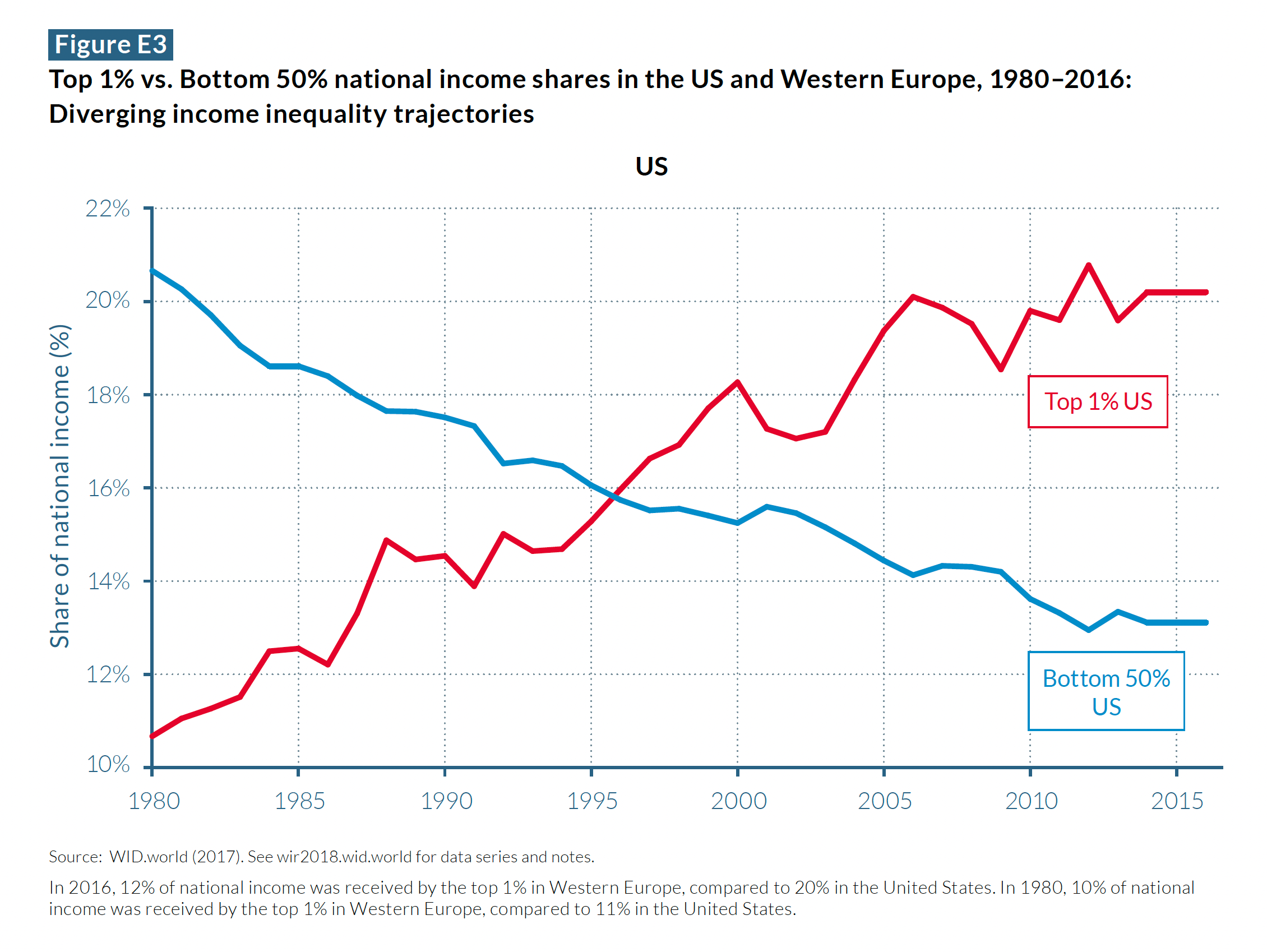
This is expressed graphically by charting the rising dominance of the top 1%. For example, see the increasing share of national income by the top 1% (red) compared to the bottom 50% (blue) in the 2018 World Inequality Report.
I hope you are able to join Jeremy and me as we discuss these and other examples of visualizing inequality. https://open.substack.com/live-stream/116379
The graphic comparison at the heart of inequality—us versus them, rich and poor, haves and have-nots—feels older than money itself. The forms will keep changing. The comparison will not.
Onward!—RJ
Attention San Francisco!
I will be speaking about data-graphic masterpieces this Saturday at ABAA California International Antiquarian Book Fair at Pier 27. Details: https://www.abaa.org/event/speaker-schedule
About
Chartography is the newsletter of Visionary Press and Info We Trust, by RJ Andrews.
RJ Andrews is obsessed with data graphics. He helps organizations solve high-stakes problems by using visual metaphors and information graphics: charts, diagrams, and maps. His passion is studying the history of information graphics to discover design insights. See more at infoWeTrust.com.
Looking forward to the conversation today and such amazing visualizations of measuring inequality. Fascinating to see how things have changed
My twitter/ X version of Pen's Parade:
Imagine massive wall as chart of UK population.
Income on y & x people ordered by income.
From distance you can't see incomes of most, black line looks like crack on floor.
Then we get to the right looking like small stain sharply rising to ceiling.
Wall grows in height & length.
I add graphic which has 99.89% of painted wall remaining - my estimated level of UK inequality.
Ask economist under oath: Inequality worsening is mathematical certainty: If wealth/income at higher percentiles grows at a faster rate than lower percentiles (which is empirically true), then the absolute gap between them must increase exponentially over time. No metric can change this reality - Gini coefficient 'stability' simply means the metric is obscuring exponential divergence. This is not debatable mathematics.
Do you accept this, or will you try to misdirect with statistical measures that hide growth rate differentials?