
The Living Planet at Arm’s Reach
How we made Earth Biomes, a world map for kids.

Welcome to Chartography.net — insights and delights from the world of data storytelling.
Most world maps skip the main character: life. They carefully mark countries, cities, and borders, but not the plants and animals that make Earth unique. We think that’s foolish.
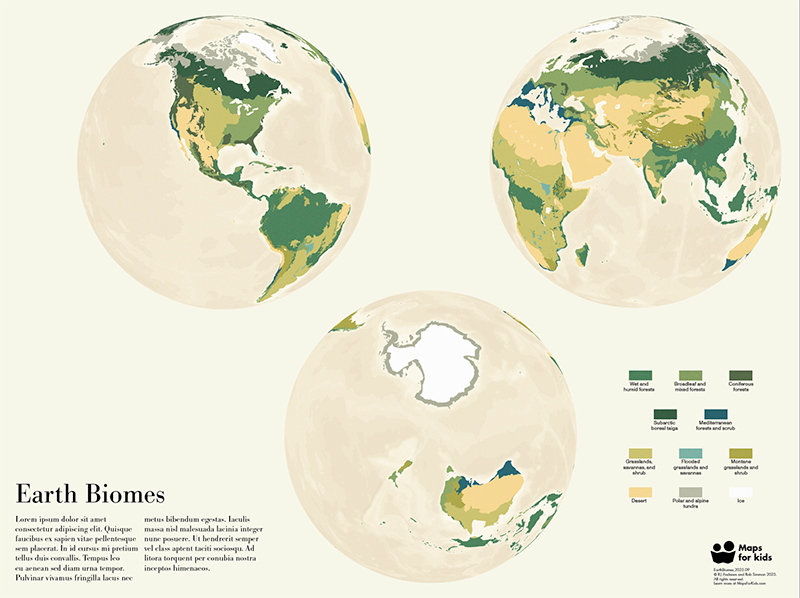
Earth Biomes is an illustrated wall map, part of the new Maps For Kids poster series. Across three views of our globe, colors mark different biomes—rainforests, deserts, tundras, and more—while ocean blues darken to show where the water runs deep.
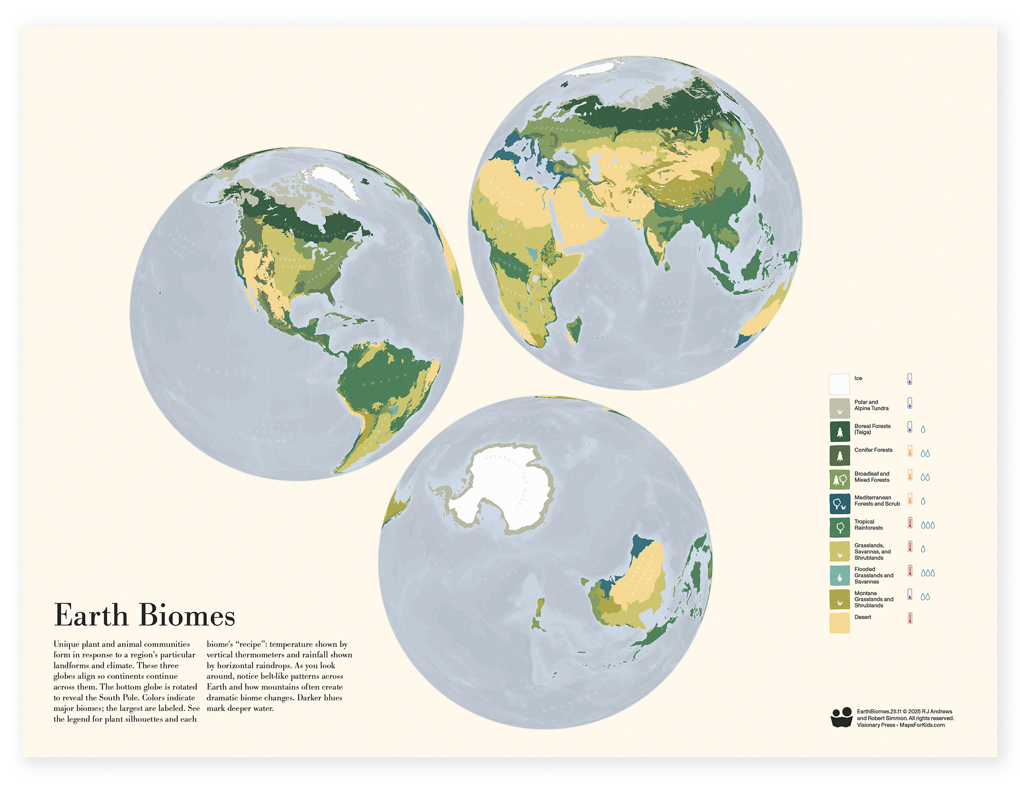
The impetus for this design was the need for a traditional geographic map as part of the inaugural Maps for Kids trio. It complements the other two types, a pictorial diagram (Steam Locomotive) and a statistical chart (Food Energy). Together, they make a rich information-graphics demonstration.
This map is a collaboration between us—RJ Andrews and Robert Simmon. Today, we’re going to reveal how we wrestled overwrought boundaries, honed our layout, and finessed delicate color balances. The explanations below are neatly organized. The work itself wasn’t: it was messy and iterative. Our process only emerged by making the thing.
Layout
One of the final steps of our technical pipeline, layout composition, was the first serious design consideration tackled: How do we arrange our globes?
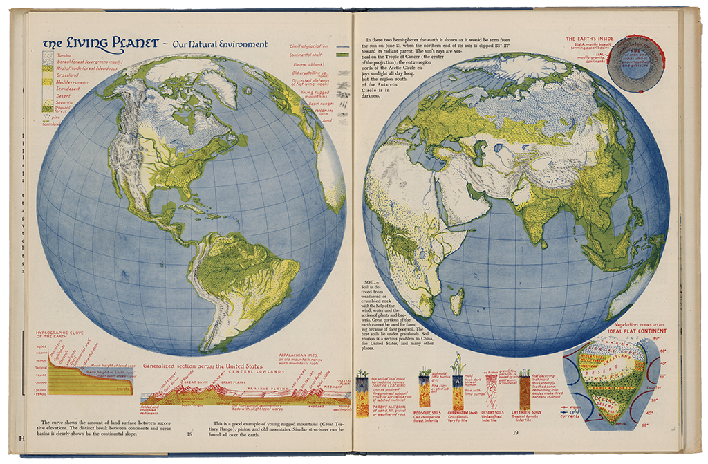
Our poster is inspired by classic double-planisphere maps, which pair two hemispheres side-by-side to display the whole Earth.
For example, we really enjoyed several spreads by Erwin Raisz, such as The Living Planet from his Atlas of Global Geography (1944).
After many attempts, though, we realized that there is no good way to split the Earth into two halves and retain all major landforms unbroken. You really need three views to appreciate major features uninterrupted. Below are early composition attempts, blurred to emphasize visual mass.
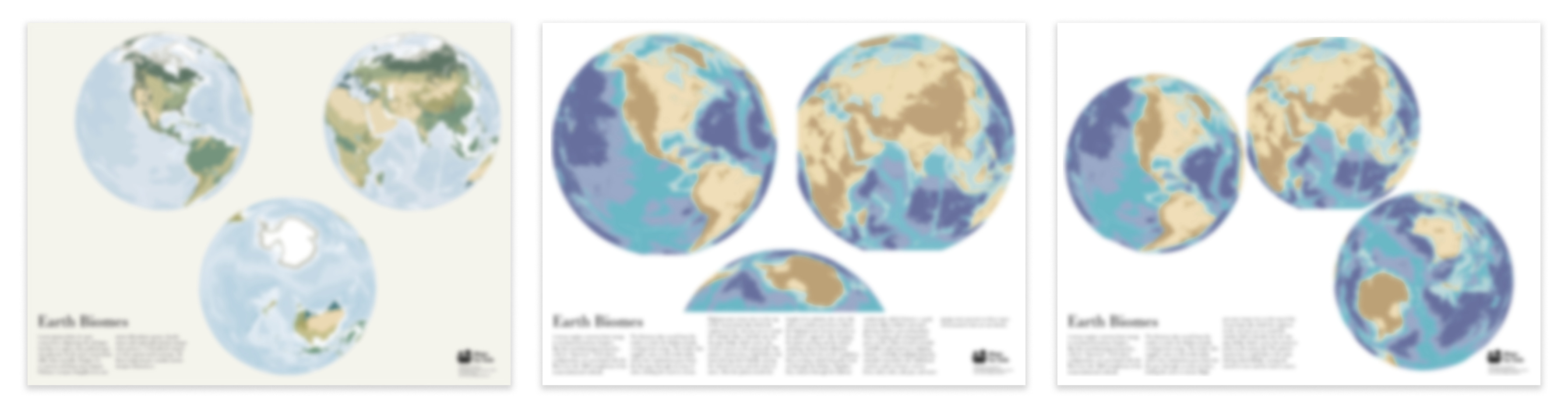
These didn’t work. The geometric arrangement on the left feels dead—and its Mickey Mouse ears are distracting. The middle one gives us bigger globes by only displaying a portion of one, but we really need three full views to include New Zealand (whose often omission has Kiwis justifiably upset). The organic flow on the right is too messy.
Our final triangular arrangement is cocked slightly counter-clockwise. This gives dynamic tension; it is more lively than the original triangle’s regularity but not as messy as the organic flow.
Landforms overlap where our three globes nearly touch. To emphasize the southern globe’s flipped relationship to the top two, its text is upside-down.
Data
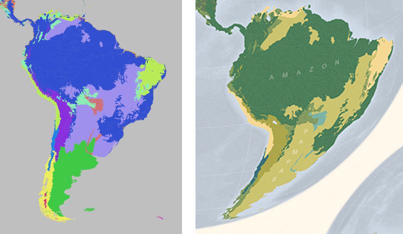
We started with the World Wildlife Fund’s major habitat types, part of its terrestrial ecosystems dataset. These define 15 biome types (including ice), each with a rather technical name.
Considering our audience, kids and their grown-ups, we combined some biome types, reducing the total to 11. We renamed most. For example, “Tropical & Subtropical Moist Broadleaf Forests” became “Tropical Rainforests”.
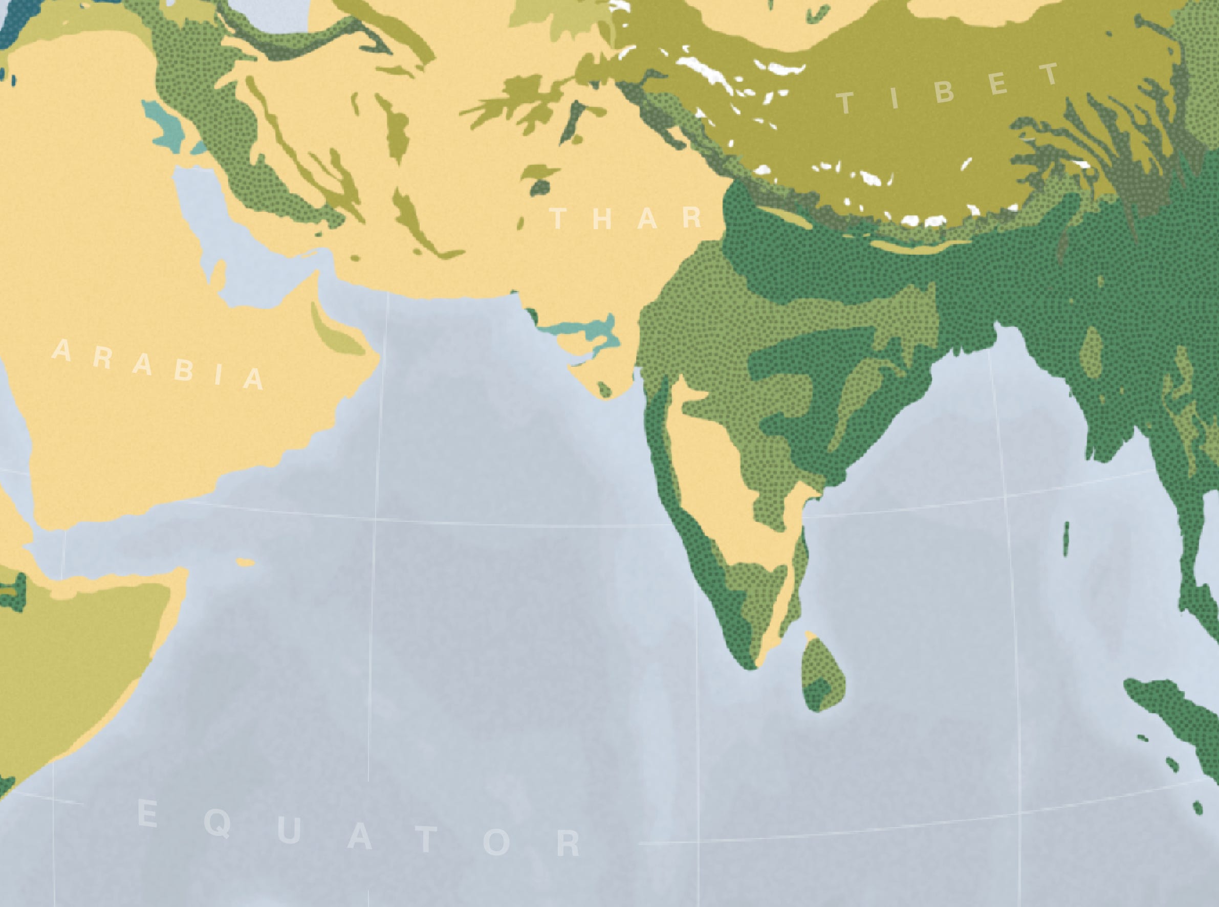
You can see the effects of this refactoring in the before and after views of South America. Notice the large grassy region on the right, which includes the Pampas. It was made by combining two original biome types that were hard to distinguish to our audience, seen on the left:
Temperate grasslands, savannas and shrublands (green)
Tropical and subtropical grasslands, savannas and shrublands (lavender)
Sea-depth bathymetry data was sourced from the GEBCO 2024 Grid. More on that soon.
Representation
Precision is a tricky aspect of maps. Too much detail looks fussy, and can result in distracting artifacts. Too little precision and important features may be distorted or disappear altogether. Ideally, the resolution of the data matches the map’s scale and purpose.
One approach to reducing detail is to remove some of the points that form the edges of features, but this tends to create jagged, artificial boundaries. An alternative solution is to smooth edges. Often, we use a combination of the two techniques.
Smoothing is simple in principle, but can be difficult in practice. Small features tend to disappear—often the very details that make a map intriguing. There’s a balance between enough smoothing to look good, but not so much that it removes important information. The below animation shows before and after-smoothing view of the Gulf of Mexico.
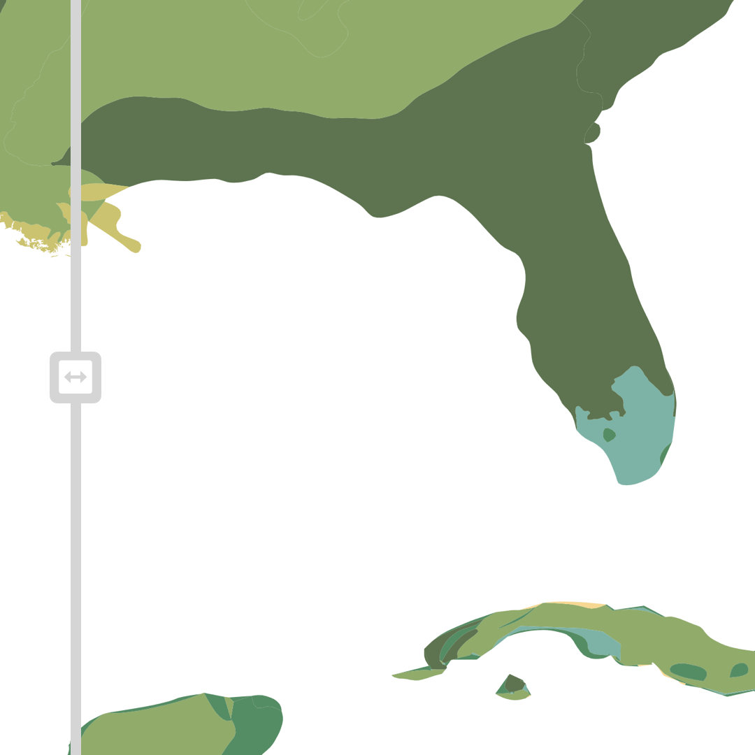
Notice how the coastlines and biome boundaries keep their character while reducing details that would only be distracting noise at our printed poster’s scale.
It required several smoothing attempts to preserve the “Flooded Grasslands and Savannas” covering the southern tip of Florida.
Our bathymetry data also required transformation. We downsampled, smoothed using a Gaussian blur, and quantized into regular contours.
Color
As usual with a map, choosing colors was one of the most challenging design decisions. In this case, we needed to balance discernibility—whether the individual colors stand out from each other—with readability—whether the colors make sense.
Each biome needed to be easy to distinguish from its neighbors, and be recognizable even without reading the legend. Typical qualitative color palettes used for differentiating discrete categories are often garish, filled with highly saturated primary colors.
Maps For Kids is largely inspired by Isotype Institute designs — pictorial statistics for the masses with flat colors and bold symbols. Our biome hues (and degree of smoothing) take direct notes from a 1930 map, Vegetationszonen der Erde, by Otto Neurath.
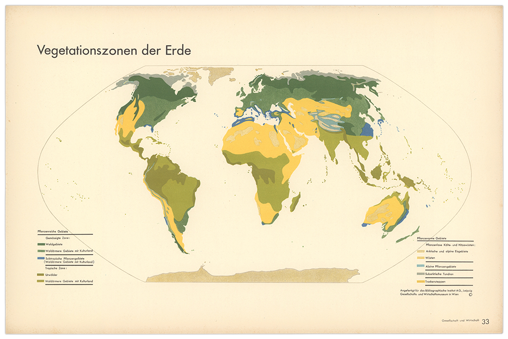
We chose to use a similar palette, with desaturated Earth-tone hues grouped into similar categories (different types of forest are different shades of green, woodlands and savannas incorporate more yellow, and desert is nearly beige). This choice, combined with merging related biomes, helps reduce visual noise while keeping each biome distinct. It also strikes a fair balance between appearing natural without coming across as a strict physical map. Ben Day patterns (tiny dots floating above the solid colors) further distinguish various forest biomes.
The other issue with color was balancing the biomes with the much larger ocean area. A single ocean fill-color would have emphasized the land, but at the expense of being rather bland. We chose to illustrate low-contrast bathymetry, aggregated into 10 levels with a nonlinear color scale.
Our ocean color ramp is wedged into a narrow value-band that maintains contrast with the ice biome’s white and the background’s cream. We created it in Adobe Illustrator using a custom script that interpolated colors between low and high values.
Inspired by Neurath, we also attempted warm oceans—see below—but determined them too avant garde for an audience that expects water to be blue.
We also considered a dark-background variant, as if the globes were floating in space. Alas, too planetarium.
Our ocean “blue” is in fact shifted subtly toward green to complement the cream-colored paper. The result helps the land areas stand out while giving interesting texture to the large ocean areas, especially in the Southern Hemisphere view.
Text and other annotations
One feature that makes a map a map is its annotations: the text that turns marks on paper into information. In the legend, small icons show the dominant vegetation for each region. Simple gauges indicate temperature and rainfall—two of the key ingredients that define biomes.
On the map itself, we overlaid a faint graticule, giving the globes a sense of volume and quiet authority.
Labeling the biomes was trickier. Many sprawl across multiple countries and languages; some have no common English name at all. We chose to label only the largest biomes, taking cues from the marine and terrestrial physical features in Natural Earth and adapting them for a primarily American audience. Each biome label is set small and in low contrast—you can read it when you go looking, but it mostly disappears when you take in the poster as a whole.
Our small block of introductory text gives just enough for a grown-up to to begin exploring the map with a kid.
Production
We discussed every design detail together, collaborating especially closely on color. Robert led the cartography, handling datasets, transformation, and projection. RJ led illustration.
Afterward, we made the below diagram to capture the cascade of tools, exports, and processes necessary to create our map. In practice, this flow emerged organically over several months and was never run all at once.
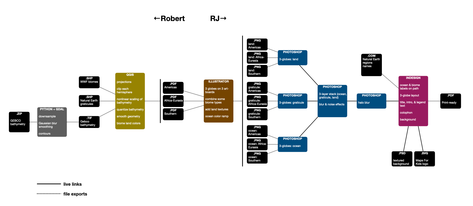
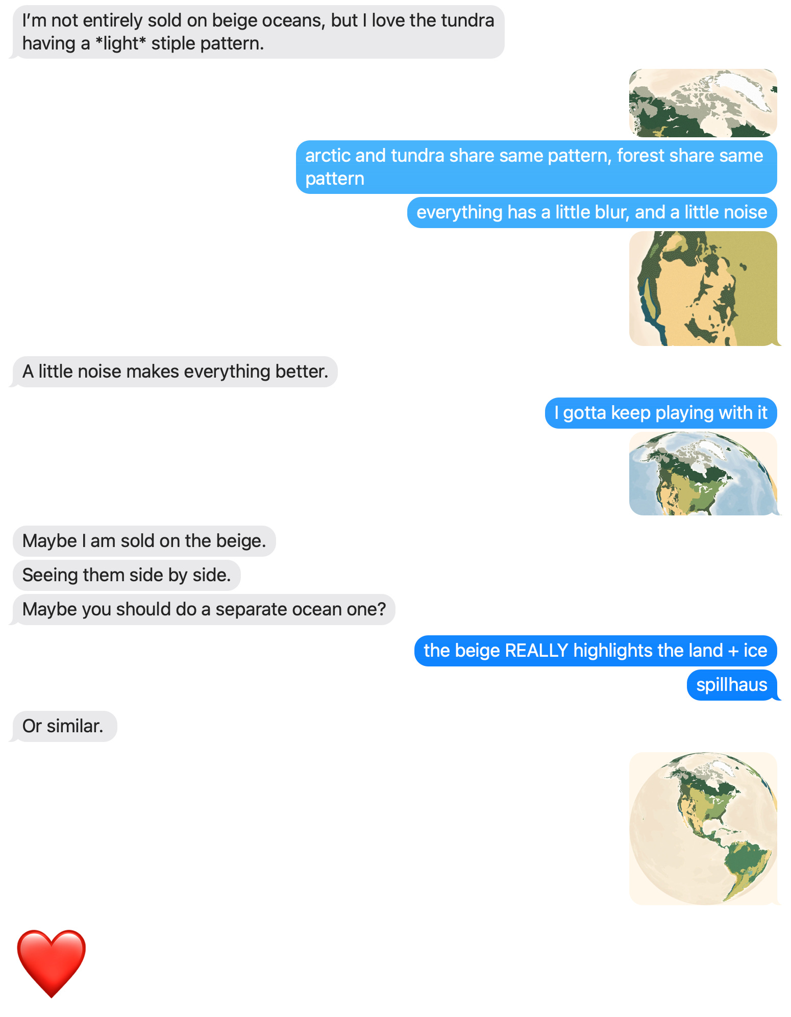
Both Bay-Area residents, we are lucky to have collaborated on this several times in person, reviewing print samples along the way. We also negotiated dozens of hiccups and decisions over iMessage. This particular exchange represents an ideal of creative collaboration: positive enthusiasm while engaging with the nitty-gritty.
Is the design a success? Adults who’ve seen it in person say it’s beautiful.
But the real test is in front of a child, unrolled on the kitchen table, hung in a bedroom, or stuck on the fridge. Does it catch their attention? Does it prompt a question? Does it spark their understanding and imagination?
As we write this, the first Earth Biomes posters are on their way to kids across the globe.
If you’d like to put the living planet at arm’s reach in your own home, and see how it performs in your own ecosystem, you can order one here:
About
Chartography is by RJ Andrews and the newsletter of Visionary Press and Info We Trust.
Robert Simmon is a cartographer and science communicator who specializes in visualizing satellite imagery. His work work has appeared on the front page of the New York Times and the cover of National Geographic. He is also known for creating the first global view of the Earth at Night, and crafting the Blue Marble featured on the original Apple iPhone. See his work at RobertSimmon.com.
RJ Andrews is obsessed with data graphics. He helps organizations solve high-stakes problems by using visual metaphors and information graphics: charts, diagrams, and maps. His passion is studying the history of information graphics to discover design insights. See more at infoWeTrust.com.
RJ’s book, Info We Trust, is out now! He also published Information Graphic Visionaries, a book series celebrating three spectacular data visualization creators in 2022 with new writing, complete visual catalogs, and discoveries never seen by the public.
A lovely digest of the design process. Enjoyed the description the layout’s “dynamic tension” and the sentence “Alas, too planetarium.“
Brilliant work centering life instead of borders. The three-globe solution really nails it - most people dunno how limiting the traditional two-hemisphere setup is until they see unbroken landmasses like this. What's clever is how the desaturatd palette keeps things natural without looking like a strict phyiscal map, kinda threading that needle between education and aesthetics.