
The Plea
Neil Halloran's new film about scientific-humanitarian triumph.

Welcome to Chartography.net — insights and delights from the world of data storytelling.
Neil Halloran just released The Plea, a short film about the eradication of smallpox. The story details how scientific and humanitarian achievement pulled us out of the horrors of history. It’s also a data-storytelling masterclass.
I’ve watched it three times this week and encourage you to sit down and experience The Plea before proceeding to my interview with Neil.
RJ: What made smallpox eradication the story you had to tell right now? When did you know you had the through-line, “we’ve done it before, we can do it again”?
Neil: I had been dreaming of making a smallpox film since well before COVID. I remember first gazing at a line graph depicting smallpox cases dropping to zero and wondering if it was the most beautiful image I’d ever seen. But it wasn’t until after COVID that I found enough interest and funding to bring the project to life. The eradication story was always meant to be a celebration of a triumph, but recently—with all the setbacks on both the science and humanitarian fronts—it became especially timely as a reminder of what we’re capable of.
What vision kept the script focused when it started to sprawl?
When I started digging into the history of smallpox, I went down a lot of rabbit holes. In an early version of the script, I featured translated text from Hittite tablets, where King Mursili pleaded with the gods to end the plagues. Smallpox is such an ancient disease, and our post-germ-theory understanding represents only a small part of our long relationship with it. That long story invited big philosophical questions—about disease, fate, and religion. Some of that stayed in, but I ended up cutting a lot of it. The version that more closely followed the scientific journey—from early forms of variolation, to Jenner’s experiments, to the WHO campaign —ultimately carried a stronger narrative.
Do you have a favorite frame—and why?
The crumbling pie charts come to mind. Unlike my war films, which focused on counting deaths as units, smallpox deaths felt best represented as proportions. I wanted the percentage-based visualizations to be emotional and cinematic—both in the cases of population loss (pie charts) and likelihood of death (Plinko shots).

Which dataset fought you hardest, and how did you decide it was “good enough”?
The Indigenous American data was especially challenging. I originally wanted to show what portion of the population died from smallpox, but when I revisited the research, I realized the data just wasn’t strong enough to support those claims. I reworked the section so that the charts reflected total population loss from colonization more broadly—still based on rough and uncertain estimates. I explained through narration that smallpox was likely the leading cause of death, but I couldn’t responsibly say more than that.
How do you develop the anchor visuals that reappear throughout a film? Tell me about the Galton/Plinko board as probability and ceramic dust as death.
The Galton/Plinko board visual emerged early as a way to express several ideas at once. I needed to show what smallpox looked like as a physical disease, but I worried that doing so could feel manipulative. The relationship between rash type and mortality rate gave me a way to ground that imagery in data—making it feel more like an exploration than an assault. I also hoped the metaphor would connect with viewers on a personal level. Smallpox might seem like a distant topic, but the experience of uncertainty in the face of disease is something I hoped could foster an empathetic connection.

The tombstone waffle chart and shaded photos—do these unique images start with a data itch or a design itch?
In this case, I wanted to show relationships across a sequence of datasets—from the relatively dense London Bills of Mortality to the simpler demographics of smallpox victims. The age breakdown called for a minimal design, and I was drawn to iconography that visually reflected the time period. Beneath the simplicity of the infographic was a more complex story about immunity—about what it means for a population to be so deeply infected for so long. One advantage of simpler charts is that they reduce the risk of overwhelming the viewer when you add another layer of information.

What’s the secret to pacing infographics, animation, and primary sources so the story never stutters? Do you have any advice for managing a huge stable of content?
For me, it so often comes down to the writing—and finding ways to say things succinctly, or not at all. My first narration pass is usually as concise as I can make it, but when I record it, I often realize it’s still too wordy. Then, when I edit the narration against visuals, I find myself cutting even more. It’s a cycle of hunting for cuts. Fewer spoken words give more room to control pacing—either by pushing the story forward with a sense of momentum or by allowing for dramatic air between ideas. Charts, in theory, let you “show, not tell,” but rough cut viewers have sometimes expressed that I didn’t explain enough, which means I occasionally cut too far. My favorite moments are often the ones with no narration at all. That’s almost always the goal: to let the data be the star. But it’s hard to create such opportunities.

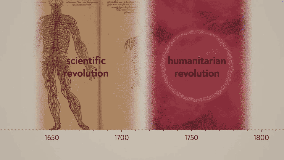
Earthy tones and dark magenta: where did the film’s visual style come from?
The color scheme evolved throughout the project—and it was a struggle. Compared to my other films, this one used a wider range of archival material and more types of charts. I knew I wanted a “hero” (or villain) color for smallpox to carry through the entire film, and magenta emerged after a lot of experimentation. I wanted it to pop, but still feel cinematic. The earthiness came in part from the old scientific illustrations —I wanted the colors to feel both old and new. I had a lot of help from other designers, and for the first time, I sent the film through a color treatment with a production studio: TBD Post in Austin.
Is today’s distrust of science or lack of humanitarianism a bigger problem?
They feel intertwined, don’t they? In the film, I tried to explore the idea that the scientific and humanitarian revolutions are linked, though I can’t say I fully understand that relationship. Still, it’s hard not to notice that we’re seeing backslides in both areas these days. Between the two, I’d say humanitarianism is more important—because caring more about other people is my favorite type of progress, and it’s what gives me hope for our survival. Also, as I’ve explored in my climate film, I’m a little wary of “trust” when it comes to scientific literacy.
What’s on the storyboard wall right now?
I’m almost certain my next film will be about car crashes—I have a very rough script in the works. I’m also thinking a lot about a film that involves visualizing pain. That one’s still in the very, very early stages.
Neil Halloran is a documentary filmmaker known for blending data and narrative to explore complex topics like war, public health, and climate change. His four independent films—The Fallen of World War II, The Shadow Peace, Degrees of Uncertainty, and The Plea—use animation and data visualization to explain statistical information through emotionally engaging, cinematic storytelling. Neil’s films are available online, including on YouTube, where they have reached large global audiences. He has collaborated with institutions including the Nobel Peace Center, Gates Ventures, and the RAND Corporation. He lives outside Philadelphia with his family.
About
RJ Andrews helps organizations solve high-stakes problems by using visual metaphors and information graphics: charts, diagrams, and maps. His passion is studying the history of information graphics to discover design insights. See more at infoWeTrust.com.
RJ’s book, Info We Trust, is currently out now! He also published Information Graphic Visionaries, a book series celebrating three spectacular data visualization creators in 2022 with new writing, complete visual catalogs, and discoveries never seen by the public.
What a powerful documentary. I really like the choice of magenta for the smallpox. It's arresting without being too dramatic. Really interesting to read your interview and see how Neil made choices about art direction and narrative ☺️