Welcome to Chartography: insights and delights from the world of data storytelling.
This issue takes a breather from our “How to Value Data Graphics” series (read recent Part 7 here). Today we’ll eye a spectacular chart type with a bunch of bigger-than-normal images, so it’s a great desktop read. Enjoy!
Ascent diagrams
The 1860s and 1870s saw a golden age of ballooning. Daring military, scientific, and aeronautical adventures elevated our understanding of our planet, what could be accomplished with human ingenuity, and what physical trials we could endure.
These exploits were meticulously chronicled with a particular data graphic I call the ascent diagram.
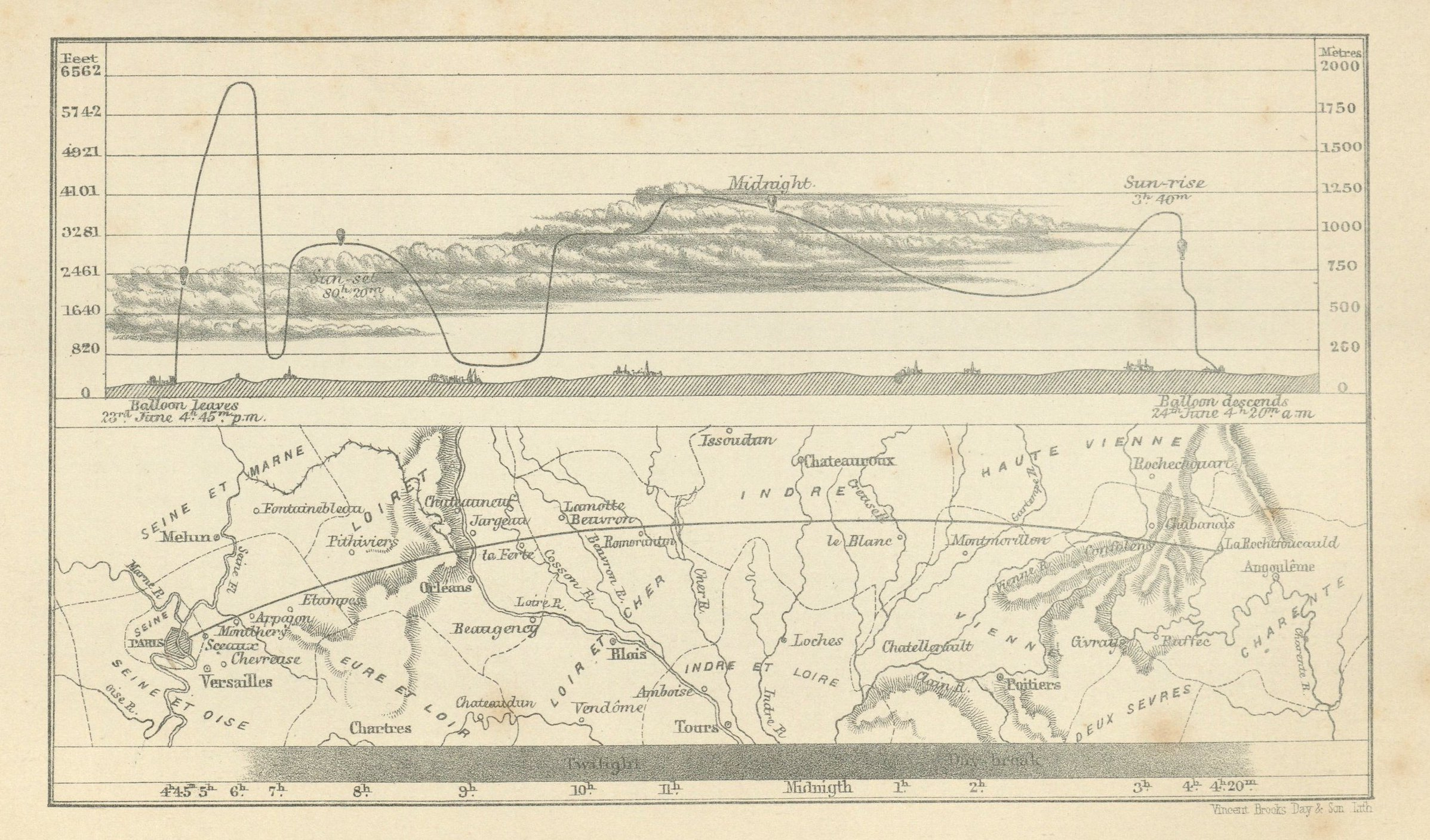
Ascent diagrams tracked hot air balloon voyages by plotting their altitude on the vertical axis and approximating travel-over-land, from left to right, on the horizontal axis. Their curves’ steep climbs and descents give a sense of the ride.
The above ascent diagram illustrates the “Course of the Balloon in M. Flammarion's ascent from Paris to La Rochefoucauld, June 23-24 1867.” It was produced by James Galisher (Travels in the Air, 1871), and is courtesy of the David Rumsey Map Collection.
The image showcases a multitude of intricate design techniques and aesthetic flourishes that make this genre truly captivating. From top to bottom:
A balloon icon accents the route
The route moves through illustrated meteorological phenomena (here, clouds)
Ground level’s rolling hills are illustrated above the chart’s sea-level baseline, punctuated with pictorial villages
A top-view map of the voyage fills below the chart’s baseline
A shaded band indicates night’s darkness
The horizontal scale compresses and extends the hours of the journey to accomodate time and space
Annotation abounds
I first learned about diagrams while translating E.-J. Marey’s The Graphic Method with my co-editor Georges Hattab. Marey exposed us to Gaston Tissandier (1843–1899), French chemist, meteorologist, aviator, and founder-editor of the scientific magazine La Nature. Tissandier escaped besieged Paris by balloon in 1870. He was also the only survivor of the infamous high-altitude flight of the Zenith, which killed the other two scientist-aeronauts on board by asphyxiation.
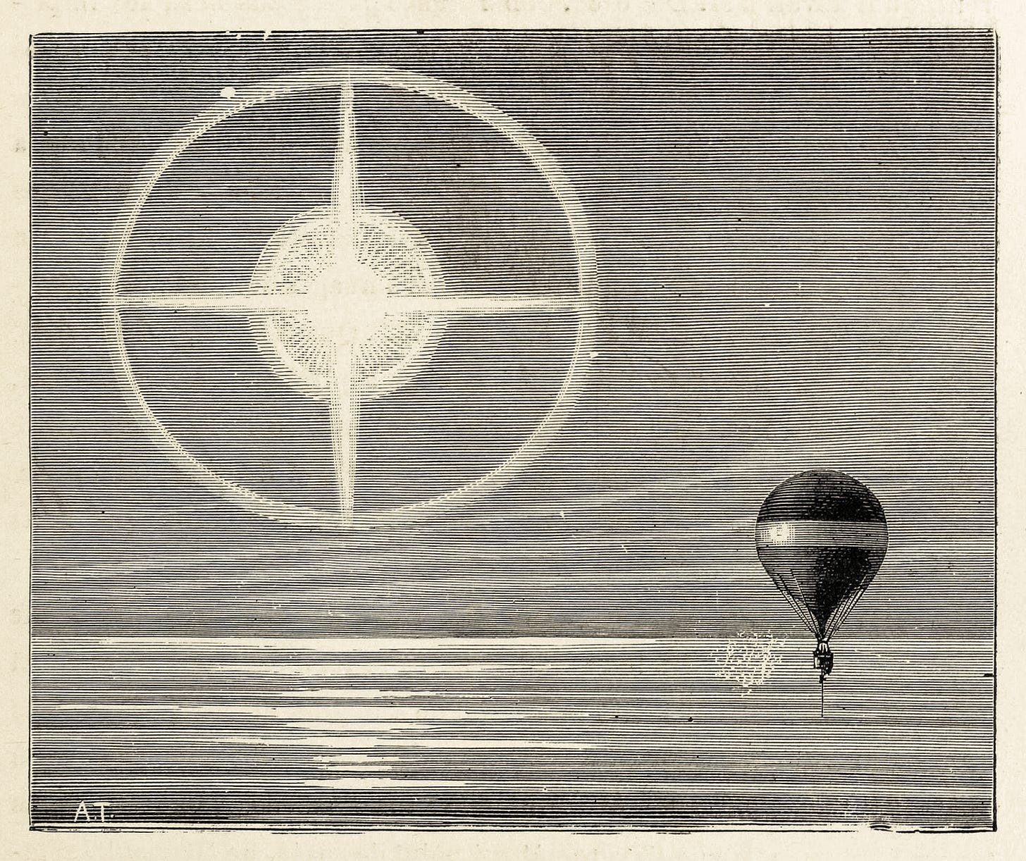
Tissandier produced diagrams of many of his flights, often accompanying them with illustrations of his daring exploits. Below are images of an endurance flight highlighting the observation of a lunar halo.
In our volume, Hattab and I provided a detailed account of this flight:
Five men rose into the air at 6:20 p.m. and flew for twenty-two hours. They used inscribing devices to record the levels of carbon dioxide, barometric pressure, temperature, humidity, and direction and speed of the balloon. Along the course of their voyage they also threw overboard printed forms to crowdsource additional environmental data from observers on the ground. During the flight they observed luminous phenomena, such as perceived halos and crosses resulting from sunlight interacting with ice crystals in the clouds.
—Étienne-Jules Marey, The Graphic Method (Visionary Press, 2022)
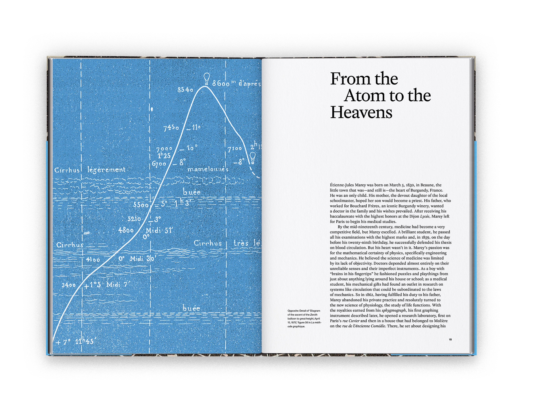
Tissandier’s diagrams moved me deeply, especially with Marey’s palpable enthusiasm for them. As a result, we chose one as our book’s frontispiece. (Georges Hattab’s favorite diagram went on the book’s cover.)
To me, ascent diagrams represent the best of what is possible with data storytelling. Their data is complex, but they are as accessible as a children’s book.
They are as engaging as they are informative: They can contain many layers of annotation and many types of pictorial illustrations. They solve the designer’s nightmare of plotting time and space (in three dimensions no less!). Incredibly, they don’t need any color to work.
James Glaisher, whose diagram kicked-off this issue, produced the most lavish ascent diagrams I have seen. Look at these details! In one diagram, the background darkens to indicate night:
In another diagram, the balloon’s route disappears into the clouds:
The golden age of daring ballooning pushed the boundaries of human exploration and endurance. The 1860s and 1870s were not just about the ascension of balloons, but also the rise of an audacious spirit that continues to inspire modern exploration and innovation.
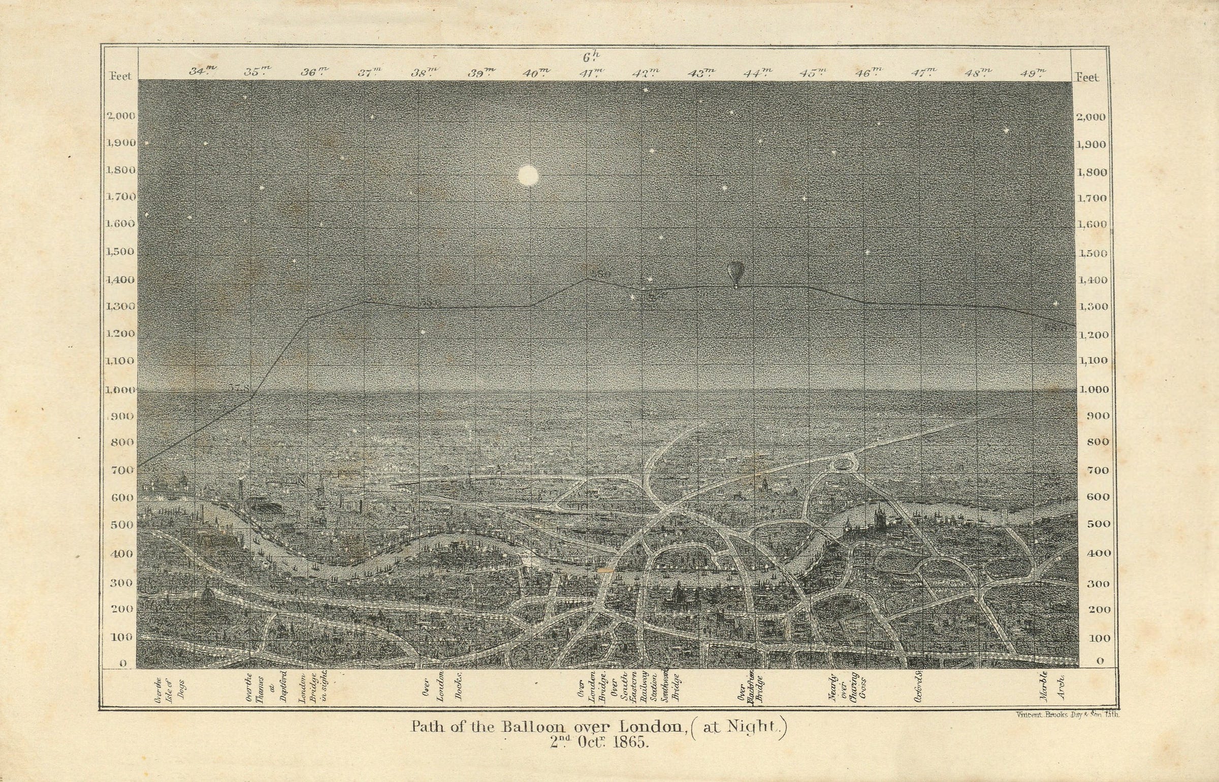
At their best, Glaisher’s diagrams captured that audacious spirit. They hurled it down through history so that we could imagine what it must have been like, for example, floating above London in the middle of an October 1865 night (below). This is where data becomes art.
See more ascent diagrams in the notes below. If you know of others, I want to hear about them.
Onward!—RJ
Notes
Ben Gross, VP for Research & Scholarship at the Linda Hall Library, put James Glaisher’s ascent diagrams on my radar.
See images of Glaisher’s Travels in the Air at the David Rumsey Map Collection. Don’t miss the connected scatter plot. link
See Tissandier’s Histoire de mes ascensions at BnF’s Gallica. link
About
Data storyteller RJ Andrews helps organizations solve high-stakes problems by using visual metaphors and information graphics: charts, diagrams, and maps. His passion is studying the history of information graphics to discover design insights. See more at infoWeTrust.com.
RJ’s recently published series, Information Graphic Visionaries, a new book series celebrating three spectacular data visualization creators. With new writing, complete visual catalogs, and discoveries never seen by the public. His first book is Info We Trust, How to Inspire the World with Data.


