
Data Micrography
Curvy labels and other concrete text for charts.

Welcome to Chartography.net — insights and delights from the world of data storytelling.
NOTICE: The Independent Map Artists collective is offering its first-ever Map of the Month subscription for a limited time (closes June 15th). I’m delighted my California cross-sections map is part of this freshman run. Learn more and subscribe to the series here:
Moses’ second commandment prohibits the making of idolatrous images. This rule led various Abrahamic sects to shun representational pictures, which in turn further elevated lettering, the manifest word of God.
Clever worshippers, however, found a creative loophole back to images via micrography, whereby representational or abstract artwork is created from text, usually with some meaningful interplay between letter and image.

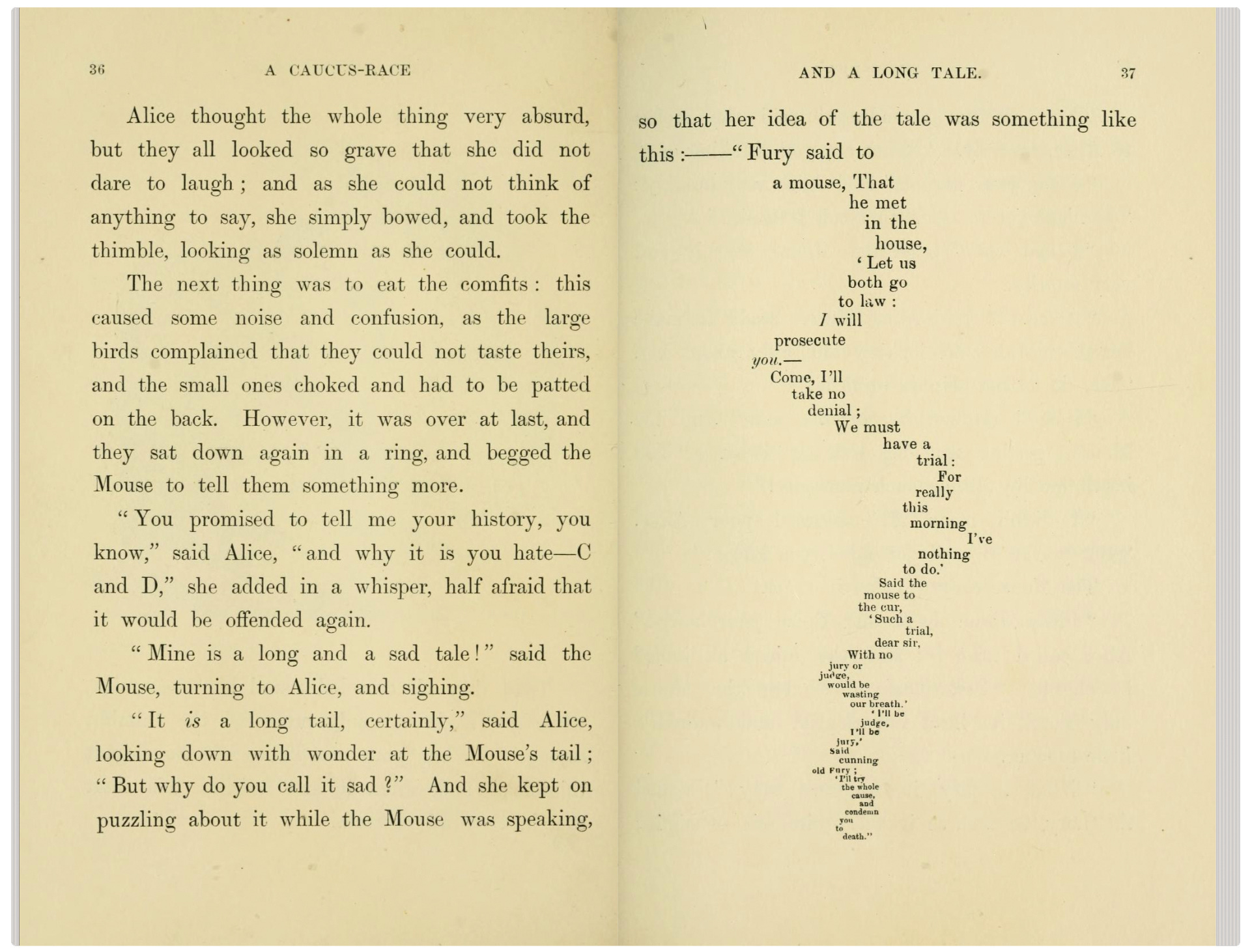
You may recognize this tradition persisting beyond religious iconography in concrete poetry, shaped text, and even ASCII art. There’s an entire subgenre of children’s picture books made only with letters.
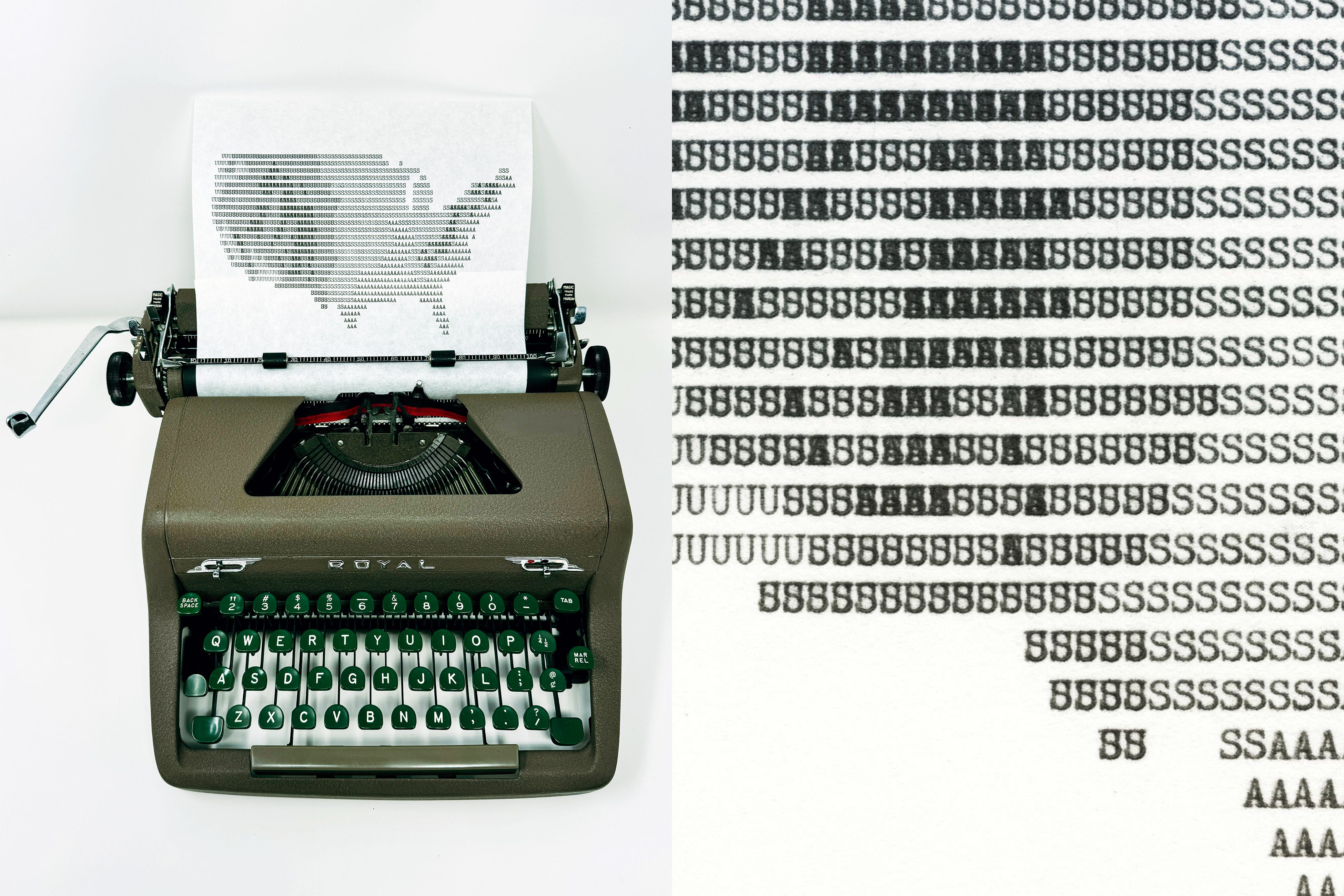
Some of these practices inspired my elevation map of the United States, typed using only the letters U, S, and A.
In 1972, John Tukey enthused “if we’re going to make a mark, it might as well be a meaningful one.” Micrography is a promising avenue for us to stroll as we strive to make more meaningful charts. In fact, there are some examples of shaped- or micro- text already enhancing visualization.
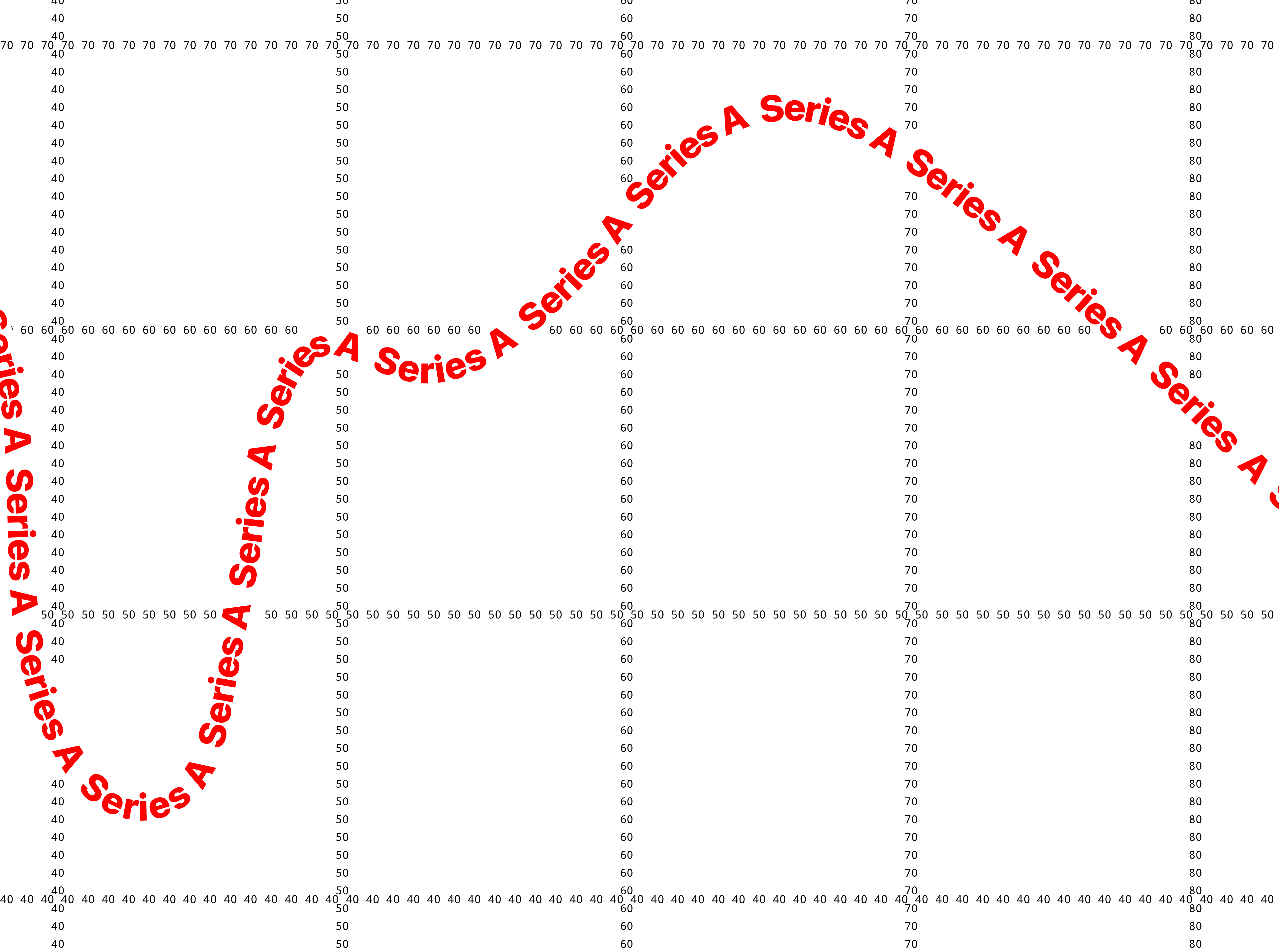
Curvy Labels
My favorite data-micrography technique bends the label of a curve along its path. For example, see how Longueur moyenne exploitée moves across this railway chart in Émile Cheysson’s 1906 Album de Statistique Graphique.

(Also note how the Paris world-expo outlier-bumps are vertically labeled.)
This curvy labeling flourish was not a one-off happy accident. Cheysson employed the technique throughout the line graphs of his later volumes.
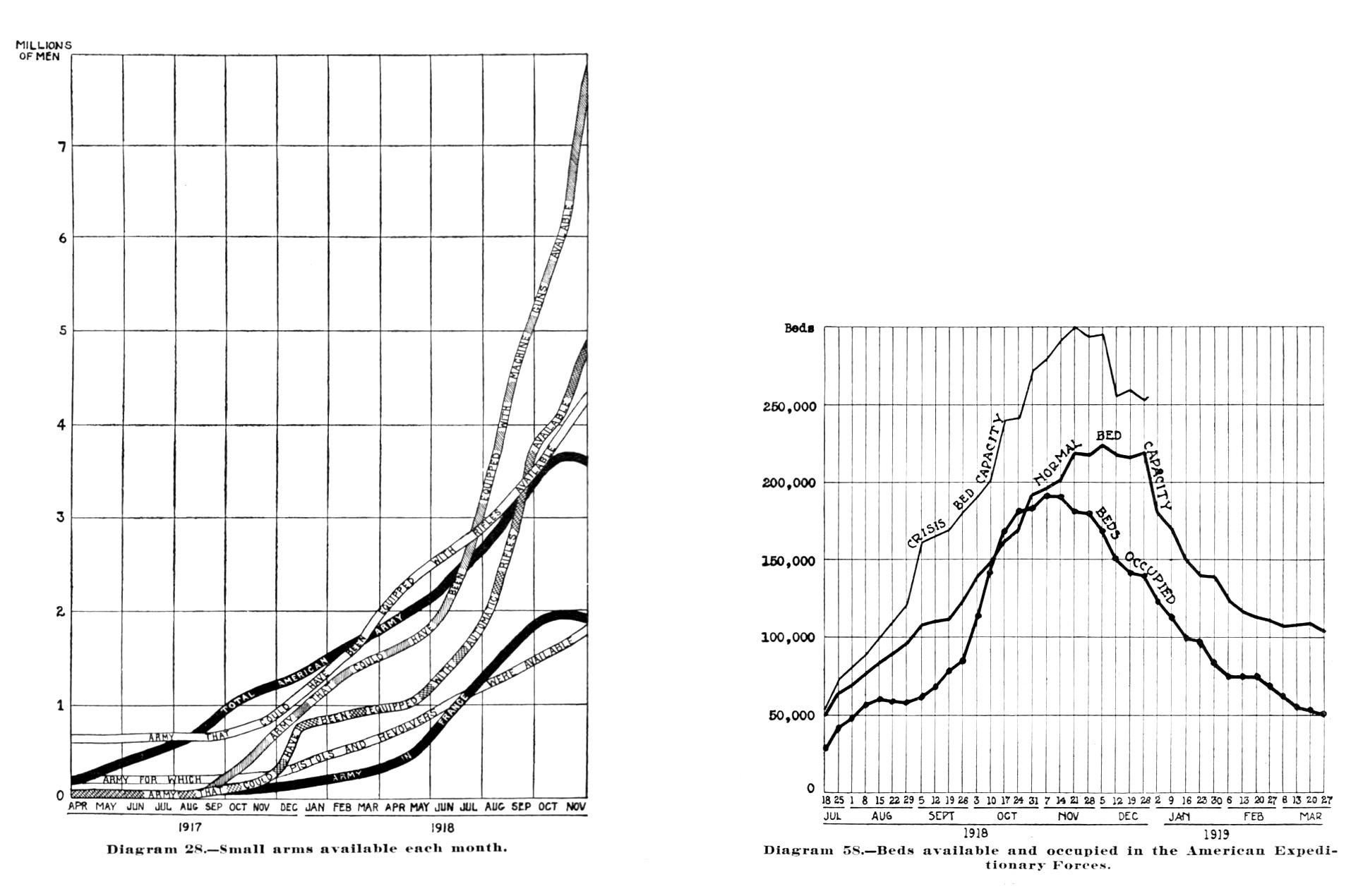
By the end of the first World War, it seemed that curvy labels were a standard practice across our field, rampant for example throughout 1919’s War with Germany:
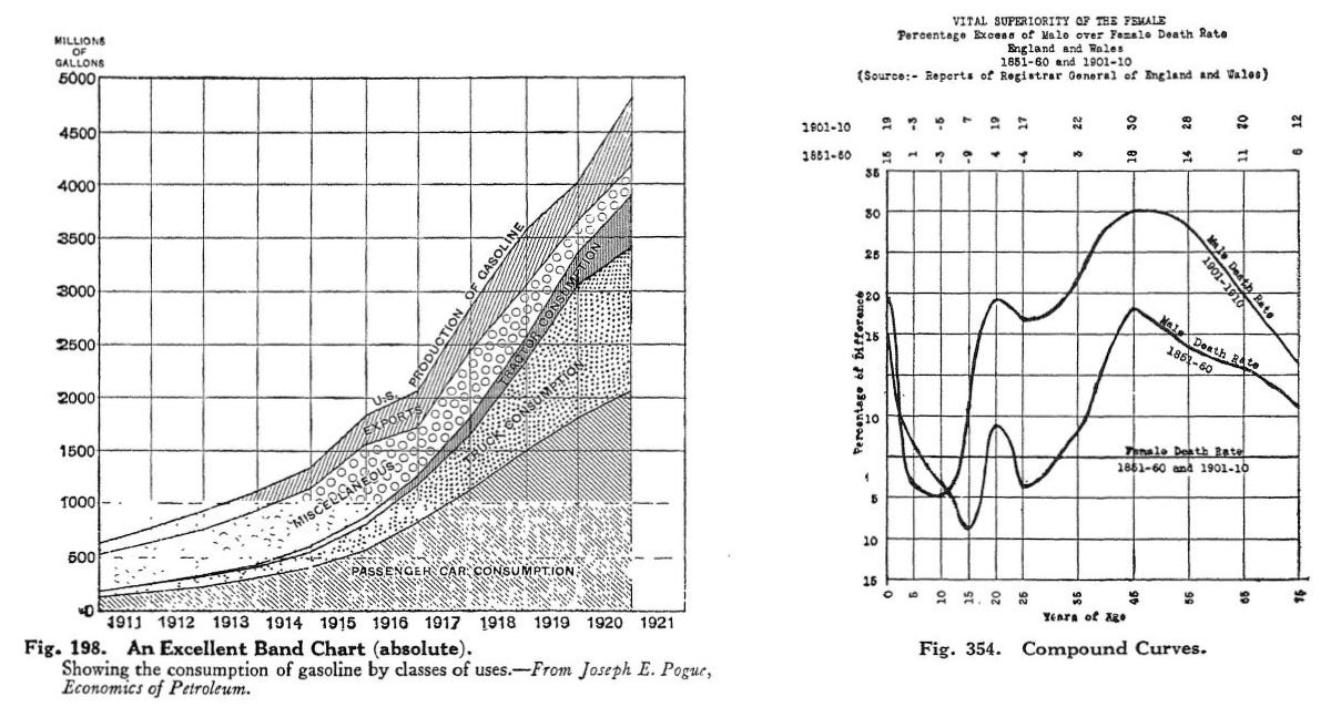
They also appeared in many line graphs selected by Brinton (1914) and Karsten (1923, below) for their megalithic books surveying charting practice.
It seems that curvy labels were taken for granted when charts were lettered or typeset by hand. Today, we can appreciate how the practice aligns with contemporary advice to directly label marks.
Curvy labels deserve revival, but they aren’t as easy to implement by machine. Getting type to hug a Bézier path without collision is not yet automated to my knowledge. You can see some implemented for the web, by hand, in my charts.infowetrust.com project.
Text used as marks (not just labels)
The last generation of analog data experts were hip to a different micrography technique.
A decade after Tukey’s “meaningful mark” quip, Edward Tufte identified graphics where "data points are themselves data." Later, Tufte called on Tukey’s quote in the Micro/Macro Readings chapter of Envisioning Information (1990). There, Tufte observed “a most unconventional design strategy: to clarify, add detail.”
Tukey’s stem-and-leaf plot is a classic example of this attitude. Consider the five ways of displaying the same data, below, from Exploratory Data Analysis. Normally, we plot a histogram or bar chart distribution using geometric objects, such as rectangles or other uniform marks, as in option (C).

Using text as marks, as in options (D) and (E), gives us the same distribution profile as option (C) while also adding interesting detail.
I had this micrography spirit—and the writings of Tukey, Tufte, and William Cleveland—in mind when I created the below comparison of the abundance (percent by weight) of the seven most common chemical elements in people and plants for my book Info We Trust (Visionary Press, 2025).

The charts would be less detailed and/or clunkier if each element was instead represented by a blue circle with label—as is the case in most scatter plots.
Text as Graticules
Last week, I hosted a client meeting focused on accessibility considerations and chart design. We discussed various user behaviors, including how some zoom-in to read what’s going on.
The trouble with zooming into a chart is that you lose its axis reference scales.
We challenged why axis labels are relegated to the outer perimeter of the canvas. Why not bring them inside too? With a weak sense that this is already done on some measuring rulers and map coordinates, I made a quick sketch of our idea:

But, micrography shows us that we could push things further. Why bother with labels at all?
The mark and its label can be one.
The axis and its value can be one. The curve and its name can be one too!
I believe there’s riches in data micrography and excited to experiment and learn more. Please share examples and inventions, from yesteryear and today.
Onward!
—RJ
About
RJ Andrews helps organizations solve high-stakes problems by using visual metaphors and information graphics: charts, diagrams, and maps. His passion is studying the history of information graphics to discover design insights. See more at infoWeTrust.com.
RJ’s book, Info We Trust, is currently out now! He also published Information Graphic Visionaries, a book series celebrating three spectacular data visualization creators in 2022 with new writing, complete visual catalogs, and discoveries never seen by the public.
Brining the axis labels inside the chart - that’s neat!
I’ve been exploring the opportunities different fonts offer for displaying text as marks: https://graphpaper.substack.com/p/typography-as-data-visualisation
Brilliant!