
"Illustration Invades Everything"
Minard on his useful idea, part 1.

Welcome to Chartography.net — insights and delights from the world of data storytelling.
This summer, we are showcasing a series of historic writing about information design. It is the SUMMER OF CLARITY! These essay inspired the blue marginalia in my new book Info We Trust ($39 from Visionary Press).
In 1861, Charles-Joseph Minard, eighty years old, published a treatise on his “useful idea”—ingenious flow maps which still inspire today. The essay reveals the design thinking behind his extraordinary intellectual and creative power.
Minard was eighty years old when he wrote this treatise. He probably thought he was at the end. We now know that Minard would go on to produce two dozen more flow maps before his death a decade later. They include a beautiful series on cotton imports during the American Civil War, a map showing the spread of ancient languages, and an iconic depiction of Napoleon’s disastrous Russian campaign.
The following original translation augments Minard's original plates with images of works referenced by his text, but not illustrated in the original 1861 publication. Further context is given by me in [square brackets].
Graphic Tables and Figurative Maps (part 1)
“To each his own”
Today’s great expansion of statistical investigation has made it necessary to record its results in less dry and more useful forms; forms that can be explored faster than numbers alone. Hence the various representations that have been imagined, including my graphic tables and figurative maps.
By giving statistics a visual direction, I followed the general impulse of the mind toward graphic representations.
Today, images apply to everything: Real estate, furniture, and clothing advertisements are always accompanied by plans and drawings. In major criminal trials, the layout of the premises is put before the jurors. The holiday gift book is more the work of the lithographer than of the writer. La Fontaine made animals speak in his fables; but we wish, even more, for Granville to show their likeness.
In the expectation of publication, a photographer is attached to every expedition; it’s not just science books, as was sometimes seen even two hundred years ago, that show text and image together on the same page.
Illustration invades everything, and by making statistics visual, I satisfied the need of the day. But did I sacrifice to the taste of the time? Or, have I contributed to increasing the usefulness and shortening the time of interpreting statistical studies? That’s what can be judged by reading the following pages.
The dominant principle that characterizes my graphic tables and figurative maps is to make numerical proportions immediately appreciable to the eye, as much as possible.
I first imagined, in 1844, a graphic table of which Plate I is a copy [below]. Published in one hundred copies, it represents the number of passengers on the total and partial routes of several railways.
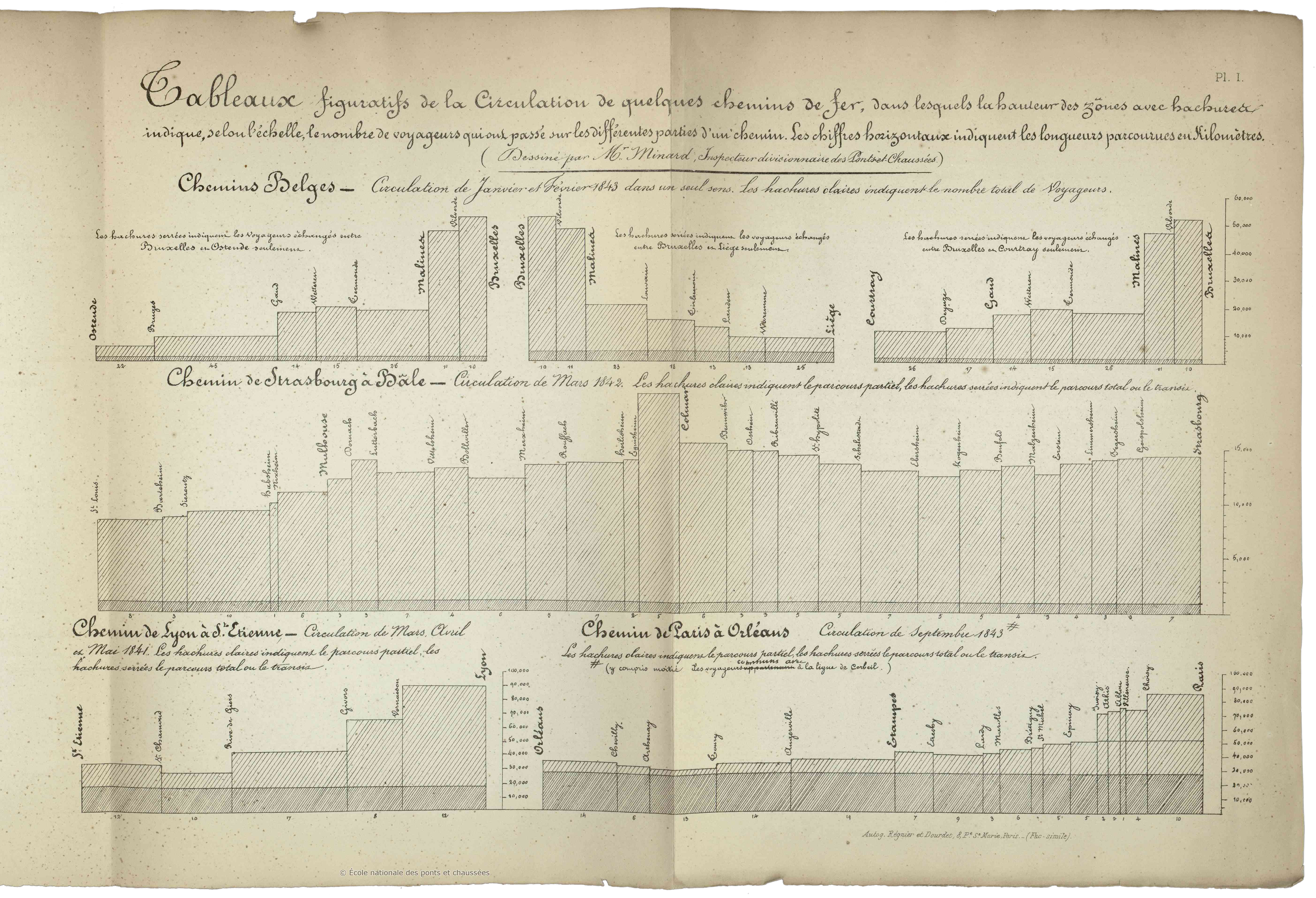
On the horizontal line I added, end to end, the lengths between stations. These lengths are the bases of as many rectangles whose vertical heights are proportional to the numbers of all passengers who passed between two consecutive stations.
A portion of these rectangles corresponding to the passengers traveling the total route distance is distinguished by a darker shade than that of the portion relating to the passengers who traveled only part of the total route.
By means of these rectangles and shading, one can see at a glance the ratio of all travelers who passed between any two stations and the ratio between total route and partial route passengers.
Additionally, the total area of each rectangle is proportional to the number of passengers carried 1 kilometer (an important metric of railway traffic). The comparison of these areas promptly give, in one image, what written numbers only give slowly by arithmetic multiplication.
The following year, in 1845, I published, using the same system, the first graphic table on the trade of the Central Canal [Canal du Centre was the first canal allowing boats to pass from the north of France to the south]. Plate III is a facsimile [below]. In this graphic table the rectangles relating to various goods have different colors. This lithographed and colored graphic table was distributed at the end of 1845 to about a hundred people: engineers, deputies, etc.
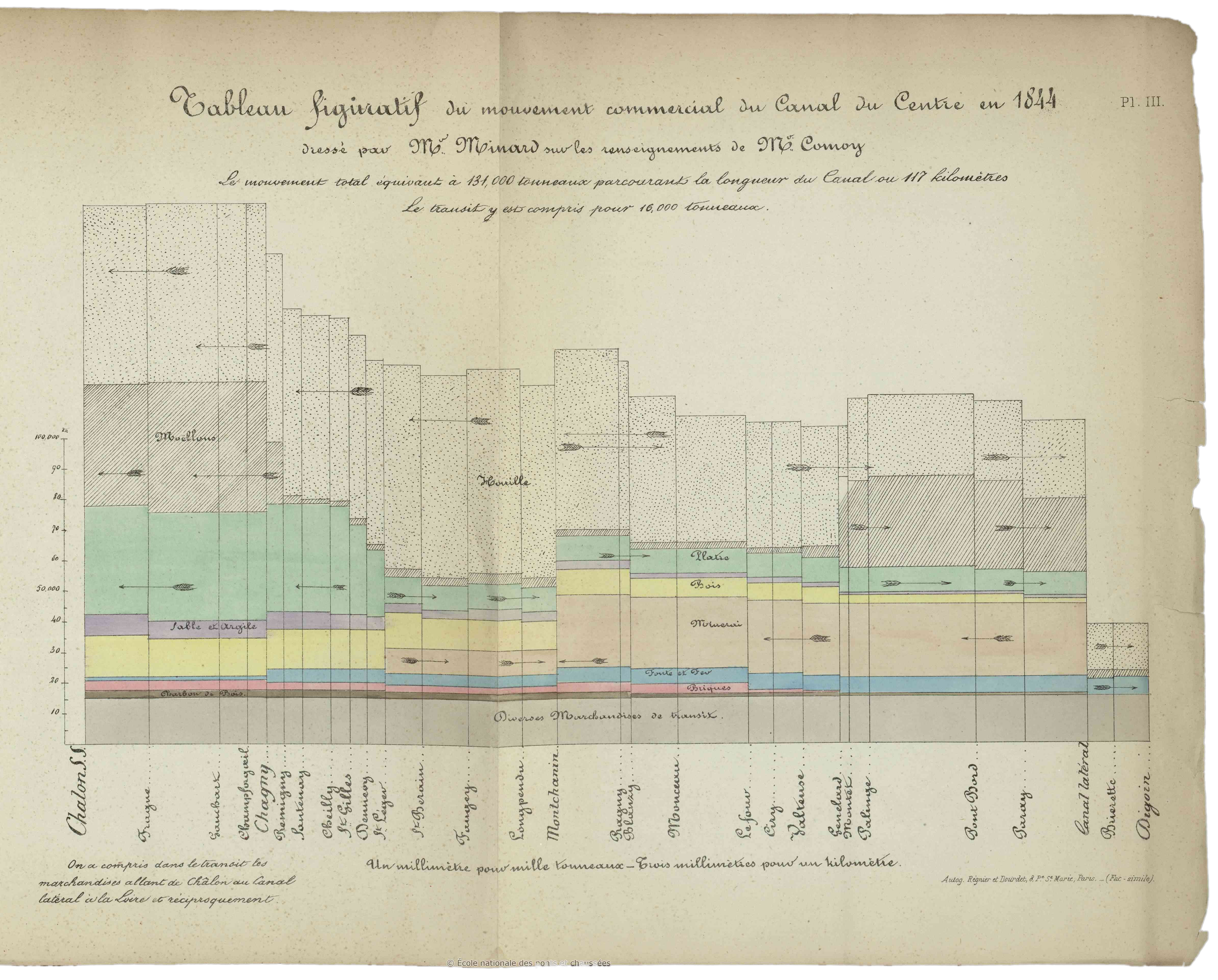
This mode of representation has a small disadvantage in terms of commercial use: sometimes the progress of a commodity cannot be easily followed by the eye, because the rectangles of the same color that represent it are separated by those of another color. If we want to be fully aware of the movement of this commodity, we must have a graphic table for it alone.
In that year, applying the same system differently, I arrived at the figurative maps in which the rectangles of the graphic tables are replaced by tinted areas that follow the transport routes and whose widths are proportional to traffic.
It March 1845, during the [planning] discussion of the railway from Dijon to Mulhouse, I published my first figurative map; Plate II is a facsimile [below]. Passengers traveling on the roads in the region, between two cities, were represented by tinted areas that follow the contours of the roads and have widths proportional to the number of passengers passing through them in public coaches. Mr. Frémy, then an auditor with the State Council and now a State Councillor and Governor of Real Estate Credit, carefully took note of the situation on the spot.
My lithographed map, in two hundred copies, was distributed to the members of the Council of Bridges and Roads, as well as to Representatives of the Departments concerned, to Engineers, etc. and enlightened the meeting’s discussion [Departments are government jurisdictions below administrative regions]. The [figurative map] idea was broadly welcomed to guide opinion in the choice of a route in general, and in particular the route which followed the Doubs valley [see how more coach traffic flows along the Doubs River compared to the Ognon River]. The map was so successful that someone produced, using my name, a forgery where he drew false zones in favor of a rival line through the Ognon valley.
It is by sight alone that this map, which was found to be eloquent, made visible the relationship between the numbers of travelers because, you may notice, it does not include a single numeral.
Advantageously, an instant evaluation of the reported statistical results and their overall configuration can be judged at a glance with figurative maps, as long as they are contained in the ordinary field of vision, while maintaining respective geographic positions.
These benefits were readily grasped by the engineers. A few months after my figurative map of passengers between Dijon and Mulhouse had appeared [Plate II, above], several engineers imitated it to support their railway projects: Mr Reynard for the railway from Grenoble to Valence, Mr Léon for the railway from Poitiers to La Rochelle, Mr Maillebiau for the railway from Bordeaux to Bayonne. All produced, based on my system, figurative maps of the travelers circulating in these regions.
Nevertheless, if my maps immediately afford simple ratios such as double, triple, etc.., which, I repeat, is only obtained from numerals through a rather long mental operation, this advantage fades if you have to compare very disproportionate elements. With numerals, when the smallest has only two digits, with a little time the mind can grasp the quotient; which is why I also write the numerals on several of my maps.
Additionally, the spontaneous evaluation of large quantities has always been very uncertain. Who doesn’t know how difficult it is for a general to count enemy troops that are in sight? Napoléon himself stated that even with his long experience, he was mistaken by a quarter at least. And yet nothing can tell the eye the number of men better than the men themselves placed next to each other.
In the past, I have not seen any expressive maps other than those of the first geographers who depicted countries by their animals.
The application of algebra to the geometry of Descartes gives us geometric curves representing the relationships between two variables. Tidal curves were one of the most remarkable applications of this discovery; I do not know if we know to whom they are due. This is an improvement in graphical representation, since the eye can see the successive heights of the tides.
Ons-en-Bray’s ingenious 1734 idea to draw a graphic table of prevailing winds using the wind itself acting on a mechanism can be applied to the representation of the tides. [top of Ons-en-Bray’s anemograph shown below]
Today we have the tide gauge, an instrument by means of which the sea itself draws on paper the heights of the tides across successive hours, giving the most complete and accurate curves of this movement. [The first self-recording tide gauge was created by James Mitchell and installed in 1831 at the Royal Navy’s Sheerness Dockyard in Kent, England]
In the 18th century, we see the first application, I believe, of Descartes’ system to phenomena without determined laws, such as those concerning public economics. Descartes drew curves according to the relationship of two variables. The question was reversed to investigate whether simultaneous, more or less correlative facts, recorded on abscissa and ordinate, could correspond to known curves or give useful representations. [The abscissa and the ordinate are respectively the first and second coordinates of a point.]
Minard’s treatise is continued in part 2:

Charles Joseph Minard (1781–1870) was a French civil engineer and professor known for his significant contribution in the development of numerical data on geographic maps, especially flow maps.
This translation was first published at InfoWeTrust.com. I am grateful to William Berg, Professor Emeritus as Wisconsin-Madison, for improving this translation effort.
Translation ©2019, 2025 RJ Andrews. All rights reserved.
Let me know if you can help improve this translation, or have suggested entries for future editions of THE SUMMER OF CLARITY.
About
RJ Andrews helps organizations solve high-stakes problems by using visual metaphors and information graphics: charts, diagrams, and maps. His passion is studying the history of information graphics to discover design insights. See more at infoWeTrust.com.
RJ’s book, Info We Trust, is currently out now! He also published Information Graphic Visionaries, a book series celebrating three spectacular data visualization creators in 2022 with new writing, complete visual catalogs, and discoveries never seen by the public.
RJ, Your "Summer of Clarity" series is, without a doubt, the finest set of visual readings I've seen in years. Thank you for making this happen. Your work is a gift.