
The Stereogram Strikes Back
Luigi Perozzo's 3-D illusion gets a quantile upgrade.

Welcome to Chartography—insights and delights from the world of data storytelling.
Spurred by critique of his first design, Luigi Perozzo released an augmented version of his stereogram in 1881—adding “isotomic” (quantile) lines and publishing the plate with Latin inscriptions for international circulation.
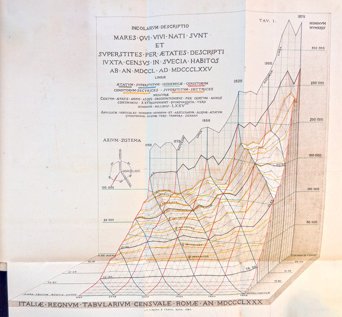
It is with this second version that Perozzo adopts the word stereogramma.
As a refresher, the first design used a skeuomorphic volume to chart Swedish male cohorts over history. It used four colors, all employed again in his second design:
🟥 Red is years, from 1750 (left) to 1875 (right). Every 25 years gets a thick line.
⬜️ Gray is age, from birth (background) to 100-years-old (foreground).
🟦 Blue traces cohorts, everyone born in the same period.
🟩 Green marks constant population counts, isolines.
[Catch up with part 1 of this essay to better understand Perozzo’s 3-D project.]
In addition to being published in Latin, because he was sending copies to other national statistical offices, Perozzo’s second design boasted two new colors: golden yellow and orange. They are his attempt to make his stereogram more useful.
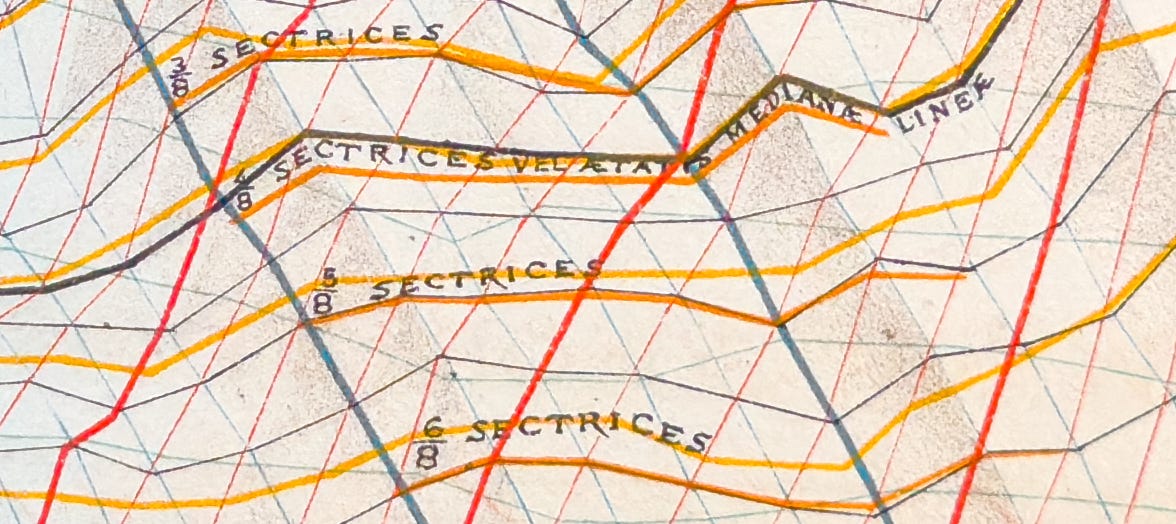
The new colors mark population quantiles. Perozzo called these lines “isotomic cuts”—cuts that divide a population into equal chunks. Eight quantiles, for example, divide a population into eight equal chunks.
Perozzo included two kinds of cuts, labeled in Latin: CENSITORUM SECTRICES (census cuts, yellow) and SUPERSTITUM SECTRICES (survivor/cohort cuts, orange).
🟨 Yellow lines slice a red year’s population into equal chunks.
🟧 Orange lines slice a blue cohort’s population into equal chunks.
The orange lines are relatively short because there are only a few cohorts in the data born early enough to reach age 100 by 1875.
Perozzo’s colors are engaging. But are they useful? It’s hard to say with historic Swedish data. Let’s try something closer to now.
I applied Perozzo’s method to the United States, illustrating its population since 1900, below.
Note that this is total population, not birth and survivorship curves. It encompasses many phenomena including birthrate and immigration.
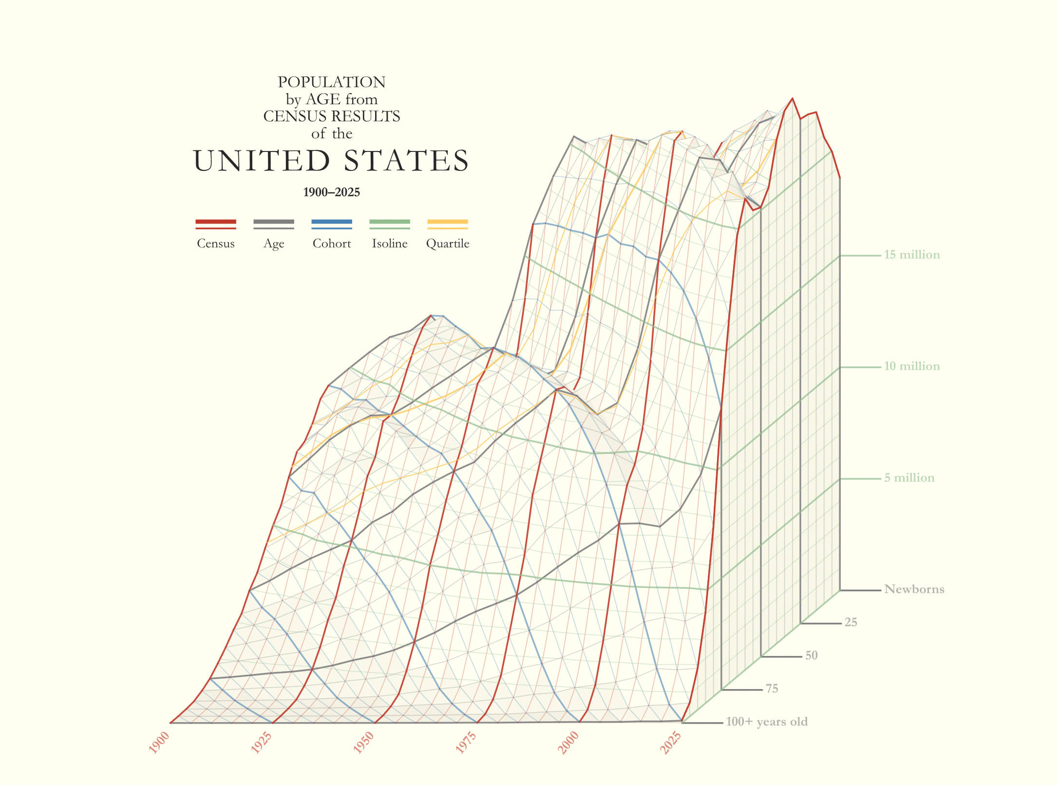
I’ve never seen my own country in such meticulous detail. Here’s what I notice (annotated below):
🅐 First hump, which begins around 1920: high births (spurred partially by parents from the largest immigration wave in early 1900s) and improving child survival rate (water filtration and chlorination).
🅑 Silent generation valley: low births during Great Depression and WW2, plus low immigration after restrictive 1924 Immigration Act.
🅒 Post-WW2 baby boom, a big ridge that persists through time
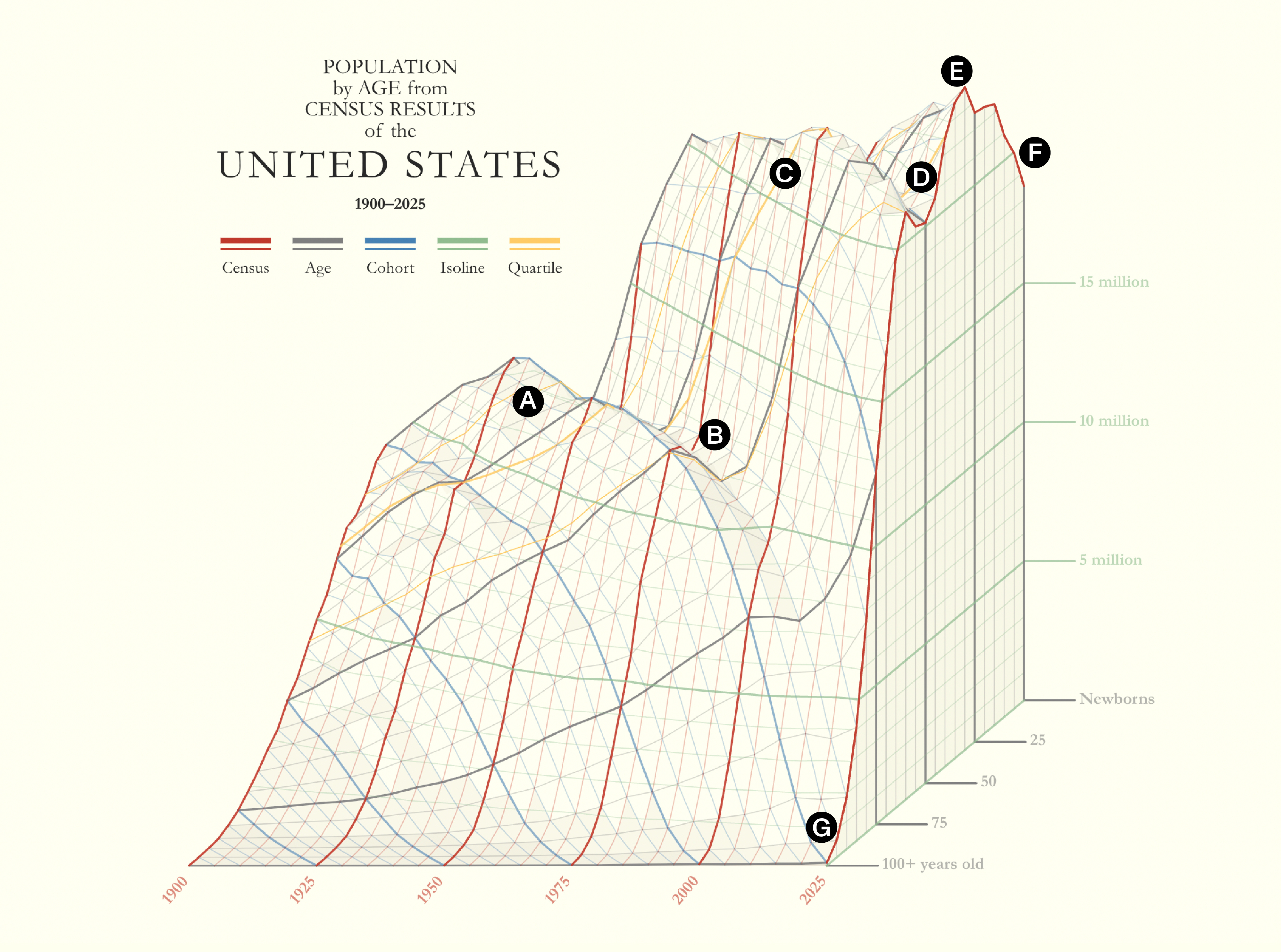
🅓 Gen-X valley, and echo of the silent generation valley
🅔 Echo ridge: baby boomer kids
🅕 Fewer baby-boom grandchildren
🅖 Noticeable rise in 100+ year-olds by 2025
From one perspective, the story isn’t about the ridges. It’s about that Depression/WW2/immigrant-exclusion valley. That valley contrasts surrounding terrain to make them look like booms. That valley echoes forward with a smaller Gen-X population.
The yellow lines cut the solid into quantiles, each with equal population.
I find that the stereogram’s perspective and overall rise in population make these quantiles hard to read. For example, the yellow line in the foreground advances forward in age in the data, starting well below fifty-years-old in 1900 and ending above fifty by 2025. However, it optically moves backwards in the graphic.
This prompted me to return to 2-D to look at two slices from the stereogram, the 1900- and 2025 population profiles. These are the left and right walls of the stereogram, below.
Empty white lines cut into each year to make quartiles. Visually you can get a sense that each chunk represents the same equal population.
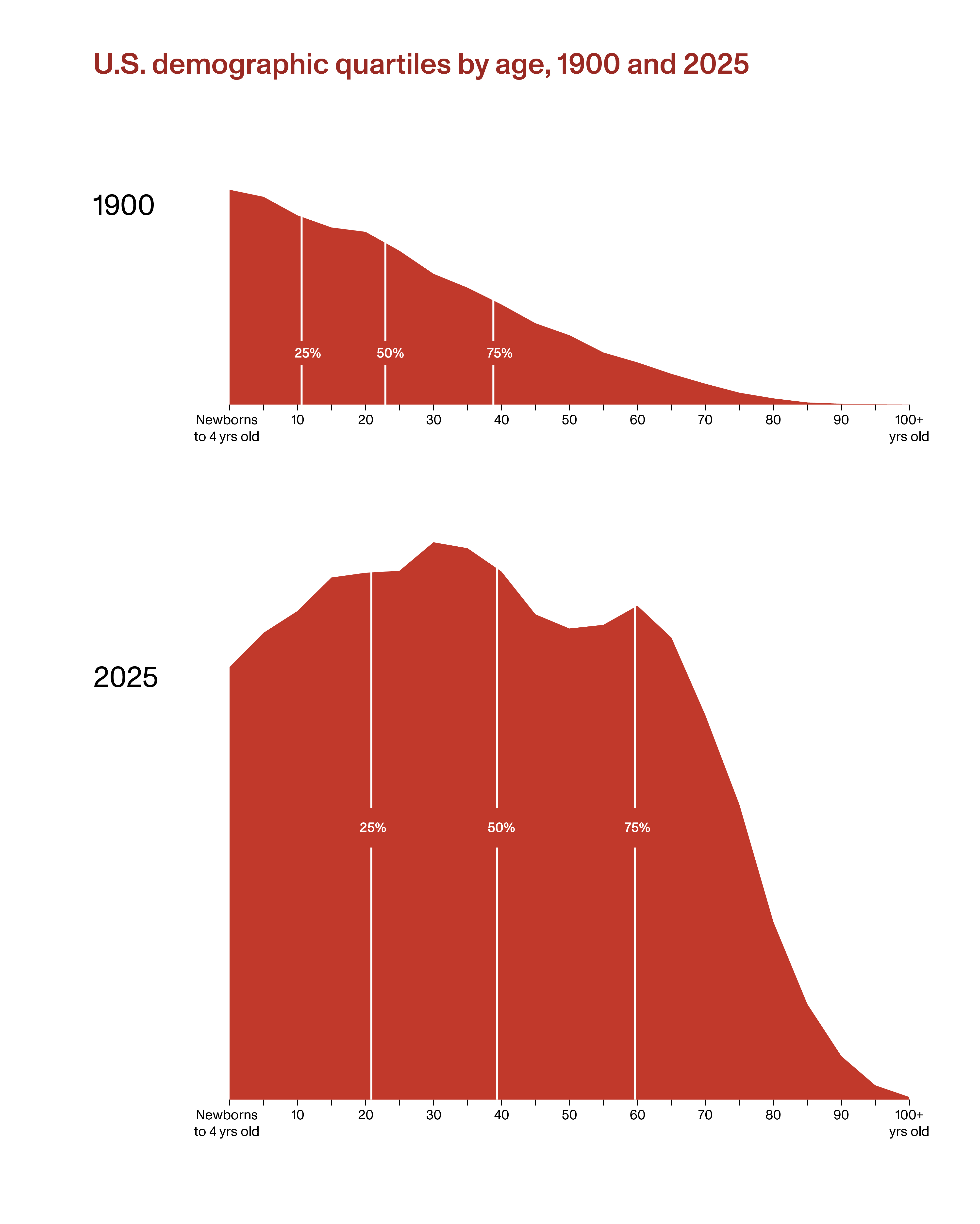
Remember, each is showing the character of the population in a given year, not the survivorship of a particular birth cohort. Seeing 1900 and 2025 like this advance three critical observations (beyond the fact that the second shape is much bigger because our total population is bigger):
The shapes of the two populations are very different. 1900 is a triangle, loaded with kids and trailing off rather constantly. It’s a young country. 2025’s shape is more boxy, like a rectangle.
There is a decade-plus quartile shift. The median age (middle white line) shifts from early 20s to late 30s. In 1900, 25% of the population were kids younger than 11!
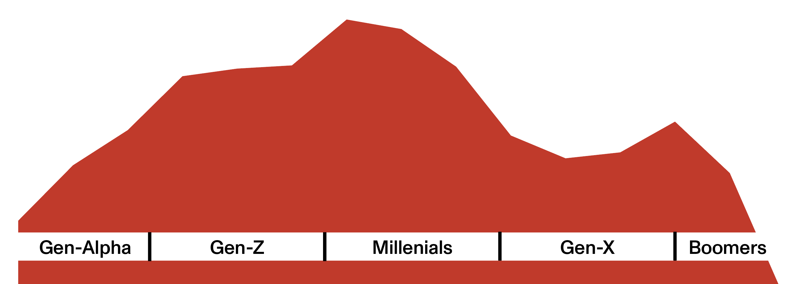
Reading the top ridge of 2025, detailed below, shows us that named generations are more than just marketing speak. Unique peaks and valleys suggest that our population composition will keep changing over time—and with it the composition of our interests and needs.
The USA stereogram differs in one significant way from Perozzo’s Sweden.
USA charts all population in a given year while Perozzo charted the survivorship of birth cohorts. The nice thing about his dataset is that the resulting cohort line always decreases. You might know this as monotonic.
A monotonic curve works great in 3-D because monotonic survivorship avoids overhangs, reversals, and other weird self‑intersections that inhibit views. They are more “terrain-like.”
USA’s full population is a different story. Its bumpy ridges block background valleys. The ridges also create difficult saddle-shape cells and ugly sawtooth transitions. For me, it was technically more challenging to render USA than recreating Sweden. Most critically, a ridge obscures populations behind it and makes it difficult to understand the full shape of the stereogram.
While they are the most enduring, Swedish stereograms weren’t the only fabulous vision that Perozzo pursued. Today we could render USA as a spinning object. We could slice and dice it digitally. We could even 3-D print it. But for now, I’ll just do what Perozzo did and pair the front view with a back view.
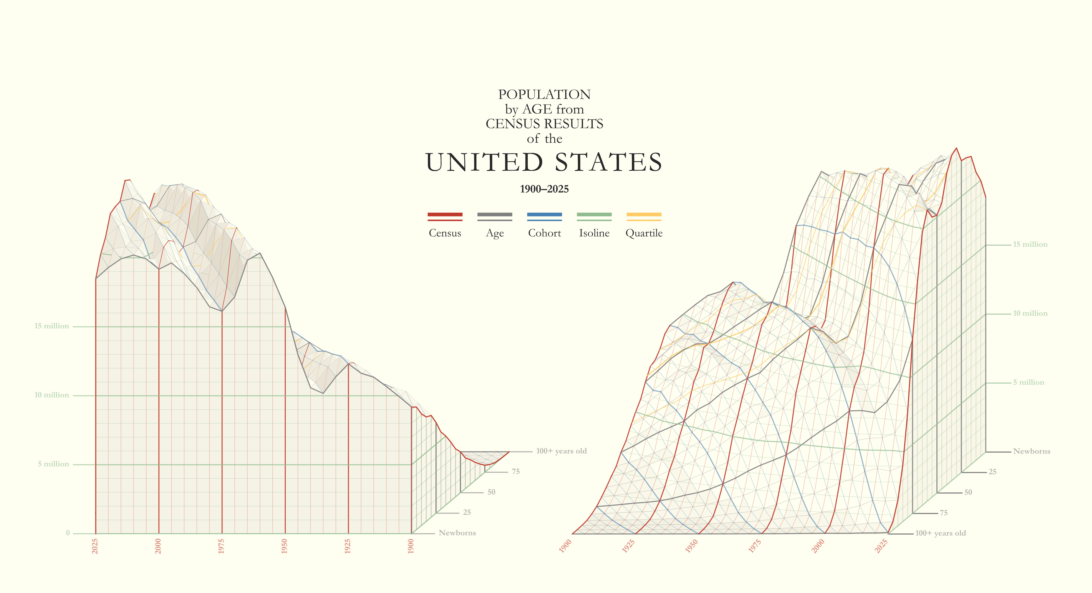
Having the back view shows us that, aside from the Gen-X valley, the original front view wasn’t missing too much (even though it felt like it was). The back view also reveals the Newborn curve and the age-profile of 1900.
There’s more to be gained from reviving sophisticated volumes. I look forward to developing more stereograms with other types of data.
Onward!—RJ
p.s. Paid subscribers get a bonus behind-the-scenes look at how I visually debugged the USA stereogram. Keep scrolling to the bottom of this newsletter to see.
For your radar
Three timely updates:
Nightingale talk + discount
On January 29th I am delivering a talk at the Florence Nightingale museum, “God’s Revenge Upon Murder” about Nightingale’s mortality diagrams.
Watch on Zoom or attend the London watch party at the Nightingale museum. Free, but registration is required.
Plus, I’ve discounted my Nightingale book in honor of this talk. Order one from Visionary Press.
Principles of Data Graphics
I’m returning to Cooper Union to teach a five-session workshop starting April 21st, all virtual—but very alive and very interactive. We always have a blast with this class, it usually sells out so don’t dawdle.
Freshy-fresh website
A nasty performance bug sucked me into a complete re-design of my online presence: avatars, images, copy, pages—you name it and I improved it.
This includes a new logo and color kit for Chartography (did you notice?) and a totally refreshed portfolio website. Check it out:

About
Chartography is the newsletter of Visionary Press and Info We Trust, by RJ Andrews.
RJ Andrews is obsessed with data graphics. He helps organizations solve high-stakes problems by using visual metaphors and information graphics: charts, diagrams, and maps. His passion is studying the history of information graphics to discover design insights. See more at infoWeTrust.com.
RJ’s book, Info We Trust, is out now! He also published Information Graphic Visionaries, a book series celebrating three spectacular creators in 2022 with new writing, complete visual catalogs, and discoveries never seen by the public.
