
Beyond Superficial Histories
An interview by Attila Bátorfy.


Attila Bátorfy unearths fascinating historic information graphics and shares them in his “Cabinet of Infographic Curiosities” newsletter. Last week, he published a chat with me about my work in our field’s history. It is the the most in-depth look into how I fell into this enchanting rabbit hole. Our interview is republished below.—RJ
Attila Bátorfy: Do you remember when and why, or perhaps who, sparked your interest in the history of data graphics?
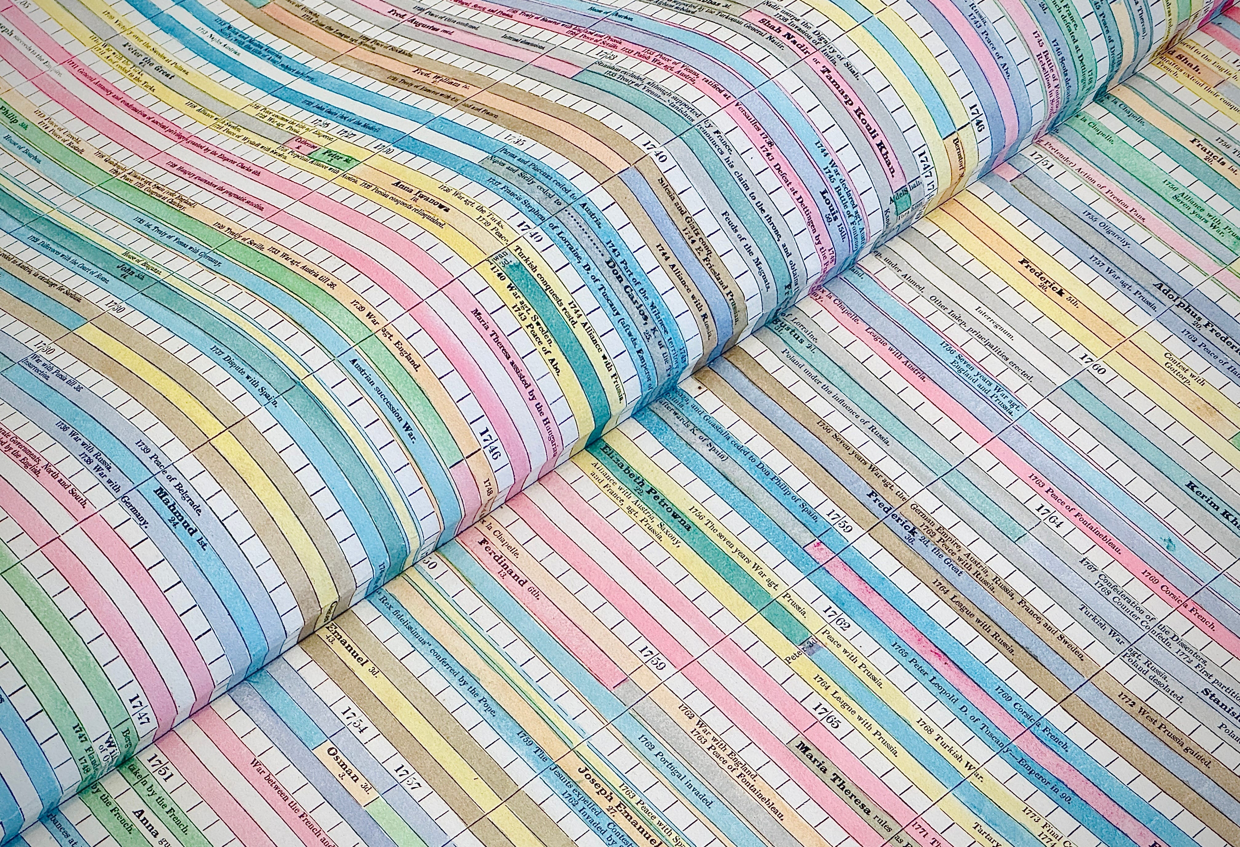
RJ Andrews: I’m the son of two history nuts (and collectors). Nearly every vacation was to a museum, often to go behind the scenes with curators into collections. In September 2016, I visited Tableau in Seattle to give a talk to their research staff. Afterward, I went for a walk with Ben Jones, leader of Tableau Public at the time, around Gas Works Park. Ben encouraged me to look into the history of data visualization, observing that no one from my generation had a good handle on it. The following fifteen months was my swift turn into historic graphics. Ben’s prompt led me to create my Ogilby timeline, which is mostly inspired by Michael Friendly’s Milestones project. The project was my first attempt at understanding our tradition. Its original poster got a lot of attention, which encouraged me to turn it into an interactive and keep digging into historic charts.

In July 2017 I pitched a publisher on a book about the history of charts titled Conveyed; how data revealed the world. They didn’t spring for that concept, instead funding the original edition of Info We Trust.
That autumn, I attended the first Ruderman Conference at Stanford’s David Rumsey Map Center. There, David Rumsey introduced himself to me, citing his enthusiasm for the Ogilby project. He confided that he was turning his attention toward collecting historic data graphics and invited me to his house to see his collection.
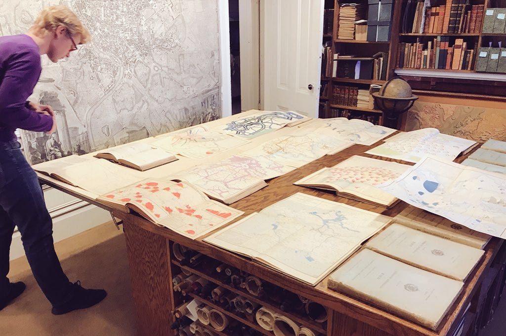
There, in November 2017, he told me that I was about to start collecting. He was right. The following month, inspired by encountering real works in David’s collection, I made a batch of facsimile linen-back case maps as Christmas presents for information-graphic friends. My accompanying card neatly summarized the past year’s journey:
Enclosed please find a handmade and to-scale facsimile of Darton & Gardner’s Comparative Heights of the Principal Mountains and Lengths of the Principal Rivers. The famous and earliest known rivers-and-mountains type graphic, it launched decades of similar charts. The 1823 original was produced as a “case map”: fixed to a linen backing & contained within a cardboard sleeve. When I first saw one of the rare existing originals in person I was amazed at how small it was and thought you might be delighted with a similar experience! It is packed with whimsy and design flourishes that are sure to inspire. 2017 has been a wonderful year of learning for me and I am so thankful that you have been part of the adventure.
Looking back, this was obviously a specter of my future publishing endeavour, Visionary Press.
What do you think is the reason for that the history of data graphics/information graphics became popular in the past decade?
It doesn’t feel popular to me. Any rise in the past decade may be due to newly digitized archives, data journalism’s rise bringing attention to the field, plus a now-extinct vibrant international community on Twitter.
Thanks for reading Attila Bátorfy’s Cabinet of Infographic Curiosities! Subscribe for free to receive new posts and support my work.
Which period do you find the most exciting and interesting?
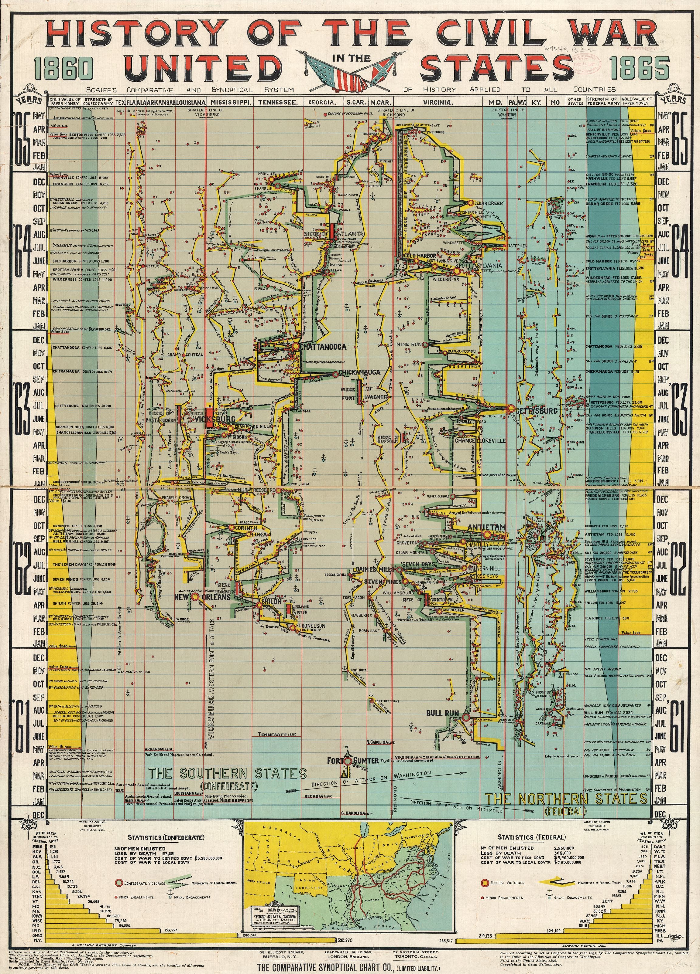
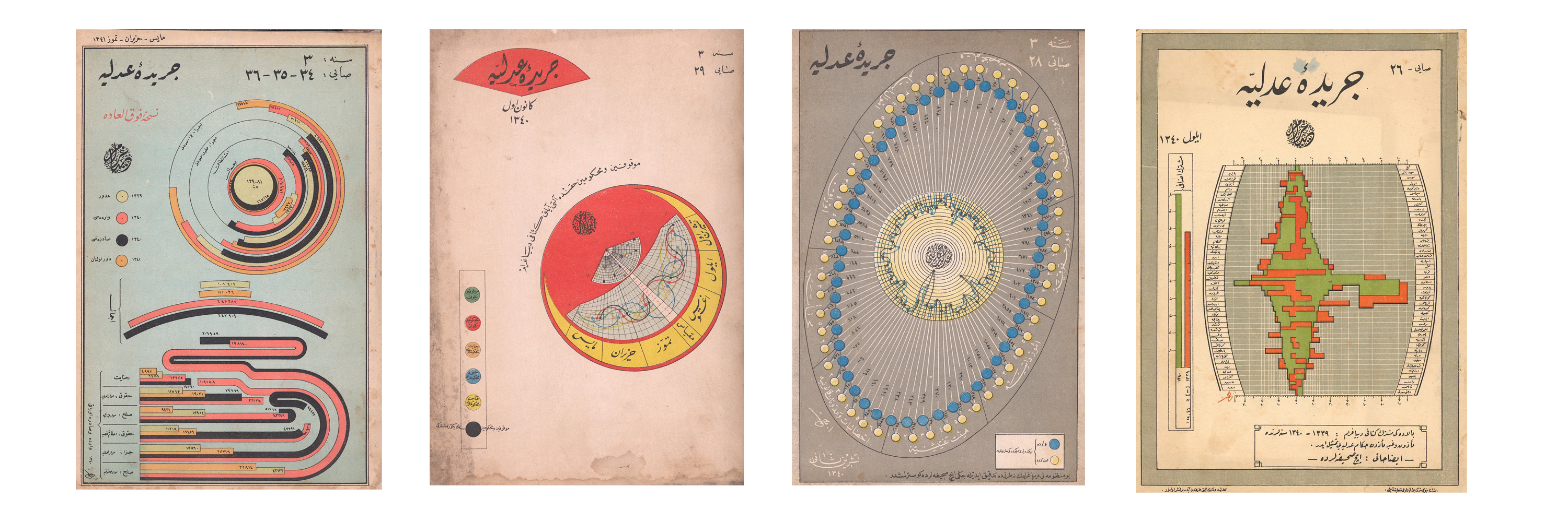
Works surrounding the first world war appeal to me. Before the Great War you had the zenith of print culture and empire powers, plus the rapid rise of statistical science. This combination produced monumental achievements, including lavish American and French statistical atlases. After the Great War, prior achievements diffused to new places where they were spun around with fresh visual approaches to voice strongly persuasive arguments, or propaganda across the world. My prior example would be Scaife’s Civil War, and later examples are the Istanbul Journal of Justice and the Isotype Institute.
How does the inspiration you draw from old data graphics appear in your information design work?
The history of data graphics teaches us two essential things. When we make data graphics we are part of a proud tradition of people all over the world and all over society who worked hard to better discern reality and create shared understanding. It’s never been easy, but it’s often inspiring and mostly worthwhile. Studying information-design history also teaches us more ways to solve information problems. Like us, our predecessors faced all sorts of information problems. The solutions they naturally arrived at are often different from how we would solve things. This is because they existed with different contexts: analog workflows, big canvases with high resolutions, large creative teams, different data, and different narrative pressures.
If you look at the literature on history to date, do you have any general observations about the works?
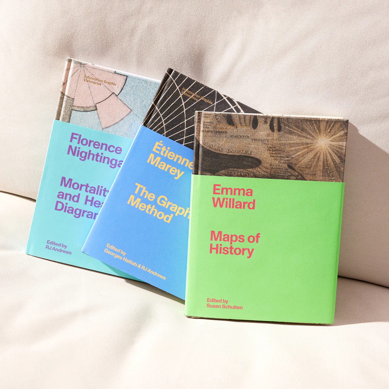
My Information Graphic Visionaries book series put forward the kind of history I am interested in: one that gets into the details about what, how, and why masterpieces are made. We are ready to move past histories that are too superficial, especially long lists without connective tissue between important works. I also have a sense that no one has struck the right geographic balance in their telling. Previous histories are too western-centric, true. They didn’t properly acknowledge universal and ancient aspects of information graphics. But modern tellings reach for some fantasy where the bar chart, and other artifacts of statistical science’s development, is as old as time and equally distributed everywhere. And that’s just not how it happened. These are tools that were invented and developed by a relatively small number of people—adopted, adapted, and improved over time. That story is interesting to me.
Are there any data graphics that you specifically discovered and introduced to the public? Please tell us about them!
I noticed, researched, and collected Frances Lightfoot’s colossal chronographer. I am also the first to organize the catalog of Florence Nightingale’s graphics.
Have you ever thought about what will happen to your collection when you are no longer around?
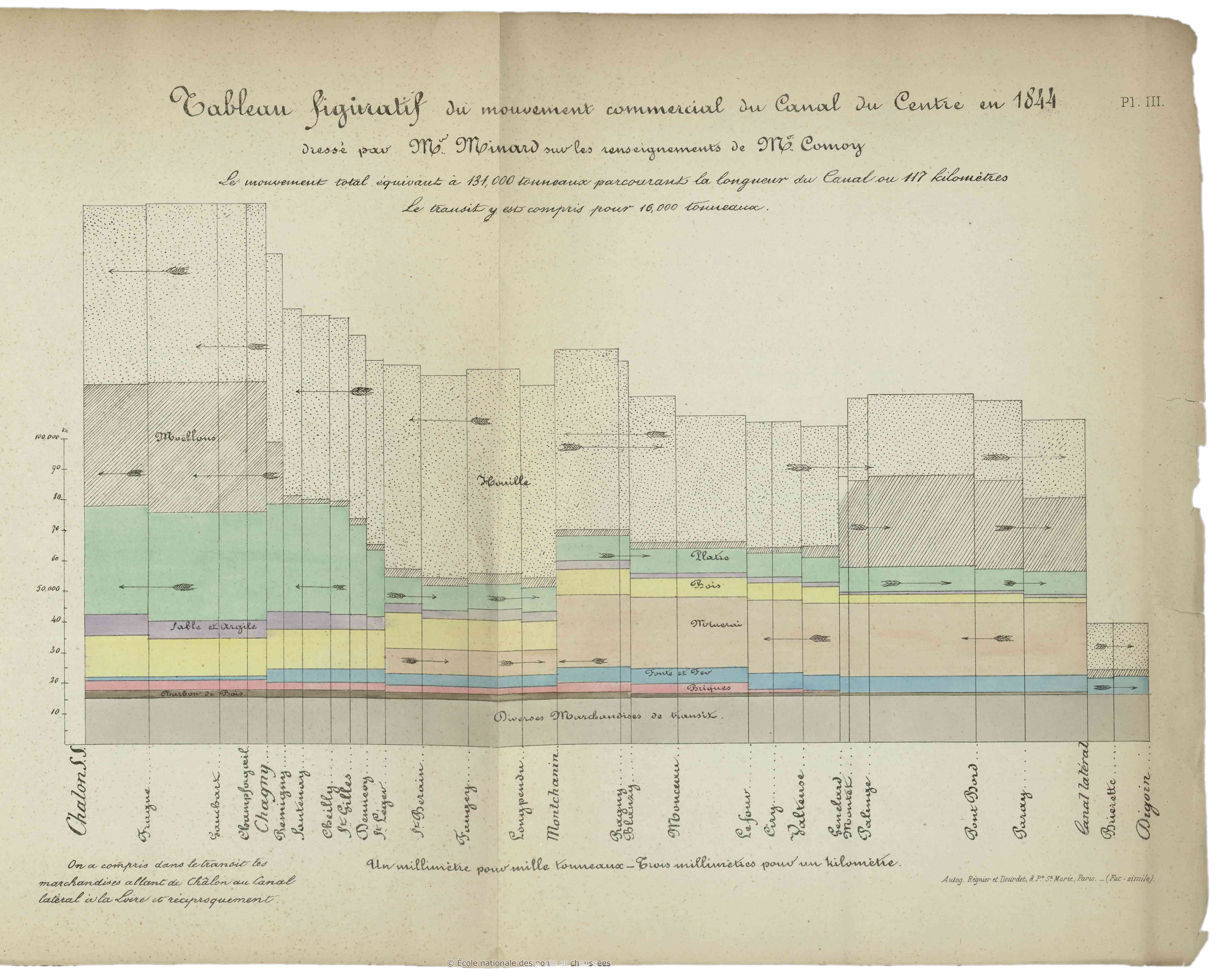
I’ve assembled a collection of data graphics that I consider a working reference design library—a resource for me and others to help us make great work. It’s a great joy to host tours and expose people to great works. I have an original Minard design treatise from 1861 that is quite precious. It inspired me to translate its accompanying text. There are logical ends for any collection. It can be sold for parts, transferred to an institution for preservation, or passed on to an heir (Or some combination.). I began collecting at a relatively young age, and believe I still have some time to figure things out!
What was the reception of the first three volumes of Visionary?
Beautiful books are very important to me. Like others before me (Nightingale, Brinton, Tufte), I embarked on a financially foolish endeavour to make beautiful data-graphic books. I wish I didn’t have to and that a traditional publisher would do it for me. Let me know if you are that publisher and can take over the burden! Making nice books is really hard. Reception and enthusiasm was enough to put the project into production, but not enough to sell out our print run. Get your books before they sell out. I don’t expect to ever be able to reprint these at such a phenomenal quality.
Do you have any new book plans for the Visionary series?
I’m working on a poster series titled Maps for Kids inspired by classic Marie Neurath books. It takes the perspective that everything is a map. We will launch with a map of an American steam locomotive, a map of Earth biomes, and a map of macronutrient energy composition across two hundred basic foods. I want to use this series to develop beautiful pictorial diagrams, statistical charts, and geographic maps.
The five greatest data graphics and/or creators of all time? One cannot be American, German, French, or British!
Acknowledging that these dudes often, or mostly had other people actually produce their designs, my top five today are: Halley, Playfair, Humboldt, Walker, and the Neuraths. Each developed several novel information graphics with lasting impact. And, Neurath was Austrian, not German ;)
Subscribe to Attila Bátorfy’s Cabinet of Infographic Curiosities” newsletter.
About
RJ Andrews helps organizations solve high-stakes problems by using visual metaphors and information graphics: charts, diagrams, and maps. His passion is studying the history of information graphics to discover design insights. See more at infoWeTrust.com.
RJ’s book, Info We Trust, is out now! He also published Information Graphic Visionaries, a book series celebrating three spectacular data visualization creators in 2022 with new writing, complete visual catalogs, and discoveries never seen by the public.
 | A guest post by
|